Yellow, Purple, and the Myth of “Accessibility Limits Color Palettes”
September 1, 2025
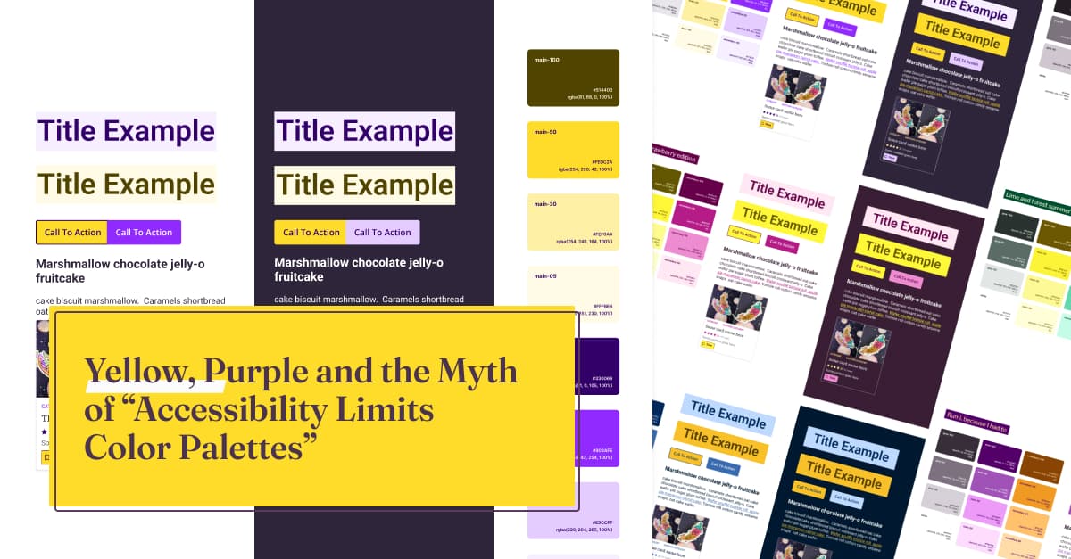
So, let’s address the myth head-on. Accessibility does not limit your color palette choices. What feels limiting is often a lack of knowledge about WCAG color contrast criteria, how to build accessible color palettes in tools like Figma. And sometimes, a lack of creativity.
Time and again, on big sites and small, research demonstrates that just about the number one accessibility shortcoming is low colour contrast between text and background colour.
One complaint designers often have Is that this contrasts requirement limits their ability to create impactful design.
Here Stephanie Walter addresses what she calls this myth, helping us to create attractive, accessible colour palettes.