Better typography with text-wrap pretty
April 10, 2025
Ideas of what makes for “good” typography are deeply rooted in eras when type was set by hand using metal, wood, or ink. Typesetters took great care when deciding if a word should go on the end of one line, the beginning of the next, or be broken with a hyphen. Their efforts improved comprehension, reduced eye-strain, and simply made the reading experience more pleasant. While beauty can be subjective, with disagreements about what’s “better”, there are also strongly-held typographic traditions around the globe, representing various languages and scripts. These traditions carry people’s culture from one generation to the next, through the centuries.
Typography on the Web has always been challenging, since among other things line lengths change due to numerous factors.
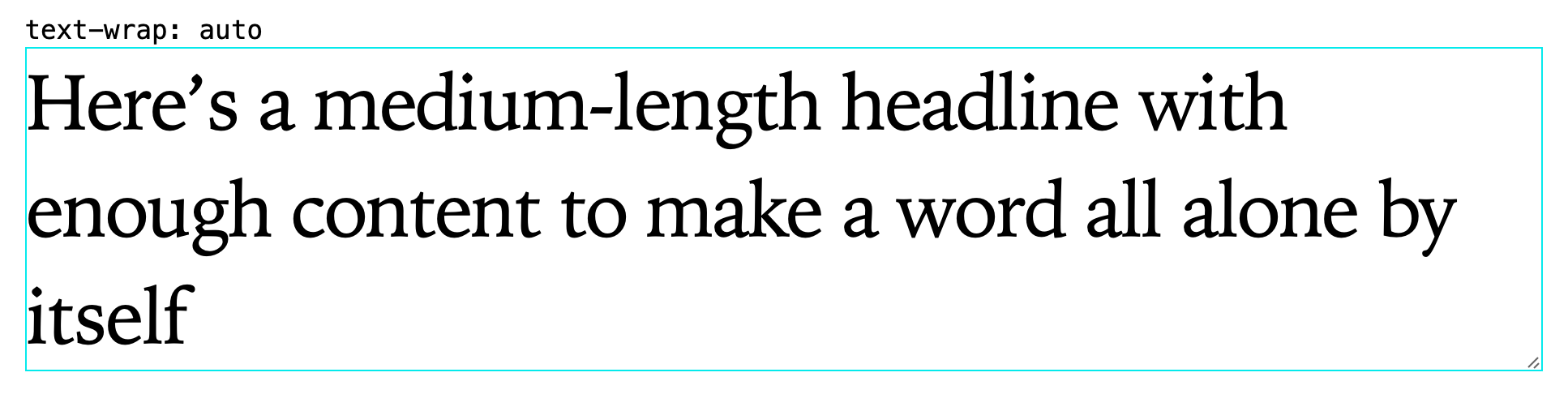
CSS’s text-wrap property improved things significantly, and text-wrap: pretty promises to make typography even better on the Web. It’s supported in Chrome and now in Safari Technology Previews, and it’s straightforward to use in a progressively enhanced way.
Here Jen Simmons gives history of typography on the Web and takes a look at text-wrap.
Related Speakers