Beyond the Noise: Data Visualisation’s Role in Shaping Tomorrow
The Evolution of Data Visualization
Jack Zhao introduces the concept of data visualization, tracing its evolution from early examples like John Snow's cholera map to modern applications embedded in everyday tools. He discusses how the field has shifted from prioritizing clarity and efficiency due to medium limitations to becoming an art form with immersive experiences. Today, data visualization is essential for decision-making, reflecting changes in data volume, tools, and the people involved in its creation.
Shifts in Data and Tools
Zhao explores the significant growth in data volume and accessibility, highlighting the transition from hack days to sophisticated open data platforms. He notes that creating visualizations is now easier due to advanced tools, including AI-assisted technologies that allow even those without coding skills to create impactful visuals. This democratization of tools has integrated data visualization into various roles across industries, making it a crucial skill.
Adapting to Changes in the Data Visualization Landscape
Reflecting on his consultancy's journey, Zhao shares how his team adapted to changes in data accessibility and tools. He recounts early projects with journalists and the evolution towards using open data platforms for more structured datasets. Zhao describes working with large data warehouses for projects like the UN development program, emphasizing the smoother, more collaborative process enabled by modern design tools like Figma.
Challenges and Growth in a Small Consultancy
Zhao discusses the growth of his consultancy, Small Multiples, from a small team to a peak of 15 members, driven by a shared passion for using data to drive change. He reflects on the impact of COVID-19, which led to a temporary pause and a stint at Accenture, before returning to their roots with a renewed focus on efficiency and innovation. This segment highlights the importance of adaptability and resilience in navigating business challenges.
Strategies for Innovation in Data Visualization
Zhao introduces three strategies for staying innovative amidst the overwhelming abundance of data and tools. He emphasizes the need to channel this abundance into meaningful and creative outputs, suggesting a focus on specific user groups, embracing diverse skill sets, and leveraging AI to enhance capabilities. These strategies aim to help practitioners navigate the complexities of the modern data landscape effectively.
Designing for Specific Audiences
Illustrating his first strategy, Zhao highlights the importance of designing for specific user groups rather than a generic audience. He cites examples like The Pudding's niche data journalism and the SBS Census Explorer, which caters to diverse Australian communities. By targeting specific needs and interests, these projects demonstrate how tailored visualizations can foster engagement and understanding.
Building Diverse and Multidisciplinary Teams
Zhao discusses the value of diverse skill sets and perspectives in team building, using Probable Futures as an example of a multidisciplinary initiative. He reflects on his own experience at Small Multiples, where a small team had to wear many hats, highlighting the necessity and advantage of being multidisciplinary. Zhao advocates for recruiting and training team members to be effective communicators and T-shaped employees with broad skills and deep expertise in specific areas.
Leveraging AI and Technology for Enhanced Capabilities
Zhao explores how AI and technology can increase capacity and enable multidisciplinary approaches, using Hyundai's microfactory as an example of modular, reconfigurable production. He shares a project with the University of Sydney that used AI to create a fictional future for renters' rights, demonstrating how technology can extend human capabilities and facilitate innovative storytelling. This approach allows for more flexible and responsive project development.
Embracing New Ways of Working
Zhao concludes by advocating for embracing new technologies and methodologies to innovate in data visualization. He describes how AI can broaden perspectives and transform traditional workflows, allowing for seamless integration of design and development processes. By operating like a microfactory, Zhao and his team can scale their efforts efficiently, making it possible to realize a wide range of ideas in today's data-rich environment.
Thank you.
Good afternoon everyone.
First, what is data visualization?
Data visualization to me is about helping people understand who we are and the world around, around us.
But, and it has evolved over time.
Reflecting shifts in, technology design and its purpose.
In the early days, visualizations like John Snow's cholera map, these kind of visualization early visualizations prioritize clarity and efficiency, efficient representation of data because they were, because of the limitations of the medium, they were printed.
Then data visualization became an art form, with immersive full screen experiences, Sometimes without practical applications.
That visualization nowadays you can find almost everywhere that they're embedded in the everyday tools.
They prioritize usability and real world problem solving.
You can find them in corporate dashboards , in apps.
So this progression from early visualizations to the stuff we see now, is, illustrate how visualization has transformed from objects of appreciation, to essential tools in decision making.
What has changed in the world of data visualization?
So thanks to shifts in data and tools and people behind, it has changed a lot in the world of visualization.
So in terms of data, you can see quote from there the volume of data doubles every year in size.
So we've seen huge growth in the volume of data and how we use it as well.
So in the early days when we first started, we attended hack days.
There were lots of passionate people come together.
Figuring out how to make data more accessible, more useful to people, and then slowly evolved into open data platforms, championed by government organizations.
And now there are sophisticated infrastructure in place for creators like us to utilize it to make use of data quite powerful.
And tools change evolved over time as well.
So creating data visualization is easier than ever.
The technical barriers are gone.
And as we can see from the last presentation, AI assist the tools making it much, much easier for people even without coding knowledge to get there, to make something visual and impactful.
So you just need the right tools to bring ideas to life.
Visualization and for people behind visualized making and designing visualization, it's not, I would say it's not a niche skill anymore.
Data virtualization has spread into all kinds of roles in organizations and in every industry.
It has becoming a must have almost an essential experience.
So a quick search on LinkedIn jobs.
So reveals, there are what, 1,500 results that contains the term data visualization.
And another number to demonstrate that that the community of data visualization has grown is that you can look at the, data visualization society that across the world they have over 140,000 members.
So that's the world we changed, in a macro level.
But what will change for us as a small, consultancy.
Yes we also experienced these changes and we've evolved with it.
So for inter starters this is one of our first projects.
We worked with the journalists at the A, B, C, to, tell people to tell the story about Coast Gas, about fracking.
It was our very first project, the process of collecting data, finding data, and creating those graphics was very ad hoc, but it was very fun.
Just like the early days of internet.
Over time, when open data platforms like, data.gov.Au, and the new, the state level equivalent became available, it made the structured dataset more, much more accessible.
So in enabled projects like the common ground.
Which we worked with Mel in the audience, Luke Studios.
This project promoted transparency and collaboration between what the mining industry and communities.
So this, projects like this became possible.
And now with we're increasingly working with warehouses where, for example, two over 200 data sets are pulled in into one place, joined, cross-referenced, to produce something like this project that, that we did for the UN development program.
So we had to integrate that over 200 indicators to help governments around the world tackle one of the global crisis.
We worked, has changed as well.
So my feeling is that it has become the pro, the whole process of creation has become much smoother and seamless and much more collaborative.
In terms of design tools figma has replaced so many of the all these different apps, so it has become the one-stop shop for doing co-design workshops, for sketching out wire frames and polishing the final visual.
It is amazing how much it simplifies things, but we're not a fan of its, pricing model.
For development, I would say the tools we use for prototyping and development, the framework hasn't changed too much, but the way we use them, definitely has changed.
Develop to me, feels more like having a conversation.
It's like writing pseudo code, which is important to me because I'm, I can't say I'm a very good coder.
I can make things work.
So having someone there, having, ChatGPT there to help me is, it's quite nice.
And also it's, it doesn't break the floor, like the old way of working by, having, requiring me to constantly switching between the code editor, the Google, and a stack over floor.
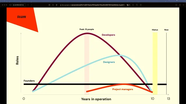
And for people the journey of building a team has been part, a huge part of our story at small multiples.
So in the first 10 years, we focused on building a very diverse, multidisciplinary team.
So everyone who joined, we were all united by passion of using data to drive positive change.
We grew from two people in a, study in our apartment.
So Andrea and I were the founders to, we grew to a team of 15 at our peak.
It was a very, it was incredible.
So we learned so much from each other and we couldn't have done all those very memorable, projects that, just by two of us.
We needed people, amazing people around us.
But then during Covid, running the business became very overwhelming.
And there was so much things to do.
There were, and the world was, felt like it was collapsing, so we made a tough decision to pause.
We disbanded the team.
And decided to focus on family.
So we had a young child at, back then.
So that, that was a decision, tough decision.
We then spent a year at Accenture.
It was quite different.
So going from a team of 15 to a multinational corporation that's 700,000 people across the world, I have to say we gained some fresh perspectives.
There were some takeaways, but eventually we came back and we started small multiples that, that we felt that was, it was where our passion lies.
But this time, just like how we started, we're, a team of two again.
So we have to learn to do more with less.
But over the past decade, more than a decade, we've built a very strong foundation and we met amazing people, built a network as well.
And along with, development that of, better tools and access to data, we were able to achieve more with less, and with a smaller team.
So on reflection of what changed in the world and what changed at a personal level, in the data tools and people, the question becomes how do we, and how do you, cut through all this huge amount of very overwhelming noise and stay innovative.
I feel we live in a era of, post scarcity because there's just so much stuff we couldn't possibly pay attention and try everything.
And it feels like everything is just one ChatGPT prompt away.
The challenge is finding ways to channel this flood of data and tools into something meaningful, into something meaningful, innovative, and creative.
Here I'll share three.
Rule three, three, practical strategies that can help you perhaps navigate and, get some inspirations from.
So the first strategy is to move away from designing for a generic, average person and instead of focus on specific groups that need your product most.
So to illustrate this, let's look at, the pudding, which is a data journalism and storytelling publisher.
So these guys, they commission visual essays and publish around 18 articles every year.
Their story, delves into niche topics and that they try to spark curiosity on conversation and debate.
And leave their audience feel transformed.
So that this taken from the website.
By the way.
Visualization is at the heart of the pudding, the mission, and bringing these ideas to life.
So what makes them unique is that they have a selection process, they select the creators with unique knowledge and passion very special, very unique, topic areas.
And then they also try to target equally, unique interest our audience groups.
So instead of targeting everyone.
Their creators take a proactive role in discovering and flipping the dynamic from just producing something for passive consumption and to, but instead they encourage, proactive storyteller.
So here are some examples.
The very niche topic about hair, and this is one of our examples.
This is one of the longest running project, we've done, for the, for SBS.
So this actually started in two, 2011, for the census, data that year.
It was designed so the census Explorer was, designed to open up population insights and showcase, the diversity in Australia to the general public.
So people can learn who we are, what language we speak, where do we live.
I think important questions like that, so to understand ourselves as Australians better.
So we did the latest iteration, which we did in, for the two 2021 census, which is 10 years later.
So we worked with, a team of translators from SBS and made the Census Explorer available in eight, different languages, including Arabic, which is, a right to left language.
And it was a interesting design challenge.
So these projects is a demonstration of expressing a single dataset, in multiple expressions, in multiple formats, as in languages and making it available to groups that are not just English speaking, the average Australian.
But to communities that are part of this great diversity in Australia.
And I think we, it is doing its job as, serving the community needs, the different community needs.
And another example is the news, the housing affordability, dashboard for teachers.
Again, a subset of the population.
And also as you can see, because housing affordability is a very complex issue.
It is location dependent, is income dependent, and is also has historical context associated with the price trends.
So again, going back to the point.
Let's not, let's stop designing for the average person to solve the generic need.
Let's be very specific in this case for teachers, at specific locations and at specific income grades, and whether they, ask the question whether they want to, they're looking to rent or buy, what type of property.
So be really specific in tackling those problems.
Stop designing for the average person do a couple of things.
The first one would be, as a creator, you take a proactive role in discovering, flipping into discovering the topic and discovering the data, and flipping the dynamic from passive consumption to proactive storytelling.
And this also opens up the possibility of how you present the data rather than building one big solution that serves everyone's needs.
That's forcing our audience to come to a and forcing your audience to come to a one single point of truth.
How about we make many little small things and take your audience, different group, different types of audience, down many different paths cause the second strategy, to embrace, is to embrace diverse skillset, and perspectives when building your team and not just focusing on their technical ability.
A great example of this, is the probable futures.
They are a nonprofit climate literacy initiative, and so they publish interactive maps.
They provide context, historical context to their story, to the mission is to help people, visualize the possible futures, climate futures .The different climate targets, whether we reach different, climate targets.
So to achieve these, they had to rely on a team of experts.
So there, there were scientists, communicators.
So this is the team, communicators, designers, engineers, the writers, and anyone who has a skillset, it's a very diverse skillset to contribute to these single initiative.
They're all working together to make data relatable to people.
So reflecting back to our own experience at small multiples, even as a two person studio, Andrea and I were, because we're, small business, we were, almost forced to be, highly multidisciplinary.
We had to wear many hats so that it has been both a necessity and advantage.
So we had to be calm.
We have to be able to design, code, sell and do accounting?
Sorry.
Yeah.
And the key takeaway for the second, for the, for the how do we recruit beyond the data capabilities is perhaps.
Asking if the people you wishing to hire.
Are they good communicators?
Or perhaps train up your existing team to be good communicators.
And, if you have heard of it, t-shaped, employees, coined by the, CEO of id, I believe.
People with a broad set of skills, be able to collaborate across disciplines.
But they have One specialized area of expertise in depth.
So that's how we see, T-shaped employees.
But I think it's much, nowadays it's much easier for people to become M shaped perhaps, so you people can have more than one specialized area of expertise.
And how do we achieve this?
We've heard this probably too many times, AI assisted technology.
So by, so all in all by having a good, having a team of good communicators and people who have deep expertise in multiple areas, you are ready to make ideas happen, to make many more ideas happen.
And the third, onto the third, we want to embrace, because the, as we have heard it, like technology, like ai, we can increase our capacity.
We can do things quicker.
We can become multi multidisciplinary, as well.
So an a case study would be Hyundai Microfactory.
So in contrast to the, to their proper mega plants, which produces 1.4 million cars per year.
These factories they set up as a test in, Singapore, they can, very modular reconfigurable.
The advantage is that they can spin up and change, and respond to, knees re very quickly.
And you can see from this photo, the workers assisted by exoskeleton, so they can lift extra load.
They're not as, they have less muscle strain and the, and spot the robotic dog.
They can go around underneath and do inspections, in all sorts of, nooks and crannies, to just to extend the human capability.
A little bit more.
So this new way of working is less repetitive and gives the worker a much better understanding of the whole product, which to me, I think when the person who's making the product understands it better, you get a better outcome.
And this is a project with, we've done with, university of Sydney, the Urbanism group.
So we help.
We heavily used ai, in this because, this project is about, promoting, renters rights because, when housing crisis, renters are being treated unfairly, the privacy being, not protected, but the data about, but to tell that story, we need the data about landlords.
It doesn't exist.
But how do we do this?
So we, how do we create a piece that, promotes research done by the, group.
So we have to invent an idealistic future.
So in that future, the landlords are the other party who's been scrutinized.
In this world real estate agents are nice and, helpful, and renters, are being treated fairly, but could create this future.
We use ChatGPT to create some text content.
We use me Journey, to create a fictional real estate agency, a fictional real estate search site.
And the whole process was, involved multidisciplinary teams.
There was like a social media creator, content creator.
There were, 10 tenants, union and university researchers.
And the outcome was also multi-format.
There were TikTok videos.
There were Instagram profiles that were made up about these fictional real estate agencies.
It was a highly bespoke, AI powered campaign.
I would say it was.
Almost, we made it with our own little, microfactory.
I think I'm a bit over.
Sorry.
So two points.
We work in our jobs, we sometimes we get stuck in our ways.
If something isn't broken, we don't tend to fix it.
But I believe, and from my own experience as well, using AI can broaden our perspective and introduce new ideas.
So taking, institutionalized knowledge that, that are resistant to change to something that, that you can train yourself constantly and become that really unshaped person.
And tech, new tech will transform the way we make products as well.
So going from an assembly line, you or the designers will producer the screens that to be cut up and handed over to a developer.
I think it, that process, we no longer work like that.
So Andrea and I, because we're only two people, so we operate more like a microfactory.
So we do everything.
We jump between, Figma, we jump, we go and, and the code editor seamlessly.
And so this new way of working can, Scale up and down really well as well.
So if we go back to the question.
How do we innovate when there are so many possibilities?
There's so much data, there's so many tools to choose from, and there so many things to learn The answer, my answer will be to embrace them all to make everything, to make every idea happen.
And because it's cost of experimentation so, low now and, with the new tech assisting you.
And with now if you're driven enough, you can make any idea happen and, whatever the future you imagine, you can make it real.
Thank you.
In this era of post-scarcity where the volume of data across the world doubles in size every two years and everything is one ChatGPT prompt away, the question arises: How do we channel this abundance into innovation and creativity? Jack Zhao delves into the evolution of data visualisation over the past decade, examining its trajectory through the interplay of data, people, and purpose. This exploration aims to equip the audience with practical strategies to foster innovation.