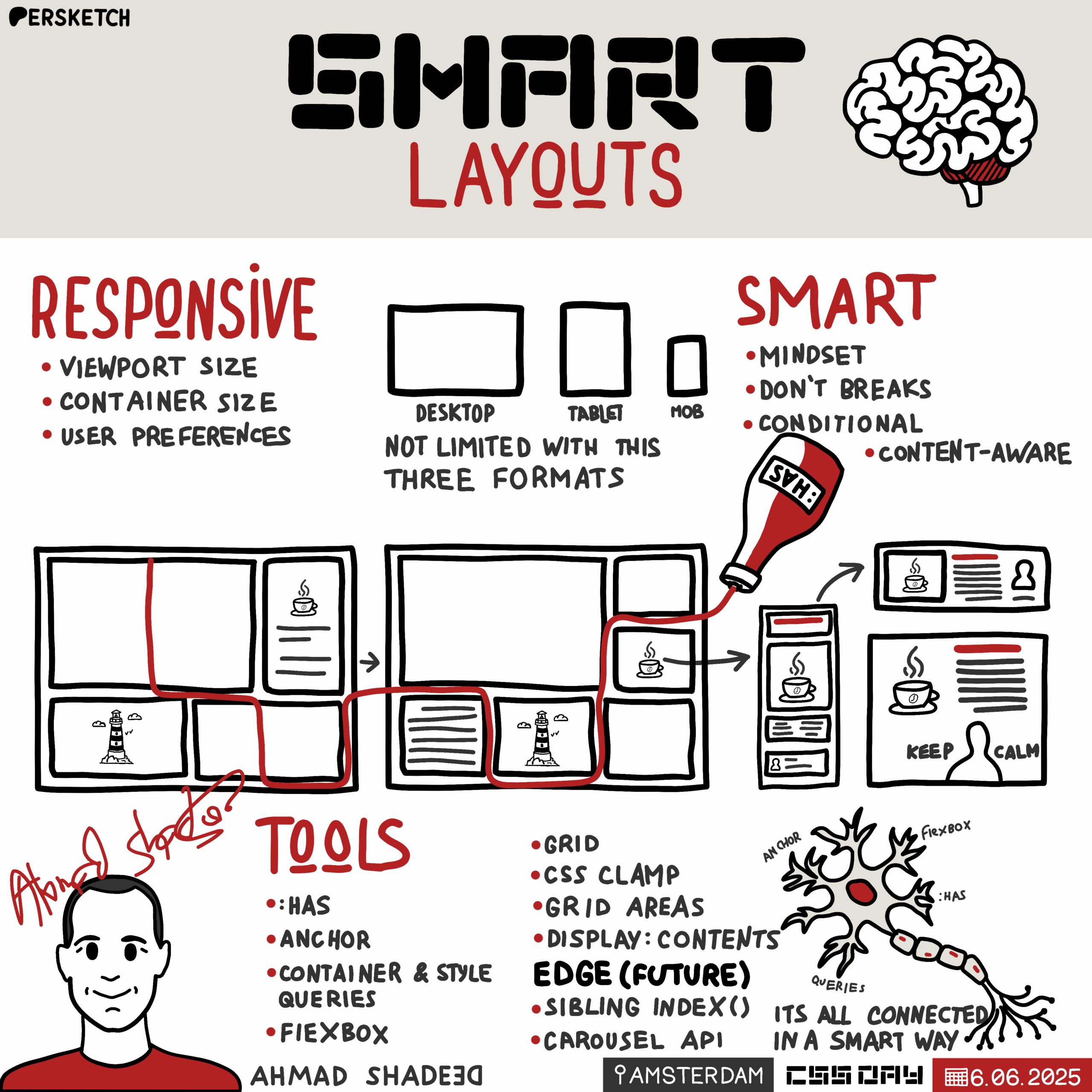
Smart layouts

Introduction to Ahmad Shadid

The host introduces Ahmad Shadid, a freelance design engineer known for his expertise in CSS and his book "Debugging CSS." Ahmad is currently working on a course about layouts and is recognized for his blog, which features technically accurate and beautifully laid-out articles. The introduction sets the stage for Ahmad's talk on smart layouts, highlighting his passion for both web design and coffee.

Understanding Smart Layouts

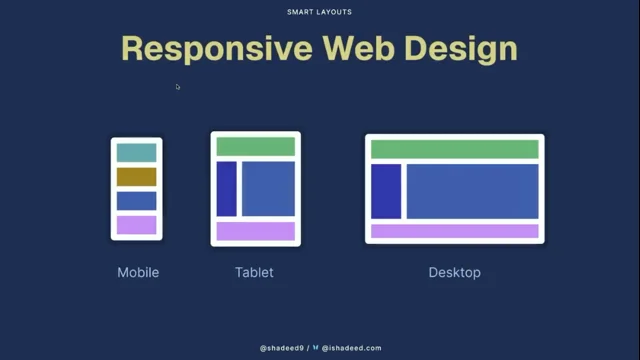
Ahmad Shadid begins his presentation by discussing the concept of smart layouts in web design. He references the evolution of responsive web design since Ethan Marcotte's 2010 article and critiques the common practice of designing with fixed viewport sizes. Ahmad emphasizes the need for layouts that adapt to various screen sizes and user preferences, advocating for a mindset shift towards content-aware and adaptive UIs. He introduces the idea of smart layouts as a future-proof approach to CSS design.

The Role of Design Tools in CSS

Ahmad critiques current design tools for their limitations in leveraging the full potential of CSS. He discusses the gap between design tools and CSS capabilities, such as Flexbox and CSS Grid, and suggests that these tools often restrict designers to outdated responsive design paradigms. Ahmad proposes a shift towards designing with container sizes in mind, which could lead to more flexible and accurate web designs. He illustrates this with examples of how CSS features can be better utilized.

Building Responsive Layouts with CSS Grid and HAS

Ahmad demonstrates how to build responsive layouts using CSS Grid and the CSS HAS pseudo-class. He explains the concept of layout zones and conditions, using examples to show how different grid areas can adapt based on content. Ahmad highlights the power of CSS HAS in connecting different layout components, allowing for dynamic changes based on content presence. This segment showcases practical applications of CSS features to create flexible and adaptive web designs.

Container Queries and Style Queries

Ahmad introduces container queries and style queries as essential tools for creating responsive designs. He explains how container queries allow components to adapt based on their container's size, while style queries enable style changes based on CSS variable values. Ahmad provides examples of how these queries can be combined with CSS HAS to create complex, adaptive layouts. This segment emphasizes the potential of these CSS features to simplify responsive design.

Advanced CSS Techniques for Smart Layouts

Ahmad explores advanced CSS techniques, including size query units and anchor positioning, to enhance layout responsiveness. He demonstrates how these techniques can address common design challenges, such as positioning elements and managing font sizes across different screen sizes. Ahmad also discusses the use of logical properties to simplify RTL (right-to-left) styling. This segment highlights the versatility of CSS in creating sophisticated, adaptable web designs.

Q&A: CSS Features and Performance

During the Q&A session, Ahmad addresses questions about the performance implications of using CSS HAS and the integration of CSS Grid with media queries. He advises on best practices for optimizing CSS performance, such as scoping selectors and being specific in queries. Ahmad also discusses the balance between design tools and coding, emphasizing the importance of designing in the browser to fully leverage CSS capabilities. This segment provides practical insights into effective CSS usage.

Designing for RTL and Writing CSS Books

Ahmad discusses the challenges and solutions for designing RTL (right-to-left) layouts, highlighting the use of logical properties to simplify the process. He also shares his approach to writing CSS books, emphasizing the importance of starting with engaging demos to inspire and guide the writing process. Ahmad's insights offer valuable guidance for both designers and developers working with complex CSS layouts and documentation.

Conclusion and Closing Remarks

The session concludes with a final round of applause for Ahmad Shadid, acknowledging his contributions to the field of web design and CSS. The host thanks Ahmad for his insightful presentation and encourages the audience to explore his work further. This closing segment wraps up the talk, leaving the audience with a deeper understanding of smart layouts and the potential of modern CSS features.

Our next speaker is very passionate not only about layouts on the web, but also about coffee. If you follow Ahmad online, you will see some photos of like some very lovely made cups of coffee, which is awesome.

Our next speaker is Ahmad Shadid. He's a freelance design engineer and you might have read his book. Maybe like he wrote a bunch of books, but one of the books is debugging CSS. It got released in 2020 and it's still relevant today. So if you haven't bought a book, buy it because there's some very valuable info in there. And the name of the tech reviewer might also ring a bell. Ahmad nowadays is busy making a course on layout, so we are very much looking forward to that. And also of course I have to mention his blog, Aisha D.com you most likely have seen the many, many articles in there. Not only are they like technically very correct, but they are also so beautifully laid out. They are packed with interactive dem.

Interactive things that you can play around with because just reading some text you go like huh. And then after that there's a demo and you can like move a slider, tick a box. It's so cool. So Ahmad, thank you so much for doing that. We really appreciate you.

Yes, I heard a woo. So please welcome Ahmad on stage today because he will be talking about smart layouts. Please give him a warm hand. Thank you, thank you, thank you, thank you. Hello everyone.

How are you today? All good? Okay, so my name is Ahmed Shahid and I'm here to talk to you about smart layouts. I will use ChatGPT for like everything today so just you can be prepared. No, I'm just joking. Okay, so I do write on CSS on my blog, Aisha D.com and I also have a book on CSS and I also published the defensive CSS guide and so on. And like now I'm like building a course.

I called it the Layout Maestro.

So today if we think about responsive web design, the first thing that we might think of actually is this article by Ethan Marcotte which is published in 2010. So that is a very long time.

And that article was inspired by John also design and it's all about the web. Is that not like with this fixed like sizes anymore?

Okay. But until today I still see a lot like of CSS devs who build with the mobile tablet like this desktop mindset. So they don't think like in components or in containers and they think with those of your both sizes. And like even now if you search in Google and type Responsive design, you can, you will get the mobile tablet, desktop everywhere. It's like this is what responsive design is all about and it's not.

So when you think of responsive design, we often misduce in between styles, between the mobile and the tablet, for example. So we might, we might have like a very wide component as you see in here.

And even on larger screens we will end up with a very large component or maybe a very small one. It's just we need to manage all of them at once, like for the in between size and for the very large one too.

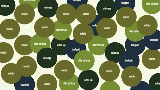
And today we have hundreds of breakpoints, as in this image.

I got this from vborch, FYI, which is by antibilly.

So as you see in this image, we have so many viewboards and it's like impossible to actually design for them. So responsive design isn't about the viewboard size anymore.

So here is me browsing my website in that perfect state. The browser window is in the center of the screen and all is good. But sometimes I do like to open a note and take notes of things.

So I might resize the screen for a bit or I might be even browsing on mobile. So if you like tab on the link, you can see the link actually before you open it.

And we have so many variations. So today the responsive design should be about the viewport, the content, the container and the user preferences. So the vbot is all about the media queries, I think we all know that and responsive to the content. So if we have a very long title, we need that title to push maybe something to the next row.

And finally we have also the responsive, like we can use ntainer and we can change the size or the style of a card like from the stacked one to the horizontal one. And also we have user preferences, so we have the reverse color scheme and contrast and all of that, which helps in tailoring an experience to the user. So I might disable an animation if the user doesn't want that. And this can be considered part of a responsive thing. So smart layouts is a mindset to build adaptive and responsive UIs.

So smart layouts are content aware, so they change based on the content they have. And they also adapt to the surroundings so they know what might happen maybe in the next element or something. And they can change based on that. And also just like smart layouts will try hard to not to break.

And that can be done by following that by like writing css. That is a future, that is let's say is like a future proof so for like we can maybe account for like when flexbox min content size hit, we can use min with zero to actually fix that.

And finally, smart layouts are conditional, so we can define conditions and those conditions can alter the layout we have. So again, smart layouts is not about using. This is like in UCSS features, it's a mindset. So again in 2010 we got responsive web design, right? And then in 2015, as far as I can remember, we started to use flexbox a lot more. But until today we have a very big gap, not the gap in flexbox.

So we have a very big gap in using and taking the full potential of those features like the Min Max clamp, the CSS grid, the subgrid CSS has and a lot more. And one reason I think is that because the current design tools we have are very bad in helping us taking the full potential of the web. So now like, even so now even like we have like the grid and Flexbox or maybe the auto layout in figma, it's still like moving things around.

So when you compare that to css, we have a lot of things. We have flexbox, we have Min Max Clamp, we have anchor positioning and we have so many things that we can do in CSS that are not possible in like any design tool. And I know that now we got a lot of CSS features every day and we are like, oh, I can't keep up with all of this.

And I know that. So design tool doesn't let us design with the full potential of CSS in mind. So for example, I think in mid May this year when Figma released, I think the Figma sites thing, they promoted the thinking of the free both sides. So if you want to create a new page, you have to choose the mobile tablet and desktop.

And this is just weird to me actually. What if they did this?

They encouraged us to think of the, think of the container size, have a container width and you can see like this component in action and that can lead us to pixel perfection.

So this is, I think I have worked on this maybe eight years ago. So like in this UI we have this header component and it looks okay, nice, perfect. But when you start writing the CSS for this, you will end up with all these variations.

And I think it's impossible to handle this in figma because it would take so much time, at least for me.

So instead of focusing on the mixed perfection, we can focus on the look and feel of things and we can just explore figma and validate in the Browser. So let's start by our first SIMI example, which is about building a layout. So if you look at this layout, we have listed like a feature news section, we have the start card.

Okay? So what I like to do is to divide each, let's say like mini grid item and I like to call it a layout zoom. And each zone has its own conditions.

So let's say this one on the top right, Like I wanted to alternate the image if we have two items or more. So I took this zoom and imagined how it looks on different sizes. So here we are on the desktop, one on the left, and then the tablet and then the mobile. And I got an inspiration from ABL shortcut, which is to construct steps or conditions that can be used or let's say can be inherited from css. So each zone has its own layout terms.

So the small zoom, if we have three items or more and the zone is less than 250 pixels, I want to alternate the image and that is the small size on the desktop we bought and on the tablet size, if the zone or if the container is 250 pixels or larger, I want to apply the min max and have the auto fit in there. So as you see when I had cards, okay, so on the smaller size again, now we are at the smaller size, it will be the same.

Like if we have three items or more and the zone is less than 250 pixels, I want to apply the alternate style and we can actually take this farther. So if we have one item and we have the feature toggle set and the zoom is larger than 250 pixels, I want to apply the featured style. So like in this example or in this zone, when we have one card and we have the feature toggle, it will apply the feature style. But if we have two items or more, it will just default back to this style or this one too. So let's start with the news layout.

And of course I use all of my images that I take for my coffee.

So in this layout we have a feature section, we have a code component, okay? And we have a list of articles. So first I define the grid, I use the grid areas. And like, as you see, I will come back to this later. But for now I have a three column for the feature and one column for the code section. And the recent one is taking the full width. So first I defined each zone conditions. So for the quote section, if we have three quotes or more, I want to show them as a separate row. So here is an example. If we have no Quotes at all. I want the feature section to expand in width. And if we have one coat only, I want it to show or to take the full height.

And with this we come to has and CSS HAS will connect those missing dots. So like an example we can use HAS to check if this card component has an image. Okay? So this will select all the cards that contain an image. And has is very well supported. It's supported in 94% almost. So I imagine that we might use CSS HAS like this because it allows us to build a lot of things. It's like the if statement of css.

So without CSS has, we have the, like we have the grid like this. So we have them in. We have the grid and we have the recent articles, the course section.

They don't talk to each other, they don't know anything about each other.

But with CSS has we can connect those dots, we can make them talk to each other like, hey, I want to change the grid if we have two codes, or I want maybe to change the grid or change layout if we have 10 articles or more. So in this example I used like CSS has to change the grid areas and change the layout if we have no quotes at all.

So here is the layout with quotes and here is the layout without quotes. And I can also, with CSS has, I can listen to the number of quotes we have and then also change the grid based on that.

So as you see now, if we have three quotes or more, it will move it into a new row.

So CSS has in this example, it's like getting us a way to connect the dots between the main section and the feature section and the code section.

And it made us know what would happen if we have X and Y and Z.

So it's like I like to consider it as a two binding thing in css.

So with that we come to size container queries.

So container queries are supported in like, Since I think August 2022 if I'm not mistaken. So in simple terms we can use container type and line size and then we can use at container min width and change the design or the component. And in this example like everything you see is like a container query.

So this is the example we have and this is a video.

Okay, it works. So when I now I'm like adding and removing stuff and next I will remove some quotes and you will notice how the layout or how the grid will change. So now I will add some quotes. I think, yes, I added one more. And then we have the change on layout. So those are all the variations. For this card component, we have the stacked style, we have the horizontal style, we have two featured styles. So it's not only about sitting at container styles, because we need to think about when a component should be featured. And also should we apply the horizontal style based on the size only? Or we might actually need to have, let's say to have a kind, maybe like a toggle or something.

And also how to make sizes and spaces respond to the container size. So in this example I just added a flex direction row and I change the layout. And in this example it's like thinking, okay, if we have one item only and the zone is larger than something, I need to set the image to 300 pixels. In this example, if we have the featured class and the zone is larger than 500 pixels, I need to apply the featured style.

But what if we need to reuse that? Like I might reuse the featured style, maybe like in the homepage, maybe like in the article page. So do we need to write all of those CSS for it? No, thankfully we have style queries. So style queries let us actually change the style based on the context we have.

So as you see in this figure, so what we need to do is to assign a CSS variable and then query that CSS variable and change something.

So here I assigned this CSS variable to all those divs and I just write the CSS once and it just works. So static queries are supported well, but Firefox is still not in the party. I think they are working on it and I hope maybe we can get it this year, hopefully. So when we mix style queries and style queries, which CSS has, we can get endlessly out options. So here in this example I have, like I said, a size container and then I assigned a CSS variable with CSS has, and then I used both the size query and the container query to listen and to change the layout. But this will work only if we have one card element.

So if we have two card elements, it will not work.

So again, style queries and size queries and has can get us endless layout options. And here is the style for the feature section again. And Here is the version 2.

Like when we have no quotes at all, this will expand to the full width.

And instead of using a class to listen, if we have one card only, we can assign a CSS variable called crow image and I can listen to that and mix it with a fuzzy query and change layout. With that we come to like to the size of query units. So 1cqw equal 1% of the container width.

And that can help us in fixing an issue.

I'm not sure if this is clear or not. The in between thing. Okay, so when we have those variations for the CART component, we still have an issue like in the in between style between each one. So like in this example, we have like this card on the top and the bottom. And when we resize that card like this is like the minimum and maximum size for this card, we will still have. Have not has.

We will still have those like font sizes that are small and the image that, that look small. So we can combine them with a CQW unit and we can get like a fluid layout. So as you see here, I use it in the font size and the fixed spaces. And here when I resize the screen or the container, sorry, notice how the font size is getting bigger and the same thing is for the image. And with that we come to the code title ratio. So with CSS has, I can listen if we have two items or more, and then I can use that ratio that I defined with CSS variables. Just move this a little bit.

And then we can use that ratio to reduce the font size. So if we have one coat, the font size will be 20 pixels.

And if we have two course the font size will be 18.

And that is all based on mixing things like CSS has with a variable and unchilde stuff. So next is the query units.

So sometimes we want maybe to use the outer container or the inner container. So here in this example, here is the outer container of this card component, and then here's the inner container of this section.

Okay, so I learned this from Anatode, where we can actually define like a CSS variable on the outer container. And I can pass this to a child element that is part of a container too. So it will take the outer container value.

So the value in here is like coming from the outer one. But now if I don't define it, it will just take the CQW from the inner container.

And here is a video. Let me just see it. So now when I resize the inner container, notice how the font size is changing.

But when I switch that off and resize from the outer one, notice how it will look like.

Sorry.

Okay, so now we come to the anchor positioning. So in the card like layout, we have, we have a tag component, okay?

And that tag component lives within the content, like on the right side. So how we can position that tag component on the Top left corner.

Okay. You might say that. Okay, it's like easy. I can just use lift and top. Okay, that works. But what if we want to put this on the top right corner? We cannot.

If we do this, it will look like this.

So we can use anchor positioning.

We can define like the anchor name on the thumb and then we can use position anchor.

Okay. And it will just work.

But it is still not supported. It's only in Chrome and Safari. So here is the final example. So with an allowing us to build stuff that were not possible before. So in this example, I wanted to place the description and the author name on top of the image. And how we can do that without anchor?

We can't, I think. So the idea is that to make the image as an anchor and then place the description on top of the image. So I used like anchor name on the thumb and then I used the left right to make it like span from the left and right sides and to the bottom one too.

So here's a video of me resizing this.

Notice how it just works.

And I love that about anchors really.

Okay, now we come to grid areas. So in short, we can use the grid areas to have like a visual, let's say maybe a visual like UI inside css. So we. We can see how the grid looks like.

So if, if it makes a rectangular shape, it.

It will just work. So here is an example where we have like this, the side by sidebar or the header. Header.

And this is an example too. So when we have like the banner, it. It will span all the width. Or we can have it like this. As you see. But what if we have a lot of cars at the bottom? What will happen?

Because the coat item is taking the full height.

We might get something like this. So the coat section will be so long that it just looks odd. So we can fix that by using CSS has to act as an and like we can nest or we can use two CSS has to have a condition. So if we have 10 articles or more and we have one quote, I want to change the layout so it.

It will look like this. So I think for me that the grid area is container query and has best friend. Because when you mix them together, you will get a lot of layout options.

And now we come to the logical props in css.

So instead of writing embedding, lift embedding, right. And that stuff we. We can just switch and use the inline start and inline end. So as you see in this example, so the start and end can it just Mean the left in LTR and the right and like end means the right in LTR and in RTL you can just flip them. So here I just switched the direction and I made this section as you see in here. So because I was using the anchor self end, it just goes to other side.

And if you want to learn more about RTL styling, I have a complete guide on RTLStyling.com which is all about RTL.

Okay, so we are done with this example and now I will show you this example where it shower of container queries and CSS has. So in this example I have this header. Okay, so notice that when I resize it a little bit, the search is converted to like like this go to file button and then the tag labels are also hidden. So here is a video of me resizing this. Notice that okay, the goto file is now in button and now the labels are hidden.

Now when I hide the info on the right it will also expand and when I hide the table of contents. So so it's like designing a component that can work anywhere.

And if we want to build this with media queries, we will write a lot of conditions to handle this. So we want to handle when we have the table of contents and the info or maybe we want to have like, we want to handle it maybe for like one of them. But if we write this with contera in mind, we will just write it once and it will work anywhere. You just write the CSS once.

So now we come to a CSS clamp. So in this example we have the min container variation or the min curve variation size and the maximum size. And I like to use this tool by 9elements which is like you can just enter the min and the max size and then you can also add select the values you need and it will just work. You have just to replace the VW with the cqw.

So clamp and container like with the query units will get us ultrafluid components.

So like clamp it works well with negative values. So in this example I have this element that is positioned left minus 30 and on small screens I want it to look like this.

So what we can do, we can use the clamp to actually define the min and max values. And then we can use the non container width or the rubber width we have and we can use some math to actually have it works. So here's the video.

Note that when I resize it will push itself to the right side and it just works.

Okay, so this is an example where I will show some interesting stuff we can do with anchor positioning.

So in this layout I use the grid areas to define each part of it.

Okay. And then I used an positioning to position the cube text and the context like to the image. So the calm and the keep, like they don't live within the same div that have the image.

Okay. So I define the image as an anchor and then I placed the column to the right side and the keep to the left side. And also that little note, I use also anchor for this. So when you resize the screen it will shift. So let me just show you.

So here when we resize the screen for like a little bit, it will show on top of the image and the keep curl will shift its position too. And for the quotes I used display contents to ungroup the div they live within and to merge them with the other codes so they act as a one grid.

And here is like on mobile we have this text right here. I used position try, which I will show you in a bit. So this is a video of me resizing this. Notice how the calm and the keyboards are using fluid font size. And now the message will move on top of the image and now the grid will just flow. So this design, I think if we go back in time, maybe one or two years, we can't do it because we didn't have encores back then, but now we can do it. And again it's like all about we design this with the container in mind. So we can just throw, we can just throw this anywhere and it will just work and like even extra fun we can do. But I need to show that in the browser and I will show it in Safari because it's not working in Chrome as I need.

So like here we have the keep and the calm. And now when I change like the align self like for this image to the left side or to the start side, it will look like this.

And for that I use position try to do it. And if we even use the end, it will shift like this. So this is not even like this is not changing based on the viewboard size. It's like changing on the position of the image itself.

So here, yeah, I just use justify itself and it just works. And now we will explore some cutting edge CSS for like even smarter layouts. So we can use the sibling index which is in Chrome Canary only if I'm not mistaken.

So for the font size of this code we can fix the same problem by just using the sibling index. And I also use the captured idea From Roma block. Thank you. Roma. Where is Roma?

Okay, so here is the component. Like the first we have the font size, it's 21 pixels and then at 18 and then it comes down to 17 and like even we can do some crazy stuff with sibling index like this one. I use the APS with the siblings to have this kind of layout. The Castle Abi I wish that I have much time to go through this. But we can use has to actually change the layout of this section and turn it into a slider or something. So here I use the scroll button, the score group and the score marker, target and all of that.

So here is a video of me using it.

Notice that when I add more cards, it will turn itself into a cursor.

Yes. So, smart layout summary. So with the smart layouts, we need to build content aware.

We need to have the components adapt to their surroundings.

We need to build them with defensive CSS in mind. So we need to think ahead when we style the stuff and know what might cause an issue and what might not. And finally we need to rely on CSS has to allow us to have this conditional styles again. So like building a layout to me is all about defining the main grid, defining the layout zones and the conditions for each zone and then build the components with those zone conditions in mind and then repeat the process.

So a layout can be as simple as a button or as large as a new section, for example.

And I can imagine if we use this mindset, we will have a lot of connections like you see in this image which I made in Adobe XD because it has this very nice visual between the item.

So with, with all that in mind, we have so many stuff that can alter the layout. As you see in this one simple section we have a lot of stuff to do.

So what I really hope for when we search for responsive design is we get something like this. We see the information about textbooks, CSS grid and anchors and all that new stuff instead of seeing this boring mobile tablet and desktop size thing. So when we use all those CSS features, when we combine them, we will achieve even smarter layouts. So as you see in this little figure, when we connect each of them together, we will get. This is Martelly, I think.

Thank you.

Wow, Ahmad, thank you for that. Please join me near the flowers. Should I take it in with me? Just don't drink it. Just don't drink it.

Scrolling, it's a thing. Yes. And yesterday I learned that if you scroll vertically it's called scrolling. But if it's Horizontally, apparently it's called crawling. So yesterday I scrolled from the. No, I crawled. Yeah, whatever. Ahmad, you have shown some beautiful latte art. Out of curiosity, how many cups does it take before you get to that result? Hundreds of cups? Only a hundred?

Yes. I thought it would take you thousands of cups to drink them all afterwards, or no. Okay. Because otherwise it would be like One of the things that you mentioned in your talk is you've talked a lot about has. I think we all agree that it's like it's one of those features in CSS that changed how you write css, how you approach problems.

Are there some other features besides the ones that you have mentioned, like container queries that the thing that have totally changed how you write css, besides has, I would add container queries. I think they are very, very helpful. Especially if you pair them together. You will get a lot of stuff. Yeah, yeah, I think it's container queries to me. Yeah, yeah.

We had a question from the audience about has Vlad asked, like, okay, are there performance implications when using has? Is it something that we should be concerned about? Yes or no? I would say, like, it depends on the use case you have in mind. So if you are using head, like if you are using has to manage a very large number of components, then yes, you might need to test. But if it is for a small layout, then I think it should be fine for. Yeah, I think it should be fine if it's for a small guard or something tacking on to that. Because we have Chrome engineers present here at the event. The advice they always give me is if you are using has, scope it through a subtree.

So don't do something like colon, root, colon has, because then it has to look like through the entire tree. If you're only checking for a has on like a side nav, then do nav has and it will only look inside of that subtree.

Also be very specific about what you're querying inside of your has. Like if you do a has colon checked, it will try and find all checked things which has like an implied asterisk prepended to it. So be very specific. Like I want to check for an input colon checked and then also don't walk the tree extensively inside of your has. So don't do something like has some element and then do a sibling combinator, some element and then with a knot and then another sibling combinator if you want to check it out. DevTools has a selector performance thingy for that.

That said, next question you've Shown CSS grid. Of course you've mentioned responsiveness. There's a question from the audience like, okay, how do you combine them? Wouldn't you still need to use media breakpoints for mobile desktop and so on to redefine the areas of your layout?

Yes, we will use AT media mainly for things that span the full viewport size, like the header and the footer. But for the inner components we can just use AT container and stuff like that.

Is there a thing that you like to do when changing the layout of a grid? Is there some technique that you use to tackle that?

That's a very good question. You mean to change the grid in a way that it flows itself? Like I don't have to control like everything of it. Not maybe that it flows itself, but that you are very specific about now, okay, like now I want one box at the top, two at the bottom and then when it's more narrow, do it three underneath each other or whatever.

Yeah, yeah. So for that I will also like, I will use Min max with autofit and. And if I have a layout that let's say that I need to place columns, I would like to place elements somewhere I might use maybe the span keyword because I like it because it will let the elements actually span two columns without using maybe a fixed like, hey, I want this to span from column, let's say one to two columns. So instead I can just like type span1. For example, like you mentioned the autofit autofill. It's one of those things that I always need to look up when I'm trying to use it again. And then, yeah, like each time I need to like to make sure which one will actually fill the space or which one is not.

I just need to search do it. Yeah, same to the rescue.

Another question that we have from audience. I think it's a really good one. When you were using style queries to match a certain variable and then correspond to the value of the style of the custom property, why would you do that over adding a class in your markup?

Because adding a class is actually.

We need to add it ourselves or we need to have maybe some kind of JS logic to add that class.

But with the style queries we can have some conditions built in CSS and we can assign a CSS variable like the section and it will just work. Yeah, right.

So if the media query or the container query matches, then you change the custom property value and then the style query takes over.

Like, oh, you changed. It's fun, right? CSS we all love it. We all love it. Yes. Another question. This is from a designer, I suppose. It's Hannah. She mentioned it's hardly possible to fully cover responsive mockups in Figma.

What is it that you expect from designers?

Are mockups in three viewports enough? Whose responsibility is it to design the areas in between those mockups?

Yeah, so this is a good question. So actually I think that designer should learn how to code first.

This is the first thing. You can clap it out. The second thing is that the design process should change. Like in my opinion. So now when I design something, I will mostly only work this on the homepage size, for example, and I will take most of the work, I will start writing CSS right away and see how those things work in the browser. So you are designing in the browser?

Yes, kind of like this. But like I don't move to that step unless I have the look and feeling there.

So I don't have to change the spacing and color in the browser. I just play with the layout itself, you know, so instead of like, let's say like having maybe like a feature of the new section, I can just like design how will this look in Figma? And then I will move to css, still like to make it work as I need tacking on that. So would you love to have something like that as a crossover of figma, but then that gave you all the web features so that you can directly play into some type of new free business idea, like some type of new app that allows you to directly do all this stuff using web technologies? Yes.

I actually thought about this and tried to make something, but I failed because it's so complex. But yeah, I would love to have something like this. I might even help with the design or the UX of it. Not like the deep technical side.

Looking at my list, Looking at my list. So many questions, so many questions. Karen asks, does the number of conditionals grow exponentially? Because if you've shown a bunch of things to account for within each component, like screen size, number of children, location of the component, and so on, does it have a big increase on your code or the number of things that you need to take into account? It can grow like the conditions can. They can grow.

But the idea is that when we have those conditions in their, it will let us actually write less css because we manage like every single case and we don't have to duplicate styles or to write stuff again. Right. And I think you showed it nicely here at the end. You had this big layout with all the squiggles on, like, oh, this thing needs to do that and this thing needs to do that. There's a lot of things that you need to think about.

Yes. And I love it, by the way, how you look at something and you go over all these details. I bet it takes a lot of work to maybe like do the first one, but does it improve over time? Do you get better at it? Yes, yes. So like you've shown this big layout, like how long does it take you to do that?

Like maybe the first example, five minutes, an hour? Half a day?

Day? I don't know, two weeks? I think I built the demo in maybe one hour or something. Crazy. Right?

Like so much time to actually like design the slides.

So. Yeah, to have all those conditions and styles. Yeah. Wow. Another complication to throw in the mix. Like you've now shown design with English text left to right. Say you want to support art right to left.

Is it very complicated to do nowadays or do you. No, it's fairly easy because if you just like stick with the start and end stuff, you will build like most of the RTL website and you will just end with stuff that you need to change your stuff like the background position X or Y. Say like you have an input with an icon on the left side.

Like as a background image in rtl you need to switch that. So it should be on the right side.

And in CSS we don't have a thing like background position, start or end. But if we have that, we can mostly just build like an RTL layout without changing anything in CSS still. So I'm hearing use logical properties for that. Use logical units like VI for example. But then there are some rough edges regarding like background position, which it still uses X and.

Yes. Okay. Are there other things like backgrounds that are X and Y fixed that you think like, this is a pain point. I didn't get the question. Can you just please repeat it? Yes. So background X and Y is one of the more difficult things or like things that you have to think of when doing rtl. Are there other things out there or X, Y based background X. I can just think of this. Maybe not.

So I think there is one thing, but I can't like get it to my mind right now. So yeah, I will share it if I. Cool. And I bet people can find it on. You have a wonderful. One of many websites that you have is the RTL styling.

Yes. RTLstyle.com yeah. So people. It's open to everyone to check out. Yes. Okay. So if you ever need, or if you want to be prepared for an RTL website, you can find all the info on there, I suppose. Yes. All right, Cool. You also wrote a book. We've already mentioned debugging css. Out of curiosity, how do you start at writing a book? A blog post?

I will mostly start with a demo because it will get me excited to move on.

Yeah, that is the style with those interactive articles. But in the past, when I used to design images of things two years ago, I used to start with the intro content or hey, in this article we will learn how to do stuff and like. But yeah, it's just like writing like what, like the end result, like for the learner will be.

So if you read that article, you can see like from the first like few lines, you have an extra fan on stage. Hi.

Thank you. With Alma joining us on stage, I think this is a nice moment to now give a big war of applause not only for Alma, but also for Ahmad for doing the talk. Thank you.

Thank you so much.

Building Smart Layouts

CSS Day
5-6 June 2025

Ahmad Shadeed
UX Designer, Frontend Developer

Photo of the speaker Ahmad Shadeed is shown in a rectangle on the slide.

SMART LAYOUTS

  • Writing
    ishadeed.com
  • Wrote a book
    Debugging CSS
  • Published
    Defensive CSS
  • Published
    RTL Styling 101
  • Building a CSS course
    Layout Maestro

@shadeed9 / ishadeed.com

  • Screenshot of ishaadeed.com website
  • Image of the cover for the book "Debugging CSS"
  • Screenshot of the Defensive CSS guide cover
  • Screenshot of the RTL Styling 101 course welcome screen, including Arabic text and a smiley emoji
  • Image of the Layout Maestro course logo
  • Empty placeholder with a dashed pink border in the bottom right, suggesting space for a future project or information

Responsive Web Design

Responsive Web Design

Screenshot of an article titled "Responsive Web Design" by Ethan Marcotte on a web page. The screenshot features a cartoon illustration of a group of identically dressed people posing for a photograph, with one person lying on the ground, and a photographer standing to the right taking their picture. A badge with the number "306" is displayed on the illustration.

SMART LAYOUTS

The control which designers know in the print medium, and often desire in the web medium, is simply a function of the limitation of the printed page.

We should embrace the fact that the web doesn’t have the same constraints, and design for this flexibility. But first, we must 'accept the ebb and flow of things.'

— John Allsopp, “A Dao of Web Design”
Portrait photo of John Allsopp, displayed beside the quoted text.

Diagram showing three wireframe layouts labeled Mobile, Tablet, and Desktop, illustrating the different visual arrangements of website sections for each device type.

Responsive design

Screenshot of Google Images search results for "responsive design," showing various diagrams and illustrations representing different layouts for desktop, tablet, and mobile devices.

In-between breakpoint

Diagram showing three device icons labeled Mobile, Tablet, and Desktop, each with different colored layout blocks, illustrating how layouts change across breakpoints. Scribbled areas highlight the "in-between" regions between device types, with an arrow emphasizing the transition from Mobile to Tablet layouts.

Smart layouts
Large screens

Three side-by-side diagrammatic illustrations of web layouts for large screens. Each layout shows a header, a vertical sidebar on the left, and a main content area that grows wider from left to right, with the last example showing extra horizontal space on both sides of the content.

100s of breakpoints

Diagram showing a densely packed grid of overlapping rectangles labeled with various viewport sizes and device characteristics, representing the large number and diversity of breakpoints encountered in responsive web design. The corner label references "viewports.fyi".

Ahmad Shadeed

Screenshot of a personal website homepage for Ahmad Shadeed, showing a section about web and mobile experience design.

Ahmad Shadeed

Screenshot of Ahmad Shadeed's personal website homepage shown in a web browser.

Ahmad Shadeed

Screenshot showing a web browser open to Ahmad Shadeed's website alongside a notes application titled "Website changes" with a short to-do list. The desktop background displays a mountainous landscape.
Screenshot of three mobile views side-by-side showing the same website article titled "First Look at The Modern attr()" by Ahmad Shadeed. The views demonstrate different interfaces: a link preview, an in-app browser, and the Safari browser displaying the article.

Responsive to the

  • Viewport
  • Content
  • Container
  • User Preferences

SMART LAYOUTS


				@media (min-width: 500px)
				@media (width > 500px)
				@media (min-aspect-ratio: 4/3)
				

Responsive to the Content

Responsive to Content

Diagram comparing two content cards: the first with a short title and the second with a much longer title, illustrating how card layout changes responsively based on content length. An arrow points from the first card to the second to indicate the transformation.

SMART LAYOUTS

Responsive to the Container

Smart layouts

@container card (min-width: 250px)

Diagram showing two card components with different layouts: one stacked vertically and one arranged horizontally, each featuring a cup icon and the same title text to illustrate responsive design with CSS container queries.

Responsive to the User Preferences

SMART LAYOUTS


				@media (prefers-color-scheme: dark)
				@media (prefers-contrast: more)
				@media (prefers-reduced-motion)
				@media (prefers-reduced-transparency)
				..and more
				

SMART LAYOUTS


				.section {
					animation: bounceIn 2s linear;
				}
				@media (prefers-reduced-motion: reduce) {
					.section {
						animation: none;
					}
				}
				

Smart Layouts

A mindset to build adaptive and logical UIs

What are smart layouts?

Content aware

Illustration showing two stylized web browser windows side by side, connected by a right-pointing arrow, representing a layout that adapts based on content.

What are smart layouts?

Adapt to surroundings

Diagram showing two example layouts with differently positioned blocks, connected by an arrow, illustrating adaptation to different surroundings.

What are smart layouts?

Doesn't break

Illustration of two website layout wireframes with an arrow between them, representing a layout that adapts without breaking.

What are smart layouts?

Doesn't break

Diagram showing two browser window mockups side by side, with an arrow indicating a transformation from left to right. The layout remains intact after the transformation, implying resilience to changes.

What are smart layouts?

Conditional

Diagram illustrating a layout transformation: a horizontal bar consisting of a dark pink square on the left and a lighter pink rectangle on the right changes, via a rightward arrow, into a vertical stack with the dark pink square on top and lighter pink rectangle below, suggesting conditional layout changes.

SMART LAYOUTS

Smart layout isn’t about new CSS features.
It’s a mindset.

Smart Layouts

  • 2010
    Responsive Web Design
  • 2012
    Photos
  • 2015
    Flexbox got more attention
  • 2017
    Grid shipped
  • 2020
    multi, masonry, content-based
  • 2022
    Container queries
  • 2023
    Advanced selectors
  • 2025
    Native real smart layouts in CSS
Timeline diagram showing progression from "Okay layouts" in 2010 to "Smart Layouts" in 2025, with milestone labels for major web layout advancements (e.g., Responsive Web Design, Flexbox, Grid, Container Queries, Advanced selectors).

Smart Layouts

  • 2010: Responsive Web Design
  • 2012: Flexbox
  • 2015: Flexbox got more attention
  • 2017: Grid support
  • 2020: min(), max(), clamp()
  • 2022: Container queries :has()
  • 2023: subgrid
  • 2025: Are we taking the full potential of CSS?
Gap (in using and taking the full potential of these features)
Timeline diagram showing milestones in CSS layout technology from 2010 to 2025, highlighting a large gap in usage and adoption between early features (like Flexbox) and more advanced layout features (like container queries, subgrid, and smart layouts).

Building a layout

  • CSS
    • Flow layout
    • Flexbox
    • Size Container Queries
    • min, max, & clamp()
    • Anchor Positioning
    • color-mix()
    • display: contents
    • Columns
    • Grid
    • Subgrid
    • scroll-state() Queries
    • viewport units
    • query units
    • :has()
    • relative colors
    • Text Wrap
  • The gap is getting bigger year by year.
  • Figma
    • Fake grid
    • Fake flexbox
    • Moving boxes around
    • Making pictures of websites
    • and so on..

Diagram comparing CSS features (in a large yellow circle) to Figma capabilities (in a smaller blue circle), with a statement that the gap between them is growing each year.

SMART LAYOUTS

Scatter plot chart with a series of large overlapping circles decreasing in size from right to left, representing "CSS Features" over "Time"; at the end, an image of a neural network or brain, labeled "Developers".

SMART LAYOUTS

Design tools doesn't let us design with the full potential of CSS in mind

Figma Sites promote thinking in terms of the 3 viewport sizes.

SMART LAYOUTS

Screenshot of a design tool interface with a dropdown menu for selecting layout breakpoints (Desktop, Tablet, Mobile, Custom).

SMART LAYOUTS

what if..

Diagram showing three card component variations for different container widths (250px, 350px, 550px), each displaying a card with the same title and latte art image, to demonstrate how layout adapts at various sizes.

Pixel Perfection

Designer

Illustration of a person sitting at a desk working on a computer shown within a web browser interface mockup, representing the perspective of a designer.

SMART LAYOUTS

Designer
Illustration of a person working at a desk with a digital pen tablet in front of a large abstracted user interface resembling a website or web app called "Nadros," with navigation tabs and a search bar.

SMART LAYOUTS

Developer

Illustration of a developer working at a desk next to a large screenshot displaying many variations of a navigation/header UI component. The screenshot shows different layouts and interface states for a product called "Nadros," including navigation bars, search inputs, RTL (right-to-left) layouts, and various menu options.

Pixel Perfection
Look & Feel

Explore in Figma
Validate in the browser

Building a layout

Screenshot of a web news/magazine layout prototype featuring multiple cards and grid zones, with placeholders for images and section highlights such as "Latte Art" and "Espresso". The layout demonstrates different ways to organize and present featured articles and content blocks.

Layout Zones

  • Single item only
    Featured item
  • Alternate if 2 items or more
  • Stack if 3 items or more
Diagram showing a sample content grid divided into labeled zones with arrows indicating: - a featured zone for a single item, - an "alternate" zone if there are two or more items, - and stackable zones if there are three or more items. Each zone is outlined, displaying how articles or cards can be organized and grouped by item count in a layout.

Smart Layouts

Diagram illustrating three different responsive grid layouts, each with various panel sizes and highlighted regions indicating adaptive placement of content blocks.

SMART LAYOUTS

Screenshot of a mobile interface for setting Do Not Disturb focus mode, showing the option to turn it on until the user leaves a location.

Each zone : has its own terms

a small size… on desktop

  • If 3+ items AND zone < 250px Alternate effect
Diagram showing a UI card with three list items ("Stunning Latte Art Designs to Try Today", "Amazing Espresso Drinks You Need to Taste", and "Creative Techniques for Latte Art Mastery") with a line indicating its small size, illustrating how a layout alternates when the container zone is less than 250 pixels wide.

SMART LAYOUTS

a larger size.. on tablet-ish sizes

  • if zone > 250pxdynamic grid

				minmax(auto-fit, repeat(200px, 1fr))
				

Diagram showing a layout block transforming into a dynamic grid on larger tablet sizes, with a visual of three content cards for "Latte Art" and "Espresso" articles arranged horizontally.

SMART LAYOUTS

a larger size.. on tablet-ish sizes

  • if zone > 250px dynamic grid

				minmax(auto-fit, repeat(200px, 1fr))
				

Diagram demonstrating a grid layout with two card-like elements titled "Latte Art" and "Espresso", each with a description, illustrating how cards expand in a dynamic grid when the available zone is larger than 250 pixels. An inset image at the bottom left highlights a portion of a layout, indicating focus on a grid section.

SMART LAYOUTS

a smaller size (again!).. on mobile-ish sizes

  • If 3+ items & zone < 250px → Alternate effect

Diagram showing a mobile-style card list with three example cards (Latte Art and Espresso topics). A flow arrow connects a pink-highlighted segment of a vertical block (indicating a smaller layout size) to the card list, which visually demonstrates the layout described in the slide. A logic flow with labeled chips visually summarizes the "If 3+ items and zone < 250px then Alternate effect" rule.

SMART LAYOUTS

  • if items 1 & --featured & zone > 250px → [featured layout]
Diagram showing a logic flow: if there is 1 item, the featured toggle is set, and the zone is greater than 250 pixels, then a featured card layout is applied. The diagram includes a rectangle representing the resulting layout.

SMART LAYOUTS

  • if items 1 & --featured & zone > 250px

1 item

The King Tide to They Live: the seven best films to watch on TV this week
Take your coffee enjoyment to the next level with these delicious recipes.
By Ahmad Shadeed

Diagram showing a conditional logic flow for smart layout selection. Highlights layout rule "if items 1 & --featured & zone > 250px", leading to a featured card design preview. The preview displays a card with a sample article headline, author name, category label, and a large illustration area, emphasizing its featured status. An arrow connects the conditional rule to the layout example, showing visual mapping of logic to result.

SMART LAYOUTS

  • if items = 1 & --featured & zone > 250px

2 items

  • 10 Irresistible Coffee Recipes You Must Experience
    Take your coffee enjoyment to the next level with these delicious recipes.
    By Ahmad Shadeed
  • 10 Irresistible Coffee Recipes You Must Experience
    Take your coffee enjoyment to the next level with these delicious recipes.
    By Ahmad Shadeed

Diagram showing a logic flow for a smart layout system with visual tokens representing layout rules. Below, there are two side-by-side card mockups illustrating article previews. An arrow points from a highlighted grid section to the card layout, demonstrating how the layout logic applies.

News Layout

  1. Large photo of a cup of latte art in a red cup, placed on a desk with office supplies in the background.
  2. Five smaller images below showing cups of coffee from various angles and settings, corresponding to each article listed in the slide.
  3. Small portrait photo of Ahmad Shadeed next to the quoted text.

Smart Layouts


				.layout {
					display: grid;
					grid-template-areas:
					"feature feature feature quote"
					"recent recent recent recent";
					gap: 1rem;
				}
				.feature {
					grid-area: feature;
				}
				.quote {
					grid-area: quote;
				}
				.recent {
					grid-area: recent;
				}
				
Diagram illustrating a CSS grid layout with three labeled areas: "Feature" occupying the larger top-left portion, "Quote" in a smaller top-right section, and "Recent" spanning the entire bottom row.

Quote

  • 3+ quotes, show as separate row
  • 0 quotes? change layout
  • if one quote, show in full
Diagram showing a layout with boxes labeled "Feature", "Recent", and two smaller boxes labeled "Quote", illustrating how content blocks and quotes might be arranged in a "Smart Layout" system.

Quote

  • 3+ quotes, show as separate row
  • 0 quotes? change layout
  • if one quote, show in full
Diagram depicting a layout with three stacked boxes labeled "Feature," "Quote (3+)," and "Recent" to illustrate different content zones.

CSS :has()

connect the missing dots

SMART LAYOUTS


				.card:has(img)
				

select all .card that contain an image

Can I :has()?

Screenshot of the "Can I use" website displaying browser compatibility for the :has() CSS relational pseudo-class, with a browser support table and a large annotation indicating approximately 94% (93.92%) support.
Photo-illustration of a hand squeezing a ketchup bottle labeled "has" onto several papers arranged like website wireframes, with ketchup lines highlighting content areas. This visual metaphorically represents the CSS :has selector.

Pre :has()

  • Section Container
  • Recent Articles
  • Quote Section
  • Featured section
Diagram showing a central circle labeled "Section Container" with three circles below it labeled "Recent Articles," "Quote Section," and "Featured section," visually representing a layout structure with one container section and three content sections branching below.

Post :has()

  • Featured section
  • Recent Articles
  • Quote Section
  • Section Container
Diagram showing the relationships between "Featured section," "Recent Articles," and "Quote Section"—each interconnected and all pointing towards a "Section Container".

Smart Layouts


				.layout {
					display: grid;
					grid-template-areas:
					"feature feature feature quote"
					"recent recent recent recent";
					gap: 1rem;
				}
				.layout:not(:has(.quote)) {
					grid-template-areas:
					"feature feature feature feature"
					"recent recent recent recent";
				}
				
  • with quotes
  • without quotes
Diagram showing how a CSS grid layout changes based on the presence of a "quote": - With quotes: a layout with "Feature" spanning three columns and "Quote" in the fourth, above a full-width "Recent" row. - Without quotes: "Feature" spans the full top row, with "Recent" below spanning the same four columns.

With quotes

Image grid featuring coffee drinks and latte art, with a large photo of a latte and quotes displayed to the right. Smaller thumbnails below depict various coffee drinks and setups.

Without quotes

Screenshot of a web layout for a coffee-related article titled "Practising latte art without wasting milk" by Ahmad Shadeed, featuring a large photo of a latte, article heading, subtitle, author attribution, and a row of smaller previews for related coffee articles with images.

SMART LAYOUTS


				.layout:has(.quote:nth-last-child(n + 3)) {
					grid-template-areas:
					"feature feature feature feature"
					"quote quote quote quote"
					"recent recent recent recent";
				}
				
Diagram showing a CSS code block (for a grid layout based on quote count) with an arrow pointing to a schematic grid containing three labeled sections: "Feature", "Quote (3+)", and "Recent".

SMART LAYOUTS

With quotes (3+)

Illustration of a red coffee cup with latte art on a wooden table, accompanied by a white dish with sweets and a black mesh pen holder.

Smart Layouts

  • Layout changes based on allocated space
  • Featured section
  • Quote Section
  • Layout changes based on num of quotes
  • Section Container
  • Grid changes based on num of quotes
Diagram showing arrows connecting "Featured section" and "Quote Section" to a "Section Container". The diagram illustrates how layout and grid in a web section container change in response to factors like allocated space and the number of quotes.

Can I @container?

Screenshot of the "Can I use" website showing browser compatibility for CSS Container Queries (Size), with a large visual indicator highlighting 94.41% global browser support.

SMART LAYOUTS


				.card-wrapper {
					container-type: inline-size;
				}
				.card {
					@container (min-width: 500px) {
						/* Horizontal Style */
					}
				}
				
  • LATTE ART
    Stunning Latte Art Designs to Try Today

if container width is 500px or more

  • LATTE ART
    Stunning Latte Art Designs to Try Today
Diagram showing two card layout examples: one card in a vertical layout for narrower containers, and one in a horizontal layout for containers 500px or wider, demonstrating the use of container queries in CSS.
Screenshot of a website or web app featuring a coffee-related blog overview, including a large photo of a latte and a grid of article cards with images and preview text.

SMART LAYOUTS

Diagram showing a grid layout with several rectangular boxes of different sizes, representing a flexible or dynamic layout structure.

Smart Layouts

Diagram illustrating a flexible card layout with four bordered blocks: one large block on the left, a tall block to its right, and two smaller blocks beneath them, demonstrating possible arrangements for a card component.

SMART LAYOUTS

Diagram depicting a complex grid layout with multiple rectangles of varying sizes and arrangements, representing different possible card or content configurations for a "smart layout" system.

Smart Layouts

Diagram illustrating a layout grid with one large rectangle, one medium rectangle, and five smaller rectangles below, representing different possible content arrangements in a smart layout system.

Smart Layouts

Diagram showing a grid layout with various card arrangements: a large block on the left, two stacked blocks on the right, and three blocks horizontally aligned at the bottom. The blocks are outlined with dashed borders in different colors, suggesting different section types or statuses.

SMART LAYOUTS

Diagram illustrating a grid layout containing several colored rectangular sections of different sizes, depicting an example of a smart, adaptable layout structure.

SMART LAYOUTS

Screenshot of a website layout displaying several coffee-related article cards, with images and headings such as "Practising latte art without wasting milk" and "Cold brew hacks for summer days".

It's not only about writing @container styles.


				.card-wrapper {
					container-type: inline-size;
				}
				.card {
					@container (min-width: 500px) {
						/* Horizontal Style */
					}
				}
				

We need to care about the context and fluid sizes.

  • When a component should be featured?
  • Should the horizontal style switch based on size only?
  • How to make sizes and spaces response to the component's size?

Smart Layouts


				.card {
					@container (min-width: 250px) {
						flex-direction: row;
					}
				}
				
Illustration of a card UI component at the top featuring an article titled "Is coffee good for you? Let's find out" with an image and byline.

Smart Layouts

  • If one item & zone > 560px → set img width to 300px

				.recent:has(.card:only-child) {
					@container (min-width: 560px) {
						.card-thumb {
							flex: 0 0 300px;
						}
					}
				}
				
Screenshot of a card interface showing an article titled "Cold brew hacks for summer days" with an image of a latte art coffee.

SMART LAYOUTS

If featured & zone > 500px featured layout v1

				.featured .card {
					@container (min-width: 500px) {
						display: grid;
						grid-template-columns: 2fr 1fr;
					}
				}
				
Illustration of a card interface featuring a coffee cup photo and the text "Practising latte art without wasting milk." The card is labeled "COFFEE."

What if we need to re-use the featured style?


				.featured .card {
					@container (min-width: 500px) {
						display: grid;
						grid-template-columns: 2fr 1fr;
					}
				}
				

				.article-header .card {
					@container (min-width: 500px) {
						display: grid;
						grid-template-columns: 2fr 1fr;
					}
				}
				

				.team-picks .card {
					@container (min-width: 500px) {
						display: grid;
						grid-template-columns: 2fr 1fr;
					}
				}
				

				.featured-v2 .card {
					@container (min-width: 500px) {
						display: grid;
						grid-template-columns: 2fr 1fr;
					}
				}
				

				.some-wrapper .card {
					@container (min-width: 500px) {
						display: grid;
						grid-template-columns: 2fr 1fr;
					}
				}
				

				.section .card {
					@container (min-width: 500px) {
						display: grid;
						grid-template-columns: 2fr 1fr;
					}
				}
				

Style
Container Queries

I change my style based on where I live.

Illustration of four chameleons, each visually styled to blend in with a different environment: a book, a log, a potted plant, and a bowl.

Assign a CSS variable anywhere and query the container.


				.card {
					@container style(--featured: true) {
						grid-template-columns: 2fr 1fr;
					}
				}
				

Assign the variable anywhere.

<div class="featured" style="--featured: true;"></div>
								<div class="article-header" style="--featured: true;"></div>
								<div class="team-picks" style="--featured: true;"></div>
								<div class="featured-v2" style="--featured: true;"></div>
								<div class="some-wrapper" style="--featured: true;"></div>
								<div class="section" style="--featured: true;"></div>
								

Write the CSS once


				.card {
					@container style(--featured: true) {
						grid-template-columns: 2fr 1fr;
					}
				}
				

Can I @container style?

Screenshot of the "Can I use" website showing browser compatibility for CSS Container Style Queries, with a large highlighted statistic indicating 86.07% support.

Smart Layouts

Illustrations of the Chrome, Safari, and Firefox browser logos with corresponding release/support dates. An additional annotation appears for Firefox, linking to a Bugzilla issue page, depicted by a partial screenshot of that Bugzilla ticket.

Size Queries + Style Queries + :has() =

∞ layouts options

Size Queries + Style Queries + :has() =

  1. Set up the size container
<section>
									<div class="card-wrapper">
										<article class="card">
										</article>
									</div>
								</section>
								

				.card-wrapper {
					container-type: inline-size;
					container-name: card;
				}
				

Smart Layouts

Size Queries + Style Queries + :has() =

  1. Set up the size container

    <section>
    									<div class="card-wrapper">
    										<article class="card">
    											<!-- Card content -->
    										</article>
    									</div>
    								</section>
    								
    
    				.card-wrapper {
    					container-type: inline-size;
    					container-name: card;
    				}
    				

2 Assign a variable (e.g: --featured)

<section>
									<div class="card-wrapper">
										<article class="card">
											<!-- Card content -->
										</article>
									</div>
								</section>
								

				.card-wrapper {
					container-type: inline-size;
					container-name: card;
				}
				section:has(.card-wrapper:only-child) {
					--featured: true;
				}
				

3. Query the container(s)

<section>
									<div class="card-wrapper">
										<article class="card">
											<!-- Card content -->
										</article>
									</div>
								</section>
								

				.card-wrapper {
					container-type: inline-size;
					container-name: card;
				}
				section:has(.card-wrapper:only-child) {
					--featured: true;
				}
				@container card (min-width: 500px) and style(--featured: true) {
					.card {
						/* Featured styles */
					}
				}
				

3. Query the container(s)

SMART LAYOUTS
Size Queries + Style Queries + :has() =

<section>
									<div class="card-wrapper">
										<article class="card">
											<!-- Card content -->
										</article>
									</div>
									<div class="card-wrapper">
										<article class="card">
											<!-- Card content -->
										</article>
									</div>
								</section>

				.card-wrapper {
					container-type: inline-size;
					container-name: card;
				}
				section:has(.card-wrapper:only-child) {
					--featured: true;
				}
				@container card (min-width: 500px) and style(--featured: true) {
					.card { /* Featured styles */ }
				}
				

Inactive, because there are 2 cards.

Size Queries + Style Queries + :has() =


				section:has(.card-wrapper:only-child) {
					--featured: true;
				}
				@container card (min-width: 250px) and style(--featured: true) {
					/* Featured style */
				}
				
Illustration of a code example at the top, with a card UI component shown below featuring a photo of a latte and the headline "Practising latte art without wasting milk."

Size Queries + Style Queries + :has() =


				section:has(.card-wrapper:only-child) {
					--featured: true;
				}
				@container card (min-width: 820px) and style(--featured: true) {
					.card { /* Featured style */ }
				}
				

Screenshot of a webpage featuring a card with a red coffee cup, labelled "Practising latte art without wasting milk" by Ahmad Shadeed.

Size Queries + Style Queries + :has() =


				section:has(.card-wrapper:only-child) {
					--grow-image: true;
				}
				@container card (min-width: 500px) and style(--grow-image: true) {
					.card-thumb {
						flex: 0 0 300px;
					}
				}
				
Image showing a code panel with CSS using size queries, style queries, and :has(), and a card UI preview below it with a photo of a latte and the card headline "Cold brew hacks for summer days" by Chill Beans.

Query Units

1cqw = 1% of the container width

SMART LAYOUTS

  • Default
  • min-width: 250px in-between
  • min-width: 500px in-between
  • min-width: 800px in-between
  • min-width: 920px
Diagram showing different card layout variations for a "coffee" themed card component at various viewport widths: default, min-width 250px, 500px, 800px, and 920px. "In-between" states are marked between breakpoint stages. Card images and example content are shown for each layout variation.

Smart Layouts

  • flex-basis: 90px
  • font-size: 16px
in-between
Diagram illustrating the layout variations for a card component as its size changes. Shows two versions of a "coffee" article card (thumbnail, title, description, byline), with arrows indicating CSS properties "flex-basis: 90px" and "font-size: 16px." An "in-between" area is highlighted to depict the transition state.

SMART LAYOUTS

flex-basis: calc(90px + 9cqw)

Diagram illustrating different layout behaviors for a card-based design at various container widths. The card displays an article about coffee with a thumbnail image, section label "COFFEE", headline "The real story of where coffee began", a short description, and author line. At the top, there is an "in-between" hatched area showing dynamic layout adjustment between 250px and 499px widths. An arrow points from the code flex-basis: calc(90px + 9cqw) to the live example, demonstrating how the layout changes fluidly across container sizes.

SMART LAYOUTS

  • flex-basis: calc(90px + 9cqw)
  • font-size: max(16px, 12px + 2cqw)
Diagram illustrating a card layout for an article, showing the effect of using flex-basis: calc(90px + 9cqw) and font-size: max(16px, 12px + 2cqw). The diagram includes a highlighted area labeled "in-between" to show fluid responsiveness between 250px and 499px widths, with callouts pointing to CSS code for flex-basis and font-size adjustments. The card content is titled "The real story of where coffee began," accompanied by a coffee image.

SMART LAYOUTS

Card-style layout mockup featuring an article preview with a photo of coffee and an espresso machine, a headline "The real story of where coffee began", and a navigation arrow icon.

SMART LAYOUTS

Screenshot of a card-style layout for an article titled "The real story of where coffee began" by History Buff, featuring an image of a coffee cup with latte art next to a coffee machine.

SMART LAYOUTS

Screenshot of a card UI for an article titled "The real story of where coffee began" by History Buff, featuring an image of a coffee cup and espresso machine.

Quote title ratio

Smart Layouts


				.quotes-wrapper:has(.quote:nth-last-child(n + 2)) {
					--ratio: 0.9;
				}
				.quote-title {
					font-size: calc(clamp(1rem, 0.4rem + 5cqw, 1.25rem) * var(--ratio, 1));
				}
				
  • font-size: 20px when there is one quote
    The best espresso is what you like. Follow recipes if you like them only.
    Ahmad Shadeed
  • font-size: 18px when there are two quotes
    1. The best espresso is what you like. Follow recipes if you like them only.
      Ahmad Shadeed
    2. Brew coffee your way. Recipes are guides, not rules.
      Ahmad Shadeed
Illustration showing a CSS code snippet for dynamically adjusting font size of quotes, with annotated arrows pointing to quote cards demonstrating how font size decreases (20px to 18px) as the number of quotes increases. Inspector panels highlight the computed font-size for each card.

Query units

Outer vs Inner container

SMART LAYOUTS

.outer-container outer container

Diagram showing a photo of a coffee cup overlaid with a dashed pink rectangle labeled ".outer-container outer container," with an arrow from the label to the rectangle, visually identifying an example of an outer container in a card component layout.

SMART LAYOUTS

.inner-container
inner container
Diagram of a card component featuring a photo of a coffee cup and a highlighted inner section labeled "inner container", with a callout indicating the CSS class .inner-container.

Smart Layouts


				@property --cq-outer {
					syntax: "<length>";
					initial-value: 0px;
					inherits: true;
				}
				.outer-container {
					container-type: inline-size;
					--cq-outer: 1cqW;
				}
				.title {
					font-size: clamp(1rem, 0.7rem + calc(3.5 * var(--cq-outer)), 2.25rem);
				}
				

Credits: Ana Tudor
https://frontendmasters.com/blog/using-container-query-units-relative-to-an-outer-container/

@shadeed9 / @ishadeed.com

Code example demonstrating how to use CSS custom properties and container query units for scalable layouts, attributed to Ana Tudor.

SMART LAYOUTS

font size relative to outer container

Screenshot of a web article preview about practising latte art, featuring a photo of a latte in a red cup on a desk and an annotation highlighting the font size being relative to the outer container.

Smart Layouts


				.inner-container {
					container-type: inline-size;
				}
				.title {
					font-size: clamp(1rem, 0.7rem + 3.5cqw, 2.25rem);
				}
				
Photograph of a latte in a coffee cup on a desk in front of a computer monitor, with a play button overlay suggesting a video. The slide visually arranges a coffee label, article card, and two blockquotes.
Photograph of a latte in a cup on a desk in front of a blurred computer monitor, representing coffee enjoyment at home.

SMART LAYOUTS

The tag

<article class="card">
									<div class="card-thumb"></div>
									<div class="card-content">
										<p class="tag">coffee</p>
										<h3>{title}</h3>
										<p>{desc}</p>
										<p>By <span>{author}</span></p>
									</div>
								</article>
								
Diagram showing two connected elements: a code snippet for an article card with a highlighted "tag" line, and a UI card with a thumbnail image, the word "COFFEE" as a tag, headline "How the world drinks coffee", a short description, and the author "By Lisa Global". An arrow links the code's tag line to the visual card's tag label.

How to position the tag in relation to the thumb?

Illustration of a card layout containing a photo of a coffee cup with a "COFFEE" tag anchored on the top left, and a content section titled "Practising latte art without wasting milk" with author attribution to Ahmad Shadeed.

The tag


				.card {
					position: relative;
					.tag {
						position: absolute;
						left: 0;
						top: 0;
					}
				}
				

That works ✅

what if the tag is placed at the top right?

Illustration showing a desk with a cup of coffee and an article preview card. The card highlights a "COFFEE" label positioned at the top right, next to the article title "Practising latte art without wasting milk."

Smart Layouts


				.card {
					position: relative;
				}
				.tag {
					position: absolute;
					right: 0;
					top: 0;
				}
				

That doesn't work

SMART LAYOUTS

Screenshot of an article preview titled "Practising latte art without wasting milk" by Ahmad Shadeed, with a coffee tag and an illustration of a sad face emoji pointing to the coffee label placement. The article preview includes an image of a latte in a red cup on a desk with office supplies in the background.

Anchor position to the rescue


				.card-thumb {
					anchor-name: --thumb;
				}
				.tag {
					position: absolute;
					position-anchor: --thumb;
					top: anchor(top);
					right: anchor(right);
				}
				
  1. Define the anchor element
  2. Anchor the tag to the thumb
  3. Position tag to the right edge of its anchor

Can I anchor positioning?

Screenshot of the "Can I use" website displaying browser compatibility data for the feature "CSS Anchor Positioning". A large highlighted statistic shows global usage coverage at 71.31%.

Enabling layouts

that weren't possible before

Meme image of two excited minion characters with captions: "EXCITING ANCHOR POSITIONING!!"

SMART LAYOUTS

Coffee

{title}

{desc}

By {author}

Screenshot of a coffee recipe card with a photo of a latte, and a layout showing the description and author name placed on top of the image. There is also a code snippet for the card's HTML structure and an arrow illustrating the design change between two card layouts.
  1. Diagram of a web page thumbnail with an anchor icon in the center, representing a referenced anchor point.
  2. A curved dotted line leads from the anchor icon to a highlighted text box labeled "Element to be anchored," indicating positioning relative to the anchor.
  3. Labeled lines mark Left, Bottom, and Right boundaries of the element.
  4. An anchor icon and the text "The anchor" are noted beneath the diagram.

Anchor position to the rescue


				.card-thumb {
					anchor-name: --thumb;
				}
				.desc {
					position: absolute;
					position-anchor: --thumb;
					left: anchor(left);
					right: anchor(right);
					bottom: anchor(bottom);
				}
				
  1. Define the anchor element
  2. Anchor the desc to the thumb
  3. Position desc to the left, right, and bottom edges

Practising latte art without wasting milk

Image of a coffee video player interface with a red cup of latte and various desk items. Includes a card labeled "COFFEE" and a background pattern of coffee-related icons.

Practising latte art without wasting milk

Illustration showing a coffee cup with latte art on a desk surrounded by stationery, alongside a decorative background with coffee-themed doodles.

Grid areas

https://ishadeed.com/article/css-grid-area/

SMART LAYOUTS


				.layout {
					display: grid;
					grid-template-areas:
					"header header"
					"sidebar main"
					"sidebar footer";
				}
				.header { grid-area: header; }
				.sidebar { grid-area: sidebar; }
				.main { grid-area: main; }
				.footer { grid-area: footer; }
				

SMART LAYOUTS

If it makes a rectangular shape in the template areas, it valid

Smart Layouts

  • 
    				"header header"
    				"sidebar main"
    				"sidebar footer"
    				
  • 
    				"header header"
    				"sidebar main"
    				"sidebar footer"
    				
  • 
    				"header header"
    				"sidebar main"
    				"sidebar footer"
    				
Diagram showing three grid layout patterns. Each pattern is associated with a visualization: The first shows a standard header, sidebar, main content, and footer layout. The second highlights the "sidebar" areas, displaying how expanding the sidebar affects the layout. The third highlights the "header" area, displaying how expanding the header affects the layout.

SMART LAYOUTS


				"banner banner banner banner"
				"quote feature feature feature"
				"recent recent recent recent"
				

SMART LAYOUTS


				"banner banner banner banner"
				"quote feature feature feature"
				"recent recent recent recent"
				
Screenshot of a web page layout example displaying a large banner, a quote section, a featured article with image, and a row of recent articles with images.

Smart Layouts

"feature feature feature quote"
								"banner banner banner quote"
								"recent recent recent quote"
Screenshot of a blog-like website layout featuring a coffee article with a latte art image, several article cards below, and a highlighted quote on the side.

				"feature feature feature quote"
				"banner banner banner quote"
				"recent recent recent quote"
				
Screenshot of a coffee-themed blog or magazine article grid, with images of coffee cups and posts, alongside an illustration of the Eiffel Tower.

AND Operator &

  • If 10+ articles & quotes +1 → change grid areas

				.layout:has(.article:nth-last-child(n + 10)):has(.quote:nth-last-child(n+1)) {
					grid-template-areas:
					"feature feature feature quote"
					"banner banner banner quote"
					"recent recent recent recent"
				}
				

SMART LAYOUTS


				"feature feature feature quote"
				"banner banner banner quote"
				"recent recent recent recent"
				
Screenshot of a news or blog homepage featuring a highlighted article about practising latte art, several coffee-related recent articles with photos, and a large pull quote: "The best espresso is what you like. Follow recipes if you like them only."

CSS Programmer :

I should use grid area.

Container queries and :has() :

Illustration resembling a meme with the words "YESSSSS" and laughing face emojis, expressing strong excitement about container queries and :has() in CSS.

Logical properties

Smart Layouts


				.card {
					padding-left: 2.5rem;
					padding-right: 1rem;
					border-left: 6px solid blue;
				}
				.card__icon {
					margin-right: 1rem;
				}
				

SMART LAYOUTS


				html[dir="rtl"] .card {
					padding-right: 2.5rem;
					padding-left: 1rem;
					border-left: 0;
					border-right: 6px solid blue;
				}
				html[dir="rtl"] .card__icon {
					margin-right: 1rem;
				}
				

Smart Layouts

Diagram showing two horizontal bars. The first bar, labeled with dir="ltr", has "Start" on the left (in blue) and "End" on the right (in pink). The second bar, labeled with dir="rtl", has "End" on the left (in pink) and "Start" on the right (in blue). Both bars have a belt icon in the middle indicating the flow direction.

SMART LAYOUTS

  • border-start-end-radius: 10px
  • border-end-start-radius: 10px
  • inset-inline-end: anchor(self-end)
  • inset-inline-end: 1rem
Screenshot of a web layout demonstration featuring CSS properties with an example card-based interface in Arabic, including images of coffee and a user avatar.

Introduction To RTL Styling

Screenshot of an article on rtlstyling.com about right-to-left (RTL) styling in CSS, showing code and language direction examples.

App Header

SMART LAYOUTS

Screenshot of a web app interface mockup showing a repository or file manager layout, with navigation pane, branch selector, search, and file list.

Media Queries vs Container Queries

  • Media Queries
    
    				/* Default: no TOC or Info */
    				.layout {
    					@media (min-width: 560px) {
    						.filter-label.branch {
    							display: block;
    						}
    					}
    					@media (min-width: 700px) {
    						.filter-label.tags {
    							display: block;
    						}
    					}
    					.search {
    						display: block;
    					}
    					.add-file-label {
    						display: block;
    					}
    				}
    				/* With TOC only */
    				.layout--toc-only {
    					@media (min-width: 700px) {
    						.filter-label.branch {
    							display: block;
    						}
    					}
    					@media (min-width: 880px) {
    						.filter-label.tags {
    							display: block;
    						}
    					}
    					.search {
    						display: block;
    					}
    					.add-file-label {
    						display: block;
    					}
    				}
    				/* With Info sidebar only */
    				.layout--info-only {
    					@media (min-width: 680px) {
    						.filter-label.tags {
    							display: block;
    						}
    					}
    					.search {
    						display: block;
    					}
    					.add-file-label {
    						display: block;
    					}
    				}
    				/* Both TOC and Info */
    				.layout--toc-info {
    					@media (min-width: 730px) {
    						.filter-label.branch {
    							display: block;
    						}
    					}
    					@media (min-width: 920px) {
    						.filter-label.tags {
    							display: block;
    						}
    					}
    					.search {
    						display: block;
    					}
    					.add-file-label {
    						display: block;
    					}
    				}
    				
  • Container Queries
    
    				@container (min-width: 600px) {
    					.filter-label.branch {
    						display: block;
    					}
    				}
    				@container (min-width: 680px) {
    					.filter-label.tags {
    						display: block;
    					}
    				}
    				.search {
    					display: block;
    				}
    				.add-file-label {
    					display: block;
    				}
    				

Throw the header anywhere and it will just work ✨

Diagram showing six different webpage layout wireframes. Each layout contains a highlighted header section in a different position, illustrating flexibility in header placement within various smart layouts.

CSS Clamp

SMART LAYOUTS

Diagram comparing two webpage layouts at different widths: a narrow (200px) layout showing a small article preview about the best time to drink coffee, and a wide (1096px) layout showing a larger article preview about practising latte art without wasting milk, featuring a prominent photo of a coffee cup.

Min-Max-Value Interpolation


				font-size: clamp(1rem, 0.554rem + 3.57vw, 3rem)
				

"vw" is struck out and annotated with an arrow and the label "cqw"

min-max-calculator.9elements.com

Screenshot of the min-max-value calculator tool from 9elements on the left, and on the right, example images simulating different viewport widths with various coffee-themed cards and headlines.

SMART LAYOUTS

clamp + query units = ultra-fluid components

Smart Layouts

clamp works with negative values, too.


				left: -30px
				
Screenshot of a web page titled "Simple Coffee" with a badge labeled "Latest from the community" and an annotation indicating its position set as "left: -30px".

				left: 0
				
Screenshot of a web page layout preview for "Simple Coffee" with an arrow indicating the CSS property "left: 0" pointing to a "Latest from the community" label.

				left: clamp(-30px, 1170px - 100vw + 50px, 0px)
				
Diagram illustrating the CSS clamp() function used for smart layouts. It shows the syntax: left: clamp(-30px, 1170px - 100vw + 50px, 0px). Labels identify the three clamp parameters as 'min' (-30px), 'positive or negative value' (1170px - 100vw + 50px), and 'max' (0px). This demonstrates how clamp() limits a CSS value between a minimum and maximum, while allowing a flexible middle value based on viewport width
Screenshot of a web interface for "Simple Coffee" showing a section titled "Latest from the community".

SMART LAYOUTS

Fun with Anchor

Photograph of a Ahmad with arms crossed, wearing a dark apron that has a small "css" badge. Around the person are various chat bubbles with customer reviews about coffee, operating hours, and a tip. Below are two buttons labeled "Subscribe" and "Learn more."

Grid areas

Diagram of a CSS grid layout with labeled areas. Includes a person in the center, text labels for grid areas, and annotation boxes with example testimonials or quotes in different grid cells.

Anchor Positioning


				@container coffee (min-width: 700px) {
					.coffee-life span:first-child {
						position: absolute;
						right: anchor(--barista left);
					}
				}
				

				@container coffee (min-width: 700px) {
					.coffee-life span:last-child {
						position: absolute;
						left: anchor(--barista right);
					}
				}
				

				@container coffee (min-width: 520px) {
					.heads-up {
						max-width: 300px;
						position-anchor: --barista;
						right: initial;
						left: anchor(--barista right);
						bottom: calc(anchor(--actions top) + 1em);
						position-try-fallbacks: bottom;
					}
				}
				
Illustration of a person wearing a barista apron in the center, surrounded by floating code snippets and chat-like coffee review messages. The slide visually demonstrates positioning with arrows connecting code annotations to the respective messages and layout areas.
Diagram showing a CSS grid layout example with labeled grid areas including "time", "quotes", "text", and "person". Three quote blocks appear at the top, and a photo of a person labeled "CSS" appears in the "person" grid area. The layout illustrates how content can be organized in various grid regions.

display: contents. grid minmax()


				.coffee-life .quotes-wrapper-end {
					display: contents;
				}
				

				@position-try --bottom {
					left: anchor(--barista left);
					right: anchor(--barista right);
					bottom: calc(anchor(--actions top));
				}
				
Illustration of a web layout demo for a coffee shop page, including testimonial quotes, a photo of a barista, and visual callouts linking code snippets to layout features.

SMART LAYOUTS


				position-anchor: --text;
				position: absolute;
				right: anchor(-- right);
				left: anchor(-- left);
				bottom: anchor(-- top);
				
Mobile UI mockup with a list of coffee review cards and a photograph of a person in an apron. A code snippet on the left is connected by an arrow to a text box in the UI, illustrating how CSS position-anchor is used to position an element relative to another.
Photograph of a smiling barista with arms crossed, wearing an apron with a "CSS" badge. There are various customer review quote bubbles and interface-like buttons displayed around the image, resembling a café website mockup.

Smart Layouts

container queries

Throw the section anywhere and it will just work ✨

Diagram showing three different layout containers, each with varying proportions of a highlighted section, illustrating flexible responsive behavior using container queries.

SMART LAYOUTS


				img {
					justify-self: center;
				}
				
Photograph of a barista wearing an apron with a "CSS" label, standing with folded arms in the center of the slide.
Screenshot of a web application interface for a coffee shop, featuring a large photo of a barista labeled "Keep Calm", customer review messages, and barista alignment controls.
SMART LAYOUTS

				img {
					justify-self: start;
				}
				
Photograph of a person in a coffee shop apron with a small CSS badge visible. There are speech bubble quotes, and a code block styled like a code editor panel.

Cutting edge CSS
for even smarter layouts

Smart Layouts

sibling-index() NEW!

Chrome Canary only

https://nerdy.dev/sibling-index

Font Size + Sibling-index()


				.quote {
					--captured-index: calc(sibling-count());
					--index: var(--captured-index);
					--ratio: calc(0.3 / var(--index));
					p {
						font-size: round(calc(16px + (16px * var(--ratio))), 1px);
					}
				}
				
https://blog.kizu.dev/captured-custom-properties/

Font Size + Sibling-index()

  • Computed font-size 21px
    • I orchestrate my mornings to the tune of coffee.
      Ahmad Shadeed
  • Computed font-size 18px
    • Coffee is always a good idea.
      Ahmad Shadeed
    • Life happens, coffee helps.
      Ahmad Shadeed
  • Computed font-size 17px
    • Coffee is always a good idea.
      Ahmad Shadeed
    • Coffee is a way of stealing time that should by rights belong to your older self.
      Ahmad Shadeed
    • Coffee is the best thing to douse the sunrise with.
      Ahmad Shadeed
    • The best espresso is what you like. Follow recipes if you like them only.
      Ahmad Shadeed
Diagram showing cards containing coffee-related quotes from Ahmad Shadeed, with arrows annotating how different computed font sizes (21px, 18px, 17px) are assigned to each card based on their sibling index.

Smart Layouts


				.card {
					margin-top: calc(30px * abs(3 - sibling-index()));
				}
				
Illustration showing a CSS code snippet above a row of five coffee article cards, each with a coffee-related photo and headline, representing a flexible card layout. The visual demonstrates how code can control spacing in a grid of content cards.

Carousel API NEW!

Chrome Canary only

https://chrome.dev/carousel/

SMART LAYOUTS

  • ::scroll-button(left)
  • ::scroll-marker-group
  • ::scroll-marker
  • ::scroll-marker:target-current
  • ::scroll-button(*):disabled
  • ::scroll-button(right)
Diagram showing a UI slider or carousel with a "Recent articles" card group. Arrows point to different UI elements (left/right scroll buttons and marker dots), each labeled with their corresponding CSS pseudo-elements, illustrating how different pseudo-elements target parts of the scrollable UI.
Screenshot of a website demonstrating a smart layout for coffee-related articles, quotes, and images.
Screenshot of a website interface demonstrating a "Smart Layouts" system for displaying coffee-related articles, quotes, and images. The layout features a main article card with an image, a side panel with coffee quotes, and a row of recent article cards with images of coffee and latte art.

Smart Layouts

The summary

  • Content-aware
  • Adapt to its surroundings
  • Built with defensive CSS in mind
  • Conditional

Building a layout

The summary

  1. Define the main grid layout
  2. Define conditions for layout zones
  3. Build components with zones in mind
  4. Repeat
Diagram showing a four-step process for building a layout, with each step represented as a connected box: 1. Define the main grid layout, 2. Define conditions for layout zones, 3. Build components with zones in mind, and 4. Repeat. An arrow loops from step 4 back to step 1, indicating an iterative cycle.

SMART LAYOUTS

A layout can be as simple as a button or a news section

Illustration showing a "Subscribe" button and a simple rectangular card labeled as a news section, representing different layout components.

SMART LAYOUTS

Diagram showing multiple rectangular zones labeled "Zone A", "Zone B", and "Zone C" arranged in groups, with directional arrows and connecting lines illustrating relationships or flows between the zones. The diagram appears to depict a layout design system or architecture, focusing on how different zones interact within a smart layout grid.

SMART LAYOUTS

  • using logical properties for RTL ready UI
  • Moved on top of thumb via anchor position
  • Logical border radius
  • Fluid font size
  • Fluid padding
  • Placed on top of thumb with anchor position
  • Fluid spacing
  • hyper responsive card with container queries
  • Fluid font size with clamp()
  • uses relative colors
  • Font size is fluid, and changes with a threshold based on N of quotes
  • Hybrid layout
  • Change its size and placement based on container
  • aspect ratio
  • Default placement
  • Dynamic grid:
    • Fit cards if < 5
    • use minmax() if 5+
    • feature items if 10+
Illustration of a grid-based UI mockup for a coffee website featuring cards, images, and annotations describing responsive CSS techniques including logical properties, fluid sizing, hybrid layout, and dynamic grid adjustments.

Google Images search for "responsive design"

Screenshot of Google Images search results page for "responsive design", showing various thumbnails of web development articles, guides, and diagrams related to CSS and responsive layouts.

SMART LAYOUTS

Use us together

to achieve smarter layouts

Meme of SpongeBob SquarePants holding his hands up with a rainbow, captioned 'LET'S BE FRIENDS'.

Smart Layouts

  • (size) Container queries
  • display: contents
  • flexbox
  • minmax()
  • subgrid
  • logical props
  • anchor positioning
  • (style) container queries
  • min() max() clamp()
  • grid areas
  • :has()
Diagram in the style of a football playbook showing connections between various CSS layout features (including flexbox, container queries, subgrid, grid areas, minmax(), :has(), anchor positioning, and logical properties) organized on a soccer field, with arrows pointing toward the central concept of "Smart Layouts".

Thank you

  • CSS Grid Layout
  • CSS Flexbox
  • CSS Container Queries
  • CSS :has() Pseudo-class
  • CSS min(), max(), clamp() Functions
  • CSS Anchor Positioning
  • CSS Logical Properties
  • CSS Subgrid
  • CSS Display: Contents
  • CSS Query Units (cqw)
  • CSS Style Queries
  • CSS Custom Properties
  • CSS Media Queries
  • CSS Grid Template Areas
  • CSS Pseudo-elements (::scroll-button, ::scroll-marker)
  • JavaScript Frameworks (React, Vue, Angular)
  • CSS-in-JS
  • Responsive Web Design
  • Performance Concepts (Lazy Loading, Code Splitting)
  • Design Patterns (MVC, Observer)
  • Web Components
  • Intersection Observer API
  • Service Workers
  • WebAssembly
  • TypeScript Interfaces