A Dao of CSS
The Canonical Texts of Web Design
The introduction sets the stage by discussing the importance of canonical texts in various fields, highlighting "A Dao of Web Design" as a pivotal article in web design history. Stephen introduces John Allsopp, the author of the article, emphasizing its impact on transitioning from print to web design by embracing the web's inherent flexibility and unpredictability. This segment provides context for the talk, linking the historical significance of the article to the broader theme of web design evolution.
Introducing the Tao Te Ching
John Allsopp begins by drawing parallels between the Tao Te Ching and the philosophy of web design. He explains the fundamental concept of the dao, which represents the natural way of the universe, and uses it as a metaphor for the web's evolution. Allsopp sets the stage for exploring how the principles of the Tao Te Ching can inform a more harmonious and flexible approach to web design, suggesting that the journey of web design is ongoing and far from complete.
The Early Web and Print Design Influence
Allsopp reflects on the early days of the web, characterized by limited design capabilities and the influence of print design. He describes how early web designers, accustomed to print, sought to control web layouts using hacks like tables and spacer GIFs. This segment highlights the struggle to adapt print design techniques to the web's unique environment, setting the stage for the need to embrace web-specific design principles.
Embracing Web Standards and Flexibility
Allsopp discusses the shift towards web standards and the advocacy for a new design approach that embraces the web's fluidity. He recounts the publication of his article "A Dao of Web Design" in A List Apart, which argued for moving away from print design constraints. This segment emphasizes the importance of accepting the web's inherent flexibility and the role of web standards in shaping modern web design.
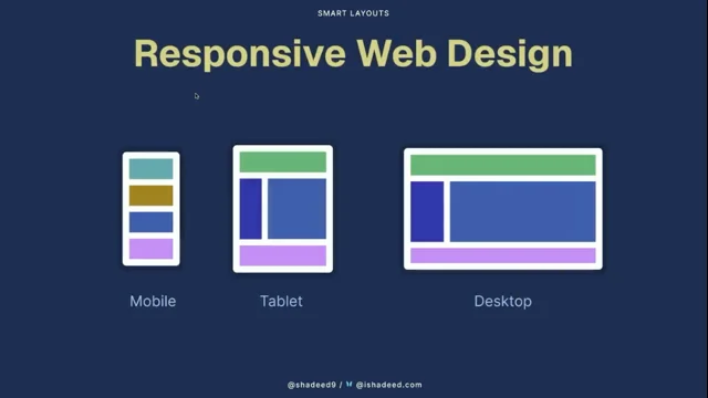
The Rise of Responsive Web Design
Allsopp highlights the evolution of web design with the advent of responsive design, particularly following the release of the iPhone. He explains how the web's adaptability was crucial for the success of smartphones, which required designs that worked across various screen sizes. This segment underscores the significance of responsive design in maintaining the web's relevance and adaptability in the face of new technological challenges.
The Challenge of Native Apps
Allsopp addresses the challenges posed by native apps, which offered smoother experiences compared to web apps at the time. He critiques the web community's envy of native platforms and the resulting shift towards single-page applications and JavaScript-heavy frameworks. This segment explores the tension between the web's open standards and the allure of native app performance, questioning whether the web lost its way by trying to mimic native apps.
Revisiting the Essence of CSS
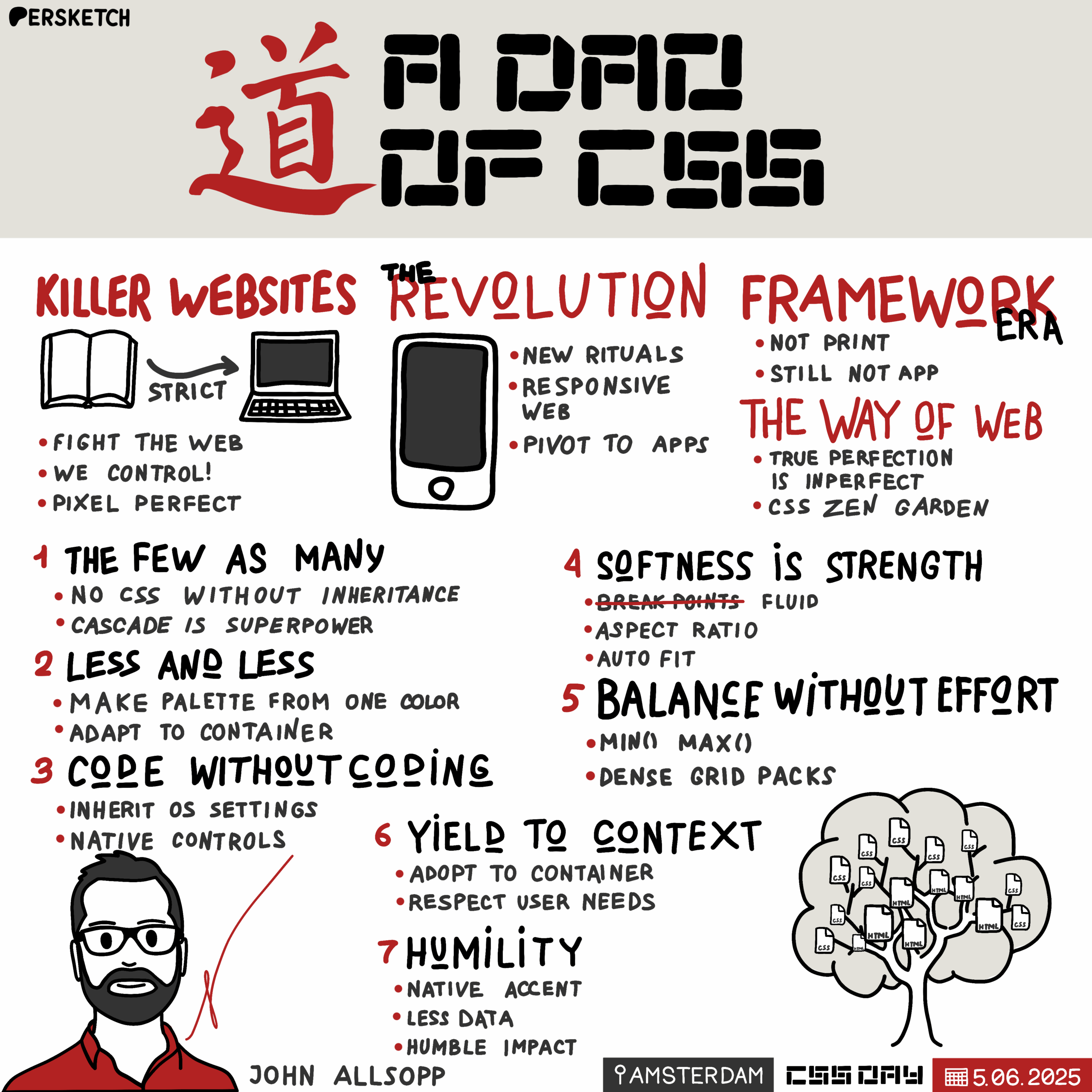
Allsopp argues that CSS embodies the dao of the web, emphasizing its role in creating flexible, resilient designs. He introduces the concept of coding without coding, advocating for the use of CSS features like inheritance, the cascade, and selectors to achieve powerful effects with minimal code. This segment sets the stage for exploring CSS principles that align with the Taoist philosophy of doing less to achieve more.
Principles of CSS: The Few as Many
Allsopp delves into the first principle, "The Few as Many," highlighting the power of CSS inheritance, the cascade, and selectors. He explains how these features allow designers to achieve complex effects with minimal code, promoting resilience and simplicity in web design. This segment encourages designers to embrace CSS's inherent strengths, reducing the need for excessive specificity and complexity.
Principles of CSS: Less and Less
Allsopp introduces the principle of "Less and Less," advocating for simplicity in CSS by using features like color functions, container queries, and logical properties. He emphasizes the importance of reducing code complexity to enhance design flexibility and maintainability. This segment encourages designers to focus on essential elements, removing unnecessary complexity to achieve more with less.
Principles of CSS: Code Without Coding
Allsopp explores the principle of "Code Without Coding," which involves leveraging CSS to honor user preferences and reduce reliance on JavaScript. He discusses techniques like respecting user color preferences and using flexible typography to create responsive designs. This segment highlights the importance of aligning design practices with user needs and platform capabilities, minimizing unnecessary complexity.
Principles of CSS: Softness is Strength
Allsopp discusses the principle of "Softness is Strength," drawing parallels between CSS and the Taoist concept of yielding to gain strength. He explains how fluid layouts, aspect ratios, and grid features can create resilient designs that adapt to various contexts. This segment emphasizes the importance of embracing flexibility and adaptability in web design to achieve robust, user-friendly experiences.
Principles of CSS: Balance Without Effort
Allsopp introduces the principle of "Balance Without Effort," encouraging designers to achieve harmony in layouts using CSS features like Flex and Grid. He explains how these tools can create balanced designs without over-specifying elements, allowing for natural adaptation to different contexts. This segment underscores the value of letting CSS handle layout complexities, reducing the need for manual adjustments.
Principles of CSS: Yield to Context
Allsopp explores the principle of "Yield to Context," advocating for designs that adapt to user preferences and environmental conditions. He highlights the importance of container queries and respecting user settings for animations and writing systems. This segment emphasizes the need for web designs to be context-aware, enhancing user experiences by accommodating diverse needs and preferences.
Principles of CSS: Humility in Design
Allsopp concludes with the principle of "Humility in Design," encouraging designers to prioritize user needs and platform capabilities over personal control. He discusses techniques like using accent colors and optimizing data usage to create efficient, user-friendly designs. This segment reinforces the importance of humility in web design, focusing on serving users and respecting their preferences.
Applying Taoist Principles to Web Design
Allsopp reflects on how his presentation embodies the Taoist principles discussed, using CSS and HTML to create a seamless, multi-page experience. He emphasizes the power of the web's adaptability and the potential for CSS to unlock new design possibilities. This segment encourages designers to explore the untapped potential of CSS and the web, guided by the principles of the Tao Te Ching.
Q&A: Exploring the Dao of CSS
In the Q&A session, Allsopp addresses questions about CSS preprocessors, teaching humility to designers, and the impact of browser standards on the Dao of CSS. He discusses the cyclical nature of web design evolution and the potential for new disruptions in the field. This segment provides insights into the practical application of Taoist principles in web design and the ongoing challenges and opportunities in the industry.
I think every industry has its canonical text or texts. If you're a designer, it might be the design of everyday things or the elements of typographic style or something like that. If you're a strategist, it might be the art of strategy.
And if you're a web designer, it might be an article in A List Apart from 25 years ago called a Dao of Web Design. Who's read that? Oh, good. Good to see some of you haven't. So no spoilers, because I think our next speaker is going to talk a little bit about it. But A Dao of Web Design was kind of a turning point, I think, in the period where we worked in print design and then we kind of transitioned to the web and the first pioneers, I guess you could say, tried to emulate what they saw in print. So this article was the first thing I ever read that put into words this idea of embracing the unknown and this malleability and flexibility of the web and the fact that we didn't know then what the web would become today and we still don't know what it'll become tomorrow.
So very important, I would say canonical text for us as web people. And the author of that article is here today. So it's a pleasure for me to introduce to you, John Allsopp.
Thank you, Stephen. Thank you.
Thank you very much. I feel very old right now, but I see a lot of old faces in the room and a lot of new faces. It's lovely to be here. The Tao Te Ching is a two and a half thousand year old book of wisdom and philosophy from, from this chaotic period of Chinese history called the Warring States Period. It's attributed to a sage called Lao Tzu, and its wisdom lies at the heart of the religious practice of Daoism. But in Chinese martial arts like Wushu and Kung fu and Tai Chi as well.
The fundamental idea of the Tao Te Ching is the idea of the dao, which might translate as the my back. All right, as the way.
And the dao is this ineffable concept of how the universe works. We can't see it, we can't grasp it, yet it works through all things. It guides without striving, acts without acting. And it is the harmony of the universe. Now, even if you've never read or even heard of the Tao Te Ching, and I really recommend you do read it, it's very short. You can read it in a sitting. It's powerful and wise. The most. You'll know many of the phrases from it, and the most famous perhaps is this, that the journey, the longest journey, journey of a thousand miles, begins with a single step or it begins with the ground beneath your feet. It's translated in many ways today.
I want to use that metaphor of a journey to look at how we have come here over the last more than 25 years, 35 years in the history of the web. And to let you in on a bit of bad news that I think we've still got a very long journey yet to go.
So the earliest web, many of you won't have experienced, it had no fonts, it had no color, it had no typography, it was unlimited in potential, and yet it felt very limited at the same time.
So if we look at the earliest browsers, all we had was text. The earliest web designers, as we just heard, came from the tradition of print. And this interesting thing had happened in the previous decade.
There'd been a revolution in print design driven by WYSIWYG editing and the Mac computer and various software on that as well. And it's perhaps exemplified by, by the work of Neville Brody, a designer most strongly associated with The Face Magazine and really set the scene for what print design was like. It was revolutionary because prior to this time, you had to work physically with the medium.
It was much harder to create these dynamic, bold, font and layout driven designs. And then the web came along and the web had none of this.
It had no tools that these print designers had been familiar with. And so they got to work on all these hacks that allowed them to do what they've been doing on their WYSIWYG tools on the Macintosh.
So this idea of pixel perfection came in to be and designers wanted to control. This word control is used time and time again. And we had this term that emerged called killer websites that some of us will have done this. Many of you may have not even heard of this. We come up with these hacks that involve using tables for layouts and then using little spacer GIFs to hold our designs together. But in reality, these were really brittle designs. And this was exemplified in this book, which you can still buy, it's still in print, or it's still on Amazon at least. It's called Creating Killer Websites. And how popular this technique was? Well, this was the most well selling book. This is the number one book on amazon.com of all of 1996. Not in web design, not in technology, of any book. Right. It's kind of lost the history now, but it captured all of these techniques.
And not only did we not have any layout technologies, we didn't have any typography, any fonts at all. And so what did designers do? Well, they used the tools they already had, like Photoshop, and they used the fonts that are available to them, which weren't available on most people's computers. And they rendered images of the text they wanted and they put those images into the spaces in their tables based layout. Right. That's what web design was. So what's all that about? Well, there's wonderful expression, this wonderful part of the Tao te Ching, which talks about how we begin with belief and then that becomes religion and ultimately it becomes ritual. And ritual is what we do unthinkingly. That's what we've always done. We use type in this way or we use layout in this way. And this, I think is very much this ritualistic moment in web design. We weren't so much designing for the web, we were kind of drawing pictures of what we wanted web pages to look like.
And they might have looked like what we wanted to look like, but they were inaccessible, they were brittle.
They worked only because we had such a limited palette to work with. So few screen resolutions, so few colors and so like, so few window sizes. Even like 1080 was a hugely wide window at the time. So this was this moment that we arrived at perhaps towards the late 1990s. But there were other people who kind of realized there was something more to the web, the web could be something different. And amongst those were the people who founded things like the Web Standards Project, who advocated for, as I did, a new approach to designing for the web, to let go of this desire to control, to have pixel perfection and embrace the web and its fluidity.
And then so I wrote a series of articles. Some of them were advocacy and some of them were very technical, kind of describing how you would go about this. And then in almost exactly 25 years ago, as we just heard A List Apart, a wonderful, canonical publication, which I believe is kind of being rejuvenated as we speak, which is wonderful news that became a bit moribund the last couple of years. They published this article of mine, A Dao of Web Design. And the idea that I had there was we should escape this kind of past of print design and we should try and embrace the fundamental principles of the web, the nature of the web. And I guess that's the idea of the dao of the web, that it was flexible, that it actually that trying to control it was like trying to control the flow of water. And I think it's a very fitting place to be here in Amsterdam, where I suspect, you know, that metaphor hits very hard, right?
So that was, and this was pre social media, there was no Twitter, there was none of these, there was no Elon Musk.
And yet this idea resonated with people. I got emails from people all over the world talking about it and to this day people still refer to it, which is incredibly touching. And a little bit, you know, I find it a little bit. I'm not a particularly self promoting person, so sometimes I find it a bit challenging. But it is very touching that even to this day people do talk about it. But I was far from alone in this. Lots and lots of people were working to show how this might work.
So CSS did mature.
This, this way of working overcame these really strongly kind of established patterns and practices of using tables for layout, using images for text, due to people like Dave Shea. And if you're not familiar with it, you should make yourself familiar with it.
Drawing itself from different oriental traditions, the CSS Zen Garden. And the idea Dave had was he published some HTML, said I want to see what you can do with this HTML just with CSS.
And that's presented in thousands of ways. The website's still there. You can go and still see what people did with that.
And then in 2007, Apple released what they called a revolutionary Internet device.
And the web was at the right place and the right time. It was ready for this device. Because prior to the small screen device, we really only had a small number of bigger screens.
We had a small number of resolutions. If you squinted, you could still pretend that web was paper. If you ignored things like braille devices and screen readers and other assistive devices.
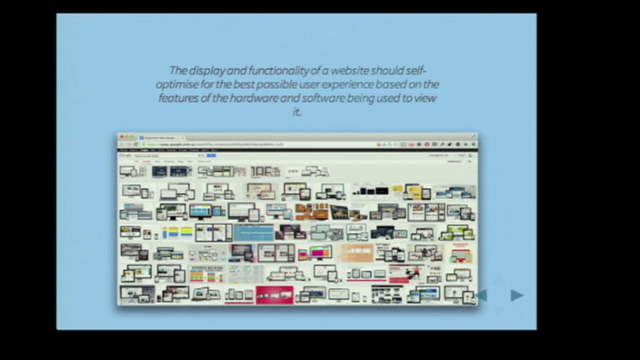
But with the iPhone and then the smartphones that followed it, that didn't work anymore. Right? Because most importantly, the people who signed off and wrote the checks for the designs were looking at them on their phone. And if you had one of these killer layouts that used tables and images, it just simply didn't work anymore. But the web had arrived at the right time. The responsive approach that we developed had arrived at the right time. And I would argue that if we'd stuck with that old ritualistic approach, then when the iPhone arrived, and remember, it had no app stores, there were no native apps at the time. If it was just the web and that web had been the web of the late 90s, it's very hard to see the compelling nature of a smartphone when all you have is kind of screen based designs.
So I think this approach of standards based responsive design was critical to the success of smartphones.
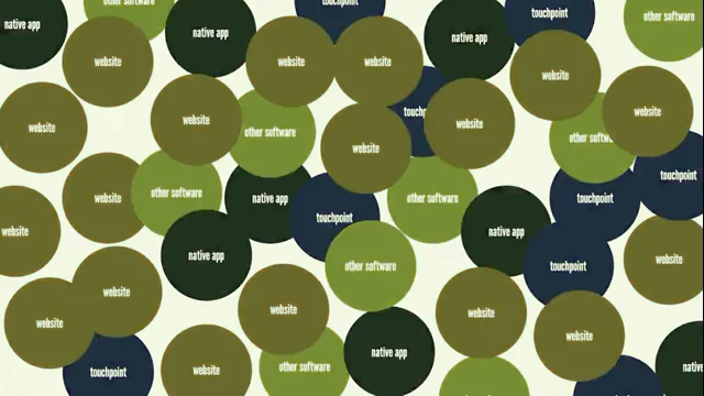
So that sounds like a happy ending, right? We see this story arc of the early web, this struggle to find its own voice in the world, developing these techniques that ultimately came to be called by Ethan Marcotte In 2010, the responsive web design, right? This looks like a great story. We've come to the end of the web's victory, but it just so happens that's not what played out. And the very device that ultimately kind of made the case for responsive web design, the smartphone, well, ended up embracing its own app platform, embracing app stores, right? And by comparison, the web felt janky, it felt inferior, right? For lots of reasons. A principal one being JavaScript's engines were quite slow at the time and we didn't have the kind of animations and the effects running kind of in CSS that we do today.
So that's one reason why web apps really struggled against the perception of native apps being better. And of course, every time you visited a webpage, you had to download the entire app in order to get it to run, whereas native apps, no matter how big, are just downloaded once and they're already on the user's device.
So the web did face tremendous challenges. And in response, what did we do? I think we lost our nerve, right?
We spent this whole decade really working to understand the nature of the web. And then when confronted with a new challenge of app platforms and native apps, we got envy. And we decided, well, we're going to have to embrace that.
We embraced this architecture of the single page application and this whole ecosystem of frameworks, and I'm not going to go into those in great, any detail, but I really think, and most importantly, like, CSS in all this gets really relegated.
It's in utility classes over here and it's in CSS in JS over there. And a lot of the features of CSS and the power of CSS, which I'm going to talk to about in the second part of this talk, we kind of lost sight of them or we hid it away.
We really did lose our nerve.
And so, as I said, we spent a decade working out what the web was, and it wasn't print. We've actually spent far longer trying to make the web conform to this paradigm, an old paradigm, a paradigm that Scott Jensen has called a Jurassic paradigm of the native app. Scott said in 2011 or 12, the native app must die. Here we are stronger than ever, right? We've spent the last 15 years envying the native platform.
And I think that was, to be quite honest, to be editorial a mistake.
Right. It's taken us further from understanding the web than where we were in 2005, 6. Right. When it seemed like the web was poised to take over the world. So that's one journey we've been on.
But I want to take you on a different one. I want to try to go back and think about the essence of the web in particular, because it is CSS day. CSS.
Because actually, I think CSS is the dao of the web. It's like water that flows. And water is this metaphor that Daoism comes back to time and time again because it seems to yield to everything, and yet nothing is stronger than water. So today, what I'm going to do is talk about seven principles from the Tao Te Jing. And seven is a kind of numerological.
It's kind of important number in Taoism. So that's why there are seven. Some look very similar. But there is a story here. And I'm going to look at these principles with examples of CSS.
Now, compared to what Adam did this morning, what so many people are going to do in the next couple of days, I have nothing to teach you about specific technologies. That's not what I'm here to do. You will know all the things I'm about to talk about. You will have used them and work with them. You're certainly familiar with them. But what I want you to do is to use those as lessons to understand the principles so that we're not just using them ritualistically.
Right. We're actually understanding their essence and how they contribute to how the web could be.
So the first principle is the few, as many. And there are quotes as we go. I'm not going to read them out from the Tao te Jing. You can go back over the slides later. And as I said, I really recommend I use Stephen Mitchell's wonderful, very poetic translation from 1990. You can get free versions online. There's a brand new translation from Ken Liu, and Ken is a science fiction writer who's also translated the Three Body Problem and other amazing works of Chinese science fiction. I highly recommend that go and get yourself that.
You can read it in a couple of hours, and it's truly wonderful.
So we're going to start with the simplest and the simplest thing in CSS. It's a superpower. It works, is inheritance. And we lose sight of it. We don't think about it, right?
And so we're constantly picking and plucking and putting and saying, this here should be this. And we're Trying to specify everything. Think about CSS in js. That's what we do. We say this thing should have all these qualities, or think about utility classes, right?
We say this thing, it should have all these qualities when they can be inherited so often. And I like to think of inheritance like water.
So in inheritance we specify something on the body or a container, and then it flows through the DOM, throws through the document to the lower points, right? And we can rely on that, we can use that. It is a superpower, right?
So trust inheritance, we all know it, we all know what it is, but really think about it and think about there is no CSS without inheritance, right? And related to that is the cascade, which I think are often conflated. And the cascade is kind of public enemy number one by many developers who haven't really embraced the cascade. So while, while inheritance is about the flow of style from a container to its descendants, cascade is about the flow of style from less specific selectors to more specific selectors, right? So think about how you can make your style based on the least specific. So here, for example, we have a button and rather than specify on each specific button, here's what I want to look like. They're all buttons, specify on the least specific and then that flows through the cascade into the more specific, and then we can override them. We can give the alert component an alert icon or a different color background. But rather than specifying everything on every element, which I really see far too much of, right? So inheritance and cascade are two incredibly Taoist kind of fundamental superpowers of css. And the third one is let's trust selectors. Selectors are amazing, right?
And here. What. Thank you.
So in the past, for example, if you wanted to style a form based on the validity of one of its inputs, we'd have to use some JavaScript and we'd have to kind of walk the tree. And we can just use a selector now and it will style based on the validity of the inputs, right? So this is the few as many. Our first principle, we think about how little CSS can we use to create the effect that we do. And why would we do that? Because actually you get strength from that, you get resilience from that. Not just of the design itself, but in your own work, right? If you overspecify everything, then every time you change anything, you've got to change it everywhere. We get these sprawling dependencies.
Whereas if they all flow from the cascade and the inheritance and we only have to change one or two things and our entire designs can change.
Now, this seems very related, but it comes from this Taoist idea that it's the emptiness of something that's important. Think of a cup of water, the cup itself, right?
It's only because it's got nothing in it that we can put something in it and becomes useful. So this idea in Taoism is we should do less and less, we should take things away. I think of that aphorism. I don't believe he ever really said it of Einstein. It was like, make things as simple as possible, but no simpler. But that's a kind of modern rephrasing of that. So in this principle, there is so much power in these new CSS features that I think we're far yet to even begin to explore. So normally, if we would have a kind of color palette, we might specify 6, 5, like a whole number of different kind of color properties and then we apply them methodically to all these different elements in our page.
But with the color mix function, and there's all these amazing new color functions, right? We can say, well, here's our base color, some sort of blue, some sort of green, some sort of red, and then we mix it with white, and then we get our entire palette and then changing one variable property gives us this entirely new palette, right? So think about doing less.
And one of my favorite things in the entire world is the container query.
They were long fought. It took a very long time. And right at the front, Miriam is one of the people most responsible. So big up to Miriam for giving us this.
So in the past, if we wanted our typography to match the size of our elements, we would use JavaScript and would will loop through and we do these calculations.
Incredibly brittle, right? Kind of like it blocks the main thread. There's all sorts of really, now we have these wonderful container query units. So think about how we can do less. And I think Adam's example, the scroll, even though there was a lot there, like how little, if at all, he relied on JavaScript, for example. So what maybe you might do over the next couple of days, and it's nice to begin before just about everyone is think about how these principles apply to what they're talking about. And one that I really like. And Adam's gonna. Ahmed, who's gonna talk tomorrow, has shared ideas with the world around this and really kind of brought it to our attention.
But logical properties. So in the past, if we were concerned about multiple writing systems, we would have to do these huge amounts of CSS and specify.
And now we can with a couple of. A couple of properties, say, well, here's how I want it to start, here's how I want it to end.
We do less and less. And in fact you get much more by doing less, which is the ultimate daoist idea.
So less and less. Think about what you can take away. The scripts, the variables, right?
Because this wonderful expression, when nothing is done, nothing is left undone. So take away now those two together kind of lead us to. So probably the most important principle after the idea of the Dao in the Tao te Ching, which is this wei wu wei. So sorry for butchering any Chinese speakers. I'm really sorry about that. But it is this central kind of mysterious idea of the Tao te Jing, which is acting without acting. So I think of coding without coding or code without coding. So practice non doing. One way we might do that is honor our users' preferences. So we might have a light and a dark theme instead of then building some elaborate switcher. They express their preference in their operating system. That flows into the browser and then it flows into our page. We do less and we code without coding by just specifying a couple of lines of css.
And now we have an entire light and dark kind of theme instead of all this complexity. And every site you visit has its own switcher and it gets in the way of the user's preference. We'll see that again and again. It's really important. We want to honor the user throughout. And we'll see a few examples of flexible typography. But once upon a time, we used to say to people, don't use pixels for fonts because you couldn't zoom, particularly in Internet Explorer 6, which was very important to us for a very long period of time.
That's not true anymore, right? You can zoom and pinch and fixing things in pixels. That's not such an issue for that perspective. But it is for the complexity of our own work. Because if I specify a font size on the body and then let it flow through the body using inheritance, and then using something like rems, or if I let it respond to the size of a container, I do very little work. But if I put a pixel, I have to calculate each pixel here, and then what if we want to change that? We have to go and recalculate. So do less and achieve more. And one is a bit of a bugbear of mine. The browser has lots of controls. Now, I know they're not all perfect and there probably are times where maybe we do have to go outside, but I think too often we simply abandon that and we add countless lines of JavaScript with the performance impact and the accessibility impact, because trust me, no one is going to get the keyboard accessibility.
They're not going to get the accessibility features that the browser developers working from the specs are going to put into controls. And you can style them beautifully. Now, you probably couldn't even tell which is which in there, right? So again, code without coding by using what the platform already gives us, right? These principles have made things as simple as possible, but not simpler, I think are really important and that speak not just an impact on the designs that we produce and the impact on our users, but also on our own work, the simplicity of reworking what we do or sharing that work with others.
Now, this principle that softness is strength. And again, the Tao te Jing is full of these... Tyt's full of binaries, but kind of ironic binaries where sometimes, you know, it kind of contradicts, it seems to contradict itself. And one of those is the softness is strength. And this is probably the principle that I relied most of in that original article, right? So an example from Taoist philosophy would be the willow tree, which seemingly weak, right?
It bends and in the wind it will bend, but it won't be uprooted.
Whereas, say, the oak tree, mighty and strong, in a strong wind it cannot bend, it cannot yield to the wind.
Its strength is actually its weakness and it is uprooted.
And above all, water. The daoists kind of love water.
It yields to everything and yet it flows everywhere and nothing can ultimately resist water. So how can that apply to the way we work with CSS?
Right? A lot of these things are going to probably start looking very familiar because I think these same ideas flow through a lot of the properties of CSS and a lot of ways we work in design. But a simple one is. So we talk about the word breakpoints, and I think that word break is really telling. Like literally we break things, right? So instead of having breakpoints, how can we be fluid throughout?
Right? Instead of over specifying at this point and this point and this point, we should have this property and this property we can use container queries and then we can clamp those to constrain them within limits and create these kind of fluid layouts and fluid typography that adapt because we have no idea the size of the screen. I remember the first time I watched one of my looked at one of my websites on a big TV and everything broke and I thought I was doing a really good job because it was all based on breakpoints.
And how many people have internalized the hack for getting a 16 by 9 aspect ratio for their video? Right, we don't have to do that anymore. We have aspect ratio right there in CSS.
And it's not just beneficial for, say, media like video. Think about it like this. When we lay out a page, we don't want cumulative layout shift.
We get heavily punished by our good friends at Google for doing that. But if we use aspect ratio, the browser knows, based on the width of an element, how big it's going to be. And so we get rid of cumulative layout shift simply by using aspect ratio. Right. So it's not just the impact in the narrow and small sense. Some of this stuff really flows far out in the world. So think about the implications beyond just what you're looking at when you, when you using a feature of css. And then we've had grid and flex for a long time and Rachel is a tremendous advocate and she's speaking, I think later today, maybe tomorrow on this.
But we still often tend to treat grid and flex a bit like tables. We say this bit here and this bit here. There's actually features in CSS for auto fitting our grid elements and look into it and explore that so that we don't have to over specify what happens when it's this wide and what happens when it's that wide. Let the browser do the work. Right? So a lot of features we already know, but perhaps there are aspects of them we're not using because we're thinking about them in an old way and there are new ways of thinking about them.
So this is a really fundamental principle and I really want you to try and internalize it because in particular, this gives our designs resilience. As Jeremy, who's down the front, has talked about in resilient Web design. How can our designs be resilient? They will not know the situations in which they will be encountered. Right. How many people kind of test with forced colors or, you know, there are so many things we've yet to really kind of test or understand about the things we're building. So we need to be resilient.
We need to embrace this softness and get our strength from there.
Just a couple more. So in, in the Tao Te Ching and in Daoism, this is this metaphor they use of the archer. And so the archer has a single finger on a string and pulls back the bow with incredible force. And the bow kind of bends in harmony.
Right? We're not pulling here or here. We're pulling on the string and yet the bow. And by doing that creates great power. So this idea of balance without effort I think is really important. And so what we might have done in the past, even using something like Flex is say, well, we want this button to be 33% and this one and we want the gap to be one. Whatever we overspecify. What happens if we drop another button in? Well, you have to have a whole different set of calculations.
Whereas if we just let the browser calculate for us, if we just use CSS, the Flex property, we get this beautiful balance with almost no code that adapts to all kinds of circumstances. And then within that.
So here we have a card that is growing and shrinking with this container, but we can then control how wide it gets and how narrow it gets using min and max. So there's way we. It's not that we have to completely abandon to the browser and to the spec what happens.
We can come. It's like us pulling the string back, right? We're in control of that balance as well. But try and use a light hand, try not to overthink things. I think is a key to that.
And as I said before, I think often, particularly working with grid, we kind of treat it like table based layout and we say, well this item should go here and this one should go in that area. But in fact there are all kinds of things in the grid like autofill and grid auto flow and we can specify how the grid packs.
So this is an actual grid, right? This is one of the few bits I have any JavaScript in the presentation and we're adding elements in and they're being auto flowed kind of at random by the browser. So I'm adding new elements in and they're randomly being assigned there so I don't have to sit down and meticulously decide. And of course what happens when the screen gets bigger or smaller or we change the orientation rotation.
Let the browser do that work. So these features are all there in CSS, perhaps in the outer limits of them for now, but I highly recommend you go looking for them. It's this idea of balance without effort.
So we don't have to create breakpoints, we have to do all these calculations, we don't have to write JavaScript, we're doing less and less and we're achieving this balance and this harmony.
A similarly kind of ironic idea or counterintuitive idea from the Tao te Ching is that we should yield to context.
So by yielding, by giving up control, we gain our power. So we go back to this idea of print designers that literally all the time we. You would look in a newsgroup or an online forum and it would ask, how do I control a particular property?
But it's actually the power of the dao and the power of the web is by giving up that control.
So again, container queries. So here it is the same element, but all we do is we size it based on its container and so on the right, and that container doesn't change on the left, it does, right? So instead of having to have multiple elements, multiple classes, multiple selectors, multiple styles, we just do that once. We're doing less with fewer.
See how these principles kind of build on each other.
One that I really like and Adam talked about it before, I'm sure many will as well. This idea of respecting the user and their preference. So here we might have a flashy, exciting animation, but respect the user's desire to not have that animation, right? They might just not like it. They might have a device that is janky because it's, you know, like most people in the world, not a particularly high powered Android device. They might have vestibular disorders, right? So we should not try to control, we should not be the masters of our design.
We should respect our users. We should yield to their desires. And again, by using the logical properties, with just a couple of properties of CSS, we can take care of every writing system that some, maybe they have yet to be imagined.
So again, we're not trying to control, we're not trying to exert ourselves on our designs.
We're trying to yield to the platform and what it brings to us. And we have one more principle. And it might seem incongruous, this idea of humility, but it's really important. It's a fundamental idea in daoism.
And I think as a designer for the web, we're not the superstar Neville Brody. We sort of do our work and step back from it. I think that's the best kind of web design. And so again, this metaphor of water, right? All water flows to the sea, because the sea is the lowest point, the most humble point. So we can do something simple like specify an accent color and then let the browser use that accent color on our elements in a form, right?
Simple. We can respect the data budgets of our users. They might be on a very restricted plan. They might be in many parts of the world where data is incredibly expensive, right? And so we might lazy load only when an image displays, or we could even use a much lower resolution image instead of the high resolution image.
So our humility not to say you must look at this marvelous design in this particular image, but rather honoring the need of our users, their expressed desires. And then a little left of center. But we can also be humble in how we impact the page, right? So by by using the context the contain property of CSS on one of our elements, which we know is not going to impact the rest of the page, we can tell the browser you don't have to repaint, you do not have to reflow, and we can really positively impact the performance.
Without that, the entire page will reflow when we change something about our particular widget. But if we tell that the contain is to layout, then that reflow won't occur. Again our humility in thinking about the needs of our users I think is really important here as well.
So the Tao te Ching is actually really quite funny, it's quite sardonic. So I put that in there and I think you will grasp the principles I'm talking about. But what I want to do in this final, very short last piece is talk about how these slides you have seen, I've tried to embody and embrace all these principles, right? So this is just a website, right? That's all it is, right? If I go up here, I've hidden from you, but it's just running at the moment in local host, I can give you a URL and you can load it, right? Every slide is its own page.
It's not like a single. I've built systems like this in the past where you've got a single document and you use JavaScript to animate between all of them.
But no, it's everything here you see is just an HTML document. So there's 50 or 60 of them. Everything in the window, there's one SVG, there are no PNGs. Everything else is just CSS and HTML and a couple of little bits of JavaScript. But even then they don't really have to be there. The grid that gets auto packed, we're adding elements, but this way we could do that as well. So I'm embracing all these principles in this particular talk. So we have navigation in the footer, I've got a tiny bit of JavaScript that will take forward and back events. But right down here in the footer I've just got a pre... It's just a previous and next button that I can click.
It's just a simple website. It's not a single page application architecture, it's a multi page application architecture which we used to call websites all right. And then there's lots of really sweet, I think, dynamic animation in there, and that's just view transition. So we can transition from page to page. Right. As if they're all seamlessly part of the whole, using view transitions. Right.
And they're widely supported now. And the great thing about them is if they're not supported, there's a progressive enhancement. They just not. We won't see them. They just get a slightly less slick transition between the slides. But someone might have their preference to not see animation. Right. And so they won't display in that case as well. So I kind of. I've been on the journey of the web pretty much from its beginning, right. And very much part of that journey as we learnt what it could be. And we had that golden period. I think it really was a golden period in the first part of the 2000s, even the first decade of the 2000s, and I really think we lost our way. Right. We got envy for what native app platforms can bring us. And so instead of ritualistically applying the lessons and the practices of print, we now do that for apps. We're thinking about how we're building apps. Everything we do is from that perspective.
And what I think that does. Look, the truth is maybe there's nothing in the web, right? Maybe that all the web really is, is a kind of janky app platform. But the truth is, I think that's very unlikely.
Very few technologies have survived from 1990 to today. Right? Like, and yet all the time the web adapts, the web is resilient, right? And fundamentally, because the technologies of the web flow everywhere, right.
It's unimaginable that I would do what I did and allow me just to share with everyone in the room so they can look on their phone or look on their device when they get home with a native app, right? It's just something powerful and mysterious, to be quite honest, about the web, that I don't think we've really begun to understand. So I'm going to leave you because, you know, 25 years ago, I was a relatively young man and 25 years from now, if I'm still here, I will be far from a young man. So other people hopefully will go on this journey with me and then for me.
But I really like us to think what is hidden deeply inside CSS and its related technologies? What capabilities are there that we've yet to even begin to understand? And I would like to give, as a guide, not the only way to look at this, but I think there's real power in using the Tao Te Ching and its principles of Taoism to think about what the web might be. So you can find a bit more about me there. I would love to see over the next couple of days, but for now, thank you very much.
Thank you, Stephen. Thank you, John.
We'll have a seat over here. All right. We worked out what to do with the flowers. Yeah, you can hold the flowers. It's a thing now, so you can. Take a picture of John with the flowers if you like. Thank you. That's all right.
They're beautiful flowers. Right. Are there any tulips? I don't think there are tulips.
Are they real? I don't know. I don't know. I think they're real. There's water.
All right. Okay. Okay. All right, so we have a couple questions. Khalil asks if you think that CSS preprocessors like sass, do they go against the Dao of css? So, no, I don't. What I think they do is they allow us to experiment and explore. Right.
And, you know, Miriam's here. She's going to speak next. It's what.
You've obviously been heavily involved with Sass for many, many years, and I think that pre processes allow us to explore what CSS might become. And I think it's a little like JavaScript and jQuery. Like the best things we discover with them, we reincorporate back into the platform. And I think Sass definitely has that. But I. I do think also, if you apply a kind of a daoist approach, there is a fragility to some extent in relying, you know, some technologies like Sass, open source, they've had a long. A long history.
There are others. I'm not going to diss anyone. I think all these technologies, when they're successful, they solve a problem. And I think it's important to understand what they are. But I think we can. We can actually get kind of fragility by embracing kind of certain technology. I certainly don't think that's true of Sass. I think it's been important kind of explorer for us in where CSS should head.
Okay, thank you.
Anka asks, how can we teach our designers humility?
They should look at the job market right now. They make most of us pretty humble. Look, it's hard. Like, humility is one of the.
Again, it's one of the principles of the dao, I think, is the most challenging principle. Right. In all our life. Not just in design. Right. Being humble, being wrong.
These are things that I highly recommend in life more broadly, the ability to say, you know what, I was wrong about that thing. There's a kind of flexibility and a growth in that. So I don't know, our entire culture, certainly Western culture, seems to very much tell us we should never be wrong about anything. And that's how we get Silicon Valley.
Khalil asks, how do different browser standards and feature acceptances affect the Dao of CSS? Well, they're the reason for it in a way, right? If we're resilient, if we flow around those problems, if we're mindful of them and we ensure that at the ocean the lowest level is we can swim in, that it can nourish us. You know, I'm trying to really stretch the metaphor here, but you know, as, as we, we get more complexity and as we get differences between browsers, A Daoist approach just allows us to flow around that. Right. To be like a simple example of View Transition. I'm not sure where Firefox is at with that. Maybe it's in Nightly's or something.
But if you were to view these slides in Firefox, they probably don't have transitions at the moment.
I find Safari has the slickest implementation of that and hats off to them for working really hard on that. But again, I think this approach helps us with the reality. Look, browsers are as complicated as anything humans have pretty much ever built, right. And there are going to be things that aren't quite right and the specifications aren't always unambiguous in every respect. So this approach is, it yields to those ambiguities.
Thanks. You mentioned Neville Brody.
My favorite Neville Brody quote is there's no such thing as bad design, only inappropriate design. All right.
And you touched on that with print designers trying to put the print model on the web.
So there's something, we had a little discussion beforehand and there's something cyclical about what you're talking about. There's something that disrupts every once in a while. I hate the word disrupt, but that's what it does. And you're forced to evolve over time. So what's our next rude awakening?
That's a really good question. So on one level, I think we're reaching the kind of end of screens. Now. Obviously we're going to be part of our lives. But I did a whole talk some years ago about how screens are kind of. There's an ultimate limiting factor around screens. So screens are essentially passive devices waiting for us to touch, touch them. They're text based interfaces and we can't take them everywhere because we get run over or we get, you know, kind of angry relatives and we try and use them at dinner. Right. So, and again, like, we're probably looking for whole new paradigms of device and interaction, but I think the web will flow there. I think the technologies are there as well.
And then I guess on a very, that's a macro, long term kind of thinking, but I think in the micro thinking we have View Transitions and we have speculation rules. And I kind of think we don't really need single page application architectures anymore. I just don't think we need them.
So. And it's not to say that we should like expect less. I just think they were a local maximum where we kind of used. They were a zero interest rate phenomenon as Guiallmo Rauch once described them. And he's the guy responsible for Next. So, you know, like, I think how do we move beyond the single page application architecture? And I think these technologies really allow us to explore that. That's not to say there won't be times and places like if you're building a thing that looks a lot and feels a lot like an app and on desktop, that's what apps are now, we will lose sight of that then. Yes, maybe those patterns still make sense.
But there's, I just think there's this enormous space of interaction and possibility out there that we are not exploring because we're obsessed with the fact that we have janky animations, for example.
Right. And a lot of what you were talking about was less. Yes, let's do less. But web pages are bigger than ever before.
They're not getting smaller. That's not my fault.
I was just about to blame you. But all right, we're doing more and more. We're doing more than ever. So what, what's the best place to start doing less? Yeah, that's a really good question. I would say where can CSS replace your JavaScript? I think it's a lot of times, it's a lot of stuff, you know, like I think what Adam showed us, I think we're going to say the next couple of days, there's very little we really, really need JavaScript for. I really like, there are certainly places where, and certainly when it comes to user interaction part that kind of UI layer, if you're a design engineer, your job should be and not just as a sort of academic exercise. And there are times probably where a little bit of JavaScript is judicious compared to a very complicated convoluted kind of hack of css. But that's what I would do. I would say here's a thing that my UI does that uses JavaScript. What, in CSS allows me to remove that. Right.
Nice. Well, the ones who didn't clap, we know what language they like. They're in the wrong room.
All right, well, I'll give you a contentious one. I'll say something and I'm going to watch your reaction and then you can comment on it. All right, ready? Shadow DOM? Yeah, that's a really good question. Right. I think what it speaks to is this desire for encapsulation. Right. And I think the cascading inheritance are powerful, but sometimes we need to build dams. Right. Because we flood.
And so I think. I think they're probably. It's really interesting to see. I'm a big fan of web components as a concept.
I kind of feel almost the evolutionary nature of them is a bit like the. What's a. We got a nerve in our body that goes all around. It begins with a V. I should remember it like evol.
I think, like a lot of those things have been evolutionary adaptations and evolution kind of doesn't always follow a straight path. So, look, I think the reality is we're probably stuck with it. But as Jeremy has observed and others, we can use web components without having to worry about that or only using it in a little way. So HTML web components, where all of the document is there in our HTML and then we layer a little bit on more with web components. So I think there are patterns. So the thing is, we get these technologies and View Transition is probably a really good example. View transitions are incredibly complicated. Right. And I don't think we've really begun to really work out the patterns. So they're very primitive, they're a bit like a machine language. And I think we should think of them like that.
Right. And maybe Shadow DOM and web components should be like that. Right.
We should be thinking at a kind of abstraction layer above that and hopefully that's where CSS comes in. In many respects, it's an abstraction layer on the DOM.
So perhaps we can talk to some of the CSS folks who are on the working group and so on about how we can do that, because I think a lot of the time we don't really want to worry about that implementation detail. Right.
Well, John, thank you for your article 25 years ago, the evolution of it today, and thanks for coming all the way over here to Amsterdam to share your insights with us. Thanks, John. Also thank you.
- Web Standards Project
- CSS Zen Garden
- Responsive Web Design
- Single Page Application (SPA) Architecture
- CSS Inheritance
- CSS Cascade
- CSS Selectors
- CSS Custom Properties
- Container Queries
- Logical Properties
- Prefers-Color-Scheme Media Feature
- Flexible Typography with em/rem
- Native Form Controls
- CSS Clamp Function
- CSS Aspect-Ratio Property
- CSS Grid Auto-Fit
- Flexbox
- CSS Min/Max Functions
- Container Queries
- Prefers-Reduced-Motion Media Feature
- CSS Accent-Color Property
- Prefers-Reduced-Data Media Feature
- CSS Containment
- View Transitions API
What if we stopped trying to control the web—and started working with it? In this talk, I return to A Dao of Web Design, an essay I wrote 25 years ago, to look again—this time through the lens of CSS. Drawing on a close reading of the Tao Te Ching, I explore how CSS isn’t broken or lacking—it’s just deeply misunderstood. CSS is not a language of force. It doesn’t tell the browser what to do. It suggests, it yields, it adapts. It’s declarative, contextual, and quietly powerful—more in tune with Taoist ideas of the dao–flow, humility, and non-action (wei wu wei) than we may realise. By understanding CSS through this lens, we see the cascade, inheritance, and layout not as problems to overcome, but as patterns to follow. We stop chasing pixel perfection and start designing systems that respond—gracefully, appropriately, and even beautifully—to the world around them. This isn’t a talk about new techniques. It’s about letting go. And perhaps seeing CSS—and the web—with new eyes.
Sketchnote by Artem Pendiurin