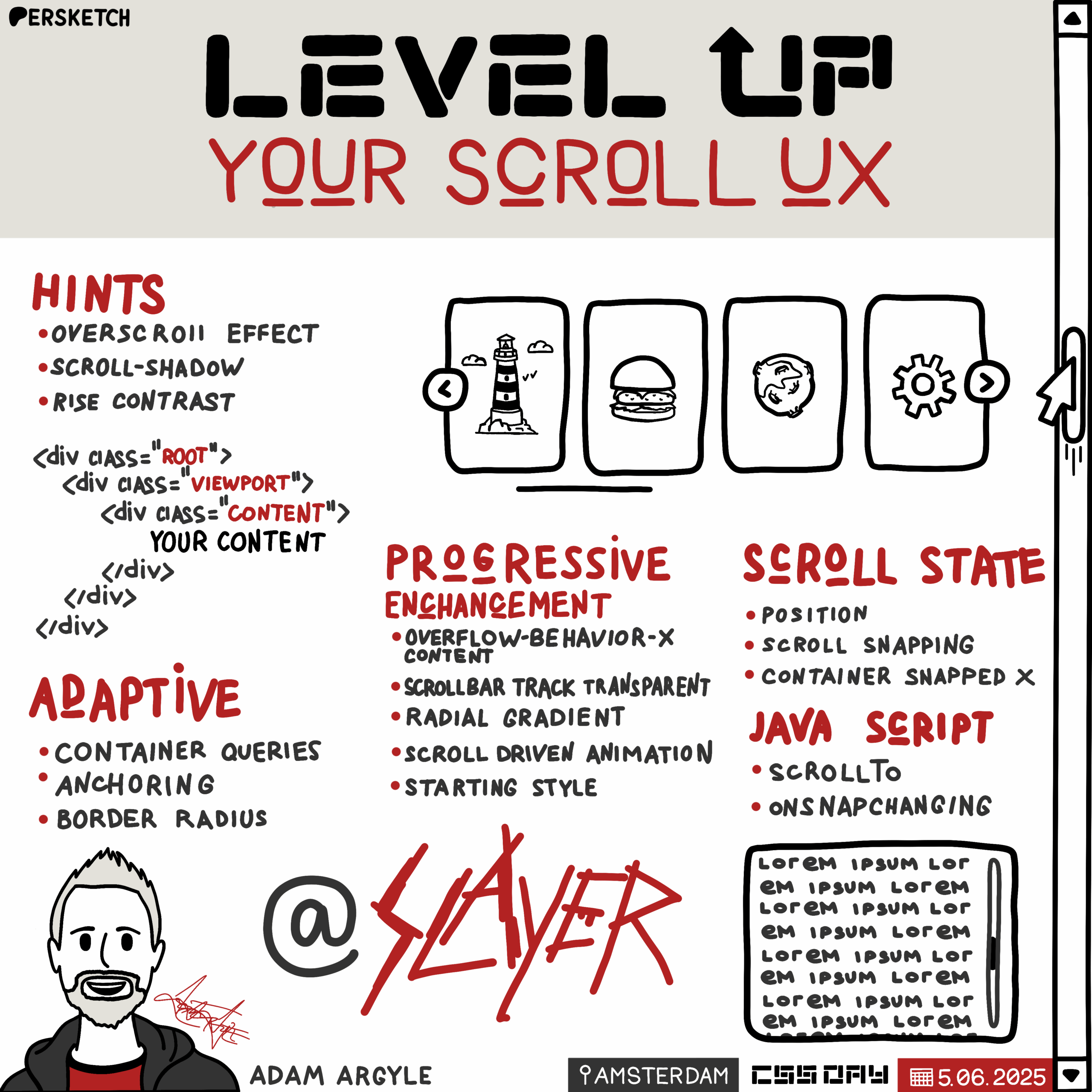
Level up your scroll UX
Introduction to Adam Argo
The host introduces Adam Argo, highlighting his creative and experimental approach to CSS. Adam is described as a proactive maker who quickly brings ideas to life, which is evident from his website, nerdy.dev. The introduction sets the stage for Adam's presentation on CSS, emphasizing his innovative mindset.
Exploring the Ultimate Scroller
Adam Argo begins his talk by introducing the concept of the "Ultimate Scroller," aiming to enhance the scrolling experience on websites. He discusses common issues with basic scroll implementations and emphasizes the importance of adding polish to make interfaces not just functional but beautiful. Adam illustrates this with examples of unfinished-looking scroll bars and highlights the potential of custom scroll bar styling to improve user experience.
Understanding Overflow and Scroll Bar Basics
Adam delves into the functionality provided by the overflow property in CSS, comparing it to the video tag in terms of built-in features. He explains the significance of scroll bar presence, thumb hints, and various user interactions enabled by default. Adam also discusses the differences between inline and overlay scroll bars, demonstrating how these affect user experience across different browsers and operating systems.
Creating a Nice Collection Scroller
Adam introduces the concept of a horizontal collection scroller, commonly seen in app stores and streaming services. He demonstrates how to implement features like scroll buttons, focus states, and animations to enhance usability. Adam emphasizes the importance of aligning scroll bars and content for a polished look, showcasing examples across various browsers.
Building the Collection Scroller Structure
Adam outlines the structure of a scroller using multiple divs to manage layout issues like padding and overflow. He explains the essentials of setting up a scroller with the correct overflow properties and introduces the concept of overscroll behavior to prevent unwanted navigation actions. Adam also highlights the importance of respecting user preferences for reduced motion.
Colorizing and Styling Scroll Bars
Adam discusses the process of styling scroll bars using both deprecated and modern CSS properties. He demonstrates how to achieve a visually appealing and integrated look by manipulating scroll bar colors, hover effects, and focus states. Adam shares tips for ensuring compatibility across different browsers and emphasizes the importance of maintaining accessibility.
Enhancing Scrollers with Container Queries and Anchoring
Adam introduces the use of container queries and anchoring to enhance scroller functionality. He explains how to position scroll buttons dynamically based on container size and demonstrates the use of CSS anchors for precise positioning. Adam highlights the flexibility and power of these techniques in creating responsive and adaptive scroll interfaces.
Adding Scroll Shadows and Animations
Adam shows how to add subtle scroll shadows and animations to provide visual hints and feedback. He uses radial gradients and scroll-driven animations to create dynamic effects that enhance the user experience. Adam emphasizes the importance of layering these enhancements to create a seamless and engaging interface.
Implementing a Bordered Variant and Conditional Styles
Adam demonstrates a bordered variant of the scroller, showing how to use conditional border radius techniques to adapt to different container sizes. He highlights the importance of maintaining visual consistency and alignment across different states. Adam also discusses the use of forced colors mode to ensure accessibility and visual clarity.
Building a Nice Content Scroller
Adam transitions to creating a vertical content scroller, focusing on integrating it seamlessly within a page layout. He showcases how to maintain consistent spacing and alignment, and how to apply similar styling techniques as with horizontal scrollers. Adam emphasizes the importance of providing keyboard accessibility and visual feedback for a complete user experience.
Finishing the Nintendo Switch Home Screen
Adam revisits a previously unfinished demo of a Nintendo Switch-like home screen, demonstrating how to implement scroll snapping and other enhancements. He shows how to use scroll state queries to add dynamic effects like pulsing highlights and title animations. Adam also discusses the use of JavaScript for additional interactions, such as sound effects and haptic feedback.
Conclusion and Final Thoughts
Adam wraps up his presentation by encouraging the audience to experiment with scroll bar enhancements and to find meaningful ways to improve user experience. He emphasizes that while not all enhancements are necessary, they can significantly elevate the design and functionality of web interfaces. Adam provides links to his demos and resources for further exploration.
Q&A: Accessibility and Deprecated Properties
During the Q&A session, Adam addresses questions about accessibility and the use of deprecated CSS properties. He clarifies that the focusability of scroll containers was maintained, and explains his choice to use deprecated properties for aesthetic reasons while ensuring fallback options for browsers that don't support them.
Q&A: Overscroll Effects and Design Consistency
Adam responds to questions about managing overscroll effects and maintaining design consistency with operating systems. He advises against removing overscroll effects, as they provide valuable feedback to users. Adam also discusses the importance of aligning custom scroll bar designs with OS conventions while exploring opportunities for improvement.
Adam, our first speaker, is one of the nicest web people that I've met and we met at this conference.
And what I like about Adam is that he's a tinkerer.
He likes to play, he explores a lot of what CSS can do and he's always making things. So I work in a larger organization where designers tend to become pretty analytical and they start thinking about what they would like to do and eventually they'll make a plan and they'll do it. And Adam's like, hey, we can make this. Well, let's do it right now. And he'll build something really quickly. And he's constantly building. If you go to his website, nerdy.dev then you'll see evidence of that. Even if it's something small, he just has to get it out there. So I really appreciate that maker mindset and I'd like to introduce you to Adam Argo.
Thank you. Appreciate that. Super nice. Oh my people, css. I hope you're ready to learn some CSS or see a whole bunch of it because I have a lot of code I'm going to show today.
This is the coolest conference. This is like the top 1%. Doing all the coolest stuff in CSS is happening right here. You are at the right place. My computer's awake. How's it look? It looks good. Let's hit refresh just because that's a fun animation. Today we are talking about scrollers and I called it Ultimate Scroller because really we're going to look at scrollers in a Microsoft like microscope lens that you've never thought of before. And the whole goal here is to help you enhance it.
We want to take scrolling, which everybody does, and we want to make it really nice. We want it to look nice and integrated. And we're going to do this layer by layer, affordance by affordance. So here's the problem.
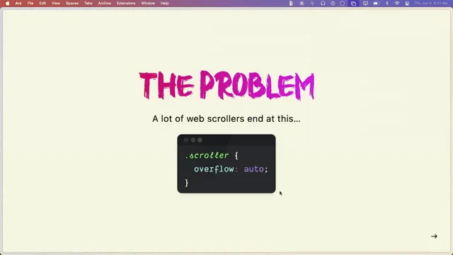
The problem is lots of devs, unless you're a react dev, you don't even do this. But if you're like a decent dev, you'll write overflow auto.
React devs are recreating this like dorks. It's really funny.
Anyway, so a lot of scrollers though end at this. And this is kind of the problem because it shows. You'll go to a site and it's alien looking. It's basic feeling and to me it's unfinished.
In this room, as far as I know, y' all are finishers. We show up to add all the extra polish layers that make something not just Functional, but actually beautiful, desirable and elegant. So here's exhibit A. This is codepen. Let me zoom in here so we can see. This is one of the things I hate so much is a warm gray next to a cool gray. Oh, you can't really see it on there, but the one is kind of like clay, and it's next to their theme. It's blue. And I'm like, that is unfinished. It takes one line of code to make it integrated.
That's just scroll bar color. And so I go to sites all the time.
And this is because I have my scroll bar set to inline and not overlay overlay scroll bars, which is the default on Mac. Most people don't even know that that gray bar is there because they're using overlay scroll bars. So one style can get you out of this little cork. Or look at this one. I was booking a tattoo when I was coming here. There were three of these bars, and I was like, ugh. One line of code makes them cool, man. Like, why'd you do this? They just. They didn't know they were. It's kind of like, you know, you didn't check that one media query. You didn't resize it to that one break point, and then, like, you just missed that moment. So today I'm really going to expose these for you so that you can make sure your site has a good custom scroll bar. Because I'm assuming some of you might not have your scroll bar set to inline and you don't know that they look like that. And then we're going to look at exhibit C. This here. Let me go to my talk here. Let's find the switch unfinished. So again, unfinished. Someone did a really good job recreating the switch home screen. And then they did this with this big, stupid gray bar down here that's way too far down at the bottom. There's no scroll snap. It's just floating. And I'm like, I want to finish that so bad. And so that's kind of what we're gonna do. We're gonna go in and we're gonna make some really, really awesome ones.
Because I'm looking at that switch thing, and it's totally like a dangling, you know, personhood. I'm Scorpion, and I'm just like, I'm gonna finish that demo. Ka.
Anyway, so the types of finishing work we're going to be looking at today are hints and feedback. Scroll hints and scroll feedback.
Let people know that that thing is interactive when they hover on it, change the scroll Bar color. Do things that let them know that your site is ready for their input. We're going to practice progressive enhancement. We're going to make sure it has adaptive theming light and dark. We're going to use forced colors also, which the scroll bars look really cool in forced colors mode. I almost prefer it sometimes. Anyway, we're going to look at scroll state queries because you probably, probably haven't written any of those yet. We're going to show how you can layer those in as a bonus affordance. So we're going to be looking at scroll, adding all these little things, some animations and I'm even going to show you some JavaScript.
Why? Why would I do that? Well, I don't know. I like it. It added a cool flare anyway. But wait, there's more. You're like, there's more.
We're going to build two beautiful examples on top of this. So we're going to make really, really elegant looking scroll just interfaces.
They're not gonna be what you've seen before. And I think that they're really special that way. And again, we're gonna do this layer by layer. We're gonna make a nice content scroll. Who's heard of oklch? I love how modest it was. They're like, it's like lch, but it's like, okay, you know, it's okay. So I'm like, I made a content scroller. It's nice, you know, it's not amazing, but it's a nice content scroller. We're gonna make a nice collection scroller and we're gonna look at all the browsers along the way. But before we get into those, we need to look at what scroll is.
What do we get when we write overflow auto because it's such an innocent little property value pair. When you add overflow auto, it's almost like adding a video tag where the video tag, you don't have to add all the buttons inside.
You don't have to worry about hover events, you don't have to worry about progress.
Think about all the stuff you get with a simple video tag. The overflow element is almost the same because you get thumb presence. If you go to a page and there's no thumb, that's feedback to you. That's not a scrollable space. If the thumb is there, that's a scroll hint to a user. They immediately can be familiar. You're giving them a clue that that's a scrollable area. The thumb s hints at the corpus of content. I Also just love the word corpus. Just a cool word. It's like it's dead, but it's not. It's like desirable anyway. Thumb hints. The size hints at how much there is, how much Runway is there. The thumb position is feedback to the user that lets them know where they are in the grand scheme of the corpus.
You can click the track to jump your keyboard. Arrows work, the home button works, the end button works. Page up, page down, they all work. Your mouse, trackpad, hover, touch, pan, scroll. They all work without you. You just added Overflow Auto.
Sometimes in browsers or in various operating systems, you might get little arrows at the top and bottom of the scroll bar that let you nudge it. You can hold shift if you have a mouse wheel and you have a horizontal scroller, you can hold shift and mouse wheel vertically and it will horizontally scroll something. You don't have to code that. That's just all in there. It's like a ten year old thing.
And the browser maintains contrast. There's so much more. So Overflow Auto is wildly packed with lots of cool stuff. So here's the two types in case you hadn't really gone into your operating system. And I think I have it pulled up right here. It's right here. So we've got show your scroll bars and I have it currently set to always. A lot of people have the default, which is automatic there. We can take a look at both of those here compared. And look at the always in line one.
They're always present. You can see that they are a little thinner when I hover them. They didn't actually grow. Look at the overlay ones. For some reason when they appear and then you hover on them, they scale up a little bit. On iOS these are really, really subtle little things. And look at when I hover over there, I'm getting some feedback about the color changing. It's really, really nice.
So those are the two different types and we're mostly going to be working in the always in line ones. But the overlay ones will benefit from all the work that we do today. And this is one of my favorite slides, which is people grab thumbs. I mean, look at right here. I'm grabbing the thumb all the time.
I think people like the thumb. It's really powerful to grab a thumb and it's also fun to say that people grab thumbs anyway, don't mess with that. That's kind of one of the things I'm trying to share here is the scroll bar is a very power centric user centric element that you don't want to disrupt their feeling of power. Scroll bars are our friend and we want to layer in meaningful contextual and helpful affordances one by one. On top of this rad thing that we get with one property value pair.
It's also quite beautiful and brutalist. The scroll bar, it's old, right? They haven't changed that in forever. But also it didn't need to. It's been kick ass ever since it's been out. You know, it's minimal, functional and it's a little rough on the edges and maybe I like it a little rough on the edges. You know, it's beautiful and brutalist. So we're going to go over three examples today which we were talking about earlier, and we're going to layer those affordances in one by one. So the first one we're going to look at is the nice collection scroller. But actually, before we get there, let's open up this one's Firefox. So here's a demo.
There's two different types of scrollers that can exist on a page. The root scroller, which is the one that manages the one on the document. I don't recommend that.
You generally mess with that one very much. You can change its color to look integrated and not alien to your site. But that one, leave that one alone.
But the ones in the page, these are called nested scrollers. These are a good opportunity for you to make something a little bit more unique and they function different in Chrome, specifically the root scroller. When you scroll to the top, you can pull to refresh. You just get that for free on the root scroller. The root scroller on Chrome also is bouncy. You see, it's bouncy. Oh, this is Firefox.
Now, see, Firefox is bouncy even on nested scrollers. And look at the thumb, how it shrinks as it gets to the edge. That's over scroll feedback.
So we're talking about hints, which is the presence of the thumb. And then we have feedback. And this is an overscroll effect. And I like overscroll effects.
It's an elastic one. The elastic effect even, yeah, plays into the thumb size.
And here's another thing, is when you tab into a scroller, I think it's nice to provide feedback that those scroll bars, did you see them highlight? That's because my arrow keys now don't manage the root scroller, they manage the nested scroller.
This is really cool stuff. And each browser kind of does it different. So let's go to Safari. Let's check out custom scrollers. So here's another one we'll scroll.
We see that we get bouncies on everywhere here. We get bouncies here as well.
And we can tab in and use our arrow keys. Notice, though, I couldn't highlight this one in Safari. So a lot of these things are just like layers of affordances, and if they don't work, they don't work. You did your work to do it as best as you could. And then we saw it inside of Chrome here as well. Oh, here. Let's just go check it out. Inside of Chrome interactive scroll bars. So that way we can see that the root scroller in Chrome. Well, if I open it up in debug mode, let's do that because I'm in an iframe. Here we go. And here. See, I get a bouncy overscroll effect in Chrome on the root scroller, but I don't get it in a nested scroller. I have been. Well, I was bugging those engineers a lot to make nested scrollers bounce. Because Firefox and Safari have overscroll effects on nested scrollers. Chrome just doesn't. It's okay, though. There's a lot of really cool affordances that we can build in here. So now that we kind of like established a little bit of a base about inline and overlay scroll bars, nested scrollers versus root scrollers, let's go to our first nice collection scroller that we're going to work on. And this is. We want to just horizontally scroll a collection of whatevers. This is really, really common. You open up a lot of, like, app stores or even, like, you're browsing Netflix and it's like exclusively horizontal scrollers. So you're like, what can we do to make and provide enough hints and feedback and affordances to make those really awesome. Let's go check it out in our first demo here and we'll look at it before we go look at the code. We're going to view this in every browser so that you can see the end result that we're building towards. And then we'll work backwards and you can see the progressive enhancement that's happening here. So in Chrome, in this particular scroller, look, I've got buttons. And the buttons will disable at the edge. That's a hint. The hint says you can't scroll left anymore. The thumb was over here. I can scroll to the end. And this one will disable as well, it should disable.
Yeah, it was there. It disabled Anyway. You can also tab into here and I'll focus. Once there's focus inside the scroller, I highlight the scroll bar with a nice focus state again, because my arrow keys are going to function as I want want them to inside of here. And I think that's kind of cool to do. We have light and dark mode. Look.
There's even scroll animations. Look, as they exit the scroller, they slowly fade out.
And as they enter the scroller, they slowly fade in. These are just really nice affordances. Also notice that the scroll bar is perfectly aligned with the left here.
And if we go to the full view, we're scrolling edge to edge. I think if you're making a horizontal scroller, try to make them edge to edge or else contain it well. And there's also another hint in here called a scroll shadow.
You can see it at the edge here. Let's go to the nested one.
See the scroll shadow? That's another really common way to hint to people that there is more to scroll there. So let's go check out this demo in Safari and Firefox. So here's Firefox, here's our full scroller. We have our scroll bar down here. Notice we're getting nice little hover highlights. We can scroll it. We have shadows in this one, but they don't animate.
So in the Chrome version, I'm using scroll driven animations to remove this at the edges. And in this one they're persistent. I don't think that's much of a loss. They still look pretty. I can still focus into this scroller and I can still highlight the scroll bar and let users know that arrow keys are now activating the nested scroller. I think that's cool stuff. Let's go check it out in Safari. So again, this one's going to look a lot like Firefox. So you can see the scroll shadow over here. But the difference is the scroll bar of this one isn't to the edge. It ends at the same amount of spacing that is with our element. This is just like little, little knits and nudges that make sure that the alignment is all there. And it just kind of creates a little sense of beauty. And in comparison to the Firefox one, where you can see it goes to the edge and I don't think that's bad. I just kind of preferred the other one that felt more polished. Right.
Okay, cool. So there's that. And now we're going to go into building this for ourselves. So here's the first tip. When I make a scroller and you can kind of see the structure up here. This is the structure of my scrollers these days. And this helps me in so many ways.
And you'll see it. I have a scroll root, which is usually some sort of container, and it doesn't have very many styles on it at all. Maybe a little bit of padding, probably not. And maybe a border and you'll see and then the viewport, which is the thing we're actually going to put overflow on. And we're going to have some scroll content with our content inside. And I know that's three divs, and you're like, three divs for a scroller? And I'm like, yes, it's going to save you a lot of pain, trust me. There's a lot of weird oddities that. Like, for example, a Flexbox layout, when you turn it into overflow Auto and you have padding inline, the padding on inline end gets gobbled up. So you scroll to the end of the scroller and you're like, where's my padding? I put equal padding on both sides. Turd browser. And it does it with grid also. And it's in the spec to eat your padding on the inline end of the scroller. It drives me nuts. But if you set up your divs in a nice way, you don't have to worry about it because you can put your padding somewhere else. So that's the structure. And now we're going to get into the lessons. So the first lesson here is this is kind of the essentials I think of for a scroll bar. In this particular one, the viewport is a Flex layout. I like to always use the shorthand for overflow. I know we've been trained a lot of times to be like, shorthand bad, because it sets things you don't want. And in this case, I think with scrollers, you should always be explicit about what you want and what you don't want, because sometimes they pop up and you'll be like, I thought I said overflow X hidden. You didn't. But here you set it in the shorthand and you make sure you're very specific about which ones you want. And then you always got to put overschool, overscroll behavior. X match the axis that you're scrolling with overscroll behavior. This will cancel things. Like if I'm in this scroller right here and I keep scrolling left, notice I'm not triggering the back navigation.
How many times you've been using a scroller and you scroll to the end and then you scroll again and it pops you back. Oh, that's annoying.
If you set overscrollbehaviorx contain, you'll trap that. And not only do you trap it that way, let's check out another way that that traps. In this interactive scrollbar here, I can whip to the bottom and notice it didn't continue scrolling the page. I can scroll it now, but that's really critical.
If you don't have overscroll behavior on here when you whip, it bubbles the scroll inertia up to the next scroller, up to the next scroller.
Save those weird moments of that inertia for tricks.
Most of the time. I think you should contain it. Let's go back to our lesson on the collection. I've got an inline size here, max inline size. And then always with scroll behavior, put it in a media query. Because users who prefer reduced motion, it's always motion that they're not in control of.
And scroll behavior is when you're programmatically setting scroll or you've focused into something and it scrolls it into view. Those are moments when the browser is scrolling something for the user. And so make sure that they're cool with motion if you're going to do that to them. So those are the essentials. And you'll see that in every single one of our demos here. So here's our first slayer layer.
I got this from Dave Rupert that if you call it a slayer, the browser is like, what's a slayer? And you're like, well, it's banned. But other than that, if you delete the S all of a sudden, everything inside of there works.
And you'll see our scroller update. So that's kind of a fun way to do lessons here today. Yeah, see? So you learned something new about cascade layers. So in this layer where we're colorizing the thing, there's a lot of work to be done in here. And it's really, really annoying work. And some of it that's kind of what I'm hoping you can take a lot of this stuff. So here's our scroll viewport. One of the first things I'm going to do is since I'm highlighting the scroll bar when focus is inside, I'm going to get rid of the the browser behavior where sometimes if you focus a scroller, it will outline the whole scroller itself. And that's good because that tells the user where their focus is, then they know their keyboard is going to work in there. I've done my own work to provide feedback about what keyboard is going to do inside of a scroller. So I'm going to get rid of it. So normally I don't suggest getting rid of outlines, but in this particular case I'm doing a lot of work to add a ton of affordances and I think this one is okay to relinquish. So here's our first thing. We're looking at.
Webkit scroll bar. I'm using old school styles here to style the scroll bar. It turns out the WebKit scroll bar stuff is more customizable than the new scroll bar color feature. The scroll bar size, scroll bar width, and we're going to do both. But we're going to start with this one because I really, really like that alignment here and you can't do that with the other one. So first I'm going to set a nice healthy size, you know, 16 pixels.
I'll take the track and I'm making that track background transparent.
I learned the shorthand here from Tamani. That's four digit hex code where the alpha is the fourth channel there. And so it's transparent black.
You'll see that all over. I could write the word transparent, but I like the shorthand. That's kind of cool. And we've got a scroll bar track. And this is one of those things that you go to those sites and you see the huge nasty old school bar there. If you just make the background of it transparent, you can get away with now it looks a lot more integrated. And then we'll change the color of the thumb here too. Part of this trick is a background clip padding box on the scroll bar track. What the heck? Why? And then we have some margin on there and that's what's helping us kind of push inward.
And then we're going to use a border and some other tricks to sort of continue constraining it until it looks like it's padded. It's not.
This is a trick, it's an illusion. Just so that our layout looks really nice. So then we'll check the webkit scroll bar thumb and here's where we're going to start layering some affordances. Let me pull this out here a little bit. Yeah, yeah. A little bit more. Yeah.
All right, so the background here, I'm color mixing in srgb, a light dark function with white and whatever the surface is with 50% opacity. So my scroll Bar thumb, by default it's going to be half opacity, you can see that here.
But when I hover, it goes to full opacity. I'm going to set a maximum border radius. Here's scientific notation, which I really like. Sometimes 50% border radius doesn't give you what you want, but if you use a really big number, and in this case it's one with three zeros pixels, so it's 1,000 pixels. And a really big length value will always give you like a perfect rounding edge versus 50% which can give you a wobbly thing sometimes.
So kind of a fun trick there and then a border. So look, this creates the illusion of being inset is that border plus that margin trick. And the border of this is the same color as the page background. So the reason this looks like that is because the border around it is the same color as the gray there. And I do the same thing in the dark version. So then when we're highlighting our thumb to indicate that focus is inside, we say, hey, is there focus visible or focus within this scroll viewport? If so, grab the webkit scroll bar thumb and give it the background color of link. And that's why when we tab in here we see it changes to the link color to show it's activated. And then we layer on some hover styles if the user can hover, because if they can't hover, we don't want to do really half opacity type of things. We want to give them a nice tangible scroll bar. But if they can hover, we can do some cool things like reveal it or animate it.
So if they can hover, we take that thumb and we set it as the background color. On hover we set the default now to half opacity on the whole scroll bar itself. And on hover we bring it back to opacity one. So we've added hover effects, focus effects and we've styled it to look inset with all of our colors in light and dark mode right now. That's why this is the colorize phase. And now we need to add in styles for scroll bar color. So I don't like this. That I had to do. I had to target Firefox specifically and it's because Chrome can do both the webkit scroll bar styles and scroll bar color and it's very eager to apply scroll bar color styles. And in this case I'm in a Chromium based browser and I kind of want the webkit ones because they fit better with My design, and I'm like, okay, that's really annoying, Chrome, that you do that. But okay, because I tried Supports, I tried Supports, I tried all sorts of ways to get this to work without a specific query. Unfortunately, I did have to do that. But as we saw, like, we already previewed this across all three browsers. They're all getting a nice experience. So as long as you're being conscious and trying to do good, I think some of these things can be okay.
So when it's scroll bar color, we'll set it to thin. That's a pretty contentious thing to set the scroll bar width to thin, but. But I think in some scenarios, like don't do it to your main scroller, the document, the root one, but you might be able to get away with it in a nested scroller.
We'll see. We set a scroll bar color with a nice light dark function.
We set a transition on it, we set focus within the same sort of thing we did before. And again we got hover colors and we're applying some styles on hover. So we're creating an equally good experience for mouse and keyboard users inside of our custom scroll bars. In the colorization phase, it's also very critical that we put a border on here because look, it's free. Cool looking forced color mode styles. Oh yeah, we forgot to look at that. Now let's go in here, let's go down here. Command shift P. Forced colors. Emulate forced colors. Look at the forced colors mode. That's pretty sweet.
And here I'll go forced colors and revert that. And that's because you put a border on things. If you have surfaces in containers, it's a really good habit to put borders on them. So we put borders on the buttons. I put borders on the thumb here so that, that way it appeared to force colors mode borders.
Transparent borders can very much be your friend. Okay, that was colorization and that was like 50 lines of CSS we just reviewed in a couple minutes. So let's look at containerization. We'll take our slayer layer, turn it back to a regular layer, and I'll take the root and I'm going to make it a container with a name and I'm going to contain inline size.
But on my scroll viewport I'm going to contain scroll state, or I'm going to be a scroll state container because I'm going to have children inside of here that want to query about various aspects of the scroller. And so I find that this works really nicely for scrollers to be a container because they're often extrinsically sized. They get a very firm fixed height and width, which is perfect for making something a container. And then all the children in there can do all sorts of good stuff. So containerization is a good phase. And we'll get into more about why we did that, especially with scroll state and size and then anchoring, because again, we're like layering in affordances here. So if these things aren't present, these are just anchor names. I also like putting an anchor emoji in the names. I just think that's cute. Anyway, so the scroll root gets an anchor name and a scroll viewport gets an anchor name. And let's get rid of slayer there and make sure that layer applies perfect.
Let's add some scroll buttons. So watch our scroller here. Get some buttons as that becomes a slayer, not layer, a layer light slayer, whatever. You know what I mean? And so we're going to take that scroll viewport, we're going to say, hey, do you know what scroll buttons are?
Browser? If you do, let's start styling those buttons so that they look fancy because otherwise they're going to look like default buttons and they're just kind of a little, you know, brutalist, which, you know, maybe that's cool. And I'm going to take all those buttons, I'm going to position them against that scroll root anchor that I decided before. I'm going to position all my buttons fixed, I'm going to give them appearance.
None, I'm going to change them. So this is all just button styles. Again, border though, make sure because even fits transparent, it's good for forced colors. And look border radius 50%. Wasn't I just talking smack about that? I was, but I got aspect ratio 1, so I feel pretty good about 50%. In that case, we got an inline size, something healthy to click for a button. Get some padding in there, a font size, a box shadow. We got margin in line.
And this is that when we go to here, we go to a nested one. Look at the scroll bar buttons show up perfectly over the edges and that's that negative margin kind of pulling them in for half their width of 64 is going to be 32. And then when we're at full, they're on the inside.
And I'm going to show you that container query here in just a second.
But our scroll bar buttons, they have accessible text inside of them. We'll see that in a second. So I push the accessible text out, I'm going to put a background icon in there. We've got some styles.
Oh, this is a pro tip. It's really annoying when you're on a mobile browser and you tap a button and you get the square blue highlight over your round button. That drives me nuts. Just like warm grays next to cool grays. I'm like, come on. Stuff is you gotta try your own app. That was kind of the thing anyway. Okay, and then with backdrop, filter overflow, hitting on the buttons and a bunch of transitions, we're gonna transition opacity, box, shadow, scale and color. Because when I hover, I make it solid.
You know, don't make me look through the button to see what the icon is.
If I'm sort of engaging with it, make it nice and obvious and easy to read. That's like one of my mantra is if someone focuses something or hovers something, increase contrast. It is the opposite effect to decrease contrast if you're showing engagement with it because you're making it disappear when I want to about to click it anyway. So pro tip, if someone's engaging with your elements, increase the contrast as your feedback. Okay, so then we got hover feedback here for solid color for full legibility. So if the scroll button is not disabled but is being hovered or is focused visible with the keyboard, we make that background color solid.
When we click the buttons, we give them a little scaly bounce effect.
Scaly, scaly bouncy. When they're disabled, we opacity 50 we take away the box shadow. So if I get to the end look, it becomes flat. It just looks like it's not going to be something you can engage with. And then we get to our first scroll button left. And so in order to add a scroll button to a scroller, you have to give it content. It's as simple as a normal pseudo element where if you give it content, it appears. Same thing with the scroll button. You target the one that you want, you add content. In this case, I put a little unicode character in there. This is accessible text. This also content now allows a slash and you can pass accessible button label. That's really nice. So that's another hot tip that's sort of like just nested in here. I've got the icon and then the handy dandy position area of anchoring where I'm just like you left button or on the left of the scroller that you're anchored to and boom, it goes left and centered.
Really nice. I do the same thing on the button, right? Give it an icon accessible Text position area. Right. And in light mode, I change the icon.
One day we'll have a better way to do dynamic icons in CSS where I can actually like pass a color to an SVG or something and then I won't have to do this junk. But whatever. This is a bona fide CSS trick right hereontainer. Inline size is greater than my own width minus the size of the buttons. Can I fit my buttons outside of my width in comparison to the container I'm in? Because if I can, I want my buttons to be outside my scroller, but if I can't, I want my buttons on the inside. So that's why when we switch between this nested one, they go on the outside and when they are full width, they go on the inside. See, this is amazing. I love that.
Then all I am just doing here is a little anchor trick where I am just. Okay, well if it is going to go on that span, then go into the center and span to the right. That is what allows it to kind of be in that overlay position where it is on the edges. Super duper cool stuff. That is why we set up the anchoring and the containerization is so that it was nice and easy to toss in some scroll buttons. Go back up at the top here and get rid of that layer and burn onto scroll shadows.
Okay, so let's change our slayer to a layer. And this is just a nice scroll hint. These were traditionally. Raise your hand if you know Leah Veru's background attachment trick that did this. And the value of that was. What was it? It's background attachment Scroll. Right. It's. It's got a weird name. Anyway, there's like a really weird way to attach a background so that it's conditional. It was a. It was a cool trick, but now I can use app property. So I'm going to set up two percentages that I'm going to animate from 0 to 100%. One for the left shadow and one for the right shadow.
Create keyframes for each of them that take those. Also look, I did another cute thing with an emoji in there to let you know it's an app property and not just a regular variable. So these keyframes will run on a scroll driven animation. These are some levers to help you kind of change the positioning and when those things disappear when they appear. What's the size of the shadow?
Just a few levers here. Strength of the shadow. Let's go to nested so we can see them. It's right here, over there on the edge. So you can make this darker or lighter, make it bigger or more pronounced or less pronounced. And the whole trick comes down to two radial gradients. Closest corner is going to make sure it spans to the nearest closest corner. And in this case it's full height. I want it to be a circle and I'm going to put it at some positions that I'm going to manage here. And that's going to be one that's going to be at the left and one is going to be on the right. Set some styles in here with some percentages and some, again, transparency, but essentially just think of these as two radial gradients that I put at the left edge and the right edge. And that's the positioning that's in this shorthand. So gradients are so cool. Learning that syntax is so wildly powerful. Anyway, when you're in dark mode, I increase the strength of the shadows because you're in dark mode and shadows kind of disappear. But if you really pump them up, you can still use a dark mode shadow. Then here's our animation.
This is why we progressively enhanced. We saw that Firefox and Safari both had scroll shadows. They know what radial gradients are and app property. But what they don't know how to do is scroll X on a top timeline and animation timeline. So in this one, I'm saying, hey, animate those keyframes on scroll of self on the X axis inside of the scroller and the range. This is the kicker here is the one on the left is going to run from the left edge to the overscroll amount, which is like, I don't know what the value was. I think it was like 30 CQI or something like that. And that's why if you get to the edge, it disappears right there and then it fades back in by the time you get to here.
See, that is just really subtle and nice. I'm not trying to build wild scroll experiences here. I'm just layering on subtle, beautiful affordances.
And so that one clamps the one on the left to just that left area.
And this one looks at the 100% so it goes all the way to the right, subtracts instead, and then spans all the way to the right. And that puts those ranges. So the keyframes will play individually at those clamped edges. Really, really cool stuff. Scroll driven animation. We'll look at some more of those later here too. So that whole scroll shadow effect, look at that modern version, we have app property. We scroll and progressive Enhancement all rolled up into one little layer.
Who wrote this? Let's look at some scroll animations to just bring in some little life and love in here. This time I'm going to put those clamped ranges into my keyframes. So that's an alternative thing inside of scroll driven animations.
You can just pack them in right to the keyframe. So on entry of you entering the scroll port at 0%. So here, let's look at 0%, you are at 0 opacity, but by the time your personal 50% size is in the viewport, you should be at 100%. And so that's what that is doing is it's saying enter at zero, but by the time half of you is available, make sure you're full opacity. And then as you exit, do the opposite. So as you exit, as soon as half of you is exiting, start to fade out and completely fade out by the time you're to the end.
So those are the keyframes. And then the way that that style works here is we're looking at each of the cards inside of there. We're looking to make sure users are okay with motion. We're going to animate again on the View X.
View is going to be itself, each card individually looking at its intersection in the school port. And we're going to animate that edge fade scroll effect along View X.
We put the clamps into the keyframes. And so our styles here are nice and minimal. So that whole entire fade in and fade out effect, which is really soft and nice, is just a few lines of code to layer in that kind of affordance on tether.
Pretty sweet. Okay, so that's pretty much the, the finished version, but I want to show a bordered variant.
I think it's because again, I've been talking about borders and how they're cool.
Let's look at the bordered variant. At full width.
We only put a border on the top and the bottom. When we're nested, we contain it. And you could argue pretty much right away that that might even be better. But something is bugging me and it's bugging me that I have a square corner next to rounded corners. So we're going to fix that with this conditional border radius trick, which I think I learned at first from you. But I have a little slight subtle syntax difference in the way that I do it. But anyway, there's also. These are in open props now you can put radius conditional. They have a clamp inside of there that looks again to see am I full width of my container. If I am or if I'm not, make a decision about the border radius. And in this case, now when I go to nested, it rounds and when I go to full, it's square. I love it.
Thank you. And that concludes that one. Although this one we could put in forced colors mode really quick just because it looks sweet. Will it do it if I do it here? Forced colors, Am I going to have to. Yeah. See, that's just cool. Putting a border on there. So we have a border on the thumb, we have a border around the container. We can go to the nested one and look. That just looks nice. It's like a really tight wireframe view and I think that's cool.
It's kind of funny that the backdrop shadow doesn't get affected by force colors mode.
I wonder if there's a blue bug somewhere in the spec, you know? Anyway, so that was our first one. Let me get rid of force colors mode here.
And we're going to dive on to our next nice scroller. So forced colors do not emulate. Let's get rid of those and we'll pop into the slides and go to our next content scroller. So this is a nice content scroller to vertically scroll whatever, you know. So we were horizontally scrolling stuff and now we're going to vertically scroll stuff and we're going to make a nested vertical scroller look really beautiful. At least I think it's beautiful.
It's going to be arguable. So let's check it out. Oh, let's look at it in all the browsers too. So here we got the nice content scroller in Safari. Here, look at it inset. I think that's really, really nice that that positioning matches all the way. I have one line height unit that's around the whole perimeter and my scroll bar is respecting the same line height unit. I'm getting this like perfect spacing distributed through the whole scroller. And this one, I didn't hide the track, I left the track. I think the track is actually pretty beautiful in this particular case. Look.
I get bouncing on this in Safari, so you get the overscroll effect for free.
You can hover on this and do the colors just like we did the colorization earlier. So that's cool. Let's check Firefox. What are you doing with this nice content scroller? It's got overscroll effects built in. I left the space.
That's up to you if you want to get rid of it. And this is Using the scroll bar. And this one's also thin. I should probably not make that one thin because people grab thumbs and that one's a little hard to grab.
Oh, and I remember, too, we've got Safari in here. So here's Safari on iOS with the horizontal scroller. Look at those shadows. Looking pretty sweet.
But now we need to go to the nice content scroller.
And this one is the most minimal of all of them. You can't really do much on iOS for customizing the scroll bar. And also, I don't think they like people to grab thumbs because my sausage fingers are not good at grabbing two pixel bars. Maybe you're good at that. I don't know.
So anyway, on iOS you're mostly relying on the fact that the content is cut off. Content being cut off is also a scroll hint. That's like one of the oldest school scroll hints is like, where did the rest of the content go? Try scrolling it. Well, it worked great. And that's why we're layering on affordances, because we can do better. Okay, I think we still need to look at Firefox.
Is this Firefox? Yeah. Oh, no, we looked at that one. All right, so let's go build it. And then here it is in light and dark mode, so that you can kind of see. And in Chromium, we're layering in scroll buttons. Again, we're still customizing the scroll bar. We're adding all the spacing. We're going to add focus styles to everything, make sure that they keyboard works.
These are really important things. And if I focus in here, I can use my arrows just like I always can. So just more affordances on the already really great working overflow element. And let's build it in and layer in those slayers. Okay, so we got our essentials, which we looked at before. In this particular case, I didn't use open props or anything, so I'm going to be manually creating the theme. And I just used light dark here, changing the lightness value. In hsl, we've got a border radius on our scroll root. And this is. We can see it here. And a border because of course, got to have those borders. And in our overflow again, we're using the shorthand set, both overscroll behavior wire contain. And with the app media, looking for prefers reduced motion, setting the scroll behavior to smooth. So we're going to colorize and I'm not even going to go into this one because it's mostly exactly what we had before. But instead of spacing it horizontally from the edges. I spaced it vertically from the edges. So I'm going to skip down just because we've already done it.
I can look at containerization again, but we pretty much did that in the last demo also. This time only on the scroll viewport. And this time we're setting size and scroll state. And that's just because it's extrinsically sized. We might as well make it a container. While that thing is firmly sized, things in there might want that. We'll check out the anchorization. Make that slayer layer.
We've got two nice little anchors in here. And finally we layer in our scroll buttons. And these are pretty similar to what we had before. But in this particular case, I'm using a media query to position them in different places. If they can't fit, I'm building them up just like I build up a normal button.
We make sure we handle disabled states. Hover focus visible. We've got that press state. Although look, it looks like they disappeared. Ooh, are they not anchored? Oh, it's a slayer. Still nice.
There it is. And now if I push these, they still have the bounce, they still move the scroller. And it's kind of funny too. It's like your arrow keys do this tiny nudge, you know, nudge, nudge, nudge, five pixels. And these kind of do a page. So it's again a nice layer to add in there.
Sometimes the nudge is really annoying. And that's why you have page up, page down, and all these other keyboard keys. And these just page you through, which is kind of cool. Those are our scroll buttons. But the trick here was the anchoring. So the up button anchors to the scroll root, but it also is an anchor. And the button under it anchors to the up button underneath it, block end.
So that way, if you move the up button somewhere else, the button underneath it comes with you. And that's some of the power of anchoring.
And I think that concludes this one.
And I really like how this looks. I think that is a sharp, sharp looking scroller. It looks integrated, it's got all the affordances. We're not really disturbing anything.
In fact, we kind of made it even. For if a user has overlay scroll bars, they're going to see something nice here. And I think they'll be pleasantly surprised.
But we'll see. All right, so we got one more demo. We gotta fix that Sub zero, sub zero is dangling in front of us right when we gotta finish him. And so we're gonna finish that Switch, home screen, I rebuilt it. Let's go check that and all the different browsers as well. And then here's the JavaScript, the switch. Everyone knows the Switch. There's even haptics on Android. As you pan back and forth, it will vibrate on your phone, letting you know that the snap element has changed. And if you let go, you're snapping to a new item.
Really cool stuff. Let's go check that one on iOS because it looks really sweet. I did all the work to do full screen in here.
Okay, here, iOS, please go full screen. If I go quick, right? If I go quick. Yeah, look at that. That's nice. And we can scroll all the way to the end. And since we're using progressive enhancement on the.
Hey, get out of here. Get on my face. This way. Yeah.
Notice the titles are there always. Except in this demo they showed up conditionally. And I think that's nice that we'll always show them we're still snapping. We still have really nice alignment. We don't have any scroll driven animation, but that's okay. This is still a very nice horizontal switch like scroller.
And we'll build up the other affordances as we go. Let's check it out in Firefox. Here we are in Firefox scroll snapping. We can still snap the last item and we've got overscroll effects that I put in there so that even though they have a natural one, I liked it inside of Chrome as well. So in Chrome I've added an over scroll effect as well and I'll show you how to do that. Okay, let's check. Safari is the final browser here for the Nintendo Switch. All right, we scroll this one. I did do a thin scroll bar and that's because on Switch at least, it's a very touch centric one. And so it's mostly there as a hint and to provide you kind of feedback about where you are in the corpus. I don't think Touch users are dragging that. So anyway, it's debatable about whether or not you want to make that thin. That's up to you. And so to make this, it's all the tricks that I just showed you just wrapped up in a new, fresh way.
So I'll get rid of the JavaScript for now. So we've got our layer that's got the essentials. We're colorizing it. We've got the containerization, we have scroll snap and the scroll snap layer looks like this on the viewport, we say scroll snap type on each Item we say scroll snap to start.
Pretty simple to add the scroll snap in there. Can you believe they forgot scroll snap in that previous demo? I was like, it's begging for scroll snap. And it didn't. They just did overflow auto. I'm like, can fix it. Anyway, here's scroll state. So this is new. So we've been setting scroll state as a container type on our scroll viewport and this particular one is going to leverage it. So notice the current snapped item has the classic pulsing focus highlight of the switch. Here's the keyframes that do that. If the browser supports container type scroll state, I add a little bit of extra spacing in a particular case and then I go grab each game. I find the image and the image can ask the game, are you snapped?
And that's the scroll state query. Are you snapped on X? And if you are, put an outline around, run the keyframes forever, alternate infinite and that gives you the scroll snap effect. And then down here we add another one which is to present the title as we scroll over is Z index minus 1. That puts this title underneath the image. We translate transition and opacity.
You could see it kind of fades in and up. And this one uses a not trick, which is kind of fun. Container not snapped. If you are not snapped, then you should be hidden at opacity zero and scroll down.
So instead of us being explicit about the in and the out state, we really just described the out state and we did it inside of a conditional query, which is really cool stuff. So a couple cool scroll state affordances that we layered in there with just a nice little layer and we got an overscroll effect.
So that's why we can scroll all the way over here and it bounces back.
The way that we do that is we create two pseudo elements on each side of the scroller that cannot be snapped. So the browser can try to scroll to it. But you have mandatory snapping set and the only things that can be snapped are the games. So even though you pulled it over somewhere, it snaps back to where it was. This is a trick I showed in this talk three years ago here called O Snap. I show you how to do all sorts of cool tricks like that. Here it is. We got display flex on the container. We go before and after we set some content. The inline size of the one all the way on the left is 25cqi. So that over scroll elastic effect is 25. And then don't shrink me flex shrink zero. And then the one at the end is 90cqi.
The important part here is you want the last item to be snappable.
And in order to do that, I had to add a really big spacer over here so that I could get this item to be snapped along my start snap coordinate. So that's a big thing too. If you make these and you're doing snap and you need every element to be a snap item, make sure you pad the end of the scroller enough so that that can actually be snapped to.
And that's a cool trick. That's it for the over scroll effect there. We've got scroll animation in this one. We only do an animation on the exit here. See how it's kind of faded out again, a hint. You're not removing the item. You're saying, hey, you just looked at that. You obviously didn't want it. But maybe in case you wanted to slightly remember what's there. I just faded out a little bit. So you get a peek at the content that's near you. And I'm only doing it on exit, not enter. So these all come in nice. This one kind of fades out as you just passed over it. And then we have a cool loading animation in here. Let me refresh again. Flare. The flare is a directional animation coming in from the side, bringing lots of intrigue, lots of staggering effects to let the users know that this can be horizontally scrolled.
Look at all the affordances we can put in here to make this. People not just use the scroller, but kind of like enjoy it. You bring life and energy and lots of really fun stuff to it. And so that loading animation, the star of the show here is starting style. So if the user has no preferences with reduce motion, then we set a transition, a little delay using the sibling index kind of pseudo thing we have going on right now. And we transform translate X and translate Z. We translate Z because I wanted the items subsequent to be behind the one in front. And so I translate Z sequentially backwards, and that way when they pop in, you know, Super Smash Bros is an overlaying splatoon because then that just kind of looks like a mistake.
So I pop it back and translate Z. And now I'm able to manage it.
Cool. And then here's our JavaScript.
I load a couple of sounds and when the scroller is clicked.
Oh, yeah, check this out. If you click one, it scrolls it into view.
Right? Nice affordance. And that we just do a Scroll 2.
Scroll 2 is weird. That's a whole other talk. We'll get into that one.
But I had to use Scroll 2 because otherwise it'll scroll more than what you want it to. And here's the on scroll, snap changing and that's going to play the pop sound and it'll vibrate the phone, if that is possible.
That's the pop. So as soon as the browser says if the user during this interaction is going to drop and it's somewhere new, snap changing alerts you before they let go. And when you let go, snap changes, at which point this callback fires and we can add in a snap play. So I wrote some JavaScript, but come on, that's not that much and that's just niceties. So it's not like I did anything that bad here. And we finished it. We finished that scroller and they look super cool. They look great on your phone. We did a light and dark mode too. The other person only did dark mode and I intentionally didn't show their name because I didn't want to throw them under the bus. But anyway, hit my slides up here and it doesn't have to be all business. I showed beautiful, meaningful component use cases that are kind of cool. But maybe you want to take that over scroll effect and do something silly.
Yeah. Go to this side. Yeah. And that's a scroll driven animation on a pseudo element. You could have fun and that could even play sound and be really annoying if you wanted it too.
And not all these things are required. So this was all. These are probably more affordances added to scroll than you've ever seen. But find the ones that you love.
Find the ones that are going to be meaningful for your users and put them in there. If you think that's good, there's suggestions. And remember, the user could have the say at the end of all this. They could write styles that strip all the scroll bar settings. Make sure it's something that they can grab. And if you want all those codepens, here's a quick little scan to the codepen collection and I'll give you a link that you can also grab it here. Yeah. If you want to take a snapshot of that real quick, wham, bam, cute little CSS logo in the middle.
And that is the talk. You could go here for more links in case you want them. Thanks for watching about how to make scroll nice.
Thanks. Thanks, Adam. Yeah, yeah. Who put that there? I'll hold it.
Okay, thanks. We had.
It's like I won something. We had like two questions and then it suddenly became like nine questions which we won't have time for. I'm afraid for all of them. So I'll just do them in order.
Okay. And I'll read them exactly as I got them. So if you. Even if you answered them in your talk, then you can address them. Sweet. So Jeroen asks, what about accessibility? Isn't the scroll container supposed to be focusable? It is still focusable.
All we did was bring our own style to it. So it's not like we changed the concept of a focusable scroller or not. And different browsers also treat different scrollers as focusable. Sometimes people put tab index zero explicitly on a scroller so that it's like an explicit tab stop, but it's per browser. And Chrome even changed it recently, last year, where they were testing about making all nested scrollers focusable by default, and they reverted it and then they put it back in. And I think it's still in for now. But that is a contentious accessibility concept in general is who decides when they're focus. But yeah, I think they should all be focusable. They should always have some sort of focus feedback. And that's what we showed in here today.
Okay, thanks. This is disturbing me.
Give me the flowers. You got it. We'll put them down here for now. All right, second question also from Jeroen. If you didn't have the WebKit styles, what would the demo look like? Aren't you sort of using deprecated CSS properties? I am definitely using deprecated properties selfishly because I thought they were more beautiful and I made sure that browsers that didn't support those deprecated properties would still get something good. And if the WebKit ones weren't there, we would still hover into a scroller and highlight the. The color of the scroll bar thumb. We would still put focus colors in there. The colorization concept was pretty much the same between the WebKit ones and the scroll bar ones, with the exception that I could pad and space the WebKit ones. And you can also add track hover effects and stuff like that to the other ones. So there's like a couple of subtle things that were better about the WebKit ones, at least from a design perspective. Okay. And then we have from Jens, can you get rid of the slight jumpy overscroll effect?
I wouldn't want to, but designers and managers sometimes have weird ideas. Yeah. Okay, so. And I call it bonking. So in Chrome, when you had the nested scroller and you scroll to the top, it just bonks its head. And so if they want bonks, I don't Think you can fix and ask for bonks from Firefox and Safari? They're always going to be elastic, and that's like a feature. A lot of users love it. They'll sit there and bounce it just because it feels good. They're like, I'm at the top. I think I'm at the top. I'm still at the top. And this is fun now. So I don't know. If a designer wanted to get rid of the overscroll effect and explicitly bonk, I would tell them no.
Okay, fair. I'm going to ask my own question. Very selfishly. A lot of designers look to what the OS is doing for such UI elements like scroll bars, and if you can change a lot of aspects of those things, what's your take on the consistency between your own context and, say, the os?
Yeah, so that was one thing I didn't show. But when we pulled up the settings that allow you to choose overlay or inline, the side nav of the settings will show or hide the scroll bar. And it's a good one to look at because you can look at the size of the scroll bar that's there.
You can hover over the thumb and see what colors it chooses and see what sort of feedback comes in by default. And if you like, you can emulate a lot of those things with the scrollbar color CSS property. And that's kind of what we did, is we made sure that if you hover over it, we're changing the thumb, which is what it does. You can even make it, if you so desire, that inline scroll bars look and behave like overlay ones, because you can have it set to transparent thumb and transparent track. But if they hover or focus in there, you can reveal those things, which is what Mac OS does by default.
So it's like you do need to be careful, though, because we don't have a media query for what the user setting is, there's no way really to derive it.
You can derive the size of the scroll bar.
Yes. And that's why I said it's already minimal and beautiful. Let's try to be gentle about our layers of affordances instead of trying to shove something new in there. But it's hard. Scroll bars are often so natural that users don't tend to pay attention to them unless it's absent or if it's really small and they're like, where's my thick scroll bar?
And then they get really upset. So you got to be careful about that. And you should emulate the things that you think are doing well. But at the same time, I think we can do better than the oss. They haven't changed that crap in years. You know, it's like, it's not broke, don't fix it, but it's also old and doesn't. It's not that desirable.
And so. Yeah, and there are inconsistencies between os. Yeah, there's inconsistency in the OS from size to the behavior of them and to being in a browser versus being in your native OS and being on iOS. Right.
Look at iOS as being super tiny and thin. I'm surprised users don't complain about that more. But maybe they haven't been thinking about it because again, they're transparent and they're like, I got my scroll task done. I don't need to drastically evaluate what my operating system's doing with it. But I think more users have inline scroll bars than you think. And I think that's a critical thing to think about is even though it works on my machine with overlay, you really should set them into inline and show always. And test your site because there are opportunities to make it more beautiful. Just. That's just straight up. So cool.
Thank you. There are more questions, but any of you who ask questions, I'm sure people will find you during the breaks and afterwards.
So thank you. Adam, Argo.
- CSS overflow property
- CSS scroll bar color
- CSS scroll snap
- Progressive enhancement
- Adaptive theming
- Forced colors mode
- Scroll state queries
- JavaScript scroll animations
- CSS overflow auto
- CSS thumb presence
- CSS thumb size
- CSS thumb position
- Keyboard navigation (home, end, page up/down)
- Mouse and touch scrolling
- CSS overscroll behavior
- CSS inline and overlay scrollbars
- CSS focus visible
- CSS focus within
- CSS outline offset
- CSS outline none
- Webkit scrollbar styles
- CSS background clip
- CSS margin calc()
- CSS color mix function
- CSS scientific notation for border radius
- CSS transition
- CSS hover effects
- CSS scrollbar width
- CSS scrollbar color
- CSS forced colors mode
- CSS transparent borders
- CSS container queries
- CSS anchor positioning
- CSS scroll buttons
- CSS aspect ratio
- CSS box shadow
- CSS tap highlight color
- CSS backdrop filter
- CSS scale transform
- CSS scroll driven animations
- CSS radial gradients
- CSS animation timeline
- CSS animation range
- CSS keyframes
- CSS prefers-reduced-motion
- CSS scroll behavior smooth
- CSS scroll snap type
- CSS scroll snap align
- CSS scroll snap stop
- JavaScript Audio API
- JavaScript scrollTo method
- JavaScript onscrollsnapchanging event
- JavaScript vibration API
Slide by slide, CSS feature by feature, we’ll incrementally enhance and craft a rad scroll experience. Normally a pain in the box; styling and managing scroll across touch, keyboard, mouse and more PLUS juggling each operating system’s slightly different affordances, can be daunting. We’ll emerge victorious, nay, elegant! Learn terms like scroll hint, overscroll behavior, overscroll effect. Plus, when to use what, and a whole bunch of niche details about CSS and scrolling. It’s definitely something people do on your site right? Have you polished it or is yours a bit basic? Upgrade time.
Sketchnote by Artem Pendiurin