The triangle love: Product, Data and Growth
(upbeat music) - Hi everyone, my name is Albert, I'm currently the Head of Growth at Vero.
Today, I'm gonna talk about Love Triangle, Product, Data and Growth.
First of all, I wanna go through who am I.
Throughout my career of seven years, I've been like working with a lot of lifestyle set up from early day into Syria, into scaling up states across different countries, and across different industry from marketplace to e-commerce to mobile app, to SAS, and, and that's where I get all experience from different country, from Vietnam, Singapore and Australia.
And, and throughout my career, I also had the opportunity to work across different types of skill sets from wire framing, landing page to growth marketing, SEO, conversion optimization, and up to now, I've been more focusing on marketing automation, product marketing and product led growth, and which is also the main topic for today we're gonna go through.
First of all, so let's go though like the Love story here. This is saying that, three is a crowd and in this case is product data and growth with the background in tech and data and working in growth marketing for why moving to work more product growth recently, I have worked with a lot of startup and experienced a lot of like pushback from the product team against growth.
And also a lot of times and then also have the ignorance against data in the product team, as in they not tracking data enough, or they are missing a lot of like important data they should be looking at.
And that leads to the fact that those three team tend to not work well together at all.
And a lot of these challenge and issues usually comes from like this, like the misconception about growth is, and hear some of the like common like misunderstanding about growth.
So from my experience in my career what growth is not, is what growth is not about like one trick pony or quick fix that can help you to grow substantially overnight. It's not just about like random tests, like find on internet or some of the best practise you can pick up here and there.
And it's just not just about a guesswork, you just think this my work because someone told me about this idea and it's not just about like, Top of the Funnel and acquisition.
(stertor sound) But growth, what growth actually about is that it's about long-term and sustainable growth for the whole company, for the product, and for the whole team, and it's also based, should be based on calculated and prioritised experiment based on data and fact. So the example here is that at Glam Corner, after four years joining them, I help them to grow the monthly revenue by 45 times by the end of, by time I left, left the company. And then not only that growth is about like lifecycle, full funnel user journey not just how to funnel, like the misconception before.
So we focus on from the start to the end from activation, retention, referral and reactivation and growth is about product life and data driven. So the example here is, that by the time I left Glam Corner I have helped to grow the returning transaction rate by 4.5 times.
So this mean every month, more than half of the transaction's are coming from the returning customer to a lot of work on retention, improving user experience and also not just on a website, but on the on the channels as well.
And other common mistakes I have observed and experienced between the product and data and growth team are: So a lot of time like they prioritise and make decision based on opinions instead of data and fact.
They just blindly copy best practises from someone else's successful experiments that might not even apply to them.
And the next case when like a lot of, like I mentioned before the product and growth silo between teams and the growth team we don't have a seat at the product table in the monthly discussion on product growth roadmap feature and prioritisation. The last two are, a lot of teams they kind of lay low emphasis on data.
So from day one, sometimes they don't track any data at all or they forget about like data tracking on in the early days that leads to the fact that later down the track we didn't need to start track some important data. They have to wait to collect data or missing out a lot of important insight and sometimes even ignore either or both of the quantitative and qualitative data. And I just want to go quickly to some of the example here by like the common mistakes. So in this case, I say that, one of client I work with, so I look, I put them to do the BI tool and then for the previous team, they have different calculations with GMV levy, different version, instead of just like writing off for the change.
They just have all of the version there and whenever there's a new person coming in they have no idea which version is correct one. So this lead to like the loss of trust in the data and this messy data and impact the decision making a lot. And there's no single source of truth on this case. And the other example is like they, they had other setup they had pentane incited data and aware sort been around one year but they haven't set tracking data even in a database. So, so in this case they use a table and they don't even track when they use the jaundice the fluff from our adult when they sign up, so that they create is totally empty.
So they have no idea for the past one year when users signed up and it's hard to track and maybe attribute and look at how you just behave over time.
So now they have stats track that from like from scratch. So that's one like very big problem for this setup. And then three is a crowd, but then photocopier solutions.
So in this case, when you put the user as the car and owned up the cross strategy, data insight and product central around like adding value to user, what the user needs and user want.
What are important to the user that can help you a lot, the strategy and the focus of the three team product data and growth. And that led to the main part of our talk today about prioritisation and how do we prioritise future project and strategy that bring product data and growth team together with focus on user. So first from the product perspective.
So like a lot many of the modern product team and communities that have been prioritising the product roadmap project and future this way, based on like a few, many like key factor.
And usually they start with the objective.
So this usually come from the company current strategy and growth, objective and goals.
It varies by company, industry, business models and depending on what the company's trying to achieve this year, so this quarter and next day was like statue.
Like each of those idea, they look at, in this case drive over in the growth perspective called Funnel. So like of each of those like features would part of the funnel impacting the user, the scoring, issue like those like factor.
And next slide of routine we look at the efforts so how easy it is to implement and build those feature for the user.
And last but not least, So it would be based on the things you care about the user impact score.
In this case, they the scores getting how many user like vote on our photos idea in the product feedback platform.
And then from there, that's where they get the process session score to have them to like decide what to do next for next month or next quarter. And he not like the four common like software that the product team are using to do this calculation brutalization. Then, what about growth? So the growth like we don't have like any fancy, less solution or software to do this more like, like productive way.
And so that's what I come up with like my own solution to like prioritise the growth experiments so that it allows the productive team and can easily explain to you product team, have them to you live with their strategy.
So as you may have known, so that's the common frameworks out there as frameworked taking into account impact, Confidence and Ease.
And the other one is like Rice scoring.
So for me, like I still like two based on a lot of assumption, like one of few people is just got an idea based on the impact or the Confident of what they think about the Ease outdoors idea. And this is not data driven and this like doesn't bring in Confident for the user and still based on assumption of one, a few people and that is not a key part for success and for the Rice. So that's a bit of like improvement from there as in they will take into account model a data day to calculate the written impact, formula.
I feel like that's still not enough.
And this collect, like assume that once I fit all. So like for me, from my experience like every startup is different, their business model, the operation model, whether it's marketplace, e-commerce, SAS, PGC, B2C, their own different and one formula cannot be like applied to all of them. So it does lead to the fact that I have to like looking at for like the solution to customise this framework in a way that's more flexible and can be like a tailor to different startup and different business model.
So this is how, like I been doing this for different startup, right now. So, you may feel overwhelming, but don't worry. We are going to go through a break data this Coloured a framework one by one how are we gonna achieve this and how we calculate to like, get into this stage for our prioritisation.
And the main part here is that instead of, for other like growth micro added I think we already had the core idea.
They look it up on internet for the best practise formula. It's all have to start with like the problem hypothesis.
So like, so I'm the user research or data what you know about like the problem the user are facing and how it can be improved.
So always start with the problem hypothesis first in one column next you look at like, so from there like what's somebody's idea that can help to achieve a solve those problems.
So that's why one, like problem hypothesis can have multiple idea to achieve that.
Next, so we can categorise them based on what part of funnel that belong to, whether it's impacting the whole website or just the onboarding experience or the retention referral of so on.
So that in this way, it could lie with the production roadmap process station you, we saw earlier, I was, I've had them the product teams you've kind of understand and align with their strategy in the future. And this next part is the exciting one.
So how are we going to start calculate the scoring the process station of this idea? So I'm applying the PI frameworks.
So that means like Potential Impact and Ease. And it's, this is like slight iteration based on the Rice and the Rice, what we saw earlier, and we're going to work to how we calculate each of these metric.
So, first of all, so like the, for the Potential. So from this perspective is still similar to our framework. So we still look, take into your account, like the perspective of the stakeholders, who are validating the impact, the potential of this idea has gone make the impact on the, the business on the, the platform or the app. And next the impact is wave actually we can do more about the data, about the fact of the test or what, what device is gonna impact what page group you're going to impact and the user type, user group, user segmentation. So it will end when we punch in we're gonna see, like this adding on impact on this product the website and from the economy with the result and the score up the impact itself.
And we don't worry, we going to go straight in how to calculate them in the next few slides and ease so it will be similar to our other two framework. But in here I break it out further into ease we had to think about our team as well as the dev team, the design team and the contentor how is it is to view prototype and release this feature.
So it's important to actually take into account those three, not just maybe only text so that's usually not enough at all, for sure. And that's how we get into the scoring here to prioritise. I can see it's more granular because you look into like the factor of autonomous scoring. So in this way, happy to prioritise more accurately and have to, don't have to make assumption when this about scoring and the same, because for the RQ framework when I use a lot of the time they will produce the same story and they had to guess again which one helped you work on first, but this one we more data driven and easier to make decision. So next, let's go to how we can calculate the impact value here. So, first of all, like to do this, you have to for each of those startup, like I said they own different and no setup is the same. So first of all, you have to define a grouping and this callback form.
And because we have to think about like what we can add a page and three grouping for your flat form or website, what type of device you have it's just a website that will be just desktop mobile, you have mobile app and taken to care of like a Android, iOS are the channels as well, and use the tie. And in here with us where you're breaking down to like, depending on your business.
So it have supplant the email and marketplace as an editor and viewer, like in the SAS and whether it's like a buyer brands like for e-commerce.
So looking into different user type and looking to use a segment as well, new and returning user.
And then you also can look for the down into like user group, whether this feature can impact the pay user free user or everyone. So when you start, you'll have a list of on of the book that you wanted, you calculate and categorise the idea into then the next step is start to restart a key metrics. So next slide depends on your business.
You can like take into view, like either just like view for the page or the screen of the app or unique visitor or conversion and revenue. In this case, the example is the photo album mobile app. So the key metric for them is like how people actually land on the screen to showcase the volume of the and the demand of the screen.
It is how much user can impact.
So we'll look at the screen and sometimes it could be limited by the current app of tracking that you have. So in this case, I picked a screen for this example. For our case, like Connnar, the e-commerce one look at revenue, that's what matters to them the most and we look through all the pages or the property by revenue instead.
So let's go through with the view here.
So we based on the use, like the tool you have, and you just need to like look, work with the data team to dig into the data for each of those grouping how much data it belongs to each of these group usually try to look at like, a year of data so that you have a full cycle of data to make sure you don't have any skewed data because seasonality or other factor or maybe some PR that spike up and down.
That's why important to get enough like division data, meaning the sample size in this case.
And next one, you have those calculation.
What you do next is to calculate the impact score for each of these groupings.
It's just simple let you get the value of that calculate and then divided by the total value for that group. And then you just times by 10 because once you calculate based on the scoring up 10 that's where you get the scoring for the impact in this case.
And next one is going to be the cut is a one select, how do you get these scoring for potential and ease value? So in this case, instead of just like myself or the, the executive team, like score the Potential and Ease with crowdsource idea from like my other team members, where we let them submit the scoring for Potential and Ease and let the dev team less submit the, the Ease scoring for the owner of the technical perspective for ideas same for design, same content team.
This way, we've been invited by us and on up the other like skewed data index calculation. The final part I want to touch quickly on is like when you have those scoring then where do you get those added from.
So easily again, I have to be based on like the metric.
And in this case, we can look at like the other like growth related metric, leading metric, lagging metric or we'll look at production UX metric, like the qualitative data, quantitative data in this case where you can drift and dive in more, say in the future.
And in terms of the data maturity where you can get the data from is at a basic or we can get the traffic data from Google Analytics to get those like calculation for the impact I mentioned earlier. And then for quality of data, I can look at the different tools for heat map session recording. You see what add a user problem, use a penned upon that they having such come up, assumption, hypothesis and then you can start to like validate those assumptions with more quantitative data based on behavioural tracking, what is click screen data from this tool to look into whether user truly perform this behaviour because sometimes what they do and what they say at totally different from user perspective and and the other final stage that they can, where you can start to aggregate data from multiple source and it, into one place using like dashboarding tool or BI tool so that you can democratise access to data for the whole team.
So everyone can have access to data to make the decision and have come up with their own assumption hypothesis so that they can submit the idea as well.
And the other part is that from the quality perspective a lot of product team, they just like usually focus too much on like the in-app like feedback.
So when after user already locked in when they do an onboarding activation, pop-up after. So after they forgot about like the feedback from the marketing side. So what used to do the, before they log in when it's browsing, before a signup.
So a lot of feedback that as a very valuable and can be grouped with out of feedback like when they log in as well.
And in this case develop also more than the feedback you can get from the onboarding and activation.
So when you work hand in hand between like production growth teams collect the feedback flow like ideas.
You have more of a connector, seamless and cohesive journey for the user and also can minimise the fit, the the overlapping and what, Oh, well overwhelming user up to many communication of feedback whether you choose to get feedback from an in-app survey or email through a live chat and pop-up.
And this is where I take it to like, we own up those access to data you give to your team member and a different department, they can come up with like a lot of amazing idea 'cause from my perspective ideas, can come from one or two person but it's about home teamwork.
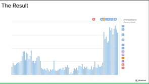
And when they can, like submit idea that you have, they have to have experience when they work with the user then can help us to like pick a better idea, and prioritise them using the framework we looked through and at the end so what you can do is you colour plotter chairs so that you can easily visualise this framework to the wider company and team members, you know. Here is what to focus we're gonna do for this quarter, what will be the important for us? And here's like salary result I've been achieving residency for various Lessing research. Even within the framework when I joined the company six months ago you can see that they've the, the weekly sign up, the user sign up has been realising rolling out the strategy for Hong Kong and they start to do the weekly testing experiments with different like tests results.
And you can see the sun has been increased by at least three times for the past few months now. And not only that, but the speed experience also very important because you can see like before we start running experience like we didn't see any like growth and sign up at all but then what, then when we start you have the experience at least like two or three per week then we can see that there is significant increase in the sign up of velocity.
And you can see the correlation co efficiency is quite high. So I suppose the report 0.9%.
So that means like, with when experience is a part of the habit and the weekly routine it can help you to let have the sustainable and significant growth for company.
And it's also long-term as well.
And to wrap-ups, that's why it's important for any company. You should always like think about user as the car so that all of the team can work well together, the product the growth and the data teams, whatever they do the strategy should ally with, like whether is like impact the user, add value to them. Whereas from acquisition perspective, retention, activation and referral, and to summarise.
So for any startup, any team always start with the objective of what is come heading, where they want you to achieve this quarter, from there you cut the side what qualitative insight and quantitative insight the unit on need to capture if you don't have it and have you start tracking so that in a few weeks time you can have the data to validate your assumption. And from there you start you have like the product roadmap from the product team. And from there, you can start to break down to like what are some of the growth project that can line up with those products? So you can have the productivity launch, the the new feature much better and can allow with a growth initiative as well. And from the, where we can start you run the growth experiment as a happen.
And of course, don't forget about the user on the design overhead.
Think of us as a car, what was the objective to product feature, the project has impacted user which part of the digital journey that you have making impact on and last but not the least so I had to keep like, fine tuning the operation, the process, the frame to make sure that it's working for a company 'cause like on one size fits all for the startup. You have to think of like what framework, what work out the best for you based on the resource, the team the business model and process you have and that's is for today.
Thank you everyone.
(upbeat music)
Everyone is often skeptical about the word “growth hacking”. However, when done right, the marriage of growth with product and data brings sustainable growth to business and meaningful user experience to the customers. How to approach product from a data-informed growth marketing point of view.
The love triangle: Product, Data and Growth.
Albert Mai: Head of Growth – Vero.
Keywords: product team, data team, growth team, prioritization, experimentation, metrics, PIE method.
TL;DR: Albert shares his growth strategy process called PIE (prioritization, impact, ease), an upgraded version of the commonly used RICE growth formula in which he replaces the commonly used Potential metric with a more robust, useful, and measurable Prioritization axis. Albert has implemented the PIE method at several companies he has worked for and achieved compelling results. Albert walks us through the PIE method step by step to break down the reasons it achieves results. By positioning the user at the core of the intersection between product, data, and growth, PIE circumvents common misunderstandings that hinder productive collaboration between these three functions and their teams.
Albert has worked around the world with various startups across a range of industries, from e-commerce to marketplace to mobile apps. He’s worked in Singapore, Vietnam, and Australia. His career history has given him the opportunity to hone various skill sets, from wireframing & landing to SEO to Marketing and product-led growth (the latter of which will be today’s focus).
Let’s start with a love story! There’s a saying: Three’s a crowd. In this case we’re referring to product, data, and growth. Given his background in tech and data and recent work in growth marketing, Albert has experienced a lot of pushback from product teams against growth and a lack of understanding or interest in data. They either aren’t tracking data at all or are doing so inadequately, and consequently missing important information. This means that product, data, and growth teams are not working well together, mostly due misconceptions about what growth actually is.
What Growth is not: Based on what Albert has experienced, growth is not about quick or overnight fixes, random tests that you find on the web or elsewhere, guesswork or Top of the Funnel/acquisition.
What Growth is: Growth is about long term sustainable strategy for the whole team – the product and the company. It should be based on calculated and prioritized experiments based on data. Over his four year tenure at Glamcorner Albert grew the company’s monthly revenue by 45 percent. This is an example of growth. Growth should focus on the whole content lifecycle and full funner user journey, not just acquisition but the process from activation to retention to referral to re-activation. Growth should be product-led and data-driven. Another example of growth Albert created at Glamcorner was growing the returning transaction rate by a factor of 5.4, meaning over half the monthly transactions were coming from returning customers. He achieved this through focusing on retention and UX, not only on the website but across all channels.
Common mistakes that Albert observes in the disconnect between product, data, and growth teams are that:
- Decisions and priorities are based on opinions instead of facts/data; Best practice for someone else is blindly copied regardless of relevance to the product/industry at hand;
- Product and Growth teams are siloed – growth teams are often excluded from monthly product discussions.
- Product teams don’t emphasize data or tracking to the degree they need to from the outset, meaning that down the road when they need certain metrics they have no mechanism to capture them.
- There is a tendency to ignore either or both qualitative and quantitative data.
Some examples: Albert worked for a client whose data files were incoherently organized, leading to a loss of trust in the information as it wasn’t clearly accessible. Another client had been signing users up for over a year into a database without tracking when they joined, missing valuable insight into user behavioural changes over time.
Three’s a crowd. Four’s a solution! If you insert your user at the core of the intersection between growth, data, and product, and centre your strategy around user needs, you can solve the disconnect issue.
Prioritization: How to prioritize features, projects and strategies from a user centred perspective? First, let’s look from a product perspective. Most companies are looking at objectives and the drivers that move them toward those objectives. They track these on various metrics of effort and impact. They use these to get a prioritization score. Productboard , airfocus, roadmunk, and craft are the most popular prioritization software providers. Where is growth being tracked? In Albert’s work, he frames growth in terms of product experiments that can be translated into formats that fit the software models.
Many companies use frameworks like ICE or RICE to come up with prioritization scores, but these are not data driven. They are based on assumptions of researchers, not users. They are also too generic and don’t account for differences between industries or individual companies within the same industry. How to customize this framework to make it more flexible and able to be tailored to various industries and business models?
Albert’s method is to move away from a ‘best practice’ model to defining what each problem is that the product is trying to solve (hypothesis/problem), and a corresponding assumption on why the problem exists and what may solve it, including identifying the point of the process at which it occurs.
In deference to ICE and RICE, Albert calls this method: PIE: Potential x Impact x Ease. Each of these three factors are scored based on the data that specifically inform them:
- Potential is scored according to data from stakeholders/market.
- Impact is scored according to metrics on the platform/device being used, page groups, and user types and stats.
- Ease is scored according to data from dev/design/content metrics.
Then all these scores are processed into a master score which offers a granular, rich, and data informed portrait of the product, instead of a more common story/guesswork approach.
Impact Value: How do you calculate these scores? First you need to: 1) Define Grouping.What group does your startup specifically seek to help, and through what media?
- Page or screen group?
- Device – desktop, tablet, or mobile? IOS, Android, or Web?
- User type:supply vs demand typical of the marketplace? Or editor vs viewer like in SaaS?
- User segment: new vs returning? Individual buyer vs brand? User group/status:
paid vs free. Identify the buckets you want to divide your data into.
2) Decide Key Metrics:
- Views
- Unique visitors
- Conversion
- Revenue
Different companies will use different metrics. Try to get a year’s worth of data to ensure you have a full cycle that isn’t skewed according to seasonal upticks.
3) Calculate Impact Score.To do this, just take the score of each grouping and use the following formula: Value/ Total Value *10. To get the scoring for Potential and Ease values you can crowdsource from your team: Ex: Albert used a card asking employees across the company How would you rate the potential of the following growth ideas on a scale of 1-10? The card lists the following options to be scored:
- Individual case study landing pages
- Vertical/industry landing pages
- ROI Interactive Calculator
- Competitor Comparison landing pages
NB: Both the questions and the answers are generated across the whole company, not just the executive branch. This helps eliminate bias and ensure various teams are part of the process.
Where do ideas come from? How do you decide what you want scored? Define your key metrics. For Ex: Performance and Growth can be broken down into Lagging (ex: signups, form submission) or Leading (ex: Clicks/spend). Product and UX metrics can be quantitative (engagement, retention rate) or qualitative (session recordings, user interviews). Define which matters to you.
Data Maturity. There are a range of software products available to help with this.:
- Basic (e.g. Google Analytics; traffic, impact calcs)
- Qualitative (e.g. Hotjar, LogRocket); heatmaps, user pain points.
- Quantitative (e.g. indicative, mixpanel); behavioural data, validation of assumptions
Dashboarding (e.g. Grafana, Google Data Studio) - Business Intelligence (e.g. mode, looker). These two are about democratizing the process and getting input from your whole team.
Feedback Flow: Think about feedback broadly. Many teams overly focus on Onboarding and Activation feedback, but tend to miss feedback you can glean from marketing sites that caused the activation in the first place. When product and growth teams are sharing feedback the result is a more cohesive experience for the user and minimizes potential for user overwhelm from repetitive pitches asking for feedback.
Crowdsource ideas: At Vero, Albert made a simple form to send to teams and users soliciting their ideas. This data can then be taken and put into plotted charts accessible to the whole team so that they can see where priorities are for testing
Results: Over the past six months, Albert has implemented weekly testing to try various strategies and achieved excellent growth results, tripling the number of user sign ups. The speed of the experiments was key here; the data shows a high correlation between signups and the number of experiments being run. This is a sustainable strategy for long term growth.
The Love Triangle (Revised): The takeaway here is that all companies should put the user at the core of what they are trying to do. Doing this allows product, data, and growth teams to align their strategies around user impact across all stages, from acquisition to activation to retention to referral.
To Summarize: Start with objectives. Where is the company heading and what do you want to achieve this quarter? From here, determine: what qualitative or quantitative insights you need to capture to achieve this objective? If you don’t have the data to track and validate your assumptions, implement it. From that data you can plot a product roadmap that will inform future growth projects and initiatives. Once these are mapped you can start running growth experiments as a regular habit which in turn generate a feedback loop back to the insights phase. All of this should be framed against the user journey and user needs/impact. Regularly revisit and fine-tune your ops, processes and frameworks according to the insights you glean from experiments to ensure your processes are aligned with core mission. This is particularly relevant for startups: the results of your data will lead you to create the right framework. Ultimately your success will be determined by your team, your processes and the models you are using and how well they align.