Super Hero Layouts
(lively digital samba music) (applause) - Projectile vomit was an interesting phrase to start my talk with, but I guess if I can deal with my daughter doing that as soon as we arrived here in Melbourne, I can do this talk pretty well too, then.
So Irwin spoke a little bit, at the start of the conference, about history of the web.
That was a really interesting sort of dive into that, and I'm gonna go into a slightly different history now, in the history of comics.
So we were first introduced to the superhero archetype in the Golden Age of comics.
This kicked off around 1938.
The Golden Age introduced us to Superman, Wonder Woman, and Batman.
During the Silver Age, the world is recovering from a world war, and readers have matured, so writers meet that maturity.
Stories focused on horror, crime, and romance become popular.
They essentially helped this comic industry to survive through what is a tough period in history. After the Silver Age used many of those stories that the writers could think of.
The Bronze Age instead, tackled social issues of the day, and this included bigotry, racism, and substance abuse. Those were sort of the focus of the stories during this era. And then the Modern Age.
This is a time of redesign and growth, but also disruption by the web.
Anyone can now publish, bringing more sort of unique stories, and making comics more accessible than they ever were before.
And no longer was it about two major players in the industry.
So I think what makes comic books an interesting storytelling medium is that, along with great characters, stories, and art styles is the impact layout can have on the story itself. In the early ages of comics, that maybe wasn't the case. Layout didn't play a huge role in that storytelling. But we're going to explore each of the age as it relates to web layout, and how CSS Grid, and other web technologies can be used to recreate some of these layouts that we've seen in popular comics.
Now even though the focus here, all the examples are comics, right? As you're looking at them, though, consider how they can be applied to the projects that you're working on.
It's not specific to this medium, just what I am using. So each of those ages we just went through have a combined duration of around 70 years. So 1938 through to about today.
So 70 years is a decent amount of time with which to evolve a storytelling medium. Back in Paris in our industry the web is relatively young. HTML is 26 years old, and CSS is just 22 years old. So that makes me older than CSS and HTMLs.
Thankfully not both of them, but that's not a judgement if you are.
The web is, after all, young, so so are you. Actually in Irwin's talk, I learned that I'm about as old as an anchor tag, so that's fun.
I thought, actually I'm gonna do it anyway. I thought of a dad joke while I was listening to that, 'cause I'm a new dad.
I have to practise these things.
You could say that we're linked now.
(audience laughs heartily) Ha, very good.
That's all right.
I'll take it, I'll take it (chuckles).
The point that I'm getting to here, is that in a relatively short period of time, layout on the web has gone through many ages of its own. We started with HTML.
It was just the content on the page.
From there, we started to repurpose tables in a way that they weren't really meant for.
We were putting all of our thing in there, nested layouts, and that came with its own problems. The first of our comic book crossovers is Flash, so we were relying on proprietary software here, but it did gain us a lot of creativity.
We've dabbled in absolute and float position layouts, and we've gone through a long period of responsive design, so making everything available from mobile phones, right through to tablets, desktops, giant screens, and to borrow a term from Jen Simmons, I think we're now heading into the intrinsic era of design and layout.
So all that in around 26 years, less than half of that of our friends in the comic industry. And it can be really tempting to bash layout on the web. You know, how hard is it to vertically align something, is a common one that we've always given.
But it's amazing how far we've progressed with the layout. We can certainly appreciate what we do have now, when we consider where we have come from.
So is the current age going to be considered the web's modern age? And I think we agreed that will be the case. But before I jump into anymore of that, as John said, my name is Anton Ball.
As you know I'm older than HTML and CSS but together. So that can give you a bit of an idea of how long I've been playing on the web.
Developer at Seven West over in Perth, so we work on 7News, The West, PerthNow.
Those last two are a little Perth specific, but you've probably heard of the other ones. Now you can find me on Twitter @antonjb, and originally I started my career in graphic design, but transitioned to development with a particular focus on front-end for the majority of my career now.
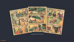
And perhaps superfluous information, but I've also read a lot of comics in that time. Less so now with a child, but I've enjoyed them in the past. So we'll jump into the first age of comics. Well the most important comics in history is Action Comics Number One.
It's released during the Golden Age of comics, and what makes this comic important in the history of all comics, is it's the first introduction of Superman, so that is him there holding the car.
Now he's evolved a lot over time but it's still quite an iconic design.
You would recognise it anywhere.
The layout throughout the comic, and others of the Golden, we're gonna put Silver Age into this as well, consisted mostly of squares and rectangles. If we look at a few pages from this comic, we can see that layout pattern in use, just the squares and the rectangles.
But as we're focused on layout, I'm gonna strip out the artwork here and see what we are left with.
So the pattern was about one to three panels per row, staggered throughout the page, with a somewhat consistent gap.
I say somewhat consistent because, I think printing in 1938 couldn't quite get the pixel perfection that we're used to today, so somewhat consistent.
In terms of CSS Grid, this is a nice starting point example for us. You might think it's as simple as say, setting the Grid template rows to repeat three one fraction, but if we want to achieve that staggered effect we need to think about it just a little bit more. So the way that I calculated the comics was to figure out the smallest panel that was gonna be on the page.
So in this case, that would be 36.
You're probably not gonna have one that wide, but that's just the widest possible one, or sorry, the smallest possible one that we could have. And then divide that by, so divide the maximum side, 576 by 36, the smallest panel, that gives us about 16 columns that we're gonna need to recreate most of the layouts from this era, from this comic. And that gives us the same ratio importantly, as the printed version.
So putting that into code terms, we have comic which is our container.
It has display grid on it, and our grid template columns, repeat 16 one fraction, and our grid gap is a little more consistent now at 12 pixels.
We haven't needed grid template rows in this example, because we can rely on the implicit grid to handle that for us.
So what do I mean by the implicit grid? If content is out of the force, outside of the defined grid, so that first row, grid will automatically add new tracks to contain that content.
So by default those grid tracks are automatically sized. So wherever the content is that will size to that. But you can set a size of the tracks using grid-auto-rows and setting a value, so that could be fraction or other units in there. For the purpose of our demo, though, we're gonna leave it as auto, as I want that track to be repeating each time. Okay, each of the panels can then span the number of columns that we require. So panel one is spanning six across, panel two spanning five, and so on so forth until it fills out that whole comic.
So there we go.
We have started a comic layout and we have only a few lines of code.
Now the staggering is a nice touch to avoid our layout being too symmetrical.
But it isn't much code for a lot of possibilities. But we probably aren't feeling very much like superheroes just yet.
So the layout in Action Comics One doesn't play a huge role in the story itself, something that I was mentioning before.
It's being used as a container for the artwork and that was about it.
Moving forward to the Bronze Age though, brings with it, a change in how layout could become a part of the story.
Spider-Man number 121 is released in 1973 and it's considered a pivotal point in his sort of story arc.
Now I hope this isn't a spoiler for something released in 1973, but it's the death of Gwen Stacy, a death that at the time, in comic book world was permanent. Now everyone comes back now but it was significant at the time.
So what's great about this story, along with the moment, artwork, and characters is the way the layout was an integral part of its telling. The height of the bridge and the fall itself, is shown beautifully through the spanning panels. You wouldn't feel that sense of height and danger if the layout was the same as our previous example from Action Comics.
So even though this is a great moment, not for Gwen but like a great (audience laughs), a great moment in the world of comics, in terms of storytelling.
So let's strip out the artwork to see the layout pattern that's in use.
So the big difference is it's panel spanning multiple rows. This is one of the areas where Grid has give us a sense of a modern layout.
No longer are we constrained to a single axis like we have been before.
Now determining the columns was done the same as our previous example, and turning that into code we get the following: our comic again, display grid.
This time we've got 23 columns, instead of the 16, and we're still able to rely on the implicit grid for sizing the rows, because Grid will fill in the blanks for us, even when panels span multiple rows like it's doing now. Right, so our panels are added.
Panel one spans nine across, and it spans three down.
That's what's giving it that height.
Panel two, it doesn't do any of that, so we're just spanning it across seven like we did before.
Panel four spans eight and then two, so we got the double and the triple height one of that. So now that we're working a multiple axes, we're able to cover a great many of the layouts during the ages up to Bronze in comics.
Now next up in the journey through the ages is Watchmen. It's famous for many reasons, but one of the reasons is, it's considered to have kicked off the modern age of comics. Watchmen adhered to a strict nine-panel grid throughout it's run: three rows, three columns, that was all they had.
Now so what we covered so far would recreate the entire series.
Now there's a hundred possibilities or hundreds of possibilities for layout in a nine-panel grid, but that's not me advocating for nine-panel grids. I'm not releasing a framework today that's gonna handle all of that for you.
The joy of Grid comes from how easily we can define a grid, and how many possibilities that opens for us. The reason I picked Watchmen is, a panel in particular, one panel that does something a little bit outside of the box with Grid, and I'd like to recreate it.
So the panel in the middle, second row, spans multiple panels.
Also the artwork spans multiple panels.
So we could, in theory, split the artwork up into three and place each one in a grid cell and achieve the effect. But I think it's better if we can recreate the effect while maintaining the image, so not splitting it up.
It'll give us flexibility, so if we need to change the image later, we just need to change the one, or we wanna work with responsiveness, we're just having to align the one image.
So I've got a little bit of setup here for our grid, but our goal is to have the image remain intact while adding the gap.
So the technique, we've got our comic again, and this time we've got columns, and rows, and the gap. Now overlap wraps around panel three, and that's got display grid on it, and it's spanning two across.
We want it to fill the entire width of our comic. Panel three, which is inside of that, goes just one row down, but it goes two across, and the reason for that, is that's where we're gonna overlay our gap a little bit later. This is setting up.
So only direct children of a container become grid items themselves.
So with subgrid through, we can inherit the rows and all columns from the parent element.
And that's what happens here.
So overlap has grid template columns, and it's set to subgrid.
Effectively it's going up to comic, grabbing its value for grid-template-columns, repeat, two, auto, and bringing it down into there.
So previously if you'd had two grids, those values are independent of each other, whereas though now, if the columns in comic grow, then so too will they in overlap.
So let's look at the layout without the image, though, to get a better idea of what subgrid is doing for us. So overlap inherits the columns from comic, applying them to itself.
So if the column grows, so too will it in overlap. But as I mentioned, we don't have to inherit the whole grid, though. So we've independently set the rows here.
So grid-template-rows, repeat three, auto.
So that's independent of the entire grid.
In comic terms, this could be useful say, if we want to align speech bubbles inside of that one panel.
So putting the graphics back, it's time for us to get the gap in the middle. Adding a pseudo-element to the overlap element is the first step, so it's at the content there, and as they're both now Grid items, we can position the pseudo-element on top of panel three. And we give it the outline and property of the same size and colour as the grid's gap. And thus we've simulated the gap in the grid without breaking up the image.
So it was 16 pixels, solid white, and then that does it in there, because you can't, in Grid, sort of make something split up and have that gap visible. So that's ticked our goal of maintaining the image and simulating the grid gap.
And like I mentioned, if we wanted, say for mobile resolutions, we could drop that gap, 'cause it's probably not gonna make much sense at a smaller size.
So that's all that's gonna be doing is removing the pseudo-element without having to realign multiple images.
So subgrid is gonna be a great next step for Grid. Any time you've struggled to align items without setting height across multiple columns, little panels there.
This is one that we often run into.
So say you have three cards, and there's always that one card that has loads of text in it, while the others are almost empty, and you're setting a height in the hopes that things will line up in the long run, and that no one changes the content.
Now a lot of superheroes work in news.
I'm not calling myself one.
Just a a little fact.
A lot of superheroes work in the news.
So we've had this happened on one of our slides. You may have experienced this trade-off when you're working with that.
If you set the height, you run the risk of your content either disappearing or overlapping.
If you set the min height, like in this example, we've got the little dividers running across. You eliminate the other issue, but then when you've got these dividers, they don't line up anymore.
So there's always that trade-off.
Grid and subgrid, instead, will have us covered. If that middle row content grows in any of the cards, they will all grow in unison.
And the advantage over a flat grid setup, is you have the flexibility of expanding rows while maintaining the semantic HTML, being able to wrap each card in the best element. So the container around the outside could be an unordered list, and then each of those could be a list item. Now if you did that with grid now, you're gonna have trouble aligning them all. With subgrid you've gotta inherit that grid down so that it will grow.
We are in experimental territory here, though. The only browser with subgrid enabled currently is Firefox Nightly.
At about two versions time.
I know, it was really exciting and then like you can only use it here.
(audience laughs) In about two versions time of Firefox, they're said to be releasing it, but expect the other browsers to catch up pretty quick, now that it's in there.
Grid is well supported so I don't think this'll be long. So before subgrid is more widely available though, we can create this effect using display contents. So adding display contents to overlap, effectively removes overlap from the dom, in a sense, making panel three and the pseudo-element part of comic itself.
They're all part of the same grid now.
We're losing the semantic meaning though, which is why subgrid is the better option for this. And there are accessibility concerns around display contents.
This article does a good job of diving into that, and it might mean that you don't wanna use it. So in short, some browsers don't announce the elements if display contents is on the parent.
So if you add a display contents on overlap, panel three, and anything else inside of it cease to exist on the accessibility tree, so that's a problem.
That's also against the specs, so there's been bugs raised for this.
Hopefully they'll be fixed, but there's always that time of sort of the older browser sticking around, so keep that in mind if you're using display contents. So it's a next evolution now during the Modern Age of comics where layout gets really creative and interesting. We're revisiting the world of Spider-Man here mainly 'cause it's one of my favourites, but we started to see a new age, a new trend, sorry, in this age of comics.
The Modern Age brought with it, layering panels to achieve a flow in depth that we hadn't previously seen.
Artists were able to focus in and provide little detail elements without taking over the whole screen or the whole page. Now layering certainly isn't new to the web, but Grid enables us to layer in much easier and predictable ways than the previous options gave us. So we'll take a look at the code here.
Up to now, we've relied on the implicit grid, but we're gonna start adding the rows here as well. So we've got our grid-template-columns, and our grid-template-rows.
Now there's a lot of values there in each of those, and that might look a little bit intimidating, but here's how I figured 'em out, at least. Because we have the original artwork, we'll draw on there, each of the rows that we need, and that includes the ending.
So the first panel there, there's that little gap, and then we've got the row, and a line underneath. So we're counting where we need to end it as well. So that gives us nine.
And then the total heights is 985 pixels.
So if we divide 985 by the nine rows that we need, we get 109 pixels, and we're gonna use that as our based fraction unit, essentially.
We're figuring out what the base unit is for our grid. We next divide the height of an individual row by that base fraction.
So our first row there is 291 pixels high.
We divide it by the base fraction of 109.
That gives us 2.6 fractions, that is the value that we used when we defined it. So why do I keep using fractions in here, the fraction units? It gives us flexibility when we need to make everything responsive and maintaining the aspect ratio up to a point.
If your page becomes too wide, Grid, or the fraction units will just grow with the page in either direction.
The CSS spec level two, is starting to introduce aspect ratio units, but we don't have too much there yet.
Repeat that same process and it gives us the column. So that's how I got to those values that we see here. We can then layer the panels over the top where needed using grid-row and grid-column values.
So panel three goes grid-row four to seven. Or sorry, row.
And grid-column five spans one across.
The zed index is bringing it on top of everything else, so panel three, the young lady with the flowers, it comes up on top of everything.
Panel four goes grid-row five to nine, and then grid-column is two to negative two. So you may be wondering what the negative two means here in the setup of all of this.
It's another handy way that Grid's given us to position cells within a grid.
So grid lines are numbered from one to n, n being the total numbers of lines that we have in our grid.
So in this case it's eighth One, two, three, through to eight there.
So our starting line for panel four is two. The lines though, are also numbered in reverse. So negative one through to negative eight.
So if we know we wanna end two lines in from the side. In this case, it's the right, but I'll show you something later which, I'm more just saying in from the side.
We can use negative two.
It will stretch all the way to that point.
So it's useful if you end up adding further panels between say two, and negative two.
Those numbers will change in the middle.
So if we use span or a specific number we would have to update panel four as well. Whereas this case, it will just grow in that size. We don't need to change it 'cause it's still negative two. Firefox's grid inspector is really good for showing this. It shows you the rows, the columns, both positive and negative, and it's a really good way of inspecting the cells within the grid.
So if you are doing some work with Grid, Firefox's tools are great for this.
It's great for getting a real visual understanding of what's happening.
If you're like me, and you like to see it happening, this is a great place for that.
So the Modern Age brought with it prolific use of this layering, and it can be a way of finally breaking out of the boxes that have contained us in layouts for so many years. This is another example, Hawkeye number one, and the web recreation next to it.
So even just adding thick borders to certain images can give the impression of a really unique layout. Not everything has that, and it would be a hard gap to achieve in our thing, so we can just get creative and add some different effects to that to create a unique effect to it.
So layering is an exciting addition to our layout toolboxes, but we do have to consider more than just the layout it has opened to us.
There's an inherent danger when you can position items anywhere on a page you like.
If the source order isn't created in a way that makes sense then you can negatively impact the accessibility of your project.
So for example, screen readers only pay attention to the HTML.
So if we're laying out the project, if we decide that our panel four was better suited up here instead of where we were in the middle, solely changing that in the grid does not change it in the source order.
So it doesn't tell the browser that the source order has changed, and it could therefore let those interacting with sites in other ways, such as screen readers or keyboard users from tabbing and hitting the first, that image instead of the other one.
It's gonna be a confusing experience if you've moved it.
So how can you avoid falling into that trap? Step one is sort of start with the structure of your document.
Set up all the HTML in the source order that you like. Then, create the grid that supports that layout, and then be vigilant.
Like any hero, you need to keep an eye that the accessibility isn't negatively affected by layout changes later.
A good place to start reading into grid accessibility is MDM's CSS Grid Layout and Accessibility article that runs through a little bit of what I just mentioned there, and also links off to some great resources as well if you're interested.
Okay so, a common criticism of web design and layout is that everything is within a box.
Sometimes this has been referred to as bootstrap layouts.
There have been techniques that have allowed us to be efficient at the cost of a bit of creativity. So, so far what we've created have also been boxes, even though we've done some layering here, it's all still very boxy.
For comics though, boxy layouts started to change during the Modern Age of comics.
That is quite dark.
Characters broke out of their boxes and storytelling, once again, evolved.
This is a nice example from Phoenix and Jean Grey number 16, plus the web recreated version next to it.
Fundamentally, inside our version that we're gonna make here, everything is still within a box.
You can't have a grid area that isn't a box shape. But, with some new techniques, we can start to get a bit creative, and give the illusion of almost any shape we like. So Clip-Path is gonna be our best friend here to recreate these layouts, but let's get the browser support part out of the way. (audience laughs) I was so happy when keynote had that animation. (audience laughs) So we've lost Edge, and we've lost IE.
Now IE isn't gonna change.
Updates aren't being created for it any longer. If you need to use these techniques you'll have to consider alternatives.
That'll probably be more around the layout than anything else.
Edge, on the other hand, as we've heard, is in the process of swapping to Chromium, so it'll be soon.
It'll be back in this list soon.
So getting started with our example.
There's a little bit of boiler plate again, that we have to set up.
The container of comic is gonna hold everything in place. It's positioned relative and overflow is hidden because we're gonna do some rotating on our grid inside of that.
So we then, the panels of the grid have a column for each of the five panels of the layout, and you're right to wonder why only two of the image here are visible. It's 'cause they're overlapping, and the other images have harsh angles on them in the source material, that aren't gonna work if each panel is in its own cell in the grid.
So if we kinda flip that on its side, grid lines can only run straight, essentially. So where we've got images on angles, we've put them both overlapping in the grid, and then our clip path is gonna create that angle for us. So Grid doesn't create the angle.
We're gonna do that there.
Grid is helping us to position it.
So our panel's container is then rotated.
Using absolute positioning, we've sort of put it down and then transform rotate 20 degrees, and translate it so that we've got it on that same angle that we wanted from our other one. It's time now, to get the shape of the panels, and this is where Clip-Path comes in.
So Clip-Path code looks a little bit like this. When you add the Clip-Path rule, in this case we're using polygon, each of those pair of comma-separated values are the X and Y values.
So we have zero to 18, 20 20%, 78 71, so on so forth, making our shape around the image. We now apply that to each of the panels and we've started to get the shape from that comic. So the Clip-Path polygon we've got each of those there on those panels, panel one and two, and those are the values that we used.
If you are wondering how to calculate these values, Firefox has given us a great option here to work with them.
If you go into the dev tools, and there's little button there on your Clip-Path and you click that.
In real time, oh, stars wasn't a good option. And if you double-click on that you can add more nodes, and start to drag them around.
This is probably much more visible on the LCDs to the side.
But in real time you can drag the pathways and essentially create any shape that you like. So it's a handy way of visually doing this. You don't just have to sit there in the developer tools and press up and down until you kind of get it to.
Totally valid option, now I've definitely done it in this, but you don't have to do that.
You can, well it's like a UI way of doing it. Just get the values that you need, and it is giving percentages so it's not too bad. So achieving the white border.
I add the same Clip-Path to the image inside the panel. The panel now has a white background on it, and I transform the image down a little bit so that we can see it.
And then you also need to use transform origin to position that, because the shapes aren't quite uniform anymore, so you need to sort of find the new centre of the image. That's why the transform origin's on there. The down side of this technique is you are setting the grid gap manually.
Now as I mentioned, Grid can't do those angles where things are overlapping.
So you need to be accurate if you do decide to create layouts like this.
But there we go.
We've created the shapes from that comic and made a fairly unique layout from what we are used to seeing now.
And if you haven't seen it yet, the code panelling for all the examples are underneath, but I'll have a link at the end as well that highlights the CodePen collection so that you can have a look at everything.
So Clip-Path is no doubt a powerful tool when you combine it with Grid, and I wanna look at another example.
This is Detective Comics number 876.
Taking the grid layering and path from our earlier examples, we can create this same layout.
The drawing is perhaps a little more intense. There's a lot going on.
It's the layout in the background though, that we're gonna focus on.
I don't have the budget for Batman images, so we're doing the city, and we're doing the squares coming down.
The shapes can be created by adding perspective and rotating the panel.
So panel one has perspective applied to it. We rotate in the X, Y, and Z axes.
That's what gives us that slightly offset shape. So we can now have the border.
If we use Clip-Path, and to get this shape, we lose the border because we're cutting it off. There is a problem though that you're likely seeing here is that we can see the panels in the background when they overlap.
This is where we use Clip-Path to solve it. Adding the Clip-Path, we can cut out the part of the panel that we don't want anymore. With each of the panels done, it gives the appearance of an almost solid border wrapping around the entire layout.
And I think it's a nice effect if we compare that with Detective Comics like before, it's another unique layout that can be tricky creating in our current sort of set of tools. So Clip-Path isn't limited to just polygons. So this is an example from Flash with our recreated version alongside.
I couldn't really find images that fit in those weird circles, so we're just going full cat.
This one up here, I particularly like what's happening here.
We've got a sort of two-faced cat goin' on. Fits with the thing.
So there's a bit of layering here which makes it look complex at first, but when you break it down, along with Grid, there are three Clip-Paths being used.
We've covered polygon already, so we've hopefully got a good idea of that, but another option is ellipse.
So if we can set the first two values at the radius, so you can get a more oval shape with this, and the X and Y are laid to offset that from the middle, that when you add the path, it will be in the middle and you can move that around.
Circle is for more uniform shapes.
Similar to ellipse, the first value is radius, followed by the X and Y values, if you need to offset.
So Clip-Path affected the shape of the container, but we can also have text react to the container shape using CSS Shapes.
We're back (mimics rushing air).
So we've lost, it's about the same as Clip-Path, right? We've lost IE.
We know that that's not gonna change.
Edge, hopefully coming back soon with the changes that they're making with Chromium. If we look at a panel from Saga, this top panel there, and if we sort of exploded it out, we can see the text wrapping around the planet. This has been fairly, something you've probably seen in magazines before. It's a bit more common in that realm.
It's been absent though, from the web, for quite a long time.
We haven't had an option, or at least a simple one, of doing it.
So adding that into our grid, it's a little bit of a simpler grid here, but the paragraph is sort of moved over a little bit with the margin left, and the margin top, and we give a width to it.
That's setting it into position.
The image is floated to the right, the planet, sorry.
It gets dimensions, and the important part is shape-outside.
Now we've seen circle from our Clip-Path, so the values in there are the same.
Again, Firefox has been helping us developers out with their dev tools.
If we click that same button, we can, in real time, start to resize and change the shape of that, and see the effect that that can have.
So we can fine-tune it in here.
I think I'm really loving seeing what Firefox's developer tools are creating for us. It's fun to look at the network panel and do a performance audit, but it's nice to also have tools that are being available for creative coding as well, stuff that makes it a little bit easier to do something a bit more creative in that area. So with these tools, we can start to create complex shapes for our text to wrap around. I've brought the cat back, and we can use polygon to draw a shape, and the text will start to react to that shape. Something that wasn't in Clip-Path that is part of shape-outside is image masks. So, oof, it's basically the outline of the cat's face up there, just in case it's not quite visible.
Adding an image with an alpha area, gives shape-outside enough information to be able to work around the image there.
So it's set much the same way as you would set a background image in CSS.
You do have to be careful of core, so you can't just go off and link to any old image. It needs to, I guess, fulfil the core's requirement. What we have created is a great example of the modern web, but it is based on western comics structures and styles. So that means reading left to right, top to bottom. That structure isn't the only comic structure that's available though.
For instance, Japan has a healthy industry with their manga comics.
I've been a particular fan of Naruto the anime for a while.
So it's fun that I get to just randomly throw it into a talk.
But this is the same page from the manga in Japanese and English.
Now even when it's translated to English, it's going right to left, top to bottom.
Essentially opposite of what we've been looking at now. Again, we could position the cells in the grid just in the way that we visually wanna get that, but if you remember from what we've talked about before, the source order is going to matter.
So when we're setting this up, we put it in the source order that's correct. So the first image, the second image.
First image is Naruto upside down, second, third, fourth, fifth, sixth.
So that's the order that we're gonna put it into then. Now, when placed into the grid with the left to right direction set it will be what probably a lot of us are more accustomed to.
Left to right, top to bottom, one, two, three, through to the rest.
Grid though, has us covered here.
If we just add direction right to left, everything is automatically flipped the other way around. We now have one, two, three, four, five, six, the opposite of this, if you're used to that sort of reading style, the correct reading style.
Now it's more likely that you'll have this on the HTML element, but Jason is doing a talk a little bit later on internationalisation, so he'll do a great job of covering some of this as well.
All the interest in the Naruto comic, is you'll notice the difference in gaps between the rows and the columns.
So I mentioned before that we can be more precise now than the printing of that time, but if you do wanna get creative there, you can independently set the row or the column values for the grid gap.
So two ram's the rows.
The one ram is the columns.
Also worth noting in the manga version si that the text runs vertically, right to left. In English, left to right, and how I sort of read. Now I'm going to attempt to write Japanse, because I don't speak it and I would be worried about what I would end up putting on the screen.
So what I've done is just put vertical text in there. Writing-mode, vertical right to left, and that will do it there.
Now if you use the logo graphic character said, such as what Japanese would be, it will stack correctly.
Again, Jason's gonna cover a lot of this stuff in his talk better than I can.
I'm not actually sure why it does English like that way and not like the sort of, the way that I would have expected it to be, but it does.
So if you know you can come and let me know after (chuckles). So that brings us to the end of our journey through ages of comics and how they can be brought to the web.
I mentioned at the start, that although these examples are for comics, think about how they can be applied to what you're working on now.
I hope the various effects demonstrated throughout the talk have sparked ideas, and I'd love to see where people take this beyond comics, and into the everyday products that you're working on now. We've been in the layout boxes for quite some time. So I imagine when you apply these layouts to what you're working on, great things will happen. That's why I believe we're now in the modern age of layout on the web.
CSS Grid gives us great new powers of flexibility in layout.
We saw how we could stagger our content to avoid being too symmetrical in that design. Layering our panels to give depth and interest in different ways.
The coming CSS Grid spec level two, gives us the ability to align better across Grid and maintaining semantic markup.
Getting a little more creative, and breaking outside the box with CSS Shapes, Clip-Path, and shape-outside, and making our projects as accessible to as wide an audience as possible with Grid's great support for internationalisation. To keep with the fame of comics, and borrow from the great Uncle Ben, "With great power comes great responsibility." Always when you're working on projects, factor in accessibility, usability, internationalisation, and your user's core needs. While I and what the other speakers have shown, and throughout the conference so far, is all amazing and worth researching and exploring with. If it isn't accessible to your audience, then you've perhaps used your powers for evil. Given you're here today though, I'm sure that's not the case, and you'll all be champions for good, but just in case.
Speaking of heroes in the land of layout.
This talk was inspired a lot from the work of some other great developers.
Just because I am the one standing up here doesn't mean that I didn't get a lot of help from a lot of different people.
Rachel Andrew and Jen Simmons have both been sort of champions for Grid for a long time, and this is both of their Twitter accounts, if you aren't following them just yet.
Rachel's Grid by Example is a great resource for seeing how Grid layout can be used, and it's been updated now with subgrid examples as well. And Jen Simmons' labs site is really useful for seeing both Grid layout and different examples of CSS Shapes. So if you're interesting in the code examples I've been showing, you can find them at this CodePen Collection here.
I can see some phones up, so I will ever so slightly to delay.
But, if the robots work correctly, It should be Tweeted from @antonjb in about a few minutes. If it works.
So Stan Lee had a famous catch phrase he used when he's signing off letters and it was, "Excelsior!". So to be a great hat tip to him and what he has done for comics, and likely many creative industries if you've ever seen. He would have inspired a lot the creative industries. After looking up its meaning, though, I think it is actually a fantastic way to finish this talk. Excelsior stands for ever upward.
Take what you learn today and from yesterday from all the talks, and the general theme has been push the web upwards.
You could also say forwards.
Whatever you like.
So, thank you.
(audience applauds) (lively digital samba music)
Modern CSS layout techniques opened a world of possibilities. Layouts previously thought impossible become possible. A great way of mastering techniques is through play, so I turned to one of my favourite hobbies – comic books.
Taking well known layouts, how could they be built in a browser? There’s uneven shapes, ever changing layouts and compositions? This talk is going to dive into modern CSS layout techniques to recreate elements of comic books with CSS Grid, writing mode, CSS shapes and more. Come along to see CSS layouts at play.
(Lots of code demos: https://codepen.io/collection/DjwRaP/)
Comic books had ages that lasted for many years, going through gold, silver, bronze and modern over a total of 70 years.
Layout on the web has gone through many ages very rapidly:
- HTML only, including abuse of tables
- Flash – while there were issues it did allow a lot of creativity
- CSS with float and absolute layouts
- We are now heading into the intrinsic layout era with flexbox and grid
…all of that in just 26 years.
Anton has built a lot of websites and read a lot of comic books…
Action Comics #1 is an important book in comic history as it introduced Superman. The layouts of comics through this era were very much rows of rectangles. Each row would have 1-3 panels and reasonably consistent space between them. For CSS grid this derives a 16 column grid.
Moving forward in comic book history to Spider-man #121, the layout changed to use vertical panels to convey the drama of a fall from a bridge. This broke away from the row-based model.
Watchmen #7 is considered to kick off the modern era. Until that point they had stuck to the nine panel grid, but in this issue they started using tricks like an image that spanned full width, with panel gaps overlaid.
We can use subgrid for this and use pseudo elements on the overlay element to create the visible gaps. News websites can use this a lot to display a set of tiles with equal-height elements even when the text length changes a lot.
Subgrid is awesome! But it’s only in Firefox nightly at this point. But it should come through quickly in the other evergreens.
We can create the same effect with display:contents, but beware of accessibility impacts.
The tour of CSS layout via comics by @antonjb is absolutely fascinating. Breaking out of the grid using grid makes for some very unique layouts. #code19 pic.twitter.com/ERqE4Ru9mM
— Phil Nash @webdirections #code19 (@philnash) June 21, 2019
Spider-man 2018 #9 introduces a very detailed, layered design. This is more complicated in Grid but is still derived by the basic process of working out how many rows you need, then calculating the base pixel size within the overall space, then you can derive fractions from that. There can be a bit of work to figure it out but if you are methodical it will work out.
Firefox has an excellent grid inspector that reveals the rows and columns; and the positive and negative references.
The modern era of comics did a lot with layering and it gives rich design opportunities, but you do need to be very careful to set up a logical source order so it doesn’t become a confusing jumble for users with assistive tech. The tab order of the page is a good way to test the basics of this, people will expect to tab to things in a logical order.
Reference: https://developer.mozilla.org/en-US/docs/Web/CSS/CSS_Grid_Layout/CSS_Grid_Layout_and_Accessibility
There is a lot of criticism that web layout is still putting everything in boxes. Comics also broke out of their boxes in the golden age, using geometric and curved shapes to really get away from boxes.
@antonjb teaches us CSS layouts using web comics, which is brilliant! #code19 pic.twitter.com/u31EJF7cA5
— Diana MacDonald (@didoesdigital) June 21, 2019
CSS can use clip-path for this. IE11 won’t ever get this; and we have to wait for Edge to move to chromium. Grid lines can only run straight, so we have to layer the images to get them into the page. Then rotate the panel container to add angles. Finally we use clip-path to create the irregular shapes. You can do this manually by setting the x/y coordinates of polygons; or use Firefox which includes a visual tool. To add the border, use a transform to scale the image down; and nudge the transform-origin to align correctly – this reveals the white background beneath.
Detective Comics #876 has a spiralling fall illustrated with a sequence of rotated panels. In CSS we use transform and clip-path. But clip-path isn’t just for polygons, it can create curves as well with ellipse.
CSS Shapes are useful to layer text into these layouts – again IE11 and Edge are gone at the moment… and again Firefox dev tools has a visual tool to visually adjust values and see the effects. You can also use shape-outside and a masking image to set irregularly-shaped text.
What about non-western comics/manga that read right to left and top to bottom? Grid can be sorted out with dir="rtl" (right-to-left) and writing-mode.
Our layouts have been stuck in boxes for a long time, so it’s exciting to have so many options to break out of that while still being able to maintain a11y and i18n.
With great power comes great responsibility. – Uncle Ben
Use your powers for good. Excelsior!
…
Resources