Select it! Styling new HTML UI capabilities
Introduction to Brecht De Ruyte and CSS Day
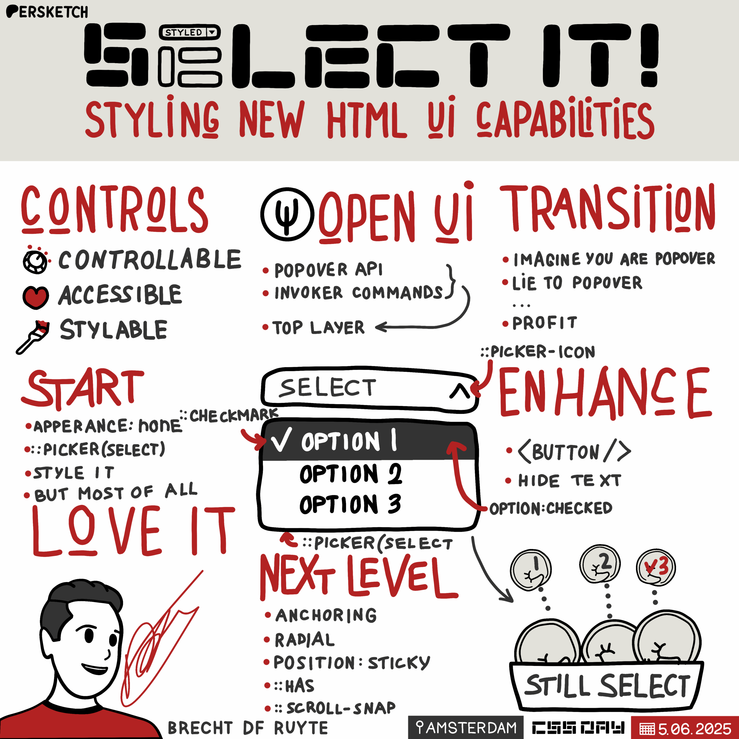
The session begins with an introduction to Brecht De Ruyte, highlighting his work with CSS and his blog, utilitybend.com. Brecht shares his excitement about attending CSS Day for the sixth time and introduces the theme of his presentation: love for CSS and user interfaces. He emphasizes the importance of UI being controllable, accessible, and stylable, setting the stage for a deeper dive into the Select element.
Foundations of UI and the Select Element
Brecht discusses the foundational aspects of UI on the web, focusing on HTML form elements like the Select element. He notes the challenges of styling these elements, which often require JavaScript libraries, and highlights the trade-offs in styling, accessibility, and performance. Brecht introduces the idea that styling UI should be managed in CSS and hints at improvements in this area.
Introduction to Open UI
Brecht introduces Open UI, a W3C community group aimed at allowing developers to style and extend built-in web UI controls. He explains the mission of Open UI and its role in enhancing rather than replacing current web UI. Brecht outlines the process of how Open UI works with browser engineers and developers to standardize UI components.
Examples from Open UI: Popover API and Invoker Commands
Brecht showcases examples of what has emerged from Open UI, such as the Popover API and Invoker Commands, which allow for creating interactive elements with HTML and CSS without JavaScript. He highlights the full browser support for these features and their potential to enhance web UI design.
The Top-Layer Concept and Transitioning UI Elements
Brecht explains the concept of the top-layer, a mechanism that ensures elements like popovers and dialogs remain on top of the document flow. He discusses how CSS properties like '@starting-style' and 'transition-behavior' enable smooth transitions for elements in the top-layer, illustrating with examples of popover animations.
Styling Select Elements with CSS
Brecht delves into the styling of Select elements using CSS, highlighting how developers can now opt-in to style these elements while maintaining backward compatibility. He demonstrates basic styling techniques and introduces pseudo-elements like '::picker-icon' and '::checkmark' to enhance the visual appeal of Select elements.
Advanced Styling and Customization of Select Elements
Brecht explores advanced customization options for Select elements, including adding images and creating visually engaging designs. He demonstrates how to use CSS to create unique Select elements, such as a Poké Ball-themed selector, and discusses the potential for further customization with features like 'selected-content'.
Creative Experiments with Select Elements
Brecht shares creative experiments with Select elements, such as a radial select using anchoring and a sticky position select. He showcases how CSS can be used to create interactive and visually appealing Select elements, emphasizing the importance of experimentation and creativity in web design.
Exploring :has() and Scroll Snapping with Select Elements
Brecht discusses the use of the ':has()' pseudo-class and scroll snapping to create dynamic Select elements. He demonstrates a Monster Hunter-inspired item selector and explains how scroll snapping can enhance user interaction with Select elements, while also addressing accessibility considerations.
Future of Select Elements and Open UI Involvement
Brecht highlights ongoing developments in Open UI, such as multi-select capabilities, and encourages participation in the community group. He emphasizes the importance of breaking and testing new features to improve web standards and shares his belief that beautiful UI can have a positive impact on users.
Q&A: Mobile Compatibility and Transitioning UI Patterns
In the Q&A session, Brecht addresses questions about mobile compatibility and the transition period for adopting new UI patterns. He discusses the challenges of integrating new features into existing design systems and the potential for design systems to adopt these enhancements in the future.
Q&A: The Role of AI and Future of Web Development
Brecht discusses the role of AI in web development, highlighting its potential as a tool for enhancing productivity and addressing mundane tasks. He shares his thoughts on the future of web development, emphasizing the importance of specialization and the potential impact of AI on coding practices.
Conclusion and Final Thoughts
In the concluding remarks, Brecht encourages the audience to embrace creativity and experimentation in web design. He emphasizes the importance of having fun with web development and creating unique and engaging user experiences. The session ends with a reminder to love what you create.
Brecht De Ruyte has one of the hardest to pronounce names for an American and actually for anyone. But what's interesting about Brecht is we've seen creative development today, we've had a more philosophical discussion, we've had kind of quick prototyping and seen some fun new things that you could do with CSS. But a lot of us in our day jobs are doing kind of normal work with CSS and Brecht is one of those people, he works at IO, who's one of our sponsors by the way, and using this stuff on a daily basis. He also has a blog - @utilitybend.com yeah, and - so very interesting to read, and he's going to tell us some things about Select today and I hope that we'll have some solutions to that dirty little secret that we have. Please welcome Brecht De Ruyte. Thank you.
Thank you for that beautiful intro there.
Hi everyone. It's my sixth edition of CSS day that I'm attending. Would you believe it? It's the first time standing on this stage though. It's a real honor. Also a little bit strange to be honest, but I've always loved this conference because it's a conference where you can feel a lot of love, a love about one thing, a love for CSS.
Look at that beautiful shiny new CSS logo out there. Isn't that amazing? It's about time we got rid of that level three badge, right?
So nice to see. It's going to be the universal theme for my presentation - love. Not just a love for CSS, but also a love for UI - User Interfaces.
I love me some good user interfaces. And some people have seen presentations of me and I like to talk a little bit about the foundations of UI. Now there's hundreds and thousands of articles out there, but I kind of want to narrow it down to three main pillars for today. I believe that UI should be controllable, it should be accessible and it should be stylable. Now, this might be true for our users, but this is also true for us as authors, as developers, as designers, as students.
There are a lot of common UI patterns out there. I am not going to do the whole hand raising thing today, but maybe just this little one.
Could you please raise your hands if you ever had to implement one of these before? It's a very easy question, right? Of course you did. These are HTML form elements and look at them. Look how beautiful they are.
Each and every one of those is controllable. They are accessible.
Not each and every one of those is equally stylable, I'll give you that one.
But still, they are beautiful in their own way. And the foundation of UI on the Web. And today particularly, I'm going to talk about that little fellow out there, the Select element.
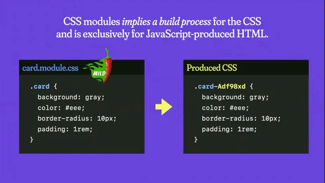
So when we wanted to style this kind of experience, we usually had to rely on libraries. More specifically JavaScript libraries.
There's a whole jungle of these libraries out there, and while you were going on your little library hunt, you might have been looking at one library and thinking, hmm, is this library controllable?
Can I make this library do what I want it to do?
But you might be going a bit further, looking at a library, wondering: Hey, is this library accessible? Does it work well with assistive technology? Does it well with keyboard navigation? If you're asking that question, you're probably already asking the good question.
And last but not least, is this library stylable?
Can I fit the branding of my client inside of that UI?
Now, a lot of times when using libraries there are some trade offs. One of them - styling. I can't count the amount of times that I actually had to use Important in my CSS just to overrule some inline styles set by a library. A lot of times. Or how about accessibility becoming an afterthought? I've seen countless of examples where the keyboard navigation is way off, where screen readers pronounce things that just that don't make any sense anymore.
But then of course we also have performance. We keep just piling up library after library after library. It's making our pages really heavy. Just because you want to style something, just because you want to style UI. And I think that was fundamentally wrong because styling UI should belong in CSS, period.
But I am here to tell you today that things are getting better and I believe that it's about time too.
You already had the intro about me, so I am Brecht, probably a very hard name to pronounce for most people and I'm a front end developer and I go by the handle utilitybend.com and I work at IO and I'm standing as a proud employee here because they are a sponsor to this event. So really cool, really happy about that.
Besides that, I'm also a Google Developer Expert on Web UI and CSS which has been an amazing and inspiring journey. I get inspired by so many people out there and I hope - and I'm almost sure that I'll be inspired by many of you by the end of this conference.
I didn't actually become a Google Developer Expert because I'm a natural speaker. I haven't been doing this for a very long time. Maybe you can tell, maybe you cannot. But it was because I write.
I write on my own little blog, utilitybend.com, where I write about a bit, a lot of things. I write about UX, I write about accessibility, but most and foremost I write about CSS.
Because CSS is the most beautiful language on the Web, right? Yeah, you only got that reaction at CSS Day, right?
Besides that, I'm also a big fan of W3C community groups.
A few people from the W3C here - thank you. I think these groups are awesome.
One of them is CSS Next. A lot of people here from that community group, but that's not the group that I'm going to go on about today. Today I want to talk to you a little bit about Open UI.
Can I maybe qUIckly ask who has heard of Open UI before?
Wow, interesting.
So they have a very clear mission statement. I think it's one of the most beautiful sentences ever written. Open UI will allow web developers to style and extend built-in Web UI controls.
Now a room full of CSS people. Do you want to style and extend buIlt-in web UI controls? Yeah, you probably do.
One thing though, it's not about replacing current web-ui. Cannot really do that, cannot really remove something, cannot really break the Web. Can't be done, but we sure as hell can enhance it. And that's what it's all about.
Okay, so that's the mission statement, but what exactly is Open UI?
It's a W3C community group. It's an open group.
Anyone can join this. Whether you're a front end developer, designer, student, browser engineer, as long as you're nice, it's probably the only thing that matters. And we do research around the different parts, states and behavior of current UI out there because of a lot of the things that were created are affordances.
Then we try to map their common ground where we want to see these things standardized in HTML. So we write explainers for that.
Now, long story short, these explainers then get picked up by the HTML and CSS working groups where later they can be turned into specs.
That's like in a very short story about here. There's a lot more nuances and things going on there, but that way new web standards get kind of born - through this small incubation group.
So I think before I go to the main dish of the Select, I kind of want to show you a few things that came from Open AI. Maybe some of them ring a bell to you. Maybe You've heard of the Popover API?
Yeah, see some people nodding there? That's awesome. But this is actually so cool. Look what you can do nowadays. With just HTML and CSS we can create these popover systems where everything is starting to pop on our screen and we don't even need JavaScript for it anymore. This is not a tutorial on popovers, but I just want to highlight how awesome time this is. This is so amazing. Another thing about this is that this has full browser support. "Auto" and "manual" is currently available in every major browser, with a new variant - "hint" now hitting Chrome and Edge. So a lot of exciting stuff to come.
What also came from Open UI are Invokers or Invoker commands.
There's a lot to Invokers like custom commands, etc. But I want to highlight one thing that it also gives you the possibility to open dialogues with just HTML, which I think is really awesome. It was needed. If popovers can do it, why should a dialog not be able to do it? Now it can.
Invoker commands are not that available yet, but they are available in Chrome, Edge and Safari Technology Preview, so it's getting a bit of traction, that's nice to see. But why am I showing you popovers and modals in a presentation about the Select? That's because there is one little ground thing that we need to get to before I go to that Select and that is called the top-layer. Who has heard of the top-layer before?
Oh yeah, great. For those who haven't, I'd like to visualize it as the following. Imagine when you open a popover and you click on a button. It's like this transparent sheet of paper that pops above your DOM. It's outside of your document flow and inside of that a popover gets drawn. It's kind of how I like to visualize this. Now when I say outside of your document flow, I mean that literally - you can actually see this in your devtools as a sibling of your HTML element out there, which is pretty cool.
This happens in an instant - when you open a popover, the top player gets created in an instant and it gets destroyed in an instant when it is closed as well. But why this top-layer? Well, it actually makes perfect sense, right? Because popovers and dialogues should always be on top. No more z-index: 9999. I mean, I've done it, maybe you have as well.
And I think this is really something important. But the thing is, because it gets created instantly and destroyed instantly, how do you transition something like this? How do you transition something from a top-layer? And the answer is, of course, in CSS with '@starting-style' and 'transition'behavior'.
So let me break this code down too, because I think it's very interesting how this works. If I have a popover, I can, for example, set the opacity to zero. I can set the translate value to minus 30 pixels, for example. And then I'm going to transition a few properties: opacity, translate, overlay and display. Now some of you might be thinking like: "hey, we can't really transition a display property." Well, you can nowadays, with 'transition-behavior: allow-discrete'. This will opt in to actually transition those discrete properties.
Overlay is the thing you need for the top-layer display - well, you know what display is. So when the popover is open, I can then say: "hey, the opacity is 1 and the translate is 0." That will result kind of in the following. You fire a popover, it fades very slowly, but it still enters rather harshly, right? Why is this happening?
I want you all to imagine you are that popover for just a second. You can close your eyes - you don't have to.
Now what happens is - all of a sudden you just get flung inside of that top layer. You have no idea who you are, you have no idea where you came from. You have probably the biggest identity crisis ever been in HTML. And so we kind of have to tell that poor little popover like, "hey, this is where you came from. It's good. I got you.
This is where you started. This is your starting style", and that's where @starting-style comes in.
But look what I'm doing here. I'm going to lie to that popover. See what I'm doing here?
I'm going to tell that popover your starting style was actually a positive 30 pixels instead of a negative 30 pixels pixels. But that's the whole beauty on the system, because that gives me the ability to give a different transition in to a different transition out.
Pretty cool stuff, right? Okay, that's probably enough with the firing popovers and I created one more. Transition- behavior is available in every browser. So is @starting-style with some minor details - Firefox not doing display: None. So, another popover. You ready? How about this one?
A popover rocket ship, right? Yeah, that's a fun one, right? But you can really have a bit of fun with these animations and. Oh yeah, there it goes again. But okay, I've probably went off track long enough. Let's get to the main dish. Right? And let me talk to you about Styling Select Elements.
The basic select - beautiful form element, very controllable, very accessible, not really styleable because you cannot really style the little listbox or picker or however you want to call it. So it's one of those form elements where we just kept adding dependencies just to be able to style it, which once again, I think is wrong.
But now there's a way to opt in using CSS so you can create a stylable select. The benefit of this is that you still preserve backwards compatibility.
This is the basic syntax for that.
One little note though: Label your elements.
I'm not going to repeat that this whole presentation. Little accessibility disclaimer: Please label your elements if you use form elements, be a good person. That's just all that matters.
But let me tell you how we use this today as a Progressive enhancement.
This is currently available in Chrome and Edge, but you can use this today and I'll show you how. This is the basic syntax.
Setting 'select' and ':picker(select)' to have an 'appearance: base-select;' That's the way you opt in.
Most people will probably show you something like this. You wrap a little support query around that little feature query and then in that case you place that select and that picker select to have an appearance of base-select. Now, I don't completely agree.
No I don't. From my standpoint, what I'd like to do is the following. I'd set 'appearance: none;' inside of my select. Because I live in a real world, I cannot just ship a select that looks plain and default to all my clients and then just only for those that use Chrome and Edge give them a beautiful experience. I cannot do that. I have to give them at least something.
And by setting 'appearance: none;' first, it kind of triggers me to start from that point. This is what that would look like. On the left hand side you see the customizable select element, and on the right hand side you see a select with 'appearance: none;'.
So then I'll start styling.
I'm not going to do anything too fancy for this first demo, but I'm just setting the appearance none. Some display property in there and also a background which is hotpink. Should have named it deep pink after that talk from Miriam. Such a shame. Setting the little "arrow.
Svg" in there. It's something we could do already. It's nothing new here.
I'm just leaving that feature query hanging down just a little bit longer.
But in the end I can already style something like this. This is already possible today. This is not something new that I'm telling you. The only thing that happens when you click it - meh.
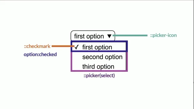
But this I can sell to my clients. And then I can get to the fun stuff, because a customizable select opens up a whole bunch of fun stuff to play around with. We have the '::picker-icon' pseudo element, which is a little arrow thingy there. We have the '::checkmark' indicating our option that is checked, which is also a pseudo class by the way - checked for that option - and then we also have the '::picker(select)', which is a nice little bounding box around our options, the thing that we usually wanted to style.
So then I get to it. What I would do in this case - the same example as before. I would once again set that background-image to none. I already set the appearance to base-select, but here I would set the background-image to none and I would set that background image on that picker-icon. Why would I do that? Why would I overwrite that?
Well, I actually have a pseudo element now. So I can do something like this.
Add a little transition in there, make that arrow rotate because that's a lot of fun. We love doing that - rotating stuff.
That would give me something like this when that picker select is open - nice little arrow pointing to the top.
Then it's time to style our picker. Once again, keeping this simple for first demo I'm just going to add a little bit of a border. Once again, hotpink. Too bad, missed opportunity. I'm also going to do margin- block. Just a little bit of margin, a little bit of padding.
Nothing too fancy, nothing too serious. It just will be something like this - nice little border, very clean, very simple.
And then I can start styling my options. But this is the fun part because now I can really play with these options. I can put hover states on there, focus states, active states. I can style that checked state independently, which I'm going to do. And my checkmark is going to set to display: none because I'm going to dedicate some color to it so I'm not really going to use that little check thingy anymore.
So yeah, in that case you can perfectly hide that.
That's what that would look like if I do all these things together. But guess what else is in the top-layer? That picker. That's why I wanted to go on to the top-layer because here, if you want to animate this well, transition this, you'll have to use transition-behavior as well as starting-style once again to actually give a nice little transition in there. In this case, I'm using a 'height: 0' which I'm going to let go to a height auto by using the calc-size function in CSS, which I think is an awesome feature.
So combining all of that and playing around with some more beautiful styles, you create something like this. It's just your own little customizable select element.
But the beauty of thing is - because I kept it rather simple, this is still accessible. I can use keyboard navigation perfectly.
The screen reader will still do everything as it should. This is a minorly beautifully styled select, but I think it's really cool. And it's still a Progressive Enhancement.
But there's more.
It's not just the styling that we can do because opting in with appearance based select gives us a whole bunch of enhanced capabilities.
I remember when I first started talking about customizable selects, people were like, "what about flags? I want flags in my select". Now I don't know what people have with flags and I'm not going to do flags - I'm terribly sorry for that. I'm going to use Poké Balls because those are awesome as well. So what you can do inside of your options is you can add images now. For example, here I'm adding a Poké Ball, a Great Ball and an Ultra Ball. With a little bit of different styling, pretty much the same as the previous demo that I did, you can create something like this.
That's already pretty cool, but you kind of want that little Poké Ball visual also in your select, right? Because we don't have that yet. Now, somebody figured out, I actually forgot who it was, that if you put a button inside of a select element, browsers would completely ignore it. So that's what they did as a progressive enhancement. If you opt in, you can use that button and inside of that you can place a new HTML element called the 'selected-content', which will clone the contents of your checked option.
So by adding this little snippet inside of this whole story, you would create something like this.
All right, that's a fun little select, but you can go a bit further than that.
Remember that I said it clones the contents of your checked option?
I'm also adding a span in there with the 'class="text"' there.
What you could do is you could visually hide the text inside of that selected content.
Make sure that it's not rendered inside of that select.
Now, you could use this panel, but I'd rather have you use a visually hidden text because it does use a fallback. But just be sure and do it that way. I think it's better.
But in the end that means you could do something like this, where you just show the Poké Ball right there and you still have the text inside of your options.
Everybody still following with me? Uh huh.
Okay, that's great. Time to crank it up.
So I've been creating a lot of demos with selects and kind of testing out limitations on how far I can go. So I cannot like explain every demo in detail here, but I try to always capture the essence here of what the ideology behind it is. Because when I thought, like behind the scenes, the select actually already uses anchoring. So I thought I can use anchor functions to place those pickers right on top of their select. That was the first thing that came to my mind - that would be so cool if I could do something with that.
Which brings me to Anchoring.
So this is my HTML. It is pretty much the same thing as you've seen before. It has a select in there with a button with '
But what I really wanted to do was create a little radial select so I could just make my items pop out and do something like that - that's like the real.. that was the final goal here. So I tried to do a whole bunch of maths and I am not very good at maths.
There's probably much more cleaner ways to do this with trigonometric functions.
So I am not going to explain this bit. But in short, the twine was creating like a sort of a fan effect depending on the amount of children there are, which where sibling counts will come in later as well.
Very cool stuff. But in the end, with anchoring and a bit of radial positioning, this was a thing I created, which is a nice little radial select, which is a potion picker. But this is just using HTML and CSS.
And the beautiful part of this is that this is still accessible.
You can use keyboard navigation just as you would before.
There's nothing very weird going on here.
Okay, so I had anchoring. So I thought, like, experimentation.
What should I do next? So I thought, position-sticky.
I can do something with position sticky. So this is the HTML once again, very simple. It's an emoji picker in this case.
Once again, it has a select, it has a wrapper div with items inside of that, not even using the selected content in this example.
So the first thing for this demo that I needed was something called 'interpolate-size: allow-keywords;' which would allow me to animate from a 'width: 64' pixels in this case to a width auto. That was kind of the idea. That way you can do this. It's already in my CSS reset. I think that's a fantastic snippet. What I did. Once again, I anchored that picker on top of that select. But you can see with inset- block there, I clipped the overflow and then I transitioned that width, the display and the overlay property using 'transition-behavior: allow-discrete'. Now, when that select was open - with the open state - I could actually set the width to auto with the @starting-style of 64 pixels... still following me? All right, great. So then my items inside of that select were set to 'display: flex' with the auto overflow in this case. And the options were a little bit styled. But the beautiful part is actually there at the end where I use my checked option, and I'm going to set that one to 'position: sticky', because that way when the width would animate, it would actually be stuck at the inline end, which resulted in a demo like this, where I drag to open, and when I click on it, it kind of drags the checked option right to the middle.
This is actually not that hard to do, and it's like a really fun thing with properties that we already know and love. So, yeah, pretty fun thing.
So then I thought, okay, I need more experimentation. So I thought I had to do something with :has(). For this. I'd like to take you back one year ago. I think that's a very important thing, because last year I was here at CSS Day, and there was a beautiful presentation by Julia Miocene, which was about character modeling in CSS.
I was blown away. I thought it was a fantastic presentation.
So I had a question, and Jeremy Keith was very friendly to ask that question to the audience.
And the question was: "when creating a character model, it must requIre you to enter some Zen state. Do you have any tips for a beginner to get into that state?" in which Julia gave the most beautiful answer possible: "Yeah, just try to do something smaller". So I did. I kind of wanted to do something that was also like, very nice information about this. So since the start of this year, I started drawing. I used to draw as a 7 year old.
Now I am drawing as a 9 year old. I call that progress.
Thank you, thank you, thank you.
So I had this one drawing of a little dumpling basket you see on the left there and thought, like, I can make this in CSS, I gotta be able to do that. So I used a technique from Julia's presentation, which is called Skeleton, where you would actually use the face and then have the eyes inside of it, like building a skeleton with your HTML for your character.
You can kind of see that going on here. So inside of that select in that button, you see this 'dumpling-container'. Dumpling in it, a face in it, some eyes in it, you see a basket in there. And then I'm not even on my options. Well, about a select of 114 lines and 700 lines of CSS later, I was able to create this little fella.
So here he is, and when you click two of him, he gets a little bit surprised. He's like, "oh, there's another one!" And then when you press 3, they're both going like, "whoa, dude!" I mean, this might not be something I'll be able to sell, but you know, there's some dumpling shops in the world. I might be able to sell that someday.
I don't know.
So what did I use has for in this example? Well, actually, it's a bit cheeky. I just used it to check the value. It's not that special.
I just said: "hey, does my select have option one checked?" Then I would do something like this and keep going on like that. I pretty much did the same thing for the facial expression, saying, hey, "if value one checked, your eyes have to be that large" and et cetera. So that's kind of the whole idea. Not that crazy, but still a really fun experiment. And by the way, this is still accessible, just so you know.
And then of course, I had to do something with Scroll Snapping.
We already had a fantastic presentation on scroll this morning by Adam, who I probably refer to now as the Scroll Master.
But there is another thing you do not know about me and Adam. We both like to hack on CSS during the day, but we are fierce monster hunters at night.
Does anybody know the game Monster Hunter?
Oh, yeah, there are a few people. Okay, so inside of that game, you sort of have an item selector that looks like this. And what happens is you can have the little items on the side, but the item in the center that is enlarged and inside of the frame, that is the item you are going to select. So I wanted to recreate that experience using keyboard navigation. Thought it would be a great idea.
So the idea behind it was the following: So pretty much using the same HTML here as I have done with other things, but maybe adding a little extra div there for a frame, some items in there, that's pretty much all there is, just some extra divs.
And then I set my items to have 'scroll-snap-type' horizontally. The items would snap in the center as well, by the way, which made sense in this case. And the scroll bar width was hidden.
That's kind of the whole idea. But then I also used 'scroll-state' queries because I kind of want that center to enlarge.
So I have a small little item in the middle, it should get bigger.
So when it's snapped, it should have a scale of 1. So when this is snapped in the middle, as I said, I wanted to gamify this experience, really.
So I also used a little bit of tiny JavaScript which would actually just focus on the option the moment it gets snapped. That's all that does.
So you move the snap position, the focus is on that option. Meaning that if you then press Enter, you select that option. That's pretty much how that works.
This is the full thing. So you open this up and you can do left and right with your mouse keys and press Enter and you have that item.
You can also do some other things with it. So I added a little bit of JavaScript for drag because I thought it was cool and also kind of want to at least try to be a bit accessible by using single pointer modalities as well in here because people need to navigate this. Speaking of accessibility, is this demo accessible?
Maybe. I'm going to be honest with you.
So this is context, right? If you would place this in your ordinary website, this is a strange behavior for a user to navigate a selector. A user would not expect this. Of course, if you're making a browser game, a CSS game, then in most cases UI kind of needs to be learned anyway, so then it could maybe work. But I wouldn't just use this on your everyday website as an accessible option.
But nevertheless, it was a fun experiment.
Which brings me to Scroll markers, because CSS carousels were becoming a thing and I was like: "maybe I can do something with scroll markers and maybe I can combine a carousel inside of a select?" Maybe? So that's what I tried.
So once again I did something a little bit different now. Inside of my... - around my options rather - I had a div with a data image inside of it. That data attribute contained actually the same image that I am using inside of my option there, the sunny.svg, as you see there.
What I thought was maybe I create a little carousel and a whole bunch of anchors hanging on that carousel.
But I thought also that maybe I could just use that image and use that as a background of a scroll-marker.
That's where really interesting ideas came from.
So then you can actually have this one select. This is actually at the same time a carousel and you can actually play around with that.
Now there's a bit more concerns to this, but I think it's important to create these kinds of experience anyway because I do have some larger accessibility concerns on that one.
One was the keyboard navigation that did a double jump, but screen readers also ignore the scroll-markers here from what I can tell, and it never taps inside of the scroll-markers, which on the other hand might actually be a good thing in this case. I am not an expert on the matter, but please do test these things for yourselves or listen to people who know more about it. And also I think some of the things might actually be fixable here.
There's one more I haven't really talked about.
Option groups. Those are a thing. So I created a select with a bunch of option groups inside of it... with the seasons, one for winter, one for spring, one for summer, one for fall. And inside of that I just went on the emoji theme again and chose some emoji that would fit that group.
Then I thought, "now I can style these option groups as well." So what I could do is hang pseudo elements on that option group, set the content to have the attribute of the value there.
And then I could set a color in there. I could position this, give it an opacity: 0. But when the option group is hovered, or an option inside that option group is hovered, or an option inside of that has a focus-visible, then I would set the opacity to 1. In short, it turned out to be something like this where you open it and then you can see the text when you are hovering the items inside of it.
Thought it was a cool idea for option groups, but yeah, really wondering what people are going to make with that in the future.
But since this being CSS Day and all, I kind of felt like I should give like a a little bit of a scoop here.
So if you go on Chrome Canary now and enable the experimental web platform features, there's something that the Chrome team has been tinkering with. So maybe you have a select for music genres, but usually people like more than one music genre.
So how about a multiple select? It hasn't been really talked about. So here I actually did the same thing and created a multi select. It's one of those elements that were not reusable. Now do mind this is still an experiment, but with the current experiment I was able to create something like this by using display grid and just placing all those options like this. So you can click multiple items and then you can for example, submit this selection and then you would see the items that I've selected. Yes, there you go. So I think that's also something nice to look forward to in the future. But to remember that everything in Open UI is still a work in progress. We are constantly working on a whole bunch of things and you can help, you can get involved with Open UI. I told this, this is an open group. Go on our discord, go on our GitHub.
Create demos and break stuff. Please do absolutely break stuff because that helps us to actually fix those bugs before they end up in stable browsers.
And I know that a select it's not going to change the world - it's probably not going to make me rich either. But I do believe that a bit of beautiful UI can put a smile on a person's face.
And a smile can be priceless.
That's my daughter, dedicated project manager and tester for my demos.
A smile can be priceless.
And I know that UI should be controllable, it should definitely be accessible. And I love it that it's becoming more and more stylable.
And if there is one more thing that I'd like to give to all of you as a little gift on this Thursday afternoon - it's that please remember that you are allowed to have a bit of fun.
Create demos. It's not all Sprint boards and Gyro tickets. Create demos. Have fun. Create stuff.
Enjoy yourself. Make stupid stuff. Make weird stuff.
Because I do believe that the web is supposed to be fun.
So next time when you go out, maybe there's something you want to pop-it, invoke-it, or select-it. But just make sure that you love it.
Thank you.
SH: Hi man. So the hot seat Brecht. Yeah, thank you for that, especially the message at the end. I think that's a good message. BDR: Thank you. I believe so. Yeah.
SH: So we do have a couple questions here. Robert asks how this does on mobile. Do we hijack the native behavior of selects there? BDR: So there's a - you can use media query in there, for example, if you want to. Or a hover query and just opt in only on desktop, for example. You could perfectly do that. So then you have the native parts by default and then maybe with media query or something else, you can make the custom opt in.
There have been some issues though, with the idea that I did by just placing the picker on top of the select, because on mobile the pointer sometimes did some strange stuff. We clicked on it, it opened, and it kind of already triggered the option closing. But this is already being fixed at the moment.
So this is one of those bugs that I say, like create experimental stuff and people find that out. SH: Do you think we're kind of in a transition period where it's still a little bit easier to use a library to just make a custom or make your own custom thing in whatever way, as opposed to...
BDR: For sure. I think this is actually the moment that everything is starting to change, which I once again think why creating demos now is extra important. At the same time, I also believe a lot of the design systems that we have will actually start adopting this in the future for their own design system. So you could probably get some other enhanced stuff inside of libraries.
Pretty sure that'll happen there.
SH: Subu had a question which you actually answered, but I think you need to hear it. "Brecht, great talk. Everyone at my place is cheering for this topic. Ha ha. So our question is, can we have a custom select with multi select option?" So you showed that.
BDR: Yeah, it's work in progress. There's a lot of bugs though, so don't get your hopes up too fast. But it is coming. Yeah. SH: Great! When we can do these things... there was a school of thought several years ago that was like, the browser gives you something. Just accept the fact that it's different in every browser and that you can't brand it and you can't style it. How can we be better judges of when to leave things alone the way they are and how far we should go in changing them?
BDR: I think there are many more people who are better to answer that question than myself. I think there's lots of studies on UI, what works and what doesn't work. Like, I'm pretty sure some of the demos that I've shown don't really indicate like, "hey, this is a select". A lot of them are gamifications, but at the same time I'm wondering, this is now, right? But maybe in five years people will be more thought that this is something you can do - that this can be a select, this behavior is expected, not sure what the future will bring. But I do think that if we create more of these things, users will in some sort also learn that behavior. Maybe. SH: Yeah, so that's an interesting one because I think you have...
we have elements now that someone made up at some point and the fact that they're used often - that doesn't necessarily mean they're the most appropriate or the best way to do something. But since it's there and it's baked in, we kind of have to use it or use it as a base. So how do you deal with that in Open UI?
The de facto standards for UI patterns there, how do you evaluate whether they're actually good or simply used all over the place?
BDR: We try to focus on the things that people want to do the most.
It's like the things that you usually see. For example, like at the moment another one that is running is 'openable', which is like the collapse. If you have like 'read more' from a bit of text and you want to collapse that open. It's a pattern that we see so many times on the web that people are actually kind of used to and to be frankly like you can do this and add aria text it but if a browser would do this by itself that would be so much easier to implement.
So we kind of always think about what do we see a lot on the web. And we kind of when we do the research we just find a lot of use cases. One of the things that I'm personally a bit more involved about and thinking about this multi handled range sliders.
Something that I'd really love to get off the ground because you see that so much right - 'price from/until 'for example on web shops, something you see so often and it's not like it's uncommon, you see that all the time. So that's one example.
SH: Yeah, I gave a talk a few years ago basically about what behavioral economists call information cascades.
So for example, the hamburger menu icon was one of them. When no one knew what it was - it was the small micro version of mystery meat navigation. So you had to click on it and then you would find out what was in there. And I think Facebook had three at the same time. You never knew what was behind it, but because a lot of people used it - it was Facebook, so people thought oh well Facebook probably knows what they're doing so we're going to do that too.
I hear people laughing - and then you add to this information cascade. So the more people that do something, the more people assume that it's a good pattern or well researched or whatever. Just because a lot of people do it and it does maybe become that way. But I'm wondering what happens once we take these patterns and we kind of set them in stone a little bit. How do they change over time and who changes them?
What are the changes based on since everyone's using that default?
BDR: That's a really good question. That's actually a question that I don't SH: I want - I want the answer right now. BDR: You want the answer right now? I cannot give you the answer right now. I guess we'll see. I mean these patterns, they exist for a reason. I think the hamburger menu is actually a very beautiful example that you've given.
Like, will we always expect an arrow when it's a select?
Maybe. Maybe that's the key. Could be.
But maybe there's, I don't know, hamburger icon was invented. Maybe somebody will invent something else as well. I don't know.
But yeah, the picker icon. I mean it's why it's there in the default, right? That we have the picker icon and we also have the check mark because that's what people would expect. But yeah, now you can get creative with it. I think it's a good thing. But yeah, of course you have to think about your users. And is it still intuitive? Is probably the most interesting question you'll have to ask yourself while going in that custom select behavior.
SH: Right, right. What's the hardest UI element to style right now in your opinion?
BDR: For me, multi handled range sliders. But if I'd have to think about another one. Well, yeah, combo box. We're also working on that one. So that's also one that you can't do because guess what?
Newsflash, an input does get rendered in a select element. Couldn't do it that way. So yeah, too bad. SH: Okay, so let's say you have a lamp, a magic lamp, and like a little Miriam comes out.
Okay. And you could ask the Miriam for anything you wanted in CSS. What would you ask?
BDR: Like - huh, anything in CSS? That's interesting.
SH: She'll make it happen. BDR: I mean like, I just really would like to have much more of those basic patterns styleable that we see on the everyday web. So if we can have a really nice way to do this with just CSS for the opt in and also a way to maybe just do a select opt in. That's kind of the thing that I'd love to see, especially for these use cases. Like now it's appearance based select, but maybe I just want to only do that for the select. But maybe in the future there'll be date pickers. Right. That we can style ourselves. So I just want to make that as customizable as possible and also limiting as possible because maybe I don't want to do the day pickers, I just want to do the selects.
I think that should be something that I want.
SH: Will this make things easier for us in design systems? BDR: Yeah, yeah, absolutely. Yeah.
SH: You talked about something that maybe - I don't know if you're doing this daily in your work, but if you look at your daily work, what's the most annoying thing that you come across, the thing that you'd want to change the most? BDR: For me, it's like the most hard UI elements. There's a reason why I started the multi handle range slider - because that's one that I do happen to use a lot on the web because we also work for car configurators and stuff like that. They have a lot of that kind of stuff and that's kind of my issue there is because these things are so hard to make accessible. If I could have a browser giving me most of that part just out of the box, that would be fantastic because there's so much scripting going on there and it can fall apart like really fast.
That's something that I noticed. So, yeah. SH: Do you use AI in your work? BDR: A bit from time to time. SH: What do you use it for?
BDR: Usually for very boring stuff, like the stuff that I don't want to do. Recently, one of the things that I did was here I have 5 icons. Make this an SVG sprite, like really stupid stuff. There's tools for that, by the way. But yeah, stupid stuff like that. SH: Okay, and do you see any kind of danger with it or - where do you see... where do you see your job going? BDR: I think like.
Oh, you're asking the AI question on me now. That's... that's... SH: Yeah, sorry, I switched it up.
BDR: All right. I wasn't prepared for that one, but yeah, sure.
So I still believe that being having a specialty in something is actually going to be very beneficial for people because then you're an expert on one field and you can easily become a bit more full stack by enhancing yourself at everything AI related.
Maybe you can just. "Hmm. I don't really know that language, but I do know programming, so maybe I can use it to kind of wiggle my way around it." And you'll probably be able to get faster out of a pinch.
On the same time, it will also be probably the first code that will be refactored. That's the other part of that story, but as a human enhancement tool, I see it beneficial.
But at the same part, I have the same scares that other people have, like, will we just be junking a whole bunch of bad code everywhere? And. Yeah, I hope that doesn't happen. SH: And that your job is reduced to the great refactoror?
BDR: Yeah, something like that. Yeah. Please don't.
SH: I'm not going to do it. It's not my fault. All right.
Well, thanks for showing us how much we can do today with styling these things. So I hope some of my own colleagues who are here saw that and get some creative juices flowing about how we might be able to use that. But thank you very much. BDR: Thank you. SH: Brecht De Ruyte.
- UI should be stylable
- HTML Form Elements
- Choosing libraries: Controllable, Accessible, Stylable
- Styling UI belongs in CSS
- W3C Community Groups: Open UI, CSS Next
- Open UI
- Popover API
- Invoker commands
- Top-layer
- @starting-style & transition-behavior
- Styling Select Elements
- Customizable select: appearance: base-select
- ::picker-icon, ::checkmark, ::picker(select)
- Transition with ::picker(select)
- Images in select options
- selectedcontent element
- Anchoring
- Fan effect with CSS variables
- Sticky options with position: sticky
- :has() pseudo-class
- Scroll Snap
- Scroll markers
- optgroup styling
- Multi-select with display: grid
- Open UI is a work in progress
We are getting spoiled with increased UI capabilities, partially thanks to the efforts from the W3C community group Open UI. One of those features is the customizable select. This new capability for selects seems to love new CSS features, and that love is mutual. This presentation is a love letter to W3C community groups, new UI capabilities, and CSS, showing you how to combine features such as anchoring, transitioning, scroll snapping, and much more to create fun, progressively enhanced, customized select elements.
Sketchnote by Artem Pendiurin