Oh, snap! The joy and pain of CSS scroll snapping.
Introduction: Rethinking Calendar Interfaces
Neil Jenkins discusses his experience building calendar UIs and introduces the concept of scroll snapping for a more intuitive navigation experience.
The Problem with Traditional Calendar Views
Neil examines the limitations of traditional calendar interfaces like Google Calendar, highlighting the inability to scroll horizontally for day-to-day or week-to-week navigation.
Introducing Scroll Snapping for Seamless Navigation
Neil demonstrates the benefits of scroll snapping as seen in Apple Calendar, where scrolling horizontally smoothly aligns with day boundaries.
Requirements for an Improved Calendar Interface
Neil outlines the key requirements for a better calendar interface, including horizontal scrolling, day boundary snapping, infinite scrolling with dynamic rendering, and directional locking.
Implementing Horizontal Scroll Snapping: A Simple Example
Neil provides a step-by-step guide to implementing horizontal scroll snapping using a carousel of quotes as an example.
Enhancing Scroll Snapping: Mandatory Stops
Neil explains how to use the "scroll-snap-stop" property to ensure users don't miss important content while scrolling.
Browser Support and Progressive Enhancement
Neil discusses the excellent browser support for scroll snapping and how it allows for progressive enhancement, ensuring a decent experience even in unsupported browsers.
Dynamic Rendering and the Challenges of Infinite Scrolling
Neil introduces dynamic rendering for handling large datasets and demonstrates a basic implementation using JavaScript.
The Pain Points of Scroll Snapping with Dynamic Content
Neil highlights the issues that arise when combining scroll snapping with dynamic rendering, particularly the glitching caused by DOM manipulation during scroll animations.
A Workaround for Smooth Snapping with Dynamic Content
Neil presents a solution involving decoupling snap points from visible elements, using invisible divs for snap alignment and reducing DOM manipulation during scrolling.
Adding Vertical Scrolling and Sticky Elements
Neil explains how to incorporate vertical scrolling and use position:sticky for elements that stay fixed during horizontal scrolling.
Adjusting Snap Points for Optimal Alignment
Neil demonstrates how to use the "scroll-padding" and "scroll-margin" properties to fine-tune the alignment of elements within the scroll view.
Implementing Directional Scroll Locking: A CSS Hack
Neil reveals a clever hack using nested divs to achieve directional scroll locking, preventing simultaneous horizontal and vertical scrolling.
Putting it All Together: The Fastmail Calendar Experience
Neil showcases the final result of these techniques in the Fastmail calendar, demonstrating smooth horizontal and vertical scrolling, snapping, and dynamic rendering.
A Final Pain Point: Scroll Wheel Compatibility
Neil addresses the challenges of scroll wheel compatibility, particularly in Safari, and emphasizes the importance of testing with different input methods.
Conclusion: The Joy and Pain of Scroll Snapping
Neil summarizes the benefits and potential drawbacks of scroll snapping, encouraging developers to consider its use carefully and test thoroughly for a seamless user experience.
Good morning.
So I don't know how much time you've ever spent thinking about calendars.
Having built most of the calendar UI at FastMail, I've spent probably too much time thinking about calendars.
And if you're interested, come find me later.
We can natter about time zones, recurrence expansions, why the ITIP RFC is terrible, all those wonderful things.
But today I'm thinking more about a typical calendar interface.
I'm sure you've all seen this before.
Here's Google Calendar.
Let's have a look at this week view here.
We're representing time spatially.
So the hours go top to bottom, and consecutive days go left to right Probably get a bit squashed if we had all of these hours visible here.
You've got a scrollable section at the bottom where you can scroll up and down to see the different time ranges.
This top section with the all day events will also scroll, but Google seemed to put a very large limit before it actually does force that.
I tried to do it here, but on this resolution it's not scrolling.
But trust me, if you put enough all day events in here, it will eventually limit it so that you don't cover up the entire bottom here.
Okay, so, so far, probably something, you've seen a lot before.
But, I know what you're thinking.
Isn't this a talk about scroll snapping, not calendars?
And I promise you, I will get there.
Because, what you can't do in Google calendars is scroll horizontally to move to the next day or the next week.
We're representing time spatially, so the next day in the mental model should just be over here.
And I should be able to just scroll across to get to it, or keep going if I want to see the next week, but I can't.
Now, if we flip over to Apple Calendar here, a native Mac app, we'll see that we can scroll horizontally.
In fact, we can just keep going, as long as we like.
We can go backwards in time as well, or whatever.
And you might notice that the days, always end up perfectly aligned in the view.
You never end up with half a day at either end.
So if I try to make it do that, it will just snap as soon as I let go of the touchpad.
Just smoothly animate.
This is scroll snapping.
It's one of those details that I think really elevates the experience and makes it feel native.
And I wanted to recreate this for FastMail's calendar on the web.
So let's have a look at all of our requirements.
So first of all, obviously, we've got to be able to scroll left and right.
The scroll left or right always needs to snap to align perfectly to a day boundary when you finish scrolling.
The horizontal scroll is also on an infinite plane, as days go on forever, so we have to do dynamic rendering, redrawing as you scroll.
And within this horizontal scrolling plane we have two separate vertical scrolling panels.
The all day event.
I haven't got any here to show you, I'm afraid, but again, this does scroll.
If I go here, you can see, even though there's only one.
And, of course, the main timeline view.
And then on the left here, we have another section, which is the hours of the day, which has to scroll with the vertical section, but is outside the horizontal scroll.
And one last thing, we also have scroll directional locking.
This means you can either scroll horizontally or you can scroll vertically.
But once you've started in one direction, it won't let you do the other way, no matter how you move your fingers on the touchpad.
Trust me, without this, It actually feels really annoying as you can't help but change the time range in view when you're trying to move between days or move between days when you're trying to scroll up and down and see what you've got later in the day.
Especially if you're on mobile and, you've just got a small screen.
Okay.
Got all that?
If it sounds complicated, I guess it is.
Sorry.
But can you do it with web technology?
Spoiler alert.
Yes, you can.
But we might need a few hacks along the way.
Let's start simple, and we'll work up to it.
First of all, I just want something that can scroll horizontally.
Let's make a very simple carousel of funny cat and dog quotes, the kind of thing everyone wants on their website.
So here we go.
I've got a panel here.
There's a container for the scroll.
That's got the white background.
Inside that, there's a bunch of children.
We're using some Flexbox CSS to stack these horizontally, and we just tell it to scroll the overflow.
And if we scroll that, Ooh, lovely.
That was easy.
Great.
But look, the scroll can get stuck halfway between two quotes.
So you can't really read either of them, and it looks pretty ugly.
Wouldn't it be better if it always stopped with one of the cards perfectly centered?
As you move across.
Yes, I think so.
Enter scroll snapping.
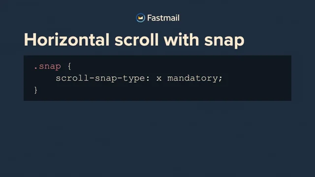
All we have to do is add a tiny bit of extra CSS.
First of all, we need to tell the container that has the overflow scroll that we would like it to snap that scroll.
And we do that with the scroll snap-type-property.
You tell it which direction or directions you want it to snap in.
X, Y, or both, and whether it must finish in a snap position or only if the browser thinks it's close enough to one.
I'm not quite sure of the use case for that, but there is a another option instead of mandatory What's it be called?
Proximity, I think.
And it's a bit mysterious because it's browser dependent.
But how does the browser know where the snap points are?
You tell it to create snap points based on the position of elements inside the scroll view.
You just have to add a scroll snap align CSS property with a value of start, center, or end to indicate where to align to.
It doesn't have to be an immediate child either, it can be nested inside other elements as long as it's inside that overflow scrolled container.
So for our card class, you can see I've told it to snap to the center of the element which will try to align it to the center of the scroll view.
Let's see what that looks like.
So we go to the next demo.
If I scroll across now, you'll see that whenever it stops, the card is nicely centered in the view.
If I try and make it finish halfway between, let go, boom, it neatly animates back.
What if we had a particularly important quote?
One we wanted to make sure the user never misses by scrolling past.
There's a CSS property you can add called scroll-snap-stop.
And you can set it to always to tell the browser you'd really like it to stop here.
Although, in my experience, some of the browsers do seem to ignore it.
But let's have a quick look at what that looks like.
So over in Firefox here, I've added scroll snap stop to the light blue cards.
If I swipe across, it actually goes straight past it.
It should be stopping on those.
However, if I move over to Chrome here and go across, you can see that it does always stop at those as it goes past.
So I'm not quite sure why Firefox is not doing that, but you can suggest at least to the browser that it always stop on those as you go past.
It won't do it if you're definitely moving your fingers are crossed, but if you just like flick it and just let it run, once it gets there, it will just go, I'm gonna stop here.
It might be useful, might be not.
I wouldn't rely on it.
Okay.
Where are we up to so far?
I think we've experienced mostly joy, not a lot of pain.
It was really easy to add this snapping behavior.
How good's that, so if you have one of these kind of basic use cases, you're set.
It's gonna be just two seconds work.
Let's take a brief moment to check in on browser support and how we're looking there.
And again, actually pretty great.
You can see in the Can I Use snapshot here, it's probably best to ignore the squares with the numbers in the corner, because those are some, generally support for older versions of the spec, but even without those, you've got support going back years in all the major browsers.
And of course, in the rare case where someone's using a browser that doesn't support this, generally if it doesn't snap it's not going to mean that they can't use it, it just won't be quite as nice.
So it's classic progressive enhancement or graceful degradation depending on your half full or half empty kind of glass person.
Okay, but I promised pain as well as joy.
So let's get to that.
Because while we've done something pretty cool, we're still a long way from ticking off all of those requirements we came up with at the beginning.
Suppose we have not just a few cat quotes, but an infinite number of cat quotes.
Or at least a very large number of them.
We'll need to do dynamic rendering.
What I mean by that is, we'll just let you keep scrolling as long as you like, and we'll redraw the view based on your current scroll position.
So a bare bones implementation, might look a bit like this.
Now, I realize this is a bit more code than you generally put on a slide, but I will give a brief explanation because this is the entirety of everything you need to do basic dynamic rendering.
I think it's worth, showing that this is not magic.
You might use a framework for this, but you can actually do it yourself.
So we presume that each item in our view is the same size, and each time we change the scroll position, we're going to call this redraw function.
You can see that with the event listener at the bottom here.
When we do that, we look at how far we've scrolled, and we work out which cards would now be in view by dividing the card width by our scroll position.
Then we compare with what we last drew, and if there's any that are no longer visible, we take them out of the DOM.
Then we do the inverse, any that are now visible that weren't before, we draw them, pop them in the DOM.
They're absolutely positioned so that they can just be independent of each other and be in the right place.
And that's all there is to it, to do this dynamic rendering.
And let's have a look what that looks like.
Here, I can just keep on scrolling, and scrolling, and we're actually cycling through the same seven cat quotes, because I don't actually have an infinite number of them.
But, in terms of the rendering technique, you can see, that works really nicely.
But, you might also have noticed, I've removed the snapping.
So what happens if we turn that back on?
Just add the properties back, like we did before.
If I scroll across here, oh, that's not great.
Ouch.
Okay.
Now we're starting to hit the serious pain of CSS scroll snapping.
The specification basically says whenever you change the snapping elements in the DOM or the CSS, it should immediately apply the new snapping rules.
But if you're in the middle of a scroll animation, this can break horribly, and you get some terrible glitches like we just saw.
Again, this is browser dependent.
Some doesn't glitch as much, but in some it does more.
Overall, though, not that great.
What can we do?
I think the obvious thing, I'll go back here, is just to disable the scroll snapping as soon as we start scrolling, and then turn it back on when the scrolling is done.
Now that's a really simple change to make.
You can see the entirety of the new code above.
As soon as we start scrolling, We removed the class that sets the CSS snap properties.
When the scrolling is done, we add it back.
What does that look like?
We scroll across.
Okay, it's better in that it's not glitching, but it's also not really what we had in mind, because it just doesn't snap until it stops, and then suddenly goes, oh, I should be over there, and quickly jumps across.
So you get a nasty, jerking redraw.
Can we do better?
I think we can.
Let's see what we can do.
So the solution I came up with was to decouple the snap elements from the visible elements.
The visible elements can be expensive to draw.
Not so much in this toy example, perhaps, but definitely when you have a more complicated interface.
So we redraw the visible elements while scrolling as before.
Only doing so when they come into view.
Meanwhile, we also draw a bunch of invisible, just simple divs that exist solely to define the snap points.
These are cheaper to render, so we can do more at once.
But we only redraw these when the scroll ends, so we don't trigger the glitching.
So let's see that in action.
Again, we can just keep scrolling forever, but every time it stops, it's nicely on one of those alignment points.
That's more like it.
So we've got horizontal scroll on an infinite plane with snapping.
One caveat here, Safari doesn't support the scroll, scroll end event yet, which is what I was using to know when we can redraw our snaps.
So you'll need to hack a polyfill for Safari there.
I use a one second timeout from the last scroll event.
As soon as you scroll, it resets the timer.
It's a bit hacky, but it mostly does the trick.
Okay, so we've made a lot of progress.
What was next on our list?
Ah, yes.
We want to be able to vertically scroll as well.
Okay, so let's make our cards taller than the container.
By just sending the height to 200 percent and let it scroll in both directions.
That's a pretty simple change.
What does that look like?
Everything else is the same.
Again, the alignment works because it's the same as before, but you can also scroll up and down.
Okay, fairly easy again.
What if we want to add a panel over on the left hand side here that scrolls vertically, but not horizontally?
We can use position sticky.
The important bits on this slide are the bits at the top.
Position sticky plus left zero, so that this div stays stuck to the left edge of the scroll view, and z index one, so it's always on top of the other content.
Let's have a look at that.
Okay, so we can still scroll across, we can scroll up and down, that scrolls up and down with us, but it stays exactly where it is as we keep scrolling across.
Okay, so that was also fairly straightforward, but now we're covering up a bit at the side of the container here.
So the cards no longer look like nicely centered.
We don't actually want to align to the center of the container anymore.
We want to offset our snap point, so it's centered on the part that's not covered up.
So how do we do that?
There's another CSS property called scroll padding, and that's exactly what it's for.
You set this on the scroll container, and it will inset the bounds it considers for alignment.
So here, we can add 60 pixels of scroll padding on the left, to match the 60 pixel width of our timeline.
Let's see what that one line addition does.
Much better.
So now, we have still got our vertical scroll, we've still got our panel that's stuck on the side, we've still got infinite scrolling, we've still got snapping, but now the alignment is centered on what the user will perceive as the center.
Just what we wanted.
While I'm here, I should also point out that you can also do a similar tweaking of the alignment point by setting the scroll margin property.
Of the elements you're aligning to.
So this is like the equivalent property, but this goes on the cards inside, rather than on the scroll container.
And it can let you adjust it differently for each element, if you like.
Again, it's just take your left, center, or right starting alignment, and then adjust it in whichever direction you like.
With standard kind of, CSS measurements.
We've come a long way.
The final thing we need is directional scrolling lock.
I've actually skipped the intricacies of that second vertical scroll, but suffice to say it just involves another sticky view, this time stuck to the top and that itself is scrollable and does its own dynamic rendering, Straightforward stuff.
Okay, directional locking.
Surely with all the amazing new CSS properties that have been introduced over the years, this is just going to be as simple as adding a single property, something like Scroll direction lock.
Sadly, no.
Please don't post this out of context.
People are going to be putting it in going, Why doesn't it work?
Let me look up and stack overflow.
This doesn't exist.
I've just made this up.
I spent a fair bit of time researching this, and as far as I can tell, there is just no way to make a container that overflows on both axes lock its scrolling to be single axes only.
So do we just give up?
No.
The classic web answer, let's add more divs.
If you use one div for the horizontal scroll, then nest that inside another div for the vertical scroll.
Actually, you do it the other way around.
The vertical scroll is nested inside the horizontal.
The effect is you can scroll in either direction, but it will only engage one of those at a time.
And so you get scroll directional locking.
So it's a little hack that you can use to force that to work.
All right, let's put it all together.
We've come a long way.
We've taken some simple CSS, added a bunch of hacks, and finally we have enough techniques to recreate that native scroll experience from the calendar that we saw at the beginning.
Let's see what that looks like.
Here's the FastMile calendar, it's got my calendar stuff up in it.
Hopefully there's nothing too private in here, it's just the work one.
Have we got horizontal scroll?
Yes.
Does it snap to the days?
Yes.
Can we just keep on going basically forever?
Yeah.
Vertical scroll?
Yep.
Sticky timeline on the left to match the scroll.
Check.
Second vertical scroll at the top.
We do.
If I go back to, a day like today, we can see that is limited in height, so that can scroll separately.
And we have the sticky headers at the top of each day as well.
Which I didn't mention before, but, also a requirement, so check.
I think that's pretty sweet and was worth the effort.
And even better, this also works just as well on mobile.
It really feels so much more native and everything is done with web technology.
Okay, I'll do a final recap in a minute, but before I do, I just want to point out one final pain point you should be aware of.
All of these demos I've been doing for my laptop, so using a touchpad for scrolling.
But there are still people out there in the world who use a mouse.
I know, hard to believe.
And on that mouse is often a scroll wheel.
And I'm sorry to say that scroll wheels do not combine well with snapping.
Again, it's really quite browser dependent, but we found Safari in particular is so janky that it can make it unusable.
So my advice on this front is, two things.
Firstly, make sure you test with a mouse as well, not just a touchpad.
Secondly, this is mostly not an issue for horizontal scrolling.
Because people rarely do that with a scroll wheel.
You can do it by holding down shift normally on the keyboard while scrolling, but almost no one does that.
So how much you care about this problem is going to depend a lot on what you're trying to do.
If it's horizontal, it's probably okay.
If it's vertical, you might want to think about it more.
You could even just disable it if you detect certain browsers and it's not ideal.
Test, is what I'm saying.
Okay, so there we have it.
Snap Scrolling.
It's pretty great if you use it in the right places, and it will bring you both joy and possibly pain.
It's really simple to add for static content.
It's got super widespread browser support.
The snap stop is a bit unreliable though.
Doesn't combine well with dynamic rendering by default, but there are workarounds.
Safari doesn't support the scroll end event, which makes some of those workarounds harder, but you can work around that too, and the scroll wheel is janky.
Still, it's worth knowing about, and in some places can add a lot to your experience.
That's all.
I've been Neil Jenkins.
I'm very happy to talk about all things web, email, calendar, or other.
Come find me later if you have any follow up questions.
We don't have time for now.
All of those demos and my contact details are on my website, which you can find just there.
With widespread browser support, you can now use CSS to ensure scrolling can only stop at certain positions. This is great for building native-like experiences on mobile and desktop, and we’ll look at how easy it is to do this for simple use cases, like a 3-image carousel.
But what if you have 300,000 images instead, and need to combine it with dynamic rendering as you scroll? Or want to allow scrolling in either horizontal or vertical dimension, but not both at once? You’ll soon find you’re fighting the browser, and the browser fights back hard. We’ll discover some clever hacks — and gotchas to avoid — so you too can build the snappiest of UIs.


