Guardrails or handcuffs? Building creative and sustainable design systems
(upbeat music) - Hi, I'm Mark.
Today, I'm here to talk to you about design systems. There's a lovely German word, zeitgeist.
You've probably heard of it.
It means the spirit of the time.
Design systems are probably and have been the exact guys for a little while now, involved in product design. But in this talk, I'd like to discuss how we move away from the prescriptive, constrictive sameness in our design systems and towards more creative potential human approach.
First so, I'd like to talk to you a little bit about Manchester.
So I grew up in Manchester.
I haven't lived there for a long time now, but it's it looks a little bit like this.
I grew up a little bit outside of Manchester, but there are plenty of streets that look like this black and white raining all the time.
One thing is, pretty true of Manchester throughout the years, though it's a home of great music and has been for decades.
I grew up, like I say, around the 80's in Manchester around that time, I was old enough to go into Manchester on own as a young kid.
And around 1989 there was this thing called Manchester. A truth be told, a lot of people took a lot of drugs. And there was one guy who was very central in Manchester and Manchester culture.
I remember seeing him on TV.
He was a TV reporter to begin with.
And then he turned into a local kind of entrepreneur. He was pervasive.
He was kind of everywhere throughout my childhood, on TV and the things that he produced and things that he worked on, his name was Tony Wilson. And he started off as a TV reporter for the local news. I remember seeing him on the middle of in more than than this sideways rain and he's talking to some farmer or rather, you know, he was just somebody you saw on TV. He then founded Factory Records.
Now you may have heard of Factory Records, you may not have but you almost certainly will have seen and heard the output from Factory Records, Happy Mondays, New Order.
So this local record company hired local designers, local freelance designers to produce a lot of the artworks. And this stuff was everywhere in Manchester. There was a time where, you know, this record label was so prolific, not just the records themselves, but stickers on lamp posts, flyers through your door. As a design student in Manchester, in the early 90's, I was taught by some of the designers who had worked there, you know being a freelance record designer, print designer doesn't pay terribly well. So a lot of these people you know, taught on, on design courses and this work like I said, this was everywhere.
This was being taught to young designers.
Designers were emulating this work.
And it kind of became this, DNA of the city right? This, on every lamp post, there was this feeling, this hyperlocal sense of what it was like to be in and of Manchester.
That was the zeitgeists of the time, I like to call it something else.
I like to call it a thingness.
There was a thingness about Manchester, and it wasn't it couldn't be really described as, a single thing. It was lots of little things that made up it to to feel like Manchester while you were there, which is quite unique to any of the city that I'd been to. Why am I telling you this? Well, to me, the goal of a design system is to create a thingness.
It's a, a design system really is a connectedness between products, content, services.
It's a described system.
So a little while ago, in fact last year, I was giving a talk on design systems, and I asked people of, Twitter.
You know, if I was a senior manager and I was being asked to fund a design system project what are the pros and cons? What are the costs and benefits? You know as you might expect, I got a lot of replies. I got a lot of positive responses about sustainability and then how it enables scale, the reuse of code, time-saving, shed resources.
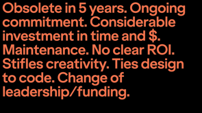
You know, there are a lot of advantages, a lot of good reasons why you should have more. Equally, there are a lot of, though I won't say it was griping but there were a lot of negative comments as well. So the fact that our technology moves very quickly and there could be obsolete.
The ongoing commitment, designs systems are our products and there is considerable time and money needed to be invested with really hard to come to demonstrate a clear ROI as well.
So there are lots of disadvantages.
We probably know all of these, one thing that came through in the positives, the parts came through more loudly and clearly than anything else was this idea of consistency right? Design systems solve the consistency problem. And they enable scale, reach and the shared vocabulary between people, between teams, and then they enable conversations about standards. They surface organisational issues, you know, they can be a driving force for a lot of change within an organisation. But there are challenges.
And we probably are aware of a lot of those challenges those are sort of worked with them for a little while. A couple of weeks ago, Ethan Marcotte a really great talk for a CID CSS. And it really resonated with me and, like him, he talked about a scenario that he seen in design system teams. And I've seen this too, a lot of the past decade or so. I'd like to just walk you through what he said and see how this resonates with you.
So here we are, we have a design system, of the core of our organisation and around it, in those grey circles are our product teams. You know, we've got a bunch of product teams or however, the organisation is structured regardless they're the consumers of the system.
So these are the folks who who take the components, and the rules of the system and apply it for their customers or users.
The products and people are served by this system. So let's take this example of them.
You know, there's a centrally produced component in this case, like an accordion, right? Something like that.
Every team takes and uses as this accordion, brilliant works very well.
It does exactly what, you know a lot of those benefits written in green that I was talking about earlier.
But then as time goes by, one of those teams discovers that they actually need the accordion to do something slightly different.
So they go to the design systems team and they say, "We need a slightly different accordion right? Because the one that you've given us whilst it's great, we need it to do something slightly different." The design system team says, "Actually, okay, great, fine. But we need to go through this process of collaboration in order to make another record DNN because we have to make that available for everyone else. Kindly just get by with the one that we've got, you know maybe change a colour or something.
Add a couple of icons you know, that scope within the design pattern to do that." The product team are not willing to do that. They, think that they need something pretty different. So what did they do? They go ahead and fork it.
They just create their own pattern, why? Because it's faster and it's easier.
And when the pressure of shipping, the pressure of, of actually the bottom line for an organisation is in question then you know, the design system team's needs are actually a lower priority than getting this thing out at all.
So, there's another team over here, team C as I like to call it.
And they have an accordion as well, though slightly different, slightly different to the one provided by the design systems team and slightly different again to the one, I think of a product team.
So what did they do? They fork it and they produce another.
Of course they do.
So we're getting this position where we have a design system.
We have one accordion.
We have a slightly different accordion, or we have another accordion.
Now you may be, you know, if you've worked in design systems before you may be nodding along as I'm as describing this, as Ethan said, you know it's my experience as well, that this is normal and natural, don't panic.
This is why collaboration is so important.
And whether the processes of collaboration around design systems is so important to smooth the way for acceptions and additions to those centrally provided patterns.
So with consistency being the issue, and the driving motivation behind design systems. We have two product teams at the side here and the design system sits in the middle.
It tries to strike a balance between one product team's needs and another product team's needs, with a compromised best fit solution.
But this proliferation of forked components will continue. It's just human nature, for us to want to create slightly different things. How can we provide this consistency whilst this is happening, by controlling the usage of the system, by policing it, by coming down hard on those who deviate or do we document what people are doing with it and we pave the cow paths that way.
Jeremy Keith talks about this as a system that is prescriptive, a prescriptive design system. One that is defined centralised and controlled. One where patterns and rules and usage like language are tightly defined centrally and controlled centrally.
There's a other system which he outlines, which is a descriptive design system.
Now this is one that is emergent, one that is being created.
One that is built over time, paving those cow paths as people, fork components and, the design system team then just builds on top of them. But that is another I think, that is another system beyond these two.
And I think it's an enabling system.
I think it's one that is looser, it empowers teams. It allows for this creativity.
Remember that is a natural sort of human process. More importantly, I think it creates this thingnes this sense of connectedness between elements in a design system.
The good news is, for us as designers is this has been done before, quite a few times, I'm now going to talk through two examples here. And they both happen to be Olympics, the identity systems for two different Olympics over, over a few decades.
Why am I talking about stuff that isn't digital? Well, I think that we have a duty as designers to look beyond our own fields, as to draw inspiration and to see where this has worked and what hasn't worked in other design disciplines and Olympics are almost unparalleled in the scale of application.
Yes, they're consumer focused.
They're also B2B focused and they cover everything from print and identity design, to architecture, to signage to fashion and clothing, to iconography and typography. They cover the whole gamut.
So the first example I'm gonna talk through with you, is the 2012 London Olympics.
An Olympics of course with my kind of a home Olympics, and it was incredibly divisive as a design system a little bit like as we say in the UK it was Marmite system. So you either loved it or you hated it.
Of course the logo was, core and central to that hatred. But I think it's a system that was far reaching unambitious, and it was derived centrally from the logo and spread out across all material.
The logo was designed by Wolff Olins and the overall branding was by FutureBrand. Central to the system was the fractal grid. It was the starting point for almost all things within the system.
It was derived from the logo and the grid became this tool to make the design decisions with.
So here you can see it applied to the seating in the arena which created these kind of random fractal-like random shapes within the seating.
Now to look at these, you know, on face value you wouldn't necessarily draw that connection between the logo and the seats, but they were used here for planning wayfinding signage.
So overlaid over a perspective, drawing to give odd structures to the supporting struts there or the shapes of the signage itself.
Now when these were then manufactured no to a wayfinding kind of beacon or posts look the same, they were all different.
And it gave rise to these very kind of obscure objects, throughout the Olympic park.
But even Mundane things such as tickets here, the ticket designs, the iconography and the colorways. They felt like they were connected to the system because in there is the fractal.
It's the fractal grid is underpinning it.
And then there were these odd moments of calm and joyful branding within the system as well.
This is the walk around the Olympic park, you basically follow the butterflies but these fractal sharp edges derive from the grid, pull everything together, visually and physically within the space that created the sense of thingness from the centre out.
Another example would be the, the 1972 Munich Games. This is an original poster of the Torch Relay. That's actually hanging up over there in my wall, in my studio.
It's, really large as well.
It's like a zero size.
The system that was created for the 72 Olympics was hung on this central idea that it's this is a cheerful, joyful games.
Otl Aicher was the man at the centre of the design system. Munich was spring boarding off the Mexico Games and the Tokyo Games, which were incredibly successful. And he and the German Olympic committee were really keen to demonstrate that the Germany was a very different place to a couple of decades ago.
It was a vibrant democratic, modern country and the system was a celebration of it.
So it was not defined centrally from a simple component, such as the fractal grid and the, from the 2012 games. This was considered much more holistically. The system that was developed were wonderfully named department, they were called Department 11 and there was maybe 80 or so people in there with a huge multidisciplinary team.
And it was very holistically designed in its nature. You know, everything from postcards, to the icons, to the programmes and tickets, they were considered as a whole.
Even down to this weird little dog called Waldi, you can actually see Waldi's not really big, they're like a wooden toy that you can buy I've yet to get hold of one.
You can get a lot the real collectibles around the games because these were produced.
It was just so much produced right? The Olympic games then poster on my wall is produced on a really terrible thin paper.
Like it's, you know, it's throw away.
It was designed to just be thrown in the bed after the games.
So it's amazing, but quite a lot of it survived considering the despite the graphic design quality and the branding quality and the system design quality, actually the material it was printed on was pretty poor.
So, the system even, you know, like the London Games even went down to the, to the architecture, and landscaping, again, the seats featured, and again there was weird clothes for the volunteers the height of 1972 fashion here.
So, Otl Aicher talked about his system for creating his material, in a really interesting way.
He said, "The system was strictly designed, had a strictly designed grammar but then allow for plea of free playful expression." I really liked that phrase.
I really liked that it's a strictly designed rules, but there's enough freedom within those rules to allow for that deviation, for that human expression whilst keeping a connectedness between anything that's produced. The way that I like to describe this is that simple easily communicable rules allowing for human expression. How can we do that in our design systems? Our digital design systems of today no matter what we we're producing them for? How can we allow for that human expression? I've been thinking about this a little while for a little while.
And the projects I've been working on recently is really helped me pull together some thoughts. So I think one of them is to articulate the design space. So in type of design, this is why I mentioned that I'm working on a project at the moment related to type design.
So typefaces are designed within this thing called the design space.
So an example of this would be, you know you have a bold type face going to a very thin type face and that is an axis of kind of boldness or weight. Then you might have another, which is slant. So going from straight to, italics or a blicked and then you can have another, which is the width. So very compressed, very extended.
Now, if you take those three axes, and you create a 3D cubeish thing from it, and that is a, really useful model, within which design decisions can happen.
Now type designers have been doing this for decades. This is how they, conceptualise and they produce their type faces is through instances and subsequent interpolations within this space. For the 2012 games, all design decisions existed within this design space, within the fractal grid. This helps with one critical question that comes up when you deviate, or when you want to deviate from a design system that is prescriptive.
One that is not described as Jeremy calls them. The question is, what does this look like? So the challenge with that, is that anything that goes outside of the design system, not operating within a design space is a challenge because those decisions are subjective.
Those are decision subjective from the designer, to the stakeholder or client.
And then it becomes about this back and forth. The dance of justification around why something should look the way it should as opposed to the system. I've tried to do this a few times.
So I've tried to articulate a design space in a few projects I've worked on, going back quite a few years now, I did some work with CERN, their physics laboratory in Switzerland, those ones who've discovered the Higgs boson yes those, they wanted a new website, and we did a bunch of work with them to try to articulate this design space.
What does it mean to the different audiences of CERN, how they're perceived or how their content is perceived and read and understood how they present themselves. And a lot of people compared what CERN do to NASA, right? NASA explores the universe and outer space and CERN explores inner space, explores that super power atomic level.
The challenges is that NASA has it really easy 'cause there are pictures like this, right? They have astronauts and spaceships and the earth rise and CERN don't have that.
They have other things.
So they have visualisations of the collisions that happen within the Large Hadron Collider, and they look something like this.
So this was a, critical moment in our point of trying to articulate what a design system would look like, if it was based around this idea of what is wondrous about the work that CERN do, when we're holding them up to the same level as NASA, and this is the kind of stuff.
So those they add some just amazing visualisations. And what we did is we tried to articulate this design space in an easy way, so that we could answer the question. Okay what does this look like? So here right down, we have a graph of, at the bottom there are four main identified kind of audience user segments for the certain website, scientists, educators, students, and the general public. And then mapped onto that, is this idea of comprehension. So if you're a scientist, you have a very high comprehension of the work that CERN does.
You understand it.
Chances are that you're involved.
The general public however, has a very really low understanding of particle physics.
So what we can do to map on top of that, is this access that we call wonder.
And if for the general public, you have very very low comprehension of the physics, but you love pretty pictures, likely that's, it's like NASA.
You love those pictures, but you don't wanna hear they don't want to see the hardcore science. Interestingly, the inverse is true for scientists. They don't wanna see the pretty pictures but they want the real hardcore science facts that work. So we can use the scale then.
And we plotted points of the, the website and the digital products that we were working on against the scale. And it determined what things look like, how they deviated from the system and how we could create the system to allow for those deviations.
So things like that home page, have these big images. And that's because it was over on the general public it's served the broadest audience.
So the wonder was high, but comprehension was low. The inverse to that was this a certain directory. So this was one of the very first web pages ever made 'cause the, worldwide web was made at CERN. One of the first pages was a directory.
That's basically just a big list of all the stuff. And it hadn't been redesigned in like 20 years. And we were unfortunate enough to redesign it. A lot of people hate us for the work that we did on this, but as you can see, right? It's, links, it's low wonder.
It's, purely functional in it's approach.
So you know, high comprehension, low wonder. My previous job I was actually still in science, I worked at the European Molecular Biology Lab for a couple of years leading that digital team.
And we tried to similar thing, there were some similarities but some not.
And we tried a whole bunch of different models, and they just wouldn't stick, right? Nobody you know as well as the digital team understood them. You know, even some of the broader service teams who would use the design system got it.
They understood what we were trying to do.
A lot of the stakeholders were just not getting it not, digging it.
So we tried a bunch of different ways to articulate this design space.
In the end, it came down to one thing, which was this volume knob idea.
So we've all seen spinal tap, right? It goes all the way up to 11, but this idea that we could tune up or down several axes, those axes in particular were colour, layering and imagery. And we could go through a product or a website or a service application or we could say right on a scale of one to five on our volume knob, what is this? So colour? Is this a one or is this a five? And you know, we just map those across those axes. And that will give us kind of a ranking, you know we'd add those up.
Like the top one there, they add up to four, it's pretty low.
So it will determine how the feeling and the component that the system used, it would determine the design there.
So a couple of examples here, right? This is the home page.
You can see, it's kind of dialled up in a lot of ways. This is the shop window for the website.
So as you can see here, there's the annual report. And that's kind of dialled down a little bit, but it's still fairly dialled up because of the audiences that it, that it caters for.
Why this was really important was for, the research groups within EMBL.
So the research groups had their own websites, and in order for them to kind of adopt them to make them their own.
We had to provide different kind of sliders and options for them in order to allow them to be, feel creative to allow them to express their research groups work and who they were.
Now, some research groups would use not interested. They're like, "Ah, just give me a working website and that's all that I want." The other research groups just wanted to go crazy, right? They wanted to make something really their own, and actually we couldn't stop them.
Science organisations don't work that way.
They are, they have very flat hierarchically a lot of people doing what they want which can present some challenges to design systems.
So, as you can see here, an example over on the left there, that's totally dialled down ask for somebody who doesn't wanna do anything.
It's like a one on the volume scale.
And the one on the right there is a little, higher. So this idea of articulating the space, the design space providing those guard rails, those edges, of where you can deviate to.
Another providing that through, is a couple of ways you can do it.
You can provide it through an examples.
So a lot of branding systems such as the Olympics, they would produce a set of rules like Otl Aicher said, some strict grammar, type, colour iconography devices such as the fractal grid.
And then they provide a bunch of examples of how they'd apply it to things.
And then that would be a toolkit for other professions to say, "I can go, okay," And then to interpret, right? There should be enough of a straight grammar there for them to interpret and to express whatever they were doing, whatever meeting they were doing it in a native way. And we can, so we can do that digitally as well. The other way that we can do it is to bake those variants into components, right? We can end up with an accordion with four, five eight different variations, a lot of design systems do this at the moment to be able to accommodate those range of you know, the kind of the volume range of things, or just simply through design tokens, by having being able to change the background colours, by able to change the typography with icons without icons, you know, a lot of these component level variables can be changed.
I wanna leave you with a thought from another, kind of a hero of mine, is Bruce Lee.
So weirdly, so Bruce Lee, as you know martial artist, film star, but in his prime when he was younger, he broke his back.
And while in hospital, he started formulating ideas around his own style of martial arts.
So Bruce Lee came from a very kind of rigid style-based martial arts system and to him and just in many ways it didn't work because it only worked within the system, but real life isn't like that.
So he understood that approach to combat didn't work and his martial arts system is based on the realities of combat is based on flexibility and adaptability of what actually works in a given context.
So he, this is a lovely, a lovely quote over here. It buys relevance to what we're talking about today. "To my followers of Jeet Kune," that was what he named his style, "Know this all fixed set patterns are incapable of adaptability or playability, but truth lies outside of fixed patterns." So maybe the thingness, this acknowledging the deviations from a predefined system is a way to create sustainable systems.
And then reality of our design systems lies outside of predefined rigid ponderance.
Thank you very much.
(upbeat music)
The holy grail for design systems is akin to designing a game like chess or football: Create a system with simple, understandable and communicable rules that empower creative freedom and expression with limitless possibility.
Modern digital design systems take a different path: create modular, reusable components so we can quickly build on-brand products at scale.
The latter is always sold with the promise of the former.
In this talk, Mark will outline his approach to building design system products and teams that acknowledge the tensions that exist between the need to scale and the need to differentiate.
Guardrails or handcuffs? Building creative and sustainable design systems
Mark Boulton – Design Director, writer and speaker.
Keywords: zeitgeist, thingness, design systems, Olympics, branding, fractal grids, design elements, Manchester, consistency, deviation.
TL;DR: Mark introduces the concept of ‘thingness’ as a way to reconceptualize how we think of the goals of design systems relative to the culture and time they exist within. He proposes that design systems which create a thingness – a described system connecting products, content, and services – will help us move away from the prescriptive, constrictive sameness in our systems toward a more human approach. He extrapolates the concept from the zeitgeist of Manchester in the 1980s and walks us through examples where thingness was created from a range of design systems across a diverse set of industries. Through this process of explication, he demonstrates that the reality of our design systems lies outside pre-defined rigid patterns and that thingness, acknowledging deviations from these patterns is a way to create sustainable systems.
Mark is here to talk about design systems. There’s a lovely German word: Zeitgeist, which means the spirit of the time. Design systems have been happening in the zeitgeist for a while now in modern product design, but today Mark would like to talk about how we move away from the prescriptive, constrictive sameness in our design systems and towards a more creative, potentially human approach.
Let’s start by talking about Manchester! Mark grew up in Manchester. He hasn’t lived there for a long time, but it’s typically dreary and grey. However, it is the home of great music and is renowned for this.
Mark is a child of the eighties, and in 1989 there was a music and cultural scene dubbed Madchester. There was a lot of drug use that went on as part of this scene and one person was fairly central to the Madchester culture. He was a local reporter turned entrepreneur and was pervasive in what he produced and worked on. His name was Tony Wilson.
Tony Wilson founded Factory Records which even if you haven’t heard of it you would have seen and heard their output (ex: Happy Mondays, New Order). Factory Records hired local freelance designers to produce the cover art. The label was so prolific not just in terms of albums but in stickers on lamp posts, mail flyers, etc. As a design student in Manchester in the early 90s Mark was taught by some of these designers and their work was widely emulated. It became almost part of the DNA of the city. There was a hyperlocal sense of what it was to be in and of Manchester.
This was the zeitgeist of the time, but Mark likes to call it something else: Thingness. There was a thingness about Manchester that wasn’t a single thing, it was lots of little things that made up the feel of Manchester. Why is Mark telling us this? Because for him, the goal of a design system is to create a thingness. A design system is a connectedness between products, content, and services. It’s a described system.
Last year, Mark was giving a talk about design systems, and posed the question on Twitter: If I was a senior manager being asked to fund a five year design systems project, what would be the answer to these two questions:
- What are the benefits of a design system?
- What are the pitfalls, risks and difficulties?
As you might expect, he received many replies. Many positive replies around sustainability, use of scale and code, time saving, shared resources etc. Many benefits articulated. Equally, there were negative comments: Potential for being obsolete, ongoing commitment, considerable time and $ investment and no clear ROI. What came through most loudly on the positives was the idea of consistency. Design systems solve the consistency problem and they enable scale, reach, and shared vocabulary between people and teams, They enable conversations around standards. They surface organizational issues and can be a driving force for change within an organization.
But there are challenges. Ethan Marcotte recently gave a great talk for SydCSS which resonated strongly with Mark. He talked about a scenario he’s seen within design system teams a lot in the past decade.
Mark will walk through what Ethan said and see if it resonates. We have a design system at the core of our organization and around it are product teams. These are the consumers of the system who take the components and rules of the system and apply it for customers and users; the products and people served by this system.
Ex: Let’s assume a centrally produced component like an accordion. Every team takes and uses this accordion. This works, and this is what a lot of the positive benefits mentioned earlier were highlighting. However, as time goes by, one team (Team a) realizes they need the accordion to do something slightly different.
So they go to the design systems team (Team b) and say: We need you to do something different. The design systems team says: Fine, but we need to go through a process of collaboration in order to make another accordion, as it has to be available for everyone else. So can we find scope within the current design pattern to adjust or tweak the accordion we already have? The product team (Team a) are not satisfied with this solution as they need something more differentiated, so they fork it and create their own pattern because it’s a faster and easier solution. This choice is often also informed by the pressure of shipping and the pressure of the bottom line. When these are prevalent, the design system team’s needs take lower priority over getting the product out the door.
So another team (Team C) have yet another slightly different accordion need, and they do the same thing, fork it and make their own version. We are now in a position where we have a design system with three different accordions. As Ethan said: This is normal and natural.
Don’t panic! This is why collaboration is important and why the process of collaboration around design systems is important – to smooth the way for exceptions and additions to those centrally provided patterns.
Consistency. With consistency being the issue and the driving motivation behind design systems, you have two product teams on either side while the design system sits in the middle trying to strike a balance between the two team’s needs, with a compromised, best fit solution. But the proliferation of forked components will continue.
So how can we provide this consistency whilst the process of forking is happening? By controlling the usage of the system? Policing it? Coming down on those who deviate? OR: Document what people are doing with it, and paving the cowpaths that way?
Jeremy Keith talks about this: as a system that is prescriptive. One that is defined, centralized, and controlled, where patterns and rules and uses like language are tightly defined and controlled centrally. Another type is a descriptive design system: One that is emergent, created, and built over time – ‘paving those cowpaths’ as components are forked and the design systems team build on top of them.
There is an alternative: An enabling system. One that is looser, empowers teams, and allows for creativity (which is a natural human process). An enabling system creates a thingness; a sense of connectedness between elements in a design system.
The good news is that this has been done before. Mark will go through two examples both drawn from the Olympics. Why use examples outside the digital field? Because we have a duty as designers to look beyond our own fields and draw inspiration and learnings from other design disciplines. The Olympics are almost on parallel in terms of scale of application: consumer focused, B2B focused, and cover everything from print and identity design to architecture to signage to fashion to iconography and typography– the whole gamut.
Ex 1) 2012 London Olympics. The design system of the Olympics was incredibly divisive. In the UK they call this ‘a Marmite system’, you either loved it or hated it. But, the system was far-reaching and ambitious, and derived centrally from the logo and spread out across all material. The logo was designed by Wolff Olins, and the overall branding was by FutureBrand.
Central to this system was the fractal grid. It was the starting point for almost all things within the system. It was derived from the logo, and the grid became a tool to make design decisions with. It was overlaid onto seating charts, informed the structure of wayfinding signage, entry tickets, and iconography. The fractal grid created a sense of thingness.
Ex 2) 1972 Munich Olympic Games. The design system created for the 1972 Olympics was hung on the central idea that this is a cheerful, joyful games. Otl Aicher was the designer and the German Olympic Committee wanted to portray Germany as a vibrant, democratic modern country. The system was a celebration of this.. The design team were called Department 11 and comprised a team of approximately eighty multidisciplinary members. Holistic design reigned, from postcards to icons to programmes and tickets to souvenirs like Waldi the dog mascot, which you can still buy on ebay.
The system for the London Games went all the way down to the architecture and landscaping. The Munich system included volunteer outfits and souvenir design. Aicher conceived his design system as Strictly designed grammar allowing for free, playful expression.
Mark loves that there are strictly designed rules, but enough freedom within those rules to allow for that deviation and human expression whilst keeping a connectedness between all produced elements. Mark extracts this as having Simple, easily communicable rules allowing for human expression.
How do we allow for that human expression within our digital design systems today?
Articulate the design space In type design, typefaces are designed within a design space. Ex: Boldness, slant, and width axes can be extracted into a cube-like form which is a useful model within which design decisions can happen. This is how type designers work: they conceptualize and produce their typefaces through instances and subsequent interpolations within this space.
For the 2012 Games, they did this within the design space of the fractal grid. This helps with one critical question that comes up when you want to deviate from a system that is prescriptive. What does this look like? Anything outside the system not operating in a design space is a challenge because those decisions are subjective. Designers, stakeholders and clients have to do the justification dance instead of relying on the system.
A few years ago, Mark did some work with CERN.They wanted a new website, so Mark tried to articulate this design space: What does it mean to the different audiences of CERN how they and their content is perceived and understood? Many compare CERN to NASA; NASA explores outer space, CERN explores inner space. NASA have images from space. CERN have visualizations of the collisions that happen within the Large Hadron Collider. So a critical moment in the articulation of what their design system might look like was asking: What is wondrous about the work that CERN do?
They began by looking at the CERN website audience, who would all have different levels of comprehension about the material they were viewing. The general public may have a low understanding of particle physics, whereas scientists would have a high comprehension. By overlaying an axis of wonder over the notion of comprehension you can capture the needs and wants of both segments. Mark’s team plotted various points of the website to correspond with the scale from low to high re: comprehension and wonder as metrics reflecting user emotion. Ex: they used large, high res images on the homepage to appeal high on the ‘wonder’ scale. The inverse to this was ‘the CERN directory’, one of the first webpages that was made for CERN which was purely functional and comprised mostly links to various department and experiment pages.
Prior to CERN, Mark worked at the European Molecular Biology Lab. He tried a similar approach in this project. They tried a range of models and ways of articulating the design space but none would stick. The digital teams and some broader teams that would use the design system understood what the concept was, but too many key stakeholders did not. In the end, it came down to the idea of a volume knob. ( Spinal tap ref! The numbers all go to eleven.
)The idea was that they could tune up or down several axes – specifically colour, imagery, and layering. They could go through a product/website/service application and score it on a scale of 1-5. This gave a ranking system to determine the feeling of system components which could be used to inform the corresponding design approach.
Ex: Homepage was visually splashy with collages and images, while page communicating data from the annual report is more text heavy but still includes infographics for easy digestion. These were designed to cater to specific audiences. This was important for research groups within EMBL who had their own websites. For them to adopt them Mark’s team had to provide various sliders and options in order to allow them creativity and express their work and identity. Some research groups were more active in the process than others.
The broader concept here is around: articulating the design space and providing guardrails or edges of where you can deviate to. You can provide that through examples, which many branding systems do. Ex: Olympics producing sets of rules around strict grammar; type, colour, iconography, devices [e.g. fractal grid] which they provide a number of application examples. This creates a toolkit that other professions can interpret and express natively via their own preferred media (for ex: This can be done digitally.) The other method is bake the variants into components. Ex: Accordion with four, five, eight variations. Many design systems currently use this method to accommodate the volume range. Or you can change variables at the component level through the use of design tokens; being able to change background colours, typography, icons etc.
Final thoughts. Mark loves Bruce Lee, who in his prime broke his back. In hospital he began thinking about his own unique style of martial arts. He had been trained in a particular system but it did not work with the realities of combat. He devised his own system based on flexibility and adaptability. Quote from Bruce Lee: My followers in Jeet Kune Do know this: All fixed set patterns are incapable of adaptability or pliability. The truth lies outside of fixed patterns.
The thingness, acknowledging deviations from a pre-defined system is a way to create sustainable systems. The reality of our design systems lies outside pre-defined rigid patterns.
Thankyou very much!


