Form control styling
Introduction to Tim and Form Control Styling
The session begins with an introduction to Tim, a WebKit engineer at Apple, known for his contributions to features like the dialog element and view transitions in Safari. The speaker sets the stage for Tim's talk on form control styling, highlighting the challenges and opportunities in this area. This introduction provides context for the audience, emphasizing the relevance of form control styling in web development.
Current Challenges in Form Control Styling
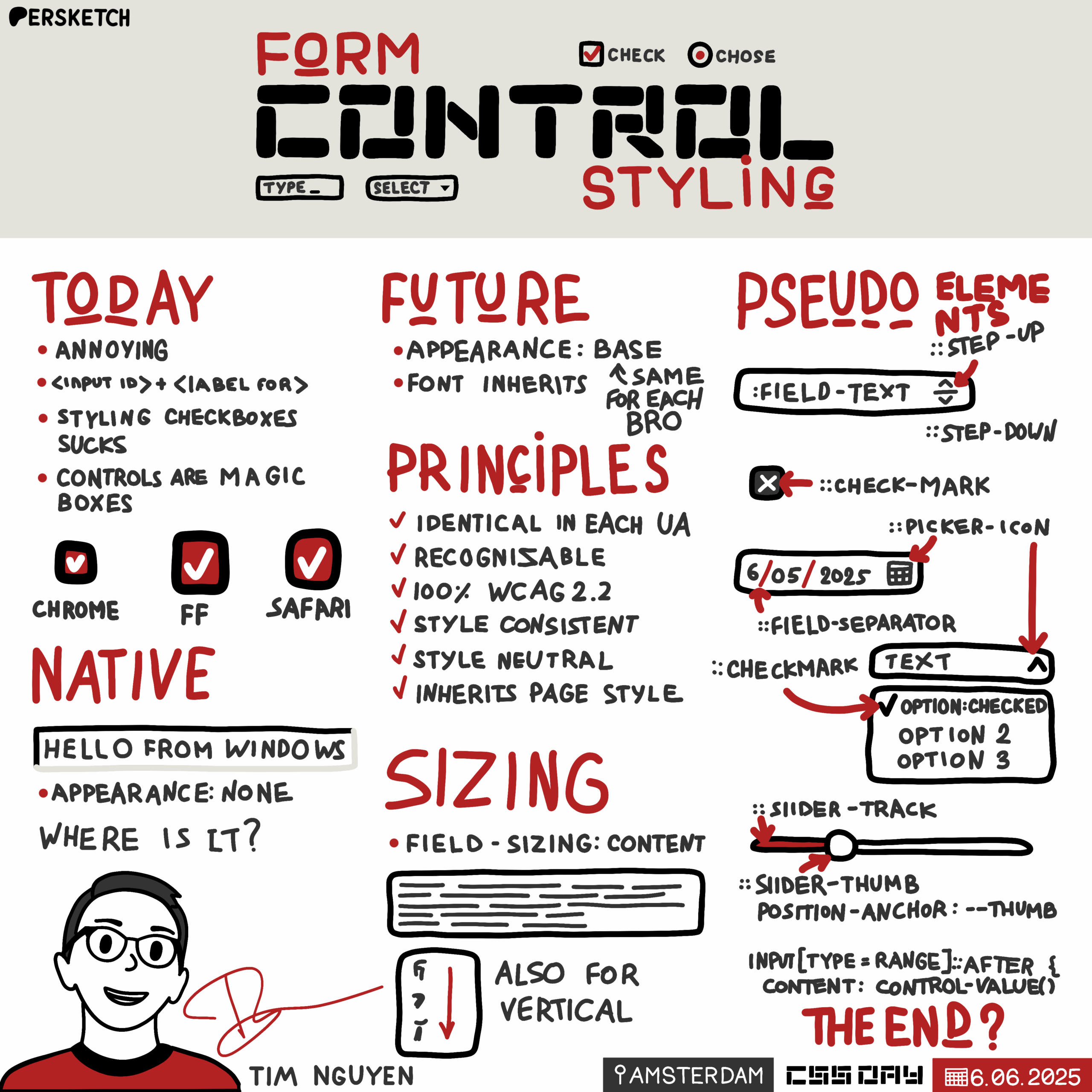
Tim discusses the current state of form control styling, illustrating the difficulties developers face with a case study on checkboxes. He explains how big brands often rebuild controls from scratch due to the limitations of native form controls. Tim shares his past experience with styling checkboxes and the convoluted methods developers have used, highlighting the need for better solutions. This segment sets the stage for exploring improvements in form control styling.
User Agent Styles and Form Control Limitations
Tim delves into the concept of user agent styles in CSS, comparing them to customer service and explaining their role in form control styling. He demonstrates how native form controls resist styling changes, such as background color, due to their inherent properties. This discussion underscores the challenges developers face when trying to customize form controls, reinforcing the need for more flexible styling options.
Historical Context and the Need for Change
Tim provides a historical perspective on the importance of native form controls, tracing their evolution from the days of Windows 95. He explains how user familiarity with operating system patterns influenced early web design and how branding needs have since evolved. This segment highlights the growing demand for customizable form controls that align with modern branding and design trends, setting the stage for introducing new CSS specifications.
Introducing CSS Form Control Styling Specification
Tim introduces the CSS form control styling specification, a new draft aimed at addressing the limitations of current form controls. He explains the concept of appearance base, which eliminates the "magic" of native controls and provides a consistent styling foundation across browsers. Tim demonstrates how appearance base simplifies form control styling, making it more intuitive and aligned with the rest of CSS. This segment previews the future of form control styling and its potential impact on web development.
Advanced Form Control Styling Techniques
Tim explores advanced styling techniques enabled by the new CSS specification, including pseudo elements for form controls. He demonstrates how developers can use these pseudo elements to customize various form control components, such as checkboxes and date-time inputs. This segment showcases the flexibility and power of the new styling options, encouraging developers to experiment and provide feedback on these emerging features.
Engaging with the CSS Form Control Specification
Tim concludes by inviting the audience to engage with the CSS form control specification process. He emphasizes the importance of developer feedback in shaping the future of form control styling and provides resources for exploring the specification further. This segment encourages active participation in the development of CSS standards, highlighting the collaborative nature of web development.
Bramus: Tim is a WebKit engineer at Apple and you might know him from features that he has implemented or you might have used some of the features that Tim actually has implemented. Like who here uses the Dialog element? Yes, Dialog element, 'Dialog showModal()'. I love that one.
Popover? Popover?
Yes, yes, yes. Tim also did work on that. One that I really like: View Transitions.
The SPA version - SPA is also known like we just saw yesterday, RFW? MPA!
So MPA, sorry, MPAs, also known as RFW - like 'real fucking websites' - was the abbreviation. This website - so you have a page, it has a link, you click it and it goes to the next page. Whoa! The Web has been good at that for the past 30 years. So Tim also did the work on View transitions in Safari.
So if you have any feedback on all these things that I've mentioned, hit him up later. He's around, he's a friendly person, Ask him questions, give him feedback on this stuff.
Tim has been around for quite some time as well. He first started doing contributions, by the way, to the Firefox user interface and then eventually he made his way to Apple to work on WebKit.
And today, who here ever has tried to style a form? And who here loved styling a form? Seven of you?
That's not many. Tim will show us the way forward because Tim will be talking about form control styling. So please Tim, take it away.
TN: Apple is very well represented here. There was like a picture of Steve Jobs yesterday and there was one just earlier this morning. Anyway, Form control styling, it's a very interesting topic with a lot of interesting history, but also a very interesting, exciting future.
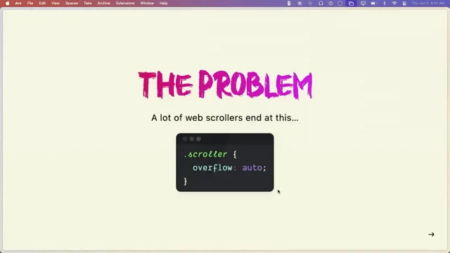
But before I dive into the future, I want to show you what form control styling feels like today.
So who here has completed the State of CSS survey?
Not that many of you. Okay, who here hates styling form controls.
Okay, more of you. Great. So that lets me transition to the other slide. So why is everyone complaining about this? So let's look at a case study on checkboxes.
So here I have some checkboxes from Nike's website and if we look closely, they're not actually using input-type: checkbox.
They're rebuilding the whole checkbox from scratch using button elements and div elements.
And they also need to take care of accessibility.
Anyway, my point here is not to be mean against Nike, but it's to say that form control styling is so annoying that big brands are willing to rebuild controls from scratch instead of customizing the built-in elements that HTML provide.
So I actually built this framework for material design 11 years ago. And this was a project I did for fun before I joined Apple. And I want to show you my own experience with selling checkboxes.
So I did one of the things every smart developer would do.
I searched the Web for advice.
And this is the advice I was given. So you put input followed by a label, and the label is actually empty.
And then the label is linked back to the input using the 'for' attribute.
So that when you click the label, it will also toggle the checkbox.
But then the advice is to apply 'display: none;' onto the checkbox. So it's getting weird.
And then you have selectors like these to style the checkbox.
And this means style the label next to my checkbox when my checkbox is checked.
So this pattern avoids styling the input directly and puts all the styling burden on the label. So my label is actually my visual box for the checkbox. That's kind of insane.
So this is not the current advice anymore for styling checkboxes. And thank God. But I remember thinking, this really, really sucks, but let's see why the Internet recommended this.
So here I have some checkboxes with no styling. So you basically get native checkboxes.
And then here I try to apply 'background-color: light green:' but nothing actually happens.
My checkboxes are still native, so.
So let's see how other things in CSS work.
So one really important concept in CSS are User agent styles. And I like to think of User agent styles as like customer service.
You don't know what the outcome is going to be and it tries to help you, but you don't know what the outcome is going to be like.
So here I have some headings and a paragraph with no extra CSS and they have different font sizes and font weights, so that's normal. You probably expect that. And this is your browser trying to help you by saying your headings are large and bold and there's spacing between paragraphs.
And this helps the user recognize and distinguish different types of content.
So you can actually see those styles in the developer tools.
And if you're in Firefox, you. Oh wait, if you're in Firefox, you need to fiddle around a bit in the settings if you want to see them. But anyway, if I apply some styling on the H1, it just layers on top, right? The purple background and the white text color are applied in addition to the larger text.
But that's not what we saw with the checkboxes earlier.
My light green background did not work.
So form controls are really starting to feel like magic boxes.
Now I want to go back in time to describe why native form controls had so much importance.
Windows 95 was one of the first operating systems I've used, and personal computers just started being mainstream back then. Most people had to go to the library if they wanted to use computers. And when you taught someone how to use a computer, you had to teach them how to use a mouse.
There was a lot of overhead around just learning how to use a computer. Now, on this old screenshot of Google on Internet Explorer, notice how the address bar in the browser and the search box on the website, they look the same.
And the buttons on the scroll bars and the Google search buttons also matches.
So good user experience back then was following patterns of the operating system.
And in fact, all the buttons in the operating system looked the same.
And that way you could recognize what they were and you could teach to someone that a 3D looking box was a button that you could click on using a mouse. And the text inputs were white boxes with gray borders that you could click on and type in using a keyboard. And some of these patterns are still a thing today. So here we have some text that's underlined, and most of you will think it's a link. And you can watch Chris's talk if you want to learn how to remove the underline.
But anyway, browser makers wanted these patterns to stay familiar, and that's why you have form controls that are native by default.
Now, if we go forward like a few years ahead, people got more familiar with computers, and CSS and technology in general got a lot more powerful, especially CSS. Yay.
And brands really started to care about how to apply branding to their digital space since they had more and more online users.
Now, if I blur the previous slide, you'll probably recognize most of these logos, and brands want that same recognizability on their digital spaces. And in fact, it's crucial for some brands. So these are two different messaging apps from Meta with a very similar feature set, but you can distinguish them from each other using the colors of their digital space.
Now, native form controls can be an obstacle for that, especially with the look and feel being different across browsers and platforms.
So native controls aren't really an ideal default anymore if you want to get fancy with branding.
And typography is also a very important part of branding. And in CSS, Web Fonts were created to make that more powerful on the Web.
So let's see how they work.
Here. I have a very, very, very, very basic website layout with a sidebar and some content. And with sites like Google Fonts, web developers can just use web font with two blocks of code. First, they import the style sheets for the font and then they set the font family on the root element.
And once you do that, the font changes and it inherits all the way from the root element down to your headings and paragraphs. And to quote John yesterday, "it flows like water", you know, but then here you notice that the text input hasn't changed. They got stuck in the past. Like water isn't flowing there. It's like a beaver built a dam around the text input.
And this is your browser trying to be helpful by saying form control should have a native font.
And you know, most of you have probably worked around this by reapplying the same font directly on the inputs.
You can use 'font: inherit;' if you don't want to repeat the font family.
So that's a little trick. But wouldn't it be cool?
Wouldn't it be cool if the browser just did this by default?
Because this is just one more thing that makes form controls feel like magic boxes and different from the rest of CSS. But I'll come back to this later.
Now next, I want to teach you about some concepts that you probably know about, but you can't really put a name on.
So as you probably know, you can get non native text inputs and in fact you see them everywhere on the Web. And thank God you can do this. You can apply a background color and it will work on text text inputs, but then you also get some Windows 95 style borders on the inputs. And this is what the standards call the primitive appearance. And there's a couple of properties that will get you into this primitive appearance.
You have all the background properties and all the border properties.
That means if you set like a filter or a margin, it won't actually like to give you this appearance. You will still get a native form control, but this does not work on all controls however, there are some controls where you need appearance: none to get into this primitive appearance. That is the case for checkboxes, radio buttons and range inputs.
That is why setting a background color didn't do anything on our checkbox, because the checkbox still kept its native appearance. Now let's see what happens when you force the primitive appearance onto the checkbox using appearance: none. Well, my box actually disappeared.
I should be seeing a light green box or something like.. my box just disappeared. But well, it's actually there. It just has a zero by zero size.
So if you add the width and height, it shows the box again.
But then initially these boxes are not usable.
Like I can't see which one of these is actually checked or disabled.
So I have to rebuild everything from scratch, including all the states.
And this is the current advice for styling checkboxes.
Imagine being new to CSS and having to deal with this. It feels really magical and error prone. I could easily forget to style a certain state and it can just make you feel lost if you lose the box when you apply appearance: none, right? So anyway, to summarize, current defaults are very, very magical.
The font family, the text color don't get passed into your text inputs. The checkboxes need to be recreated from scratch if they want to be styled. So at Apple we've been thinking a lot about addressing these specific problems.
We developed this CSS Form Control Styling specification, which is now our first public working draft. Now, most of the things I'm going to talk about next are a preview of the future.
So you can't use them in any browser yet.
Part of this draft includes 'appearance: base' and it wipes away all the magic we saw earlier and lets you start from a consistent set of styles that would be the same in every browser. So let's see how that looks like. So here I have a form with some native form controls since I haven't styled them. And if I apply 'appearance: base', I would get this styling.
There's still a bit of discussion around it, but that's what you get now.
And here's what happens if we add a gradient in the background of the page. The background of the form controls in 'appearance: base' is transparent, so you just see through the gradient.
And this is a screenshot of 'appearance: base' across both color schemes. And you'll notice a few things.
The text color matches the parent form by default and the border color matches the text color for all controls.
And by adding 'appearance: base', I can simply style one of the parent elements like the form. And the form controls would feel like part of my website really easily. So in this case, I've set a black background and a green text color and I've added no extra styles on the controls themselves aside from 'appearance: base'. And this is what the end result would look like.
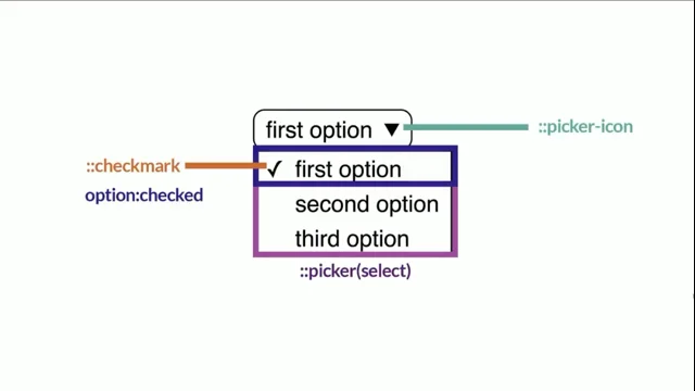
And we've also fixed the font problem from earlier. I could just set the font-family on the root element and it would inherit all the way down to the form control. So to summarize: by default, the font family and the text color inherit, there's a transparent background and this is exactly the same as styling a plain And this is - styling form control should just be as simple. It shouldn't be a magical box. So when trying to come up with the appearance base, the CSS Working Group wrote some design principles and these are some ideals that the Working Group wants to achieve. And this makes sure we don't repeat mistakes from the native or primitive appearance, and also to make sure that appearance: base is friendly for developers. So let's go through some of them. The styles are identical in every user agent. So this sounds like a very obvious one. But the native or the primitive appearance don't work the same in every browser, but they will work the same for appearance: base. The controls are recognizable and usable on their own without additional styles. So some of what I said earlier about familiar patterns is still true. We still want users to recognize what a text input or a button is. And this is why there's like borders on form controls, for instance, because if there's no borders, you wouldn't know where to click on the page to focus the form control. The controls pass 100% of accessibility standards, so developers should be able to trust built-in form controls. And getting accessibility right is a very important part of it, since you can easily get it wrong when you rebuild your own. The styles are consistent across controls in look and feel. So this means that if you put two form controls that have appearance: base, they should feel like part of the same universe. The styles are consistent across controls in how they are defined in code. So this means we should use the same methods when we define the layout and styles of the controls by default. Like we shouldn't - if we use padding on buttons, we should use padding on text inputs for the default style. So there's no surprise when styling one type of control versus another type of control. And the styles are easily adapted to the website's branding without needing complex reset stylesheets. They use minimal code and are easy to override, so it's not painful for developers. They don't have a strong voice and tone of their own and are visually as simple as possible. So this means the design should be timeless because design trends keep changing endlessly, so we don't want to end up in a situation where the default style is a Windows 95 style input that you saw earlier. Last of all, they inherit page styles rather than define new styles whenever possible. So this is everything that I showed earlier about the font inheriting and the color inheriting into the text inputs, and all these principles play together to achieve the current appearance based default design. So defaults are really, really important. They make up a bunch of the developer experience, especially if you're new to CSS. And since we have this chance to restart from scratch with appearance: base, it's important that we spend time getting them right. So now I want to look at something else that's magical that browsers have started addressing, which is form control sizing. So here we have a text area with four lines of text, but only two lines of our text area are shown when we display it. And here I have a So this is how you can try it out today. You just apply 'field-sizing: content' to your form controls and the size of the text area will adjust as I add and remove lines. So this is a pretty cool trick you can start using now if you want. I mean, Firefox doesn't support it, but... Anyway, we'd love for sizing to not be magical for appearance: base. And we're actually debating whether to put 'field-sizing: content' by default. So I'd love for you to try out field sizing and your thoughts on how it feels and whether it would be a good default for you to work on top of. So who here is or has worked on the... who here is from the Chinese or Japanese or Korean market. Okay, one person. So I don't know if the next slide will be very relevant, but one other thing that browsers have fixed recently is you can lay out form controls vertically for Chinese, Japanese or Korean text. And that's actually new since 2024. It's very recent and that's thanks to Interop 2023. So you could imagine getting a bit more creative with online questionnaires or quizzes with it. So I hope that this really changes web design for the East Asian market. I went to Japan recently. I've seen very awesome posters, so I hope people will be able to do great things with this. Anyway, I've talked a lot about defaults and sizing, but what about these little bits and pieces inside the form control, like the button inside the file input or the little icons in the number input. Some browsers have a generator tree and let you target different parts through what we call pseudo elements. And most of these pseudo elements are non standard and differ across browsers and that makes them very, very painful for developers to use. Thankfully, there's parts that are already standardized and that you can use on your website, like the '::file-selector-button' pseudo element. And another common part you probably know about is the '::placeholder' inside text inputs and this is also usable in all browsers for a lot... it's been like a couple of years now. Now let's talk about the future. In the future, appearance: base would opt you into new pseudo elements. So one of the pseudo elements is '::field-text' and it actually targets the area where you type the value. So here I've changed the background to yellow and in the future number inputs would get new pseudo elements and '::field-text' is what I just showed earlier. And it's more relevant for number inputs than for text inputs really. '::step-up' and '::step-down' are the buttons to increase and decrease the value. And '::step-control' is a container around these two buttons. So I want to go through a small example on how to use those pseudo elements to achieve this result. I don't know if this is hot pink. No, I think this is magenta actually. So first of all you want to apply 'appearance: base;' to get the new pseudo elements. Then we can remove the border from the inputs, which is awful now, but we can add it back onto '::field-text' and we get something like this. And then we can change the up and down arrow images to our liking using the '::step-up' and '::step-down' pseudo elements and the content property. And since by default appearance base uses Flexbox to lay out the form controls, you can use the 'order' CSS property to move the '::step-control' before the '::field-text'. I don't know if this is great for accessibility. Please double check. This is just an example for you to see how to use those pseudo elements. Next I want to come back to checkboxes with a preview of how you would use them in the future. So you would get a '::check-mark' pseudo element and by default the checkmark pseudo element has Unicode character as content, and 'input type="checkbox/radio"' can also use this pseudo element. So let's go through a basic example. So first of all you would apply 'appearance: base' to get the new default styles and the new pseudo elements. And I can change the border color to magenta or hot pink, whatever you want. And then the disabled state actually already works because appearance based sets opacity by default, that's something we might change, but that's how it currently is. But we can customize the check state. So here I've applied the magenta backgrounds and I've applied the white text color and we can actually set the text color here because our check mark is a Unicode character. But if you don't like the Unicode character, you can change it by setting the content to a custom svg, for instance, on the ::checkmark pseudo element. And as a final touch, we can add a small border-radius so it actually looks like a more realistic example. And that's our result. So notice how I did not have to set any of the sizing related properties. I only set styling related ones because appearance: base would give me one the width and height instead of making me start from nothing like appearance: none would. So it feels a bit more like the rest of CSS. Next, I want to show you the future parts for the date/time inputs. So you have '::field-component' which are the pseudo elements that represent the numerical components of your date and time. You, you have '::field-separator', which is a separator between the components. And you have '::picker-icon', which is the icon that you can click to open up the picker. So one thing to note right now is that you can't target a specific component because the ordering of the components depends on the current operating system's locale. So it might lead to unexpected problems to style each component differently, which is why we decided not to allow that. Imagine you decide to make the year larger, and at the bottom then you might screw up accidentally. We haven't addressed the calendar picker yet because it's quite complex. There's many use cases. Some of the use cases involve adding prices under the dates and it requires extensions to HTML. So it's not quite CSS only. Anyway, I want to go through another example. So here we apply appearance: base, which gives us access to the new pseudo element. And then I can style the picker, change it using the content property, set it to a custom svg, and we can change the color of our separators as well. So here I've set the separators to be magenta, and we can also add a margin around the separators to make the date a bit more readable in real world situations. So that's how we get this result. Now, the new customizable select that everyone is super excited about, and that's already in Chrome and the Chrome team has done a lot of work standardizing this in HTML. So big up to them. So the new customizable select is also part of this world because it also takes in the font family or the text color from your parent element. If you use appearance: base, some of the new pseudo elements are shared like '::checkmark' or '::picker-icon' for instance. Brecht has done a whole talk about this yesterday, so if you haven't seen it, you can watch it to learn more. Now I want to move on to show you the preview of the future of sliders. You have '::slider-"track, which is a full track for the slider. You have '::slider-fill', which is the progress part of the slider, and '::slider-thumb', which is the part that you can drag around the slider. And we've also seen a lot of use cases like this where you display the current value of the slider on top of the thumb inside a bubble. Currently you need to use JavaScript if you want to reflect the value of the inputs. I've said the bad word JavaScript. So we decided to introduce the 'control-value()' function in our new spec to allow doing this without JavaScript. Let's see how we can reproduce this result. So first of all, to build our bubble, we want to add content after our range inputs. So we can use the '::after' pseudo element to do that and we can set the content to control-value which will reflect the current value of the slider. And we can also add a background-color and a text-color. Then if I want to get the sizing right, I can set a width on the bubble. But to do that I need to change the bubble to be inline-block because by default the '::after' pseudo element is inline element. I also need to set the aspect- ratio to one to make it a square instead of a rectangle. And this gets the sizing right. But then the text alignment is a bit weird. So to fix the text alignment, I can swap out inline-block for inline-grid and I can use 'place-content: center', which is a nice shorthand for align content and justify content. And then you can apply 'border-radius: 100%;' or 1 exponent 3 as I saw yesterday on Adam's talk. And now the so wait, what side am I on? Okay, so now we have the bubble, but it's not actually anchored to the to the thumb. So if I want to display my bubble on top of the thumb, I can use anchor positioning, which should be widely available by the time control-value is available. Fingers crossed. So to start, I need to use appearance: base to get access to the pseudo elements. And the reason we need access to the new pseudo elements is because we need to set an anchor-name on '::slider-thumb' and once we have the anchor-name on '::slider thumb', we can refer to that anchor-name from position-anchor on the bubble. And then we need to set anchor scope to --thumb because anchor-name will do document wide lookup. So if you use multiple 'input[type=range}'s on your page, it will all refer to the same element if you don't scope the names. So we need to set anchor scope to make sure this works when you put multiple range inputs. But this anchors my bubble to the thumb, but my bubble is actually overlapping the thumb and to put the bubble above my thumb I can just use 'position-area: top center;' and that puts it on top and that's how we get our result. So control-value is not just for the CSS content property. It can also be put in calc functions to generate lengths or angles. Hopefully people will get very creative with this and hopefully you'll enjoy this extension. This was a preview of some of the new stuff and there's many, many different steps to ship a CSS feature. There's lots of drafting, debating decisions and prototyping, and these steps are not linear. A lot of these repeat. I had a much messier version of this slide, but I decided to only show a simple version because it was too messy. But anyway, this is where CSS Forms currently is in the process. So it's not currently in any browser. But that means you can be part of making this happen. So I'd love to know if there's any use cases or pain points that we haven't thought about. So you can check out the spec. There's more in there that I haven't covered. And I got the great idea from previous speakers to add the QR code. That's great. And this is a link for issues if you want to file issues and request stuff. And here are my socials. I'll put them here for a bit. You can also just come up to me during CSS Day if you have any questions. I don't bite, I promise and thank you for listening.
Text inputs, checkboxes, radio buttons, sliders… Form controls have been part of the web since the beginning, but styling them can still feel like a battle. If you’ve spent time struggling to figure out countless lines of CSS to make them look right, or rebuilt native elements from scratch because they weren’t customizable enough, you’re not alone. In this session, we’ll explore why HTML form controls have been so hard to style — and introduce upcoming improvements that will make them easier to customize, using only the power of CSS. You’ll also get a peek at how form controls have evolved, and how the new enhancements fit into the broader web ecosystem. If you’ve ever struggled with form controls, this talk will give you practical insight and a glimpse of what’s next.
Sketchnote by Artem Pendiurin