Designing with Components
(bright music) (applause) - All right, thank you, John.
Yeah, so as you heard, my name is Mark Dalgleish, and of course I'm here today to talk to you about designing with components.
Now, I work here in Melbourne at SEEK, a company that luckily you are all familiar with so that saves me some time.
My focus there at SEEK is, particularly in the realm of front end tooling, we have a dedicated team for that and of course a big part of that is design systems which we look after as well.
Now, design systems are all about bridging the divide between design and development, that's of no surprise to anyone in this room, I'm sure. But what does that mean in practise? People obviously take this different ways.
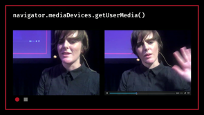
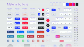
So for example, if you're at SEEK and you're a designer, this might be what you see during the day, I'm creating a Sketch file here.
And it's very normal for designers to have a Sketch library that they pull from with reusable symbols. Here, we're building a sign in form with an email address, password field, we're changing the text in there to be what we want on the error messages, adding some buttons at the bottom there.
But there's a bit of a catch to this demo, even though everything that you're looking at is in inside of Sketch, we actually generated for our code base.
So this is using a CLI tool that is open source that we wrote called html-sketchapp CLI, this actually wraps another open source tool called html-sketcher.
So here we're pointing it at a URL which is our local documentation site and we're telling it on disc where it should write to. So we have a hidden route on our style guide website that looks like this, it renders all of our components in their various states top to bottom and each one's wrapped in a div with a data attribute that allows the tool to find it, know what the symbol should be called and how to generate that Sketch file from that. So this has been a huge win for us to try and unify these two domains, keep us speaking that same language and feeding our development work back into the next round of design.
But there is a problem with this method, it's not perfect of course and that is that Sketch isn't a browser.
We're kind of trying to act like it is but that page that I just showed you, if you were to actually go look at the source, there's even hacks in there as if we're targeting an old version of IE or something like that. And Sketch is not a very dynamic environment, it's almost like we're taking static screenshots of it in these different states so it's not like working with the real underlying code and this has not gone unnoticed by the design tooling industry, there's a new generation of tools coming up that have realised this and they're trying to cut to the core of this problem.
So the most notable one in this space is called Framer X, Framer's been around for a long time but this is their new tool and it's built from the ground up to work in this way so it looks and feels like a traditional design tool, dragging and dropping components into the page but the trick is that those components are written in code, you can view source on those, they're written in React. And they also have a store attached to their tool where you can go there and search for component libraries and instal them with the click of a button, you can publish your own ones there as well. They've got tooling on MPM for publishing automatically from CI, they've got it all sorted out, it's really amazing stuff. But yeah, they're not the only one in this space, there's also Modulz Studio, is another one that's in active development at the moment and it's again, following the same principles of laying out a page but using the components written in the original source code that you've provided.
Interplay is another one, this one's partly come out of Australia as well which is really great.
Here you can see it's actually being used to create a SEEK page, it's a tool that we've used ourselves a little bit and these are all very much, again, following the same principle of being able to pull in your component library and feed it into a traditional design tool. What I love about these as someone who's really interested in both the engineering and the design aspects of the web is that it's blurring the lines between both sides of the design in code equation.
But what makes these design tools, I think it's a very important thing to reflect on, especially as we start blurring these lines more and more, why do you reach for one over the other? So the big thing about design tools, I think, first of all, is that they're easier to get started. It's very simple to instal a design tool and get up and running.
It really doesn't require much expertise to get a black document on the screen and start playing with it.
So new documents are cheap, that's a key thing about design. Design is very much about iteration and being able to start up a new environment is really critical to that.
And once you're iterating, that iteration speed needs to be really fast. Again, design is about iteration and trying things and you really don't wanna be held back by the intricacies of the underlying platform if you can avoid it.
And once you start to narrow down the ideas that you think are working, that work should be easily shared and design tools are all about that with files that you can of course send around to people, single Sketch file or you're using a web-based alternative like Figma, for example, the beauty of it being on the web of course is that you can just send a link to someone, which is fantastic.
But what about development tools? Is there anything out there that's trying to follow these same ideas in the world of development tools? And if you have a look, we've actually been doing this for quite some time now.
You've got tools like JS Bin that are just web-based, these are really great for lowering the barrier to entry for people who wanna get started in coding, for example, because just by going to this website, you can start typing some JavaScript, executing it and seeing the result on the other side. More advanced versions of this concept are things like RunKit where you can actually run packages from MPM.
This is actually integrated with MPM so if you look at the documentation page for any package of MPM, there's an automatic link to a RunKit page for that package.
So here, we're playing with Lodash and again, no set-up, very easy to get started. Babel is another interesting example where they've got a REPL on their website which lets you play around with new JavaScript language features or things like JSX in this case and you get to get a nice feel for what does it turn into once it's compiled into regular old JavaScript. I know a lot of people have used this as a way to wrap their head around what is going on with something like JSX and you can see on the other side that that's just turning into a React.createElement call, not that scary once you see that process in practise. Another really good example of this that we use all the time at SEEK is the TypeScript playground, as they call it. So on the pane on the left there you can write TypeScript code and it gives you the auto-completion and the type checking that you expect in a full IDE, but not only that, similar to what we saw with Bable, you see the complied output on the side and you get to be reassured at how it pretty much is the same code, just minus your type annotations so that's great. The real extreme end of this type of tooling is CodeSandbox. Now, if you've never seen CodeSansbox, it is really incredible piece of tooling, it's basically a full IDE in your browser.
It's got a file browser on the left there, you can create new files, it's got a package JSON and you can add dependencies to it that get installed from MPM and what's amazing about this is that it's got this whole community around it where you can see how, I'm actually pulling from a tool kit that someone else has prepared for React Native for Web. I can fork this if I want and make changes to it and share it with other people, I can sign in with GitHub and link that all together, and one thing that they've recently added actually is being able to deploy this to a website for other people to see.
So you can go from zero to a running website without installing any software on your machine. If you wanna teach someone how to be a web developer, this is an amazing place to do that.
So what about design systems? Is there any way that we can bring this thinking into the world of bridging design and development? I think there's a lot of opportunity in this space. So to cut a long story short, we tried a lot of things internally and that's culminated in the creation of this tool called Playroom, it's an open source tool that you can try yourself and I'm gonna give you a quick demo of it rather than explain what it is.
So here is our SEEK style guide website, it's very much your traditional style guide site so if I scroll down, you can see that we've got our different components and you can see them in the different states and everything like that, you get the code snippets for that generator automatically based on those props.
But the interesting part for today's session is that we have a Playroom link here.
So when I click that, give the Wi-Fi a second, we now have this environment here that looks similar to a design tour but the difference of course is that we've got this white section at the bottom here so this is where I get to write JSX code.
This is kind of a trick up our sleeves here as front end developers is we've been able to create our own domain specific language and we can start applying it here.
So what that means in practise is I can start by adding a header component and as simply as that, I've got the SEEK header responsively across mobile and various sizes of tablet, desktop and so on, and it is interactive. So right now it's in this sort of pending stage so you can see it's loading, it doesn't know yet whether I've signed in or not so what we can do is start to pass some props to that to change that.
So if I say that my authentication status is authenticated, you'll see it's got some auto-completion there for me and my username is Mark.
And so now I'm signed in, my name showed up on the menu, if I open it, you can see that it's got features that are only available when you're signed in, it's got a sign out here at the bottom as well. So we can start to round that out now, I can add a footer as well.
We'll add that to bottom of the page and now we've got the top and bottom of a standard SEEK starting to be formed.
So what I'm gonna do now is do a bit of a hello world of a UI from a component library which is a sign in form. So what I'm gonna do is add a section to the top of the page and inside of that I'm gonna add some text and I'm gonna, oops, I'll add some text here and we'll say sign in.
Now, it's a little bit small by default because I need to use our hero text size so that's enlarged that a little bit.
Now, below that, what I'm gonna do is add a card to the screen and inside of that card, I'm gonna add a section and inside of that, I'm gonna add a text field. Now if I hit command S at any point, it's gonna format it with prettier so if anything gets a bit long on one line, you can tidy it up a bit.
Now, inside this text field, I'm gonna add a label of email address of course. Now, what you'll see is that already I'm starting to be faced with the problem inherent in response of design which is something that might look great on mobile, it's starting to stretch wildly across these larger screens, especially if I scroll across to our 1024 size card, that's quite extreme.
Now, we have layout components for dealing with this but for the sake of our session today let's pretend that I didn't have that and I had to hack my way through it, I can start to add something like a style attribute here and say that the max width is 400, let's say, and shrink that down a little bit.
Of course, I can play with that, make that a little bit larger.
Now, let's start finishing our form so we're gonna add another text field, we've got our email address, now we need to have a password. Because these are real Iframes rendering real code, I can interact with the form.
Now, that password is not hidden, if someone's nervous about that, I can just say type the password.
It will rerender and keep the state so you see that what I've typed in the field stayed there. Under that, just to round it out, I'm gonna add a button group component, inside of that, I'm gonna add a button and we'll say submit.
Now that needs to be mocked as which colour we want, we'll say that we want the pink version and then finally, we'll round that out with a, oh, let me format that, be a bit easier to work with. I'll add one more button which is the cancel button and we'll make that of type transparent.
So simply is that we're starting to get a form together but this time it's in real code and there's really no question about which things are in the system and which things are missing.
If I was to show this to another developer, they can see that this is maybe a gap in the system that I've had to reach for this.
Now, when it comes to sending to someone else, one thing that's really interesting about Playroom that you can see right now because it's full screen is that the entirety of this code is Base64 encoded in the URL.
So I can copy this, I could send that over Slack to someone, they it the link and there we go.
They can start to see my work as it's evolving, they can make changes, of course, and sent it back, that's the beauty of the web and the beauty of URLs. I don't have to convince you of that, I'm sure. Okay, so, that was a basic intro to Playroom, there's obviously a lot further you could go with that. As I said, it's available on MPM, it's open source so if you wanna check it out and try it on your own component library, please do. The two main commands that you would use with Playroom are start and build.
Start is for your local development environment and build is what gives you a finished website that you can deploy into production for your component library.
Now, it's configurable like all good JavaScript libraries with it's own config file, here you can see that what we are able to configure is which components were available in that scope at the bottom so you saw there that I didn't have to import anything explicitly, they're all available, that's how you can figure that. So that components files is just something that exports all the components that you want in that scope. There's also themes there so if you have a themed system, you also expose those in a similar fashion. You have a frame component that allows you to configure how each frame is wired up at the root level if you have any theming, that's where you're gonna do that. You can configure the responsive widths that you saw there so whatever's relevant to your company, which screen sizes you target, you can configure that. If you wanna go to the extreme end of configuring it, we also exposed the webpackConfig if you're doing anything interesting with Webpack. So I mentioned themes there, what about themes? We haven't seen that so far.
The reason that themes particularly are important for us at SEEK is that we're actually working on a new design system called Braid and the reason for that is as was alluded to earlier in the day is that SEEK is actually the SEEK Group, and we're a global company with different brands around the world and we're looking to start sharing our products more across those boundaries and in order to do that, we really do need a design system that can spam those brands automatically based on our theming system, so that's what Braid provides.
Now, this is what Braid looks like, here you can see, again, it's very much your standard component library except this time it's got all the different themes exposed for you but now when you go to the Playroom for Braid, you'll see that it's not just the responsive screen sizes going across the screen horizontally but also the themes. So we've got four active themes here, one of which is a wideframe theme if you wanna work it in a more abstract fashion. That's actually the theme we use for the Braid website itself.
And so this is what allows us to start operating in this way, it just would not be possible for us to design at a code level without tooling like this, it's very much why we went down this road.
Now, the interesting thing for me about this is that it was created to surface these components in an easy way but it really started to augment our workflow in ways that I hadn't planned for. So the first thing to note is how it changed our development workflow, so for the developers working on Braid, it's really not uncommon to see this on their screen or generally across multiple screens so you might have your code window on one monitor, on another you've got a browser window with Playroom open and what this lets you do is it lets you jump back and forth between iterating on the code base itself and the underlying logic of the components but then you get to simulate what it's like to be a consumer, to play around with those components, compose them in different ways, add and remove props and see what happens.
This is something that's really hard to do if you don't have an application typically to run these components and this gives you that development environment. Again, this is not something that we planned for but it just naturally started to pop up again and again that this was the best way to develop these components. The other thing as well to note is our pull request workflow so we're big on pull requests and making sure that all changes to the code base go through a set of quality controls and code review and so on.
So here is a pull request adding a text field to Braid, this was a while ago, now each commit to the pull request has a set of checks against it, it also deploys a copy of the site as a preview. So you can that I can navigate the full website for Braid but because Playroom is part of the website, it means that I also have a copy of Playroom with the new proposed component in it.
So as I said, we're introducing a text field here so I can add a card to screen, add a text field, add a label to it and start getting a feel for, not just what does this component look like in a simple example, but what is it like to build up a realistic form? Now, luckily, that's already been done for me because the person who opened this pull request provided a Playroom example link for me.
So if I click that link, here's what the author of this PR has presented as a good example of what this looks like in a realistic scenario.
Of course if I wanna change anything about this, I'm free to go into the code below and start iterating and we've even found that this is good for quality assurance where sometimes you might find that there's actually a bug once you start playing around with the code underneath. Now, typically to go through this kind of flow, you would need to go out of your way to pull down their branch, instal any dependencies I might have added and spin up a local development environment, with this it's just one click away and it's very, very, straight forward.
The goal of this was ultimately to make our component code more approachable and not just for developers but for designers as well and to really drive out those conversations. So making it easier to get started, with new documents being cheap, iteration being fast and work being shared easily, I think this is a really important set of constraints to put on yourself when you're trying to build tooling that really cuts down the divide between these two domains. So what does this mean for UI design? What does this mean for people in this room? I think, to me, it paints a future of low fidelity iteration, that low fidelity iteration should be on paper. I think if you talk to a lot of people, particularly in the UX industry, they will strongly agree with this, that this is really the way that you should be planning out new screens and flows and what a user sees because at this point, it's not so much about what it looks like, it's about what behaviour you're exposing.
If what you want is high fidelity iteration, that should be in code the further you go down this road of having a design system because design systems are all about designing this palette once and reusing it, applying this on top of your wire frames later in your design phase.
To me, as someone who's interested in design and engineering, I'm excited about the prospect of design in the final medium.
Tools that embrace the web and code as a first class design medium which I think it really is. So we're seeing the rise of code powered design tools but what I'm really interested in seeing is design powered development tools.
Tools that bring the mindset of designers into our development flow and that's what's gonna take design systems out to scale into production and feeding back into the next round of design. Now, as I said, Playroom is open source so if this was interesting to you and this is a space you're working in, please do download it, add it to your set-up, give it a try and let me know what you think, I'd love to hear how it works out for you but otherwise, that's it for me, thank you so much for listening.
(applause) (bright music)
Thanks to modern component-oriented architecture, the front-end community has been naturally gravitating towards design systems as a way of standardising our respective design languages into reusable components. When done successfully, it suddenly becomes trivial to translate standard designs into code. In fact, we may even find that this translation step starts to feel somewhat redundant.
In a world of components, how should our design processes change? How should our tooling change? How should we, as front-end developers, better enable this change? In this talk, we’ll look at the current state of design and development, and where we could go—if we’re willing to push for it.
Blown away by @markdalgleish demoing the tooling for component based prototyping #code19
I really want to know the cons of doing this thus far pic.twitter.com/5GiVgEmVad
— Xavier Ho ?️?? (@Xavier_Ho) June 21, 2019
Design systems are all about bridging the divide between design and code. What does that look like in practice for Seek? They use html-sketchapp to generate Sketch symbols, so devs and designers work from a common source when working with the design system.
There is a problem though – Sketch isn’t a browser and still works like the old ways of static mockups/screenshots. A new generation of tools are trying to resolve this:
This is blurring the lines between design and code, and adding new options to the tooling choice.
Why still use a design tool? They’re fast, easy, new documents are cheap; and the work is easily shared.
What about dev tools? We have tools like…
- JSBin
- RunKit
- Babel
- Typescript playground
…which are essentially REPLs so you can easily get up and running. There are more extreme tools like Code Sandbox which is a full IDE in the browser.
So can we bring this thinking into design systems? At Seek they came up with Playroom, which lets people use JSX in a visual tool and share it with a base 64 encoded URL.
(Demo of Playroom)
Seek is currently working on a new design system, Braid; and Playroom can preview all the themes at once.
What they found was Playroom changed their workflows:
- Developers started using Playroom as a complement to their IDE
- PRs started using Playroom previews to assist reviewers and QA
The goal was to make component code more approachable, and it mirrors the advantages of traditional design tools (easy, fast, cheap).
Low fidelity iteration should be on paper, high fidelity iteration should be in code. Design systems are about designing a palette and reusing it and this encourages that, by letting people design in the target medium.
Playroom is open source (npm install playroom) so you can use this for your own design system.