Animating Web Experiences
Animation on the Web has a long, though not always esteemed history on the Web. From Animated GIFs, to the blink and marquee tag, and more recently to JavaScript based animation, it’s indisputable that the Web has lagged behind other technologies such as Flash.
But CSS3 changes all that. No longer a ‘won’t it be cool when…’ technology, Web based animation has arrived, and it’s time for you to start taking advantage of it to engage and delight your users. And in this session we’ll see how. We’ll cover CSS Transitions and Animations, and throw some 2D and 3D Transforms into the mix as well, to understand how today’s most common, and eye catching, animated UI design patterns can quickly be implemented in all modern browsers and devices.
Humans love things that move – we have a long history of commercial animation. There are suggestions that the earliest cave paintings were a kind of animation, as they appear to “move” when you move the light source around in the cave.
We’ve had animation on the web for a long time; from the crude early things like blink and marquee. We have some state in CSS; we have plenty of JS animation as well. There have been non-native animation sources as well, most obviously Flash.
Now we have CSS Transitions. This lets us avoid the instantaneous change between states, we can do a smooth transtion instead of a sudden, jarring change. We can specify which property to animate, with what duration and easing.
CSS Transitions respond to both DOM scripting and user changes like resizing the browser window.
However CSS animation can be confusing – not all properties can be animated. Non-length heights can’t be animated (animating from 0 to auto doesn’t work). This is particularly problematic because animating dimensions is a really common thing to do. So you can use max-height instead of height. Instead of height:auto you can set a max-height that is always going to be bigger than the element; then animation will work.
You can also delay animation – really common in slide decks… delay the slide-in effect of nth-child list items.
Transition cushioning/easing can make a massive difference to how credible or believable your animations are. There are aspects of skeuomorphism which are valuable – we’ve got rid of faux stitching, but animation is still about skeuomorphism. We are trying to make people feel something about the animation, so beware the uncanny valley…
Browser support? Most browsers don’t even require the webkit prefix any more. Plus if the browser doesn’t support animation, it’s probably the worst device to be doing expensive polyfills.
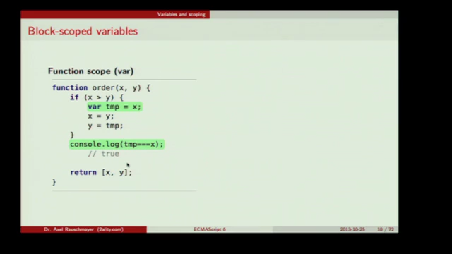
Many shortcomings of web animation are alleviated with keyframes – @keyframes allow us to specify multi-step animations, animations that run for multiple iterations; and keyframes can be reused across elements.
Step one: specify animation using @keyframes rule. You give the animation a name; you specify the steps – at minimum the start 0% and end 100%; each step is a lot like a standard CSS statement (percentage instead of selector; uses brackets for familiar syntax).
@keyframes pulse {
  0% {
    box-shadow: 0 0 0 yellow;
  }
  100% {
    box-shadow: 0 0 12px yellow;
  }
}
Step two: apply the animation to elements using animation properties. By default, animations will only iterate once – then it will revert to the state it had beforehand. So you specify how many iterations. Because animations can be jarring, sometimes you want to alternate the direction so things don’t pulse alarmingly – but keep in mind that it will get an extra “step” by reverting to original state. This is resolved with setting the fill mode – with the value of forwards the final properties persist after an animation (it stops and holds the animation, rather than reverting).
input:focus {
  animation-name: pulse;
  animation-duration: .7s;
  animation-iteration-count: infinite;
  animation-direction: alternate;
  animation-fill-mode: forwards;
}
John’s heuristics for non sucky web development
- If it can be done in HTML, with no need for CSS or JavaScript, use HTML.
- If it can be done with HTML+CSS, with no need for JavaScript, don’t use JavaScript.
- Never use jQuery.
(example with a carousel – “one of the most derided patterns…”)
When calculating animations, you need to work out durations so you can convert to % for keyframes. Remember animations start when the conditions of the selector are met.
Animations are constantly changing the DOM. Each time the left of the element changes, there’s a reflow and repaint.
This is where transforms come in, as they allow us to rotate, scale and translate the element in 2 and 3 dimensions – but without such huge performance hits.
We apply these with the transform property, which takes one or more transform functions as its value. eg. 2D: translateX, translateY.. which work in terms of the top left corner of the element.
You measure this with Timeline → Events. Using transforms reduced John’s example many orders of magnitude.
Scale: numbers from 0-1 reduce the size; numbers 1+ increase. You can change the way things ease in and out by working with transform-origin.
For 3D effects you need to be aware of the perspective – this sets the scene, and essentially works out how far or close the observer seems to be. This is how you do foreshortening effects. Commonly apply this to the <body>.
So is all this animation just a gimmick?
When we move to flat design, 3D allows us to add meaningful depth. That depth can be animated. This helps the user start to imagine a space where your application lives.
(example with iOS effect applied to a stack of iframes – by rotating each one slightly more, you get a fanned look; by transforming the Z axis you can make each look a bit smaller behind the next)
The last thing is the perspective-origin, which sets the viewer’s point of view – where they are viewing the scene from.
[“I’m clearly excited about this stuff…” ← not sure what web stuff John is not excited about? :)]
For a great animation 101: do a bouncing ball. It’s the hello world of animation.
What’s next? Explore, create! Remember animation is the new typography… don’t use Comic Sans!
Don’t use animation as a gimmick. Think about how can create meaningful transitions.