CSS:has(.everything)
Introduction and CSS Color Spaces
The speaker shares excitement about attending the conference and the developments in CSS. The focus is on reducing JavaScript to make web experiences faster and feature-rich. The session begins with a discussion on CSS color spaces, exploring the introduction of new vibrant color spaces like LCH and Lab. These are introduced to keep up with modern displays and offer richer colors than sRGB. The session highlights how CSS is evolving to accommodate these changes and the practical usability of these new color spaces in current web development.
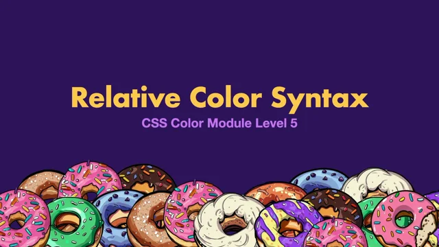
Color Manipulation and Relative Color Syntax
The speaker discusses the relative color syntax becoming baseline in 2024, highlighting its potential for color manipulation. This syntax allows for easier customization of colors, converting existing colors to new spaces like OK LCH directly through CSS, thus reducing complexity. The discussion touches upon the benefits of these changes for UI consistency and theme adaptation, especially for maintaining brand color integrity.
Layout Innovations: Subgrid and Masonry
This section delves into advancements in CSS layout capabilities, focusing on Subgrid and Masonry. Subgrid has become baseline, offering improved grid versatility particularly useful for complex grid layouts like pricing tables. Meanwhile, Masonry is highlighted for its potential to replace JavaScript-heavy libraries with simple CSS for Pinterest-like layouts. The speaker explains ongoing discussions about integrating Masonry, exploring its potential as either a Grid extension or a standalone display property.
Anchor Positioning and Relationship Selectors
The speaker introduces anchor positioning as a CSS feature that might replace JavaScript for linking UI elements together. This is followed by a discussion on the 'has' relationship selector, which offers a way to create more dynamic and responsive designs by allowing CSS to style elements based on children or sibling selectors. This feature represents a major shift in how CSS handles parent and sibling relationships, providing a more intrinsic approach to responsive design.
Future of CSS: Scroll-Driven Animations and Developer Tools
The speaker discusses upcoming features like scroll-driven animations which empower engaging web experiences similar to Apple's product pages. The focus then shifts to developers' quality-of-life improvements such as media query range syntax, revealing how these can simplify understanding and implementing media queries. This segment provides an encouraging outlook on how CSS advancements aim to streamline both user experience and developer workflows.
CSS Nesting and Cascade Layers
Nesting, a familiar concept from pre-processors like SASS and LESS, is now being incorporated natively into CSS, making it more accessible. The implementation allows developers to streamline their stylesheets by co-locating related styles efficiently. Additionally, Cascade Layers introduce a new way to manage specificity and cascade order, allowing developers to organize and prioritize styles more effectively within their projects.
Closing Thoughts and Additional Resources
The speaker rounds off the session by highlighting the cumulative impact of these CSS changes on web development. They offer resources for further exploration and experimentation with these new features, promising enhanced capabilities for personal and professional projects. Attendees are encouraged to engage with these innovations via GitHub repositories and online discussions, fostering a community of continuous learning and adaptation to CSS evolutions.
Cool.
The harrowing journey from Perth to Sydney, but it's great to be here and be a part of kind of this conference, but all of the exciting things that are happening in CSS as well, there's great stuff coming along.
That's going to make like our lives easier, reducing JavaScript as the theme has been, which decreases bundle size, boosts the web speed, adds new features, so it's pretty win/win for everyone.
Now, there's a lot coming to CSS, and we're going to look at some of the stuff that we can use now, without too many problems, and touch a little bit what's coming in the future, these are big lists, so do not worry.
After this talk, you are going to feel ready for, CSS in the next year.
And a little bit beyond.
So we'll kick off with some color.
You could probably do an entire talk on colors and the things that are happening, but I'm going to dive into some of the most relevant stuff that we have now.
So CSS is increasing the color spaces by, like that many.
And the reason that these are coming along is for more vibrant colors than what sRGB was able to do.
Modern phones and monitors can display so many more colors than what sort of sRGB could handle.
So the web needed to keep up or risk getting left behind by those things.
Unless you have a specific use case in mind, I think it's likely that it'll be one of LCH or Lab with their OK variants, which sort of fixed a couple of little quirks with those.
They're good for like gradient UI work, predictable color manipulation, there's familiar channels, rich gradients, and their baseline from 2023.
So it shouldn't be a huge problem to start using some of these.
If you use those new color spaces, it resembles some of the other functions.
So we'll have LCH, and then a value for the lightness, the chroma, and the hue.
The new color spaces do include some sRGB versions.
So you'll have the color function.
The name of that color space and then the RGB values for that.
But gradients are a good demonstration for this, for the richness of these new colors.
So we have one in the sRGB color space and it's The monitors washed out, but it's a little washed out in the middle, right?
And then the equivalent in the LCH color space.
So the only difference we've done is add in LCH and look how amazingly rich it is.
If you all come up to here and look at it on an Apple monitor, it's, it's very vibrant, right?
Hopefully it's enough to see that like we haven't changed anything.
We've just changed the color space and you can see how much more dynamic that is already.
And the way that we move between these is something that we can work with as well.
The, typically like artist impression of this, it just goes the straight line between the two colours.
And we can start to play around with that as well.
We can adjust this with longer hue, and it will go the long way around, right?
That's not the, that's a technical explanation of how that goes from one to the other.
And we can go the shorter, but still longer way between the colors, and have these different things.
But again, color is a big topic.
And if you want to get right into each of those different color spaces, their pros and cons, where they're strong.
I'd have a look at Adam Argyle's one in there, but typically LCH and Lab will be where you're at.
But it was talking about like color manipulation and being able to do that.
So relative color syntax is a really interesting one.
It's joined baseline newly in 2024, so maybe a little early for production depending on what you're working on, but personal projects is certainly somewhere to do that.
And it enables an amazing level of sort of color manipulation and customization.
So we have our brand sort of design token custom property there.
If we wanted a version with transparency, and we've had to do this in our own design system, we might make a new version, or we might just pull out the channels from that, and then it adds complexity because you've got to remember, is this one have the color function around it already?
Or do I need to do that when I am using it?
And it, it just adds complexity.
So this is where relative color syntax is going to help us out.
We start with our RGBA function, and then from is what tells CSS that this is now a relative colors.
And then we provide our brand custom, yeah, our brand color in there.
And then we have access to the red, green, blue, and alpha channels.
And we can modify those in different ways.
So if we wanted our 50 percent transparent version, we can change that in there.
Which is one of the only ways that we've been able to adjust sort of hex colors to do this.
We can convert to these other color spaces that we've been talking about.
So we can say OK LCH from that brand token, that brand color.
And then we get the L, the C, and the H channels that we have access to.
And we can start modifying these individually with CSS math functions.
So we can lighten and darken those colors if we needed that in there, typically the realm of preprocessors.
Or we can generate entire color schemes using, say, a single color in there.
So even if it's provided by our users and we want them to be able to customize our app or do something by having that one color, we can then do some sort of math on things and adjust that.
So again, this was the area of like preprocessors.
But now it can come straight from CSS itself.
Now, with all these improvements and just mentioned with accessibility, we need to keep that in mind.
Color contrast is not quite ready for primetime, but it's available in Safari's tech preview.
I'm hoping other browsers pick this up, but you can supply a base color and then the versions, which I think is a new sort of thing that comes in there.
And we have our colors that we will do.
And CSS will figure out which one of these colors has the best contrast for what we're doing.
Not quite there yet but hopefully soon and a great one for accessibility.
All right, we'll have a look at some layouts here as well.
Now, hopefully you were here for Miriam's talk on container queries.
It was, if not, you can watch it again on Conffab.
But I just wanted to re refresh our minds on the syntax for that because I referenced them a couple of times in there.
But, very happy to see that these have made their way to, browsers and what we can do with them.
If you want a really quick win from this thing, text wrap balance, it's not in every browser, but it's one of those really nice progressive enhancement ones where typically you'll have a title and you'll have that one word that like drops down and you're like no, go back up here.
So text balance can let the browser do some of that adjustments.
Now there's things in the spec where you can't go over 10 lines or a little, ignore that.
So you're more likely to do it on headers, fig captions, maybe the occasional card.
But yeah, a quick win that you can do from that.
Subgrid.
I think subgrid's cool.
It became baseline in 2023.
But it's probably still a little underutilized, I think, for how impactful it is.
When creating grids, only the direct children have access to the columns, rows, and areas that are in that grid.
But it's often necessary for us to nest layouts for semantic reasons, or if we're working on components, we'll have some sort of a wrapper there.
A great example I found, find is like the product cards or the pricing page that we've probably all worked on before.
When you design things, are lining up nicely across the rows.
Titles are spaced evenly, things are aligned, everyone's having a good time.
And then development starts.
And then there's like responsiveness, internationalization, so we translate to 19 languages, so you get one of those you get German come along, and they will do amazing things to your layout.
But the content can grow and shrink, and we can see that the rows are there, in the grid, we've built for this, but the cards just don't know anything about that.
And this is where subgrid is going to come along.
So it's a property of grid template columns or rows.
It's not a new type of grid.
It's just part of one of these properties.
And what we're asking it to do is go up to your parent grid and just pull that down and start using it.
So now whenever our body content grows, the grid will grow, which will cause the parent to grow, and it'll inherit that down.
So anytime the title or the body grows, everything is still lining up nicely.
It's now aware of the lines that are in the grid.
I think it's always good to discuss limitations.
So when we inherit from the parent grid, we no longer have access to the implicit grid.
Which is how CSS Automatically adds other things to the grid.
So if you need more space, you might need to add a new grid in there or reconsider the layout.
And we're also quite tightly coupling the container to the sort of layout and the components.
I just learned the turtle phrase there.
Maybe that's where turtling things will come in together.
But you, might not just be able to move your components.
You might need to bring some sort of container along with them.
So something to keep in mind.
But if you've ever, built a pricing page, you will likely know this problem of trying to get things to line up.
There's always that one pixel line that goes across the thing.
So you'll get the most benefit from subgrid in those situations.
And still in the realm of that, not quite ready yet, is masonry and you might recognize this from Pinterest, which makes it like an interesting slash controversial edition because it's super specific to like what it is doing, but I like it and it's a theme that we've been having because it's a one line CSS thing that removes a whole bunch of JavaScript or entire libraries.
Making it… There's kind of some discussion about what that syntax is going to be.
So it's not quite ready, you can play around with it a little bit.
But yeah, they'll either go down the route of it becoming part of Grid, or it'll be a new display property on its own.
You can join the conversation about that one if you're like, really interested and passionate about masonry layouts.
And speaking of things that everyone was talking about, It's a really good one.
And so we're gonna even though it's not quite ready yet, right?
Browser support is a little bit early.
I think it's worth talking about because similar to the last one where we can remove entire things of JavaScript, this is what anchor positioning is really good at.
The idea behind it is to anchor one element to another element.
So we've been able to achieve this a little bit with absolute positioning.
But if we needed to, say, adjust multiple elements or adjust to scrolling, JavaScript started to come into it at that point, or often is just the default where we start.
And anchoring should help to choose that.
So the tooltip.
Is a classic one for this.
And we saw in Zach's talk the other day, examples of the menu system as well.
When we hover over it, we want that item to appear.
So there's a couple of steps that we can do to enable anchoring.
We give it an anchor name, which is like an ID.
So it looks like a custom property.
It's a double dashed identity.
That we can do.
And then we tell our tethered element, it's positioned absolute or fixed.
And then we have position anchor.
We give it that ID that we were had before.
Then we have the introduction of anchor.
So it's like, what can we, ask our containers similar with anchor.
So we can say the top, we want to anchor it to the top of that anchored element.
And then left, we want to anchor it to the center of that.
So that's how it locks those two.
Components together.
But that sort of anchor function and with the containers, queries and sizes, we can also ask about the size of our anchor.
So in a design, you might want the tool tip to be two times the width of that what your designs might look like.
So we can say the width will be calculate the anchor size.
And we were just saying the width like the variable and then times it by two.
So you've got a lot of power in there to adjust your designs with that as well.
The other one, I was talking about was handling position.
So when we roll over that, we want that.
But then as we start scrolling and our anchor is up there, we need that tethered element to still be linking to that.
So there's like this waterfall structure that you can use.
As this is still maturing, I'm not going to dive too much into that, but there are some constants that you can use as well, which is flip block or flip inline.
And I think that'll be most of what we use, like how inline size is most of what we use, but you will have the option to really get in there if you have some options to do that.
And we're not limited to that single anchor either.
So the anchor function can also have the name of the anchor that you want to do.
So if you had multiple anchors and you wanted them to be dragging, so the dragging is JavaScript, but the anchoring and how that's adjusting to that is handled with CSS and I'll link to all of these code things later so don't stress too much about kind of the words on the screen but it's easy to play with them in your own time I've found but yeah.
That's anchoring so so seeing what JavaScript can be replaced with CSS is always exciting.
I think we can all hope so that the other browsers come along soon and implement this.
But there's enough to start playing with now and understanding how it works.
Has, I think there's, there's three big shifts in CSS.
And I think we learned about containing queries before.
We've got Elle up next with, view transitions, which is another game changer.
And I think has is the other one that is really going to shift how we think about CSS.
It's become available in all the evergreen browsers.
But if your browser support isn't quite there, still think of it as a progressive enhancement opportunity because don't, maybe avoid core functionality, but there's still an option there for it.
And this is typically been called the parent selector, but I think a more accurate way of describing it is relationship selector.
You can do more than just select a parent.
But this sort of idea of selecting parents is really what's driving the hype.
For this one because you inevitably have had times when someone's Oh, can't we select this based on what's inside or you'll have wanted to do it yourself.
That's what it's going to do.
So if we have our sort of donut cards that we've been working with, and if that card has an image, we might want to adjust that a little bit.
So we can say a card has an image.
And then we'll adjust the border just to start with, but these selectors have always been top down from that.
So typically image would have been the thing that we were styling, but in this case it's card and we're just filtering that down based on the children that are inside of it.
So if you're using React, you would have been used to selecting things or adding variables, passing that through a CSS class and doing all of these things.
And we're helping that separation to keep our styling sort of the thing that controls it.
And it's wild to think that this exists now as an option.
But there's so much more we can do, which is why I think relationship selector is a little bit better.
So if we have a card that has an image, we can select the card header and we might use display grid to put those items together.
And then we can say the card that has an image, the H2 element will adjust that with our brand yellow so that it looks good with the image.
And we can combine that with the not selector.
So the card that does not have an image, that H2 we can then make it fill the space that we've had to do that.
And again, we've not had to delve into JavaScript and be passing props up here and there and everywhere in classes.
That one class that does this one thing.
We can remove that to our styling, which I think is generally nicer.
Of course, there's rules.
We can't, what's the word?
Nest selectors.
But you can chain them.
Just something to be aware of with that.
One of the really interesting ones I've found is quantity queries with CSS and I actually use this with has, and I use this the other day we had a list and we wanted it if it's more than 10 to go into two columns, but we'll use our grid here when you've got the full items.
It looks nice, but if you lose one or don't have that many, I don't know why you'd lose it, but if you don't have that many, it looks a bit unbalanced.
So again, don't stress the code.
I'll link to this later.
But what we're doing is saying.
I want to choose this if it has five elements, so an uneven number.
And then I'm going to adjust the grid to be four equal columns.
And then I'm doing the same thing again.
We'll get to nesting in a sec, which would make that a bit nicer.
But we'll get the first one and we'll make it go all the way from the sides of that.
So we create this feature layout in there just by counting the number of elements that are in there.
And because it's a selector, we can use just any CSS in there.
So we can use, what are they called?
Data attributes.
Thank you.
And we can do some very basic filtering by saying if the import has been checked, select the cards that don't have that and you can change the opacity of them.
So there's some really interesting stuff that you'll be able to do like mimicking the Mac finder thing as well, because has the ability to know when it's hovered, what the thing next to it on both sides were and you couldn't really do that before you could only get the next one.
So it's basically a super powerful selector and when you have it with container queries that we saw, it's a game changer for this intrinsic version of design and layout, moving the responsibility of how the component handles it to its own styling rather than relying on global sort of media queries and hoping for the best.
It's definitely one of the biggest changes in how we think about doing our styling.
So it's exciting to use this and start getting into it now.
Jumping into the future, scroll driven animations.
So these can be as simple as, the progress bar as you're going through an article, all the way up to Apple's product pages, which are giant sort of scrolling interactions.
Some are subtle, some are not, but we will introduce this scroll function.
We'll do it on the block axis and on the root element, but you'll be able to do, select other ones and even start to build these together to get something towards the end of Apple's range.
And again, removes all the JavaScript that comes along with these scrolling libraries trying to track everything that the user is doing.
The browser is going to handle it for us.
All right, so we've we've covered things that are like for the users, but what about us poor developers?
What, what things can we expect?
So we'll look at some CSS syntax things now.
And the first one is media query range syntax.
It's, syntactic sugar for media queries, but I think it helps make them be a little bit easier to understand.
Browser support is pretty good across evergreen browsers, and given that according to the HTTP archive, 80 percent of sites use media queries, it's one that, will be very helpful for us and make them easier.
Like I was saying.
Now, have you ever done the thing where you'll start with a media query and you're like, I want it to be like below a certain size and you're like, is that min or max?
And you try one.
And then you do the other one, and maybe I'm just outing myself here as the person that does that.
And I'm like, I'll definitely remember it next time.
And then you just do the same thing again.
What if the syntax looked a bit more like this?
The width is greater than or equal to 480.
In my sort of developer y brain, I can understand that a lot easier, right?
And what I also like about that is it's a little bit more precise because you could get the overlapping media queries at times where, you start to delve into cascade and things as to which one is going to be applying because they're both going to be on 480 pixels.
Or you had to remember how to add one to it and things like that.
We can say, greater than or equal to, or just less than, there's lots of options for avoiding those different collisions.
And you can combine them together.
So we'll be between these two values.
Now I've yoinked this graphic straight from the spec, but it's a good reference for what can be done.
The feature names, this is like width or inline block.
And then the value, those are your pixel values or things that you'll be using.
And then the different options that are available.
So if you want your value, then you can check against the feature name.
It's just a handy little reference I found for that.
Now, given the solid browser support, you should be able to start using this now.
And there is a post CSS plugin that will just convert them to the old style.
And if you prefer the old style, maybe don't call it old, if you prefer the existing style, like that's fine.
You can use that and keep going.
I would just suggest like picking one.
You don't want one person using one and one person using the other.
So if you've used tools like Sass, LESS CSS and those, you've likely come across nesting before.
It's so prevalent that it's become part of the browser itself.
And the good news is it's supported across the evergreen browsers.
Depending on your browser support, you might be able to remove some of the tooling that's handling that now.
And simplify your build process.
We'll look again at our, Oh my gosh, we'll have a look.
It doesn't really matter.
We didn't need the CSS anyway.
We're interested in nesting.
We'll have a look at our donut card.
We have the main selector that's there.
And then there's some CSS properties.
You'll trust me in there needed for the component.
And then when we want a nested selector, you can do that by nesting those CSS rules within there, meaning that the H2s within the card are what's going to be affected, right?
Saves us repeating ourselves, which we don't like to do, and will make refactoring easier later.
And like these pre and post processors, we can link it in with our other themes.
So we can say the dark theme and then the ampersand with theirs.
Handy for co locating styles, which you can do with your media queries and container queries as well.
Keeping your components nice, neat and organized.
There is a sort of gotcha, if you're using below Safari 17.2 or below Chrome 120 where the ampersand had to be there, the look ahead, nesting, didn't know if it was like a CSS property or a new selector.
And again, you can use the ampersand, that's fine, but if you don't use it, you need to be above these.
Just like a Gotcha.
That is good to know about.
And if you find yourself wondering, but how far can I nest down the thing?
128 levels, as it turns out.
If you're doing that, maybe reconsider how far down.
So that's 128 levels of nesting.
Probably don't.
But I don't know.
I just thought that was interesting to know.
128. The more you know.
So that's CSS nesting.
It's interesting to see these nice to have CSS features becoming just part of our browsers and part of the things we can do natively.
Cascade is important to CSS, right?
It's the C of CSS after all.
But it's one of those things that can trip us up, and I get it, right?
It can be difficult to handle.
And that's where tools like BEM, Kube, ITCSS, and to a degree, Tailwind, have come along to help us manage that, but in most cases, sidestep it altogether.
And to help with that and with, specificity, this is where Cascade layers come into it.
Browser support is good.
But there is a giant asterisk, but we'll talk about that in a second.
Typically when working with CSS though, we have all of our styles and we're importing them in some fashion and a bundler might be doing that.
So we might have our theme and our reset and components and stuff all coming in and we manage the cascade as best we can, however that's coming in.
What the cascade layers is going to allow us to do is start to group those or put them into layers, limiting the cascade to within those layers or the specificity as well.
So when we're doing this now, we can have a layer base or a layers utility and the order is important here, right?
The higher in the stack, so utilities is the highest.
The higher in the kind of cascade that is going to be.
So it's best practice to define already your layer, base, theme, components, etc. Define that as early as you can, so that if another layer base was to come along, we could do that, and it would know where it goes.
And even entire libraries can be put into there.
So if you have some external thing that you need to do, you can put it in a layer.
That's, gonna be organized.
The specificity is the interesting one, right?
So if you've ever worked with like ads or something like that before, you can get some pretty funky selectors, which will have a high specificity.
So like 0 0 1 2.
And we've got our color red, and we're just wanting to do it easy.
So we're saying the li we're saying brand purple without the underline.
And you can see that's not happening over there.
With Cascade Layers, we can be, better with this.
So we can say our Layer, Vendor, Theme, and then we'll, in our Vendor, we put that sort of greedy selector.
And then in the Theme, we have our sort of artisanal CSS, which is nice and clean and, isn't doing anything crazy.
But again, if you've, worked with ads or anything like that, that can come along and do these things, you'll know this frustration.
Things that aren't in a layer do become part of a layer or CSS that's not in a layer.
It's the anonymous layer and it sits on the top of everything.
Important is going to have an impact here as well.
So this is where those sneaky sort of vendor ones can still get you.
If there's an important in there, it flips the order.
So anonymous is now lowest and base is the highest.
And it will go through and find the, important on the highest layer.
And the big one, now that you might be excited about what Cascade layers can do.
Typically with CSS, if something's not supported, we can just ignore that, it doesn't fall on its face and all is good.
What we're going to end up with though Is just the stuff that's not in the layer.
So it's not gonna ignore the declaration of the layer, it's gonna ignore the entire block.
So you do need to make sure that your like browsers can use this one if you're gonna do it.
There is a post CSS plugin, there's trade offs.
You can read it there.
It's around media queries and any other dynamic CSS.
It goes through all the CSS, adjust the specificity so that it does that for you.
You might need to wait a little for this one.
But it is, I think, a real quality of life upgrade for us as the developers and understanding some of these important areas of CSS.
So I'm hoping it won't be too long.
Cool, so that was like our speedy run through of exciting new CSS features that you can use now or a little bit into the future.
I mentioned the code.
I find it's easier to go and play with these things.
So I've put them all in GitHub.
And because there's like a short amount of time here, I've added like extra examples where you can look at, different sorts of anchor positionings, the color, contrast, et cetera, et cetera.
I'm just rambling so that everyone has time to snap the thing.
I need that.
What was it?
This text thing before that just was filling in the gap for the JavaScript.
That's just what I'm going for here.
But yeah.
If you have questions with CSS, I will be, I guess other questions as well.
I'll be around here.
Feel free otherwise to reach out to me on Blue Sky or LinkedIn.
Otherwise, I hope you've enjoyed this talk and the conference and I'll see you around.
- LCH
- RGBA function
- CSS math functions
- text-wrap balance
- grid-template-columns
- grid-template-rows
- subgrid
- absolute positioning
- position: anchor
- has pseudo-class
- not selector
- display grid
- CSS Nesting
- Cascade layers
- important keyword
In this talk, Anton will explore the latest and most interesting CSS advancements coming to browsers, including CSS Layers, new selectors like the parent selectors (:has), new color functions, layout modes and more. These tools allow for more responsive design, simpler selectors, and better organisation of your CSS code.
Throughout the talk, you’ll see engaging examples that will help you pick up tips and best practices for incorporating these techniques into your work, as well as a little inspiration for what’s to come!