(playful music) - It takes a lot of effort to set up a conference, and I think it's really cool like it's just a cool opportunity for me now to finally thank John for having me here in Australia, and it's been really a wonderful time for me coming here on a second time, and being in Melbourne for the first time so I'm kinda fully enjoying it, and I also wanted to just kind of use the opportunity to share something that we've been working on recently, maybe share some lessons learned, and the things we did, and maybe some things we didn't do and why just so it kinda makes sense.
It all has to deal with the checkout experience. Now when we start designing, very often at least our team tends to focus on one thing that I think matters the most, which is interface copy so when we start designing, it's never visuals, it's never like a sketch in a grid of what it's going to look like but it's always writing down the interface copy, and very often, it all starts with error messages actually so we start writing error messages first, and then we radiate outwards, and it all boils down to kinda identifying the core essence that we're designing, and then moving forward, and so I had the privilege to be working with a couple of companies in Germany mostly for some reason on e-commerce projects, and it was a lot of fun observing them kinda trying to improve checkout experiences, and I'm talking about quite large companies, right? So (laughs) I had this opportunity to test all the crazy ideas I had, and I actually did, and I'm really wondering, when it comes to checkout, why is it that all of us here in the room being professionals like web professionals don't go on streets to protest against the horrible checkout experience that we have to endure almost every day? That's incredible.
We go to somebody, want to give them money, and they force us to go through at least three to 26 steps in order to get there and to give them money. This is actually unacceptable but we just take it like, "That's the internet. "That's okay," but this is not okay.
It was my job to make sure that we don't have this kind of horrible checkout experience most of the time, and there are so many things that will go wrong as you go through the checkout experience, and from adding an item to a shopping cart, checking the price and local currency, checking coupon codes, and all the other things until at some point, you finish the payment or unless something happens in-between, and you have a credit card that gets rejected, and then you find yourself in this infinite loop where you just leave the checkout because you're just frustrated, and you forget about it but they, well, they never forget.
They will send the transactional emails just to remind you how wonderful their product is so you can return back to the site, and actually buy what you actually wanted to buy in the first place.
So no wonder that an average documented online shopping cart abandonment online today is approximately 70%, meaning that seven out of 10 people who want to buy something, or who have at least an intention to buy something end up not buying.
That's a staggering number.
That's a huge number.
And of course we will not be able to reduce it to like 10% because many people just go to browse, just go, you just check a couple of items, and then you go back, just leave, and then eventually come back but we can drastically reduce this number if we just do a couple of optimizations because if we look into the reasons why people abandon, they're always the same.
This chart has been kinda travelling around the world for the last six, seven years, and it's always the same story.
If we ask users, or look, observe users, not ask, why they abandon, we'll find out that number one is extra cost, which are not visible by default. It could be shipping cost, taxes, any other fees that are not clear from the start.
Forced account creation.
Nobody wakes up in the morning hoping to finally create an account on the website today so if you're forcing somebody to create an account to buy, to give you the money, you will experience abandonment.
Credit card trust is not a thing.
If you look weird or suspicious, of course you have an issue there, and the surprising thing is that complicated checkout process where things are just weird, layout is strange, maybe the way of asking questions is strange, that accounts for just 18% of dropouts, which means if you have a really strange system with really, really bad UX, you still can improve it a lot by just improving all of this stuff, and it's often about, I think personally, about just framing the question properly.
It's not just about the questions you're asking but about how to ask these questions meaningfully and properly, right? And then there was another study, which was conducted just last year I think, and you find this is exactly the same reasons, which keep appearing every now and again, and you might ask yourself, "It's been around for a while. "We should be quite fine at this point.
"At this point, the e-commerce UX should be okay." Well, the truth is it's not.
If you try to measure or map rather, usability score against all the different thing that you have to do on a website like if you want to order review, order confirmation, credit card form, and all the other things, and try to just run eye-tracking studies to realise and to see how users or customers actually experience e-commerce sites, and not just regular ones like the smaller ones and so on but actually top 1,000 retailer stores, you'll find out this is really bad.
These circles, the black circles stands for the average, the average experience you will be getting from those sites, and as you can notice, red is bad.
Well, on the left side, you'll find that it's bad. On the right side, it's better usability score while red and green is a different story, usability-wise but one thing and another, we want to be close on this side of things, right? Unfortunately in most cases, it's gonna be somewhere in the centre here, which is suboptimal experience at best.
This is what you should be expecting, and there are a couple of techniques you can do to make it work.
I just want to highlight some of them that you can apply to your work right away, and they're kinda trivial but they're kind of still quite important.
So looking back to the staggering number, five reasons so maybe we can look into all of them shortly, briefly. First of all, hidden costs.
Nobody wants to pay more than we actually committed to, right? When it comes to shipping costs, taxes, fees, or anything else, and it also relates to data. If all of a sudden, you're requiring some sensitive data, this is a reason for you to abandon because they don't know what cost to associate with this, right? Why do you need this data like telephone number, and other things? So here is an example for Walmart.
It was a couple of years ago but it still holds true although they did redesign.
Now if you want to buy something on Walmart, you're going to go through one, two, three, four, five, six steps in order to finally see the final price, and that final price is actually way different than your subtotal, right? So at this point, it's actually $6 more.
Now we know why it is this way because actually we do need the shipping address in order to be able to show you the final price, right? But this is just unacceptable because if you ask or you show the final price after somebody already has entered the credit card number, well, this is not good.
This is just not going to elicit any sense of trust. How can we make it better? Very simple.
You can try to estimate shipping cost.
It's not going to be correct, right? Based on user IP or anything else.
Now it's not going to be correct but it's going to be closer to the final price, right? So if you are somewhere in Europe, and you're ordering something from the US, obviously you might be living in the US.
It doesn't mean that you're going to ship to Europe but still if you say, "Estimated shipping is like $10," it's better than zero because it's closer to the final price, right? So again display full or estimated price early on but definitely wait before entering credit card data, and it's not just about the price, it's also about what goes into the price so the price breakdown at the end displaying full cost granularity is important as well. And I ask myself, and this is kind of what brings me to what we decided to do, how can we make it even better? What is absolutely necessary for customers to see or for us to know to display final price as early as possible? What is the minimum information? What is actually required? And of course, we need two things for this. One of them, we need the currency, right? And we also need to know where the item is going to be delivered to so on whiskey, World of Fine Spirits website, I'm not like into World of Fine Spirits or so but it was kind of my job to go through lots of e-commerce sites.
This is also the reason why I realised that buying things in Japan is kind of a big deal.
Now imagine me going through thousands, thousands of e-commerce sites, and all of a sudden, I'm doing the checkout thing, and I have my prefilled things, and so on and so forth but of course I don't buy.
I can't just go ahead and buy things, stuff, random stuff everywhere so all of a sudden, I'm looking into my Gmail inbox, and I realised that there are seven messages on that day from some e-commerce store in Japan.
I'm like, "Huh, that's kinda weird." Imagine you adding something to the shopping cart. It's not like they're going to send you seven notifications that day so you'd buy it so I just dropped it.
I think maybe it's spam or something of that kind, right? And just call it a day because I don't care.
So next day, I see 23 messages in my inbox, and I'm getting confused because I don't understand what's happening. Now all of a sudden, I know that I do my regular thing. It's not like I'm getting 23 messages from anywhere so I started looking up, and I of course used Google Translate the translate the message into English, and I realised that apparently I bought a bicycle in Japan, (audience laughing) and that guy who owns that store in Japan, he desperately wanted to send it or ship it to me. As you can imagine, the addresses I provide are more or less fictional so he couldn't find that address on the map. Now it was really strange because I kind of remember that I wouldn't be stupid enough to just type in my credit card data automatically so it can't be charged, and I definitely didn't want to buy a bicycle in Japan. I'm pretty sure about this, and imagine shipping a bicycle from Japan to Germany, that's going to cost you as well, right? So I was really confused so I started having a conversation with him, and I send a message explaining what I actually wanted to do, and then he'd send me the message back in a really interesting English that I desperately try to understand so I had to kind of pull off but it turned out if you're in Japan, it's kind of common to say you are humble enough and respectful enough if you just make an order, then it's going to be shipped to you, and then if you're happy with everything, you'll pay. If you are unhappy, you're returning it back, right? Well, I didn't know it was a thing, and I still don't think it is a thing by the way but this guy may be just wanted to have his first sale finally, I don't know, but this is interesting, right? This is kind of a different checkout experience. I went through all of those sites, many sites, and I found this interesting example where even before you start checking out, they're asking you both in mobile and on desktop what the currency or preferred currencies, and also where country of delivery is 'cause once you know this, you can display final price even on the products all in all. You don't even need to go to the checkout to actually start checking out to see final price. That's pretty cool.
So I asked myself, "How can we maybe use it, "and make it better?" Now we do the redesign now, and there are couple of things involved, and I asked myself, "How can we make it better?" We have a shopping cart as well, and then when you add an item to the shopping cart, you have these two options.
One of them is checkout, and the other one is shipping to so you can basically select where the item is going to be shipped to before you go to the checkout but this kinda looks weird, and I thought maybe we can make it a bit better so we decided to do something different.
Now for a while, we had this little thing here where we removed one of them, and we said, "It takes just 30 seconds for the checkout." You'll get the book before February 14th, and it's based on your IP, and then I thought maybe we could make it even a bit better than this, and the way it works is like this.
Yes, I know it's red.
We'll talk about it later.
So here we have this shopping cart thing, and then we start checking out, and see we have this little thing over here, right? And so we're basically displaying everything we absolutely need to convey to the user or to the customer before they start checking out in this sidebar so we have subtotal, shipping, can pay by card or PayPal, and expected delivery time to your country, right? And it runs but we didn't test it yet properly so we're about to do it but that was interesting because I looked into how it can actually really make sure we communicate as much as we need in a very compact way.
So here we have subtotal, taxes, shipping, expected delivery, and you added this pay by card or PayPal free, and we tested a couple of things because we could also do it this way, right? You can say pay by card, credit card, or PayPal free, and you have three radio buttons here, I don't know if you can see them, and it says basically the same thing.
Now can you guess, now that we tested, can you guess why conversion here is higher than here? Now everybody is kind of thinking.
So it says pay by card or PayPal free, the same message just framed differently.
Yes.
Yes so we give a choice.
Oh they did saw it.
They did see it actually.
Now the only reason is there is a little trick that always works on e-commerce sites, and that nobody likes to talk about, and I'm here to, it's being recorded, John? Beautiful. (audience laughing)
So it really works well.
If you you want to engage customer, one thing that works except animation of course and transitions and stuff like that is to introduce some sort of interactive controls. So one thing is you can do, when you start scrolling a page, and let's say you have a tall landing page, a really huge landing page, and the user starts scrolling down, and you want them to capture their attention to a specific element, a specific part or section of the page, the one thing that you can do is just introduce a slider.
He will start scrolling down.
Oh.
I kind of tap it.
Everybody likes a good slider.
Everybody also like to have good buttons that they can toggle on and off, and the same goes of course for radio buttons as well. So at this point, it's kind of the same message framed differently. I'm not saying this may be a trick, I don't know, I just tested it, and of course in the end, we decided to go with this one, just better design obviously.
Yeah so this is pretty much everything you need to convey in order for the customer to make a decision, right? That thing is pretty important.
Now another thing that's been bothering me for quite some time is this so very often, you have to make a decision how you want the item to be shipped, standard delivery, express delivery, and so on and so forth.
Now there are options, and it depends on the timing, it depends on the price, and yes, these are old screenshot but it's still kind of appearing over and over again. So here on all of these examples, there is a piece of information missing so you can't make a decision.
If you can't make a decision, you just dismiss a decision altogether and abandon. So here on Toys R Us, you can select whether you want a standard delivery or express delivery but how do you know how express express is? You don't know how much more time or less time it needs. You also don't know, neither do we know how much time, how much more money you have to pay to get that express delivery, right? How can we fix it? Again, very simple with interface copy.
Whenever you're displaying the time, you need to explain the price, extra price, and when you should be expecting it, and it's really way better to say instead of four to eight business days, just write down, dynamically generated date when the item should be expected instead of making you actually run mathematical equations but just figure out on their own when the item is going to be delivered.
We met already, and I had a couple of really great conversations yesterday but I feel like I know you really, really well, really well because there are some things that appear all the time in every single e-commerce projects I am working on.
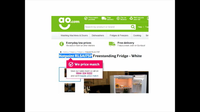
One of them is whenever there is an item you want to buy, and the price point is above a certain threshold, you copy paste the appliance model number into Google to find if somebody else has it cheaper.
Who does that? Right? Now if we know that people do that, now you can try to find a way to maybe make use of it because they will find it cheaper.
The problem is this cheaper is sub-cheaper of subtotal price because whenever you add shipping cost and all that insurance or whatever, you might end up paying more, right? And nobody likes to compare.
Nobody likes going to Google, and compare five different sites, and going to the checkout process just to find the final price because what we tend to do, and this is the reason why we have the 70% mark because we add an item to the shopping cart, and we go for the first step, and the second step, and the third step although we don't intend to buy at all just to figure out what the final price is going to be. How many of you do this? Right? Why? Because we don't trust them.
We don't trust that they're actually displaying the actual price early on so we do this.
Now if you know the many people will go ahead and copy paste the appliance model on Google, we can do something about it so if somebody just selects the appliance model number or anything of that kind here, you can just have a little tooltip saying, "Hey, don't go anywhere.
"We've got best price matching already for you. "It's already done.
"You don't have to go anywhere.
"Just trust us, and if you find it somewhere else, "you can get it cheaper with us.
"Just come back." You might lose like five, $10, I don't know but it might be a long play because again at this point, people start doing this only if it's above a certain threshold.
You would not do this for batteries probably, right? But you would do it above $100, $200, $300, right? Just a couple more things to show because they're so much fun.
This is really cool.
Sometimes it's really helpful to be able to buy or shop by form or by shape or by material, right? In this case, you can shop our glasses by shape and material, and here the same goes for boots or shoes, which is pretty cool but it kind of brings down one important problem, which is images.
Now images are important, and if somebody tells you, "Make images bigger," this has a really good business motivation behind because images do sell.
They are important especially again if you're above a certain threshold so if you're selling like hotel rooms, make images larger, I mean make them as big as you can like twice as big as the screen, three times as big as the screen.
The bigger, the better.
They literally do sell better so if you want to make sure that your conversion increases, you really do have to increase also the size of images, and it's kind of a problem because we have really weird screens and large screens because people do want to pay attention to like texture and the quality, make sure that it fits especially when they buy things like this online, and it's not just about the price point, it's also about just some things that need to be right like again here maybe trousers or shorts, right? And especially again the more expensive things are, the higher is the probability that people will actually go for all the way in the carousel, and zoom in and zoom out as much as they can, right? So it kind of really is important to make the images bigger but it does not hold true for everything because it will not help you sell batteries or USB sticks. This is not helpful at all at this point but at least helpful for again this kind of considered purchases, which kind of matters a lot, right? All right.
But there are a couple of things, which is kind of fun in a way, and it has to deal with the way of how we use internet in general.
Now we know coupon codes.
(sighs) This is fun.
We know coupon codes.
Now the problem is if you start checking out, and you find the coupon code input field but you don't have a valid coupon code, it's not like you'll just dismiss it and go home and do something else, you go on Google and try to find one to make sure that maybe you can save a bit of money during the checkout.
How many of you do this? All right.
Now (laughs) I know that all of you or most of you actually did but on average, like 92% of people are doing this.
Now if you do this anyway, then I ask myself, "Okay so what would be the best option "to improve conversion?" Now you could say of course, "Who cares?" If customer doesn't find a coupon code, what's the big deal? So they don't find a coupon code.
Just proceed.
Well, there is a big difference between the person who is frustrated because the coupon code that they found is invalid or they didn't find one.
He's like, "Okay, whatever.
"I'm just going to move on and go with the checkout," and the person who is so excited because they kind of found a crack in the system. They are so cool, they found this tricky way of saving $5 or $10, and they have this green checkbox around it, and green bar both around the input field, and they are so excited when they see this green field, they're like, "I tricked it," right? So there is a big difference between these two people because if you start as being annoyed and not being able to find the coupon code, if you just start checking out, and there is one problem, it could be credit card gets rejected or email problem or whatever, anything else, they will abandon right away while the other person has invested a lot of time, a lot of time to find that coupon code that actually works. There is no freaking way they're going to get out of this as quickly as the other person, right? So I started asking, "Okay so let's measure." We have options, right? So we what can we do? Now we can say we have coupon code.
We know that most people go on Google anyway. Let's just type in the coupon code right here so you don't have to go to Google.
So ooh you don't have one? Here is one for you.
That's option number one.
Show a coupon code right here.
Option number two, well, because we know that people go on Google anyway, let's create a dedicated coupon page on our site, and so it's easily findable so they will come to the page, and they will actually use a coupon code of the month or so. Option number two, dedicated page, right? Option number three, while there are tonnes of coupon farms, right? Where you can just plug in one coupon, and then they're going to propagate everywhere because they all duplicates of each other anyway so yes, make sure that there a valid coupon code in one of those farms, and then they just get duplicated.
Option number three, just submit it to coupon farms. Option number four, do nothing.
That's the easiest way.
Who cares? They don't have a coupon code? So be it.
Right? And option five is the one I'm not going to show you just yet but I'm going to show it to you in a second. So how many of you think that showing coupon code right here works best? Nobody.
Interesting.
Who thinks that having a dedicated coupon page works best? Who thinks that having a coupon code submitted to coupon farms works best? Who think that doing nothing works best? And everybody else is like, "Whatever.
"I don't care about coupons." (audience laughing) Okay, that's fine because we decided to test, and this is what happens.
This is really, really fun, and so if you like a coupon code right there, people go like, like this is the actual gesture that they're using, they'll go like this, "Well, okay.
"I'm going to keep it as a backup "but I'm still going to go on Google of course, "and try to find a better deal.
"But if not, this is okay.
"I still can use this one." If you have a dedicated landing page, and they find it, "Okay, I'm going to use this as a backup "but I'm still going to try to find one on the coupon farms, "and maybe I can make a better deal," and so they still go on Google, and they still try to find the coupon code on the coupon farms, and they would use a specific pattern, which is really surprising to me.
They use a specific pattern.
If you want to buy something from Dell.com for example, John, you have to tell how much time I have, if you want to buy something from Dell.com like let's say today is what? May, April? May? May.
Right.
So May 2017.
You would go on Google and type in Dell coupon code May 2017 because this is kind of the pattern that Google also suggests to some degree, right? Okay.
Now we could say, "Let's just target that keyword specifically, "and make sure that we always in the end of the month "submit an active coupon code "so it's always for that month." That works, and in fact, this is the preferred version because this is going to boost the conversion because people do like having this little green checkbox.
It's way better than doing nothing.
You will be able to save a little bit but there is a clever way of going around this. This is what (laughs) worked best.
It's kind of fun to see it happening here.
So here obviously you will try to go on Google. You will try to find one, and you will have some weird webpages with weird advertising all shaking and screaming into you, and you will find somebody recommending something that actually works for 1% of all users, and so they will type in, and you will find something like this, I don't know, a discount code like this, right? And then you type it in, and you hope, "I hope it's going to work." Let's make it bigger, a bit bigger, right? So you click on cash in, and it says, "Uh oh.
"The coupon code smells fishy.
"Don't have a valid one? "Why don't you try FISH?" Hmm.
(audience laughing) So at this point, you are losing 39 cents on that sale, right? Admittedly it's 1% of that sale.
I get that, right? And you can play around it.
It doesn't have to be like this nonsense but this is an experience, that is delightful if you want to call it this way, and so the abandonment after this is almost zero unless really credit card gets rejected or something like that.
At this point, first of all, people have this wonderful green thing.
Everybody likes green checkbox or border or something, and you're saving 1%, right? Google AdSense advertising will cost you way more but we're kind of doing this little thing, just increase, not only increase conversion but also to increase just this level of playfulness and delightfulness that we actually have on the site anyway. There are many of those everywhere, and remember those error messages I mentioned in the beginning? Well, they are all over the place.
It's so much fun.
Probably it was the best thing I've ever done I think. It was just a lot of fun for me so if you look into it like first name, we have to care about usability so this is probably going to change this somehow because it's all beat up, right? But if you have let's say first name, and you're asking for first name, it would be really boring to say, "Hey, we don't have your first name yet.
"Can you just type it in please, please, please?" Well, no Cat is an island, right? You better have a name.
Everybody has a first name, and if you don't have a last name, you can come up with one.
Tiger is a common Cat's last name so that means it's going to work for you as well. And then we also have like for example for the city, probably the best place in the world if you live there, right? And then for the street address, no imaginary addresses, please.
So it's again kind of this story about wrapping around the entire experience. And then there is the checkbox.
(audience laughing) Yeah so we have many conversations about that checkbox because it's often, what are we expecting there? Now this tricky thing where you're expected to be subscribed to email, right? And yes, I know what you're thinking but don't make users think but I think maybe at some point when it comes to storytelling, when it comes to kind of wrapping everything around an experience, it's important to slow users down.
It's important to make them think, and it's maybe even important to make them laugh a little bit or smile, kind of think for a second, "What the hell is this?" And yes of course it wouldn't work for everybody but you are a technical audience, and obviously the audience of that site is doing technical as well so you probably know exactly what you should be expecting here, and that does literally nothing although it actually does something because if you do check it off, (laughs) you're going to get a little message in the end with a little discount extra because you like ticking off large checkboxes but again this is another thing maybe for another time, and then there is the last thing I'd really do want to show because this is so annoying.
It's annoying like hell.
(sighs) Approximately 75%, it's growing, 75% of customers, potential customers, when they ask to verify their email address in a confirm email input field, they will do what? Well, exactly what most of you do, which is copy pasting email address in the input field, the second input field. just pasting it. How many of you do this? Right.
So I'm wondering, just so for fact, for record, it's probably like 75, 80% here as well so if we do this anyway, what's the point of having confirm email input field? If you made a mistake in the first place, you're going to copy paste it, and carry it over to the second anyway.
That's just useless, right? So we ask ourselves, now we know that most people do this, and it's kind of important for us to get the correct email address but it's also important for you as customers to get the correct email address, right? Because if you're buying something, you do want to get it delivered to you, and then there is one thing, which you all do, and I don't expect any exceptions here, which is once you buy something, and you complete the order, and you have a confirmation page that you bought something, you don't close that tab, do you? No no no no.
You don't close that tab.
You're going to check the email inbox just to make sure that that email has arrived, and it hasn't arrived yet, you're going to wait and hit refresh, or even better, you're going to take a screenshot of that page just so they can't screw you.
Who does that? (audience laughing) All right.
Now this is really not good.
This kind of shows us how much distrust we have against all of those e-commerce companies who try to screw us.
Well, screw them, right? This is what you can do.
You could ask yourself, "What would be the best way to phrase that question?" Because everybody needs an email, and for customers, it's also important to give us a correct email address so what is the right time, when is the right way to actually ask that question? Not in the first step where they have like basic form where you ask for first name, last name, address, and so on and so forth.
At this point, you just want to immediately get it done, kind of get it out of the way.
That's not important.
Well, it probably matters the most when you actually start almost done with the entire thing so here is the first email address.
You type it in for the first time, right? And then you proceed to payment details.
All right.
I have now to prove.
(blows a raspberry) Okay.
Don't steal my data, please.
Okay, this is weird.
No no no.
Just something.
Yeah because it's not, it's beat up but the thing is, so with the way we're asking that email, for that email is right before you actually paid and also right after you paid.
I have to submit now correct data.
It's strange.
Damn it.
Okay, I have to buy a book now but I don't remember my.
(sighs) Okay, right.
It doesn't matter I guess.
So the way it works is you get this preview page where you have to click that button in order to finally pay, and on that preview page, you're getting this little box saying, "Hey, please verify that the email address is correct," whether your email address, which you typed in is big, and displayed right next to that button, and we also does the same thing right after the checkout so once you bought the book already or anything else, you also have that box also appearing at the top so if the email hasn't arrived to you for some reason, instead of taking a screenshot and stuff, you can just resend it to another email, and we are also of course going to update, in the back, we're going to update that email address as well adding one of them as a secondary email address, right? And then this is kind of the moment where it's really important for you to submit the correct email address, and also for us to ensure that you're getting, we're getting the correct email address as well. Now there are many, many things like that.
I actually want to write an article about this anyway. So I'm just going to take a little bit of time, and I want to just finish by, I don't want to hijack any sessions here, by adding this.
Not this one.
Okay, this one is okay too.
Maybe.
Again as I said in the beginning, we can go ahead and be playful.
Why not? I think it's perfectly fine at this point as of now, we can go ahead and do something crazy as this. It's kind of cute I think.
All right, with this in mind, thank you so much, John, for having me here, and I hope you're going to have a great rest of the conference.
(audience clapping) (playful music)
