(funky electronic music) - Hello, hi everyone.
My name is Mandy Michael, as John just said, and I am on CodePen, I love CSS so I have a lot of stuff on there but, the reason I'm telling you this is, all of the examples that I'm gonna show you today, all my title slides and everything are on CodePen, and I will tweet out a link to it if you want to have a look.
But I guess today, what we're gonna talk about is creating text effects with CSS in the browser, and kind of a nice segue from Mike's talk, it is about pushing the boundaries of what you think is possible and, I guess challenging your perceived perceptions I guess about the limitations of CSS.
So, I hope that I can inspire you to maybe do something a little bit nicer with your text and see what CSS can achieve for you.
So our talk is called The Power of Three, and the reason for that is I'm gonna talk about three things that I think form the foundation of creating these effects on the web.
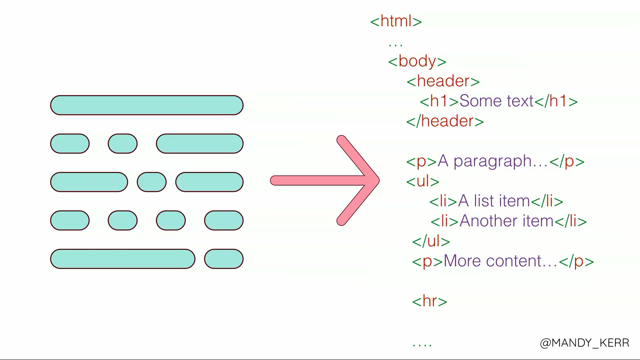
The first two are going to be using everything, and then the last one kind of extends it, and gives us some more opportunities, especially in the layout region, but, let's get started because I've only got 20 minutes. So the first part is the data attribute, and I know that's not CSS but it's actually a really important part of what we're going to do today, and, for those that don't know, a data attribute allows you to pass information between the HTML and the DOM, and in our case we're going to use that in our CSS. So, it looks a little bit like this, and when you create a data attribute, you add it onto the HTML element that you want, and you always prefix it with data dash, and then on the end you call it whatever you want, I called it a heading because I'm using a h1 and that kind of made sense to me.
Usually for these effects, we're gonna put whatever's in our h1 in our data attribute, sometimes you do this different, and I do have an example later but, for the most part you want it to be the same. I guess the reason that we're using a data attribute here and we're not duplicating our markup or hardcoding the value in our CSS, there's a few reasons. One, duplicating your markup is messy, harder to maintain, it's not super cool, but also, this is much more accessible because if we duplicate our markup, we're gonna end up having a screen reader read Hello twice, and that would be not very nice for some of our users, so in this case, this is just gonna get ignored, and they're only gonna get Hello once, so that's really important.
The other reason is this is easier to set up with a CMS, it's more editable and it's more searchable text so, this is why we use a data attribute.
On its own, it's not gonna do much, so, part two of The Power of Three is a pseudo-element, which is a CSS thing, and I use them all the time, and what they're gonna do for us is give us our layers to work with.
So, if you were to inspect it in the DOM it looks a little bit like this.
They're attached to the HTML element that you're using, and you get a before and an after, you can choose to use them if you want to.
So, when you combine these two and a h1, that's gonna give us three layers, it is limited but you can do a lot with that. But before we can use them we need to tell our pseudo-elements that we want to use that we want our data attribute content in the value, and you do that like this.
So, here I'm just setting up my h1 and saying I want a before, and then you can see here, in a content property, you might leave it blank to create shapes or put a string in there or whatever, but instead, I'm gonna say I want to use my data attribute, and you just do this by saying attribute, and then in the brackets whatever you called it, and that's going to give us an additional layer of text in our pseudo-element. So, now that we've got that, let's make some cool text layouts, or effects, I might say. So this one is a really simple example, and we're gonna go through setting it up.
It's pretty straightforward, just like my previous example we set up our h1 with our data attribute, and it's got the same text in it.
And then we chuck some CSS in, really easy, I want it to be black because it was black on the white side.
And then we set up our pseudo-element, and here I've got my content property which I showed you before, but I'm also adding a position absolute and a left position of zero, and the reason for that is I want it to sit perfectly on top and aligned with my text, so that they're layered. And that's gonna give us this, which isn't quite what we're after, so, what we have to do, is get this last bit to be white. Now you can't really see, this contrast isn't awesome, but anyway, to do this, we're gonna make our h1 white, and we're gonna make our before black, and that looks like this, which again isn't quite what we want, but the reason I wanted to show this is that you can kind of see the white sitting below the black pseudo-element.
So all we have to do now is get rid of half of that pseudo-element, and that's really easy, we just set a width on the pseudo-element with overflow hidden, and that gives us our final effect. So I guess, a more easily visual representation of that is our h1 is our base layer, our pseudo-element sits over the top, we set a width on it at 50%, which is where our background gradient, which is what I'm using, exists, and then we just set overflow hidden, and we easily create a awesome split layout. Now this example only works with a single line of text, but I've got an example later that's multi-line and you can do more complex layouts.
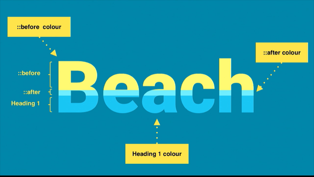
So I guess the natural progression is doing the same thing with heights, this is one that I made earlier.
And it works the same way, so the reason I wanted to show this was, it's kind of a good way to show how the layering works. So, in this case again, the h1 is the bottom layer, the after pseudo-element is the middle layer, and the before is the top layer, and all we're doing here is setting a height with overflow hidden to reveal the layer below. And once you've done that you can start, you know, animating and doing cool things, Perth has lots of great beaches so, you know why not? And then you can do more stuff like this, once you start adding other CSS properties, this is set up the same way as the beach text, but what I'm doing is I'm using the before to mask the top layer of the h1, by setting it to the same colour as the background. This is quite straightforward to set up again, the colour is black, and then we set up our pseudo-element, again I've got my content property, my position and my left, from now on I'm not gonna go over those because they're actually used in all of the examples, but let's just remember that they're there. And the bits that we care about at this point, is the height of 50%, the overflow hidden, and the colour of white, which is really important, because that's the colour of our background, and that gives us this.
You're definitely not gonna set it on this, but, there is a kind of slight artefact behind this sometimes, kind of like the effect I showed earlier with the white behind the black.
The way I got around this in this example is adding a text shadow, and kind of blurring it out of the way, doesn't always happen, but when it does, text shadow's a good way to get around that. So now what we want to do is set up the after, which is the offset text, and all we do is set a height, I made it 49% so that it would be slightly higher than the bottom, and then overflow hidden as usual, and then I transform, I'm just using a translateX to offset by 20 pixels, and that gives us our fracture text.
And this is editable and searchable, you can change it, and that's really cool, because normally you might use an SVG for this, and that's a lot harder to change once it's in the page. So CSS can do some pretty awesome things.
Also rainbow text, I added a span to get two extra colours but, because it's not really a rainbow if it's only three colours, but anyway.
This is a Swiss design poster I remade, this is just layering and offsetting and applying a blend mode.
You can rotate and reflect text, this is another Swiss design poster, lots of good material there.
You can also do something like this where you're offsetting different layers and applying blend modes. Or you can do something like this, and you might have seen this in Mike's talk earlier, this thing with the flashing thing from his game show, and what I love about this is that, instead of slicing our text or changing the colours we're actually just layering different font families. And the easiest way to do this is to use specially made layered fonts, and what's great about that is that the person who made the font has done all the work for you, which is great and you'll find out how difficult that is later and have sympathy for them, but it's super easy to set up.
So all we do is we set our font family on our h1, I'm using CoreCircus which is an awesome font, it's by S-Core, in that colour, and that gives us this, which is kind of boring in comparison to our other effects. So we set up a pseudo-element, and we just changed the font family, I'm using one called Core Circus Dot, and then, I'm also setting a font weight of normal here because the pseudo-element inherits the bold from the heading, and it looks really rubbish, and that gives us this, which is cool, but it's not quite there, the last part we need to do is add the 3D element to it. Now, most layered fonts will include the 3D for you to use, but, you can accomplish it with a text shadow, so I don't really want to waste my limited layers on that. It kinds of looks like this, I'm not gonna go through it all because it would take a while, but, it's essentially two parts.
The first part is a white outline around the text, which is this bit here, and this bottom part creates the blue text shadow, 3D part, and all you're doing is incrementing the pixel values until you reach the desired distance from the text, so it's not very difficult to accomplish, and that's the final effect again in case you forgot. This font is really well made and there are heaps of them on the internet, some of them are better than others for layering. This one is Yaki by Novo Type.
This is CoreCircus again, but using a different font family and a bunch of text shadows.
This one is called Festivo Letters.
This one is Fata by Novo Type.
This one is called Guru, this one I'm applying an exclusion blend mode to, so when it moves over the background image it actually changes colour which is really cool. And this one is called Rig Shaded, I'm actually using four different font families on this, because I like how he made the shadow, it's really cool. But I guess, the point here is that you don't have to have just standard, single colour text, you can make some really impressive headings and things on your website.
And I guess once you've started combining and layering, the natural progression is emojis, and you can make new emojis because we've learned about how to split and combine different colours of text, why not combine emojis to make new ones, like twitchy eye face, which we use in my work slack group all the time. Or winky cat, which is also, I didn't know I wanted this until it existed. This is our high five, which I think now actually looks like a high five, which I think is really cool, I wish that's what the high five emoji looked like. So, these are set up slightly differently to our other text effects, the split part of it with the width and the overflow is the same, but we're actually putting a different emoji in the data attribute that we are in the h1, and it looks like this.
So you've got your really angry emoji face in the data attribute, and your normal, I guess, generic angry face in the h1, and that just means that you have different things to work with.
And sometimes you want to do that if you want to have a single, like, letter in your text to be a different colour or something, you might want to do that, but I think emojis are a really good example and it's kind of fun.
Side note, they don't always work, sometimes they don't align, which is a bit frustrating, and operating systems render them differently but, not everything we do has to be serious, sometimes it's just for fun right, that's why we all got into web things I hope. You might have noticed that some of these are not vertically or horizontally split, and the reason for that is, sometimes you want to do more complex shapes and more complex slicing, so that brings me to the last part of The Power of Three, in case you'd forgotten there were three, and that's clip-path.
Now, clip-path is not fully supported in all of the browsers unfortunately, it does work in Chrome, it's got partial support in the other major browsers, no support in IE unfortunately, no support in Edge, I do suggest you upvote on Edge because it'd be great to have it in the browser, it does give us a lot of opportunity.
And the way that it works, is it allows you to specify a region to show, rather than the whole area.
The bonus is that you can create all sorts of different shapes with it rather than just rectangles. So this is what the syntax looks like, and it does vary, depending on the shape that you want to make, a circle looks very different to a polygon, but the polygon is pretty useful because you can create all sorts of shapes with it. I am gonna be super boring and make a rectangle with it, but that's just for demonstration purposes, and it kind of works like this.
Each coordinate point represents, sorry, each set of numbers represents a coordinate point, so the top left is just up here, it goes around clockwise until you get back to the start, then the top right goes over here, the top left down the bottom, sorry, bottom right, and then bottom left down here.
And essentially what that's creating is a area that we want to see within our container that's 70% from the left-hand side, so you'll only be able to see this visible area, and the rest will be hidden.
So we're actually gonna use that in our next example, like I said, we're going to have more complex split layouts, and here we're using a before, a h1, and an after. So we start off with our layers, so you can't see what's below, and we add our first pseudo-element, I'll start with the 70% one that we just went through, and that reveals just this part of the text on the end. So now what we want to do is reveal this area over here, so we're going to set another clip-path that's 30% from the left, and hides everything from beyond that, and that's gonna give us this.
So as a result, we end up with our h1 in the middle, completely free to be seen, because we're cutting away everything in the before back here, and everything that was in the after, this has all disappeared and hidden behind our clip-path, so it's pretty handy way to cut and create certain shapes. And once you've learned all these concepts, you can combine them all to create stuff like this. This was actually copied from a Photoshop tutorial I found on design cheats, and you might have previously thought that you could only do this in Photoshop with an image. I'm not gonna go through it in a lot of detail, but I will show you the layers that it has. So this is the h1, there's some transforms and a text shadow, and then we add the first part of the fold, which is our first pseudo-element.
The CSS looks a little bit like this, we have a height of 50%, like our beach text, and a overflow hidden, there's a text shadow because, you know, makes it look cool, and then we've got a whole bunch of transforms to put it on an angle and that kind of thing. And then we create our bottom layer, now, because we want to get rid of the top part of this, we can't use a height, so I'm gonna use a clip-path, and what that's gonna do is get rid of everything from here upwards.
So, very similar to the before, except instead of a height and an overflow, we're gonna set a clip-path that shows only the bottom 50% of the text, and again I've got some transforms and scaling and what not to make it look foldy.
And that gives us the folded text, which, there we go, you can animate as well, and it's editable, which is pretty awesome because, again normally, you might just chuck this in the page as an image, or you might make it as an SVG and you might not be able to change the text. So, CSS can do some pretty amazing things, if you experiment a little and see what's possible. The great thing about clip-path is that you can create different shapes, so this is the animated version you saw earlier, and I'm creating a split diagonal layout, I love this because the text shadows are different colours as well as the text, super cool, plus unicorns. You can create the fracture text but on an angle if you wanted to, which is pretty awesome.
I love this one, most people don't like it but I think it's really cool, this is using blend modes and just some random shape that I made with a clip-path, you can actually use some tools to make the clip-path, there's a bunch of them online if you search for it, rather than making all those points yourself. You can create text that bends around a corner, like this one, this is using both width and clip-path as well, and some perspective. You can make '80s retro text, here I'm using clip-path to reveal the in-lay colour of the text, I'm also using Rig Shaded in the 3D effects here which is really cool.
Or you can move into making some cool layouts, so with this one, whatever text appears over the image is a different colour to whatever's over the body, and this is responsive, especially if you use Mike's fluid typography stuff, and I guess this is leading more towards creating magazine-based layouts, rather than sort of traditional web.
You can also do something like this one, here I used a custom clip-path, so the text around, the clip-path kind of comes around here, so any text that sits over her dress is a different colour. Now you can do stuff like this specific example with blend modes, but you don't have as much control over the colours that you want to appear, so, this is like the good alternative if you can't get the exact colours that you want with blend modes. So, that's kind of all I have time for, this is another really cool layered font by the way, the Os in it are awesome, that's why I've got cool up here. Anyway, sorry, I'm getting distracted, so I guess, I hope that you see these examples, and if you're a designer or a developer, next time someone comes up with a really cool idea, you kind of don't just go, oh no you can't do that, that we'll have to do as an image, or it has to be SVG, because it might not need to be, CSS is so awesome and so powerful and new things are being added every day.
Don't get caught up in all the new shiny things all the time, SVGs are awesome, I love them, I use them all the time, JavaScript, it's wicked, so many cool frameworks, don't forget that CSS is there, grids just come out, new things every day, it is super cool and we should love and appreciate it for the amazing things that it's given the internet. So thanks, I'm Mandy, please look out for the link later if you want to have a play.
(audience applauds) (funky electronic music)