How we optimise component reuse at ABC
The Evolution of ABC's Web Tech Stack
Louis Stowasser introduces the history of web development at ABC, beginning his journey in 2015. He discusses the technical evolution starting from 2011, highlighting the disjointed nature of design and engineering practices. Stowasser details the slow-paced changes due to the CMS dependencies and the eventual transition to modern technologies like React and Typescript, resulting in a unified design language system known as the DLS, implemented as Nucleus.
Optimizing Component Reuse at ABC
The speaker discusses the importance of component reuse, suggesting a balance between speed and flexibility. He encourages teams to leverage existing mature and tested components over creating new ones from scratch to maintain accessibility and foster rapid iteration, ultimately empowering development teams.
Component Landscape in Presentation Layer
Stowasser elaborates on the scope and categorization of approximately 3,000 components within ABC applications. He describes an objective to increase component reusability by reducing bespoke components within applications, to facilitate cross-application sharing and benefit from shared resources.
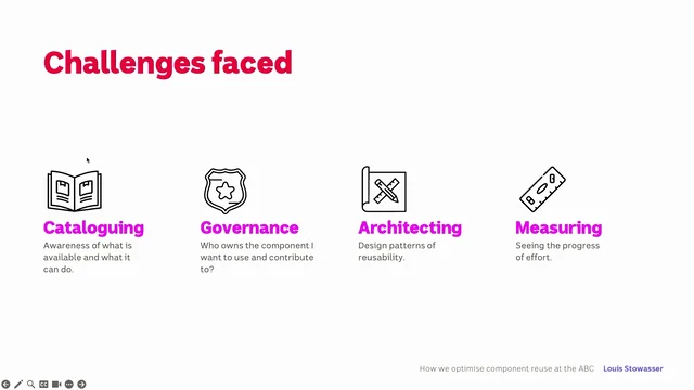
Challenges in Component Reusability
The speaker identifies issues that hinder component reusability including cataloging, governance, architecture, and measurement. He emphasizes the significance of understanding available components, their ownership, and the technical patterns required for efficient reuse.
Cataloging Components with Storybook
Louis explains the use of Storybook to organize ABC's component library and make it accessible. He highlights issues with scalability and searchability given the vast number of components, discussing future improvements like ontology-based browsing and tools for linking components from websites to their source in Storybook.
Governance and Ownership of Components
Stowasser introduces the code owners tool, which clarifies component ownership and facilitates changes through cross-team collaboration. This ensures accountability and shared ownership when updates are made, enhancing transparency and teamwork.
Architecting Reusable Components
The speaker addresses component design practices for optimal reuse, detailing antipatterns and best practices like slots, compound components, and hooks. He illustrates the advantages of each pattern while acknowledging the challenges and limitations they present.
Measuring Reuse Effectiveness
Stowasser presents a conceptual framework for measuring reusability through a simple reuse ratio, noting its roughness but utility in comparing relative progress over time. He shows data indicating improvements in ABC’s reusability with an increasing reuse ratio.
Advantages and Outcomes of Component Reusability
Concluding the talk, the speaker recaps the benefits of achieving component reusability, emphasizing efficiency, consistency, ownership clarity, and collaboration across teams. Outcomes demonstrate faster feature development and increased reuse efficiency as measured by their metrics.
Yeah, thanks for the introduction.
I'm here to talk about how we optimize component reuse at ABC.
Before I get into the details, I thought it might be fun just to talk a bit about, the history of web, at ABC.
So I actually joined ABC around 2015 as an engineer.
I joined the news team, and in that time I've got to experience quite a lot of, evolutions of our tech stack.
So you'll notice it starts at 2011.
I'm not gonna talk about what happened before 2011, but I have it on good authority that it involved, notepad and drag and dropping with, FileZilla FTP client.
So it's truly the peak of web development back then.
Back then, each ABC product, had a different team that, did the engineering and the design.
They all, worked in different ways.
They all pulled in different directions.
There was no real consistency, no unification of, the code or the design.
I actually worked on news.
So news, the way that it worked was we had a CMS and the web template was built into the CMS.
With JSP as well.
So that meant that if we wanted to make any changes to the page, it required a full deployment of the CMS, which would take months, I'm not joking, it would actually take months to, get a change in.
So that meant that, any change that we did make had to be on the client side.
So development was quite slow and we just were so limited by what we could actually achieve, just through the client.
It also meant that when a deployment happened, the entire CMS had to be brought down.
So that mean, that meant journalists couldn't actually write any stories or edit anything.
So you just pray that, no news happened when you, you did a deployment.
So the next evolution of this, we end to solve that by separating the templates from CMS, and we use something called free market templates.
It's just a templating layer.
And that did solve that deployment problem.
And deployment would happen within a day.
That worked.
We migrated a lot of the ABC's websites to this system, but by the time we got to news, it was, first of all, the technology was already outta date by then.
What year is this?
2017. 2019, yeah.
Already outta date.
And news is a behemoth.
It is a big website.
And people in news don't like to get rid of some of their things.
They're old things.
So you basically had to migrate absolutely every part of the website.
So this didn't work.
We cut our losses and we moved to where we are today, which is called presentation layer.
And that is a completely separated, web stack.
The CMS becomes a headless CMS, and we communicate with an API.
And so presentation layer is, built on modern technologies.
It's React, it's Typescript, NextJS, and it now gives us the engineers access to the full stack.
So previously when we could only make changes in JavaScript, we can now change the entire web stack.
So it gives us a lot of power and that made it a lot easier to migrate some of those websites.
And with this came a, unified design language system, which we called the DLS.
Which we then, implemented as a component library called Nucleus.
So this tech stack, very powerful, very flexible.
It allowed us to actually migrate, the bulk of our web presence with, that sort of security that you know, and consistency.
And I think it was possible because we had reusability at the heart of the project.
So that's why I wanna talk about component reuse.
To me component reuse is a bit of a balance between speed and flexibility.
Sorry, I had, a designer friend do the animations here, so I'm not too sure what's happening.
Yeah, the path of least resistance should generally be to take something existing off the shelf, something that's mature, tested, accessible.
ABC needs to adhere to some really strict accessibility standards, which I think is a great thing.
But that's not easy to implement.
I'm sure we all have tried to do that and it's not easy to do.
So yeah, generally you wanna take something that exists and work with that, configure it as you need it.
And we don't wanna get in the way of quick iteration.
So we want teams to be able to experiment.
We want them, to be able to iterate and build new features and new experiences.
And reuse shouldn't get in the way of that.
It should empower the teams to do that.
And if anything, when deciding between reuse or building your component.
The engineer should think in their head, I've gotta make this accessible.
I've gotta test this.
The, sort of pros and cons should heavily lean in the favor of reuse.
So that's why I call it the path of least resistance.
Cool.
In presentation layer, we have about 3000 component.
Is that stuck?
Okay, I've gotta stay on there.
We have about 3000, components across our applications.
You can see the bulk of it is in the shared libraries.
So the shared libraries means that, any application can pull from that space, and use a component there.
So in presentation there, we've got the news website.
That's by far the biggest application.
There's a lot going on.
There's a lot of features and experiences.
Then we've got the ABC homepage and radio, Listen is in that group there.
Actually that one does a lot of the heavy lifting, surprisingly, a lot of new websites and probably most websites you can think of are from that application.
And then we've got Triple J unearthed.
It's a bespoke experience.
It's got user generated content, so it has to have its own experience, and emergency as well.
So that's the breakdown of how our components look.
Ultimately we want that square to be to just dwarf the others.
We don't really want applications having too many of their own bespoke components 'cause it means nobody gets to benefit.
We want, a world where, news if they want to use something from Triple J, they can just import it.
Right now, they can't import through those, application boundaries.
It has to go through a shared com, shared library.
So that's our goal with reusability, is to, make as much as possible reusable.
But not all these components are reusable.
So even though they're in a shared space, it takes a lot of effort to actually make something reusable So you can make a component shared.
Anyone can import, import it, but.
How do they configure it?
Because you're not always gonna wanna use the component in the same way.
You might, you're probably gonna want a different style.
You're probably gonna want a different functionality.
It's not gonna just plug and play, exactly how you'd like it.
But you wanna take that functionality.
You don't wanna have to rebuild that.
Yeah.
And the other thing you don't want is overlap.
So we've got a lot of overlap, in our component library there are components that do 90% of other components.
We need to actually consolidate that as well.
And, at some point you ask yourself, how many card components do you need?
I, did look at this on the flight here this morning, and there's 161 card components in our repo, so that shows you something.
Yeah, on this path of optimizing for component reuse, we identified some of the key challenges that get in the way of that.
So first of all is cataloging.
That's just a general awareness of what is available.
So when you've got, 3000 components, how do you know which, what's there and what you can even use?
And then governance.
So there's a component you want to use.
Do you know who owns it?
If you do need to make a change, how do you actually contribute?
Who do you talk to basically?
And then, do you own it?
If you've made that change, that's a question that gets asked a lot.
Architecting.
As I said earlier, it's not easy to make a component reusable.
There are certain design patterns that make it easier.
But, it's, yeah, it's not straightforward.
And then finally, is measuring, so that's just how do we know if we actually made a difference?
So firstly, with cataloging, the questions we ask ourselves of what components are available, what components come close enough.
How configurable are they?
And then what is the source of truth?
So designers and engineers, they need to know what is available with 3000 components.
The chances are good that you're gonna find most of the things you need in there.
There's probably not a lot of new experiences that haven't been thought of or built before, or at least some overlap.
But they might be buried in a application or in a shared library and not in a state to use or to reuse.
Typically it'll be hard coded for the problem that it was built for.
And there might even be a component that ticks all the boxes that is reusable, but you might not know it exists.
And if you don't know it exists, how can you use it?
Might as well not exist.
So what we use to, to deal with this is a tool called Storybook.
I'm sure a lot of people are familiar with Storybook, and storybook acts as our single source of truth.
We use it to organize, we use it to categorize, which components we have available.
It's really neat.
You can actually play around with the configurations and see, how it renders like right there and then.
So it's, great for our designers as well, as they, they can just look at this and they can see what, is available.
But there is a challenge with this 'cause, I mean imagine 3000 components in this left hand column.
It's like that's, at least it's there, but it's not very searchable.
So the only thing you've got is that little find components thing in the left hand corner, and that only matches by the card name.
Future improvements that we're looking at is just a better way of being able to browse this list.
Maybe having different like ontologies so you can browse by, like domain or browse by layout components or something like that.
The other thing we're looking at is an internal tool, for engineers or designers if they're on an ABC website and they say, this component is exactly what I need, we have some way of linking the two so you can jump straight to the story, and see what it can do.
So the next key challenge is governance.
Who owns the component?
Who can provide input?
Who can review my change?
And if I make a change, do I own it?
Now it's a, scary prospect to own a new component.
So if you do find one and it needs a few tweaks, who do you go to about it?
You dunno if it's gonna affect other parts of the website.
And.
Yeah.
Who owns the responsibility?
You've made a change.
Does that mean you own it?
So we have a concept, sorry, we have a tool we called, that's called code owners.
And this acts as like a directory listing.
It lists all the libraries that we've got, and you can see we've got a team as the owner, of that library.
This will automatically add the relevant team members to all pull requests.
So if you made a change to live blog components, it'll automatically add the entire news team.
And so below this, the individual members of the team are listed and it's a good, first task for new employees is to go and put your name in the relevant team so we've got a clear understanding of who owns the components now, and, yeah.
And if you do wanna make a change, then you know who to go to.
And we believe that, if you do need a change, you need to have those cross team conversations.
Because if the change is truly an improvement on that component, then we wanna raise all boats.
Everyone should benefit from that.
So next key challenge, architecting.
So that's how can I design my component for maximum reuse?
How do I avoid prop stuffing?
That's a pretty common issue.
And then how do we support different design language systems?
It's not always straightforward how to achieve this.
There's multiple different patterns, multiple different ways to skin a cat.
But the risk is you build a monolithic component, a component that tries to do everything for everyone.
Something that won't scale, something that's hard to test, it's gonna have lots of props.
And the configurations are gonna be opaque to designers and engineers.
So without good architectural patterns, I, find this is the state of entropy.
It'll just naturally occur.
And if you've been using ABC news website, and I did wanna poll the room, how many people actually read the ABC news website?
Oh, that's a lot.
That was more than I was expecting.
That's great.
You've probably noticed a change.
Yeah, this is a, maybe a little bit controversial when we did this.
I was waiting for that.
I was waiting for the heckles.
But anyway, we massively overhauled this and this presented a pretty big engineering challenge, because this is an entirely different design system.
It's very different.
And presentation layer was actually built around the idea of you just have one unified design system.
You don't have two design systems.
So that meant that our components were built in a way that presentation was very strongly coupled, with the function of the component.
So that presented a really big problem because all of a sudden we need to reuse the same components that we've been using before, but we need to, completely change how they're laid out, how they're rendered.
So this is where we get into some of the, code patterns.
So I'm actually gonna go through some code examples.
It's not an exhaustive list by any means.
There's patterns and antipatterns in my opinion.
But they make up the solutions in our code base, and there's perfectly valid reasons to use some of them and perfectly valid reasons to not.
But I think it's important just to know what's available, when making that judgment call.
So I'll talk about the first pattern, the, maybe the, base pattern, which is you copy and paste.
That is an option.
You could technically call it reusability.
This is when you would just copy and paste the source code of a component, paste it in your application and make your changes there.
Not a great solution though.
Very error prone.
If you do need to fix a bug in one of them.
You are gonna have to fix it everywhere.
And how will you even know that one is a fork of another to apply that change?
So yeah, we can do a bit better than this.
Yeah.
The.
The animations, they're great.
Design oriented props, is probably the next worst option.
So this would be where if you need to use this component somewhere else in a different context, but you need to just make one little design tweak.
It's just a tiny little thing.
We just need to make the text white, change the padding, whatever.
How do we solve it?
Oh, we'll just add a prop.
That's that, does it.
Problem with this is it doesn't scale.
You can imagine you would just be adding props, infinitely for each style that you need to override.
So yeah, this, approach doesn't scale very well, and some of the, props can even conflict with each other.
So that's a bad place to be in.
What's better than this?
What can we do that's better?
Class name props.
This solves the scaling issue.
We don't have an ever increasing amount of props.
We just have the props that we need to pass in a CSS class that can override some of those styles.
So look, this is honestly the most, prevalent solution we've got in our code base.
We use this a lot.
It works.
It does.
But there's problems with this as well.
One problem, there's actually a few.
First of all, you can just imagine there that little CSS class, how tempting it would be if you needed to just tweak something else in that little component, you would start to nest those, selectors and start to reach into the, component and go, actually, I just need to find the thing right next to it.
You end up with these really awkward, selectors that are trying to override styles.
So now you've got, a very strong coupling between your, your style overrides and the, structure of the component.
So if you were to ever go and change that change, maybe it's not a div anymore and it's a span or whatever.
Or it's a new component.
All of those things break and you will not know that they're broken because there's no static analysis or anything to tell you that.
So while this is an effective solution, it's definitely has its challenges.
So the next approach that we've started to use is design tokens.
And this is great.
This is like a shared vocabulary between designers and engineers.
So a design token is like those atomic values.
That you often need to reuse things like colors, things like font sizes, that sort of thing is an example.
So yeah, this is, a great way to, to handle the situation of multiple design languages.
The way we implement it is, the designers actually set these values in Figma, and we export that into a whole bunch of CSS variables.
And then when we're building our component, we reference those, those variables, those design tokens, and have our, have another layer of tokens at the component level.
So that level of interaction allows us to very easily just swap out the definition of some of these, tokens.
So yeah, this is a great way to, to be able to swap, design systems, branding, things like that.
So this, is a great, approach.
Problem with it though, is it's very limited.
Changing colors is one thing, but what happens if you need to change the layout or, the functionality, it is only so far that you can get with design tokens.
Prop stuffing or the, the 'procalypse' just rolls off the tongue.
So it is actually quite similar to the, design oriented props solution, but for functionality, And it's a similar situation where we need to add more function to a component.
So we just add more props, which again, works maximum flexibility, but very quickly becomes pretty unwieldy, pretty bloated, difficult to maintain, difficult to test.
Each new prop introduces a new, exponential amount of configuration that can possibly occur.
So how do you test that?
If you, just wanna take one little part of that component.
It's a monolith.
So how do you split it apart?
You can't, you have to take the entire thing.
So we need a good way to break it up.
And a good way to break it up is something called slots.
So slots, rather than having a big monolithic component, you have special props, which we call slots.
And child components, that make up that bigger component.
And the good thing about this is first of all, the props are only applied to the sort of component, the child component, the area that actually needs that prop.
It doesn't have to go to the entire thing.
You can reuse some of those child components and you can even, introduce your own components that might be a complete reimplementation of the default one.
So slots is a really good approach.
Again, we use this quite heavily.
I guess one of the downsides is, the amount of slots can, start to grow as well.
So that's where this next approach comes into play.
And it's called compound components, similar sort of idea, but, the difference is you're using React children as a way to, a way to compose those child components.
And the benefit of that is there's no limit to how many slots or, things that you pass into as children don't even have to change the definition of the modal component.
Whereas if before, if we, sorry, added a new slot that changes the definition of the component.
So this is great, but it's a bit of a challenge to implement because, you now need to coordinate those children, which can be a bit tricky.
You probably end up needing to use like React context a lot.
So it has its downside as well.
Finally, the one has absolutely zero downsides is, hooks.
I'm a big fan of hooks, powerful pattern.
The idea is you wanna extract the business logic from the component so you've got a clear separation between the functionality, the business logic, and the presentation of the component.
This is perfect 'cause we can, we can just ensure we've got really well tested, really well, really accessible hooks.
And we are less concerned about the implementation of the hooks.
So what we typically do is we'll have a hook.
With it, a partner component.
So in this case, let's say it's a use button hook.
We'll have a button class that implements that hook, button component.
So the idea there is most of the time you probably just use the component in the absolute worst case scenario, there's, we use compound components, we use slots, we've designed tokens.
We still, that's not enough.
We need more customizability for that level of extreme, I guess extreme difference in how the component works.
Then at the very least you've got a hook and the hook abstracts that, that business logic.
So we're less concerned about, if it's gonna be accessible or if it's gonna be functional.
And I should also say, even though I said it's perfect, the one downside with hooks is, we're at square one where you can just imagine a monolithic hook.
And we've got the exact same problem as before.
But I do find that thinking in hooks generally makes for cleaner code.
It generally makes for, like thinking in a more composable way.
So it's worked out for us more often than not.
Yeah, that's a good overview of the challenges and some of our solutions and approaches.
The last challenge is to know if it's even effective.
That's pretty important.
So we need to measure how do we track progress towards reuse and how do we measure how much reuse is even happening.
I've got a very simple, very rough, and I have to emphasize the word rough.
It's a metric that can gauge how much reusability is in your project.
So if you take the total number of components that's used in your code base, and you divide that by the amount of components that there are in the code base, it gives you a ratio, of for every component how often on average is that component used?
So I've got a sample of our code base for the last, I think two years now.
And you can see the component list is growing.
We're adding more components, but the components used is growing at a higher rate, which means that our ratio, is looking better.
So the higher the number, the more reuse is happening.
So this isn't an absolute measure.
You might have in your code base a completely different, number.
I actually couldn't tell you what number is good.
I think a relative measure is, probably the best this could be.
Although I think it should probably be above one 'cause that means you've got more components than you're using, which would be interesting.
But by prioritizing reusability, we've really gained in efficiencies.
New features are quicker to build.
Build correctly with established and well tested and accessible, patterns and, components.
We have consistency as well in our design.
And we're providing designers with the tools, to achieve that consistency, and to use what exists first.
So we also have clear boundaries of ownership of components.
And collaboration as well, so that teams aren't dipping into the backlogs of others.
They're actually working together.
And there's clear ownership of that of course, as well.
And yeah, lastly, we know if it's actually making a difference and it is the numbers going up.
So the initiative is working for us.
And that's it.
So thank you for listening.
Thank you.
This was actually based on a blog post that I wrote on the ABC digital, product blog.
If you are interested in what we do and anything like that, I would encourage you to go check that out.
And feel free to reach out to me as well if you're interested.
Thank you.
- React
- TypeScript
- Next.js
- import
- Storybook
- code owners
- props
- slots
- compound components
- hooks
- className
- CSS variables
Reusing components leads to visual consistency, higher quality code and faster development yet it’s so tempting to building from scratch. Explore the benefits and decisions to increase component reusability at ABC.