Buttons are a Hack
Touch gestures are sweeping away buttons, menus and windows from mobile devices—and even from the next version of Windows. Find out why those familiar desktop widgets are weak replacements for manipulating content directly, and learn to craft touchscreen interfaces that effortlessly teach users new gesture vocabularies. The challenge: gestures are invisible, without the visual cues offered by buttons and menus. As your touchscreen app sheds buttons, how do people figure out how to use the thing? Learn to lead your audience by the hand (and fingers) with practical techniques that make invisible gestures obvious. Designer Josh Clark (author of “Tapworthy”) mines a variety of surprising sources for interface inspiration and design patterns. Along the way, discover the subtle power of animation, why you should be playing lots more video games, and why a toddler is your best beta tester.
“I hate the ipad back button with the fire of a million suns”
Fitt’s Law – roughly, the smaller and further away a target it is, the harder it is to hit. Also we have issues with accessibility and discoverability… not everyone can even use a touch screen (he met a cabbie with a hook instead of a hand…) and even if they can how do they know what to do.
Gestures are the keyboard shortcuts of touch. They are patterns that are more forgiving, they can be done anywhere on the screen; they don’t require as much precision.
Buttons are a hack – an inspired hack, but still a hack. Even in the physical world they’re a hack – a button over there for a light up there is not intuitive.
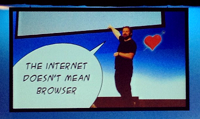
The internet is not the browser – we have been reminded many times here at WDS12.
The web (browser) is inside of every application instead of every application being inside the web (browser). – Luke Wroblewski
You can do some touch stuff in browsers; but a lot of gestures have already been reserved by the browser itself. So for the time being the greatest/richest level of gestural interface design is going on in native apps.
App demo – quick prototyping with Adobe Proto. Would’t work all that nicely on desktop but it’s perfect for an ipad.
Also showed Clear – really good exploration of touch driven interface, inspired by playing a musical instrument.
Discoverability…
How do you find what you can’t see? Especially when there’s no prior familiarity to fall back on? How do we get to the stage we’re at for keyboards – muscle memory.
“There’s no such thing as an intuitive interface. Everything is learned, there’s no such thing as intuitive.”
UIs are social conventions, we can’t truly rely on them. Many can get solid; but you can design to remove uncertainty. Example: salt and pepper shakers, the very best is the one with glass that lets you see what’s inside. The content itself tells you what’s happening.
Design the content as the interface. We may finally get to a point where the message is actually the medium.
Many apps still give you a complete set of instructions when you start them; which asks people to become experts before they’re novices. Front loading the instructions makes it seem complex even if it’s not.
Besides, nobody reads the manual. We all have incomplete knowledge of the tools we use, because we don’t read the manual. It drives us nuts when our users don’t read the manual, but we know they really don’t.
But people watch TV, maybe a screencast will work? Example video: Al Gore introducing an app, but it’s a very dry, boring video.
So what else? We don’t have to give people an instruction book.
Nature doesn’t have instructions, even though it has a pretty complex interface. We all spent years learning the interface to the world. We’ve got it now, which is great, but it took work.
Some people use skeumorphism to tap into prior knowledge, but if you don’t follow the metaphor all the way through you make a much worse situation. Eg. Apple Calendar is skeuomorphic but for the first 18 months you couldn’t “turn the page”.
When you’re teaching things to users, think of the patience and tolerance you would show to children. They don’t know things yet and we accept that. When an interface is unintuitable, why expect people to get things instantly?
To learn great ways to teach people how to use a UI… play more games! Games use…
- coaching
- levelling up
- power ups
…to great effect.
Some sites and apps use little popups/inline dialogs… but we are haunted by the ghost of Clippy past, where the terrible content and persistence despite dismissal drove us nuts.
If you add a hint or callout, make sure you stop showing it once the user has actually done it – when they know, you don’t need to tell them. If they’ve done the gesture or said ok, stop hassling them.
Provide visual cues for custom gestures. A suitcase without a handle is useless; a gesture with no affordance is useless.
The best time to give a hint is when people need it – games may pause and tell you how to block when you’re getting heavily attacked.
Apple took it a step further and forced people to learn to scrollin in OSX Lion – you had to scroll before you got a continue button, it was just that important.
Power ups in games give you super powers – they let you shortcut things and reward you for effort. They can be used by anyone but are especially effective when used by experts.
If people are doing a slow version of an interaction, after the tenth time you can offer a hint about a quicker way. You can even require them to do it to proceed.
Even so this all shows we don’t have conventions. We don’t have enough commonality to form standards. So talk to each other, be generous. Ask people why they built something the way they did.
