Breathing room for Design
(upbeat music) - Hello everyone, before we get started with our presentation, let me just tell you a small story about Gina. Gina is the quintessential community activist, and she's my friend who wants to do her bit in everything. Come the pandemic she started to sew, and sew she did about 30 odd face masks as prescribed by the Australian Government Health website. And these masks were distributed to friends and neighbours. Then came her first trip to the supermarket with the mask on, and she did a complete product recall from all the 25 people that she had distributed the mask to.
The problem, no breathing room.
The masks stuck to her face and rubbed her lipstick off. So, after some trials, she came up with this. She's very happy with the outcome now as a lipstick stays safe and undisturbed.
Funnily enough, that is exactly what design teams in an enterprise face every day. In an urgency to hit the market, we often go the prescribed way without having the time or room to question it. However, we don't have the luxury of Gina to pivot and put out a new product the very next day. In summary, there's no breathing room for design to conceive and execute a delightful solution. Good morning everyone, I'm Sharbani Dhar, design director at Australia Post, an enterprise that has been the backbone of Australia for over 200 years, and.
- My name is Michelle O'Reilly, I'm the UX design leader Australia Post.
- Lovely to meet you all.
Today, we are here to take you through a case study on how we've created breathing room for design within our enterprise.
It's been a journey of trial and error, one, we are continuously looking to improve, these are some of our learnings for those of you who are facing similar challenges.
But first, a few facts about us.
We are over 210 years old, so yes, our first Postmaster General Isaac Nichols was in fact a convict, transported to New South Wales for stealing. Nichols was responsible for collecting the mail from newly arrived ships and distributing it to the colonies.
From the first post office in George Street in Sydney, we are now about 4300 post offices, spread across over 7.5 million square miles. Our post offices are the lifeblood of rural Australia, they're a key enabler of e-commerce, and from small businesses to large enterprises, our customer is everybody.
From the tech-savvy millennial in Melbourne to the lady knitting baby jumpers in cable Cora, where the nearest town is 700 kilometres away. A continual insult we often hear from people in our research over the years is that when banks close, they're not so fast.
But when post offices close in a rural town, people get very worried for if they don't have a post office, they feel that they don't consider themselves a town anymore.
That is the level of trust and responsibility Australia Post shoulders. Last year, we sent about 3.3 billion items across 12.1 million addresses in Australia and 214 countries across the world.
With the onset of COVID, our volumes have increased to triple than what we normally experience during peak times. It takes a lot to run a network and business of this size and making change is hard.
Believe me, there are some days when we feel as if we are working with technology from Mr Isaak Nichols himself. Having a large footprint means we have multiple operational dependencies and multiple operational complexities.
And this has become more obvious than ever before, during the pandemic.
- As the digital team at Australia Post, we are the facilitators for experiences.
It's our job to connect customers without them having to come physically to us and allow them to easily search service online. Most importantly, we are the key channel of communication in emergencies, bush fires, floods and the pandemic. The digital team is more than 500 people working across 20 engineering teams that are spread across four to five major programmes of work in the enterprise. For delivery, we follow the Scaled Agile Framework for enterprise or more commonly known as SAFe. SAFe is a framework that allows complex enterprises to adopt agile methodologies within our development teams. So that they can function in a lean manner where they can be nimble, agile and better able to react to market demands. In order for this to work, the whole digital team plans together every quarter.
We check in every six weeks to reassess the progress and planning, and we adapt to any changes.
Each team plans for their work, for every milestone that needs to be delivered for the next three months.
We then map the dependencies with other teams to ensure whether are teams with dependencies, they aren't operating in silos, but are communicating and planning together. However, SAFe is a self-aware development methodology. It has been a constant trial and error to mould and shape this process to ensure these experienced teams' needs are also accounted for. Australia Post is a really large enterprise with customers of various digital aptitudes across the country with legacy tech and old school stakeholders, this has been a very interesting challenge. It's not only how do we build the software, but how do we design that software in a way that's simple, useful, and delightful for our customers.
So what's that sweet spot? That allows for thinking time yet enables quick delivery? That is inclusive and enables collaboration with engineering and cross channel product partners? That enables the right tools and methodology for a problem? What's that sweet spot that allows breathing room, to create delightful experiences for our customers and the light's designed to inform strategy? - We tried a multitude of experiments to search for our perfect sweet spot, from working few sprints ahead to working just in time for the devs, to design sprinting to be better prepared.
And guide them to a few others in, from you know, our playbooks.
This is when we decided to experiment for dual track. This is where discovery and delivery run parallel to each other without a time dependency on each other. While experience continues its discovery towards an evolving vision that teams can use as a beacon, delivery becomes the incremental realisation of that vision.
As part of discovery track, we kick off end-to-end research and design activities that could ideally be at least a quarter to six weeks in advance before delivery kicks off.
Once we start to uncover the insights, the delivery teams can then start to pick them up as opportunities for quick wins.
As the research gets more and more mature and findings get media delivery can then start to plan for bigger pieces of work.
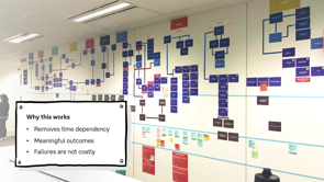
Why this works? Removing time dependency between experience research and delivery, allowed further breathing room to think, unpack and invite cross channel collaboration.
Continuous slicing of learnings from research into smaller pieces of delivery, allowed delivery teams to work towards meaningful and viable outcomes.
Identifying quick wins also allowed for quick, not so expensive fails, while making time for research on more complex problems.
How this works? How does this really work? Let's look at our double diamond for a bit to see how it fits into dual track.
The first half of the diamond, learn is when the discovery track kicks off and the create half is where the delivery track kicks off. Learn is when we try to spend as much time as we can, understanding the problem, learning as much as we can about it, so that then we can begin to create. Now, when I say discovery track, I don't mean that this is an activity that is solely owned by experience. In the same way delivery track is not solely owned by the tech.
So for this to work, it is of utmost importance to identify the right balance of people for driving the right parts.
The participants of discovery track are therefore the product managers from viability, the software architect from tech and the design directors from design driving, the research and vision setting.
The participants for delivery, are business analysts from viability, the developers from tech and designers from design driving the delivery for an optimization.
Now this is important, while these two tracks run parallel to each other, the producers, iteration managers and the leads become the connectors of the two tracks. Having roles that work upstream rules the flow downstream with kind of does in the process who ensure that there's a constant dialogue happening between the two, facilitates the space and breathing room to focus on the right parts of the process at the right time. From day one, we also operated on showing full transparency of our processes and methods.
The team were unclear around UX processes, and we took every opportunity possible to educate and answer any questions they had.
We instigated a weekly share back that was an open forum for 30 minutes.
We would share back progress and take anyone that is interested on the journey, explaining the decisions we were making.
It was an open forum for collaboration, product owners, security experts, engineers, architects, business stakeholders, just about anybody could come and keep across the project as often as they wished. - Our first experiment with this new delivery approach was the redesign for mail redirection, Mail redirection is a service that allows you to have your mail redirected from one address to a new one. And it's most commonly used by people when they move to a new home.
Mail redirection is one of our most expensive services that we provide.
Unfortunately, that was the drive's the maximum calls in customer complaints.
When we kicked off the discovery truck, we were off with an unclear problem and an unclear solution. We knew that customers are complaining.
But that wasn't the problem, that was the symptom. By starting the discovery track it allowed us to separate the problems from the symptoms. To see what's really impacting our customers and our staff. At the same time, we found that 30,000 customers were forced to call us, as they were unable to verify their identity online owing to special ID requirements.
This allowed us to identify an opportunity we could add towards delivery backlog.
We could open up servicing 85% of concession customers online.
This was a big win for our concession customers because they have high rates of disabilities and mobility issues.
And the cost of travelling to a post office for them can add significant stress to their budget. This has been especially helpful to customers during COVID, as we are allowing them more flexibility for them to apply to their preferred channel of choice. Through continuous research throughout the project we uncovered lots of issues.
However, the biggest issue was that we keep getting in our own way.
What I mean by that is, that over time people spotted opportunities to piggyback on the traffic of this product.
Over the years, multiple upsells slip their way into the flow on a road to the experience. During testing customers would get so distracted by all of these upsells that they would forget the original intent of the task they were trying to complete.
The solution was simple, move upsells outside the flow to increase overall conversion rates.
Most importantly, based on our research and analysis we were able to set up the right measures of success which became our criteria to continue optimization post delivery.
We use data to inform decisions and decide when features were suitable to be released into production. This helped us get big changes across the line and build trust with our stakeholders.
The project was a success, it came in ahead of schedule and budget, we met and exceeded all expectations, some of which such as the overall conversion for mail redirection significantly.
So what does this mean? Having the breathing room to collaborate and proactively work through dual track, has allowed us to build partnerships instead of receiving a list of requirements, establish a continuous culture of measure and learning, prove the value of design and experience to the point that now design informs strategy. - So all these trials or all these experiments what do they really mean for you who are watching? Creating breathing room starts with creating transparency, a brick and mortar enterprise, which has multiple operations trying to work together, will not always have a prescribed process.
But whatever process you choose needs to start with creating transparency about it for all the players involved.
We as design can sit in a corner and complain that we don't get hurt.
In the beginning, we were asking for a seat at the table without really offering a chair at our own. Getting out of that mindset and having partnerships enabled us to build and try different methods. A framework is good, as long as you allow a bit of push and pull into it.
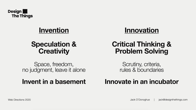
To create the breathing room means not being a fundamentalist in agile or design thinking, or even design sprints or you know, service blueprinting. But identifying what works best for the opportunity. Don't drink the Kool-Aid just because the cult leader says. No, the different roles in an organisation work better at different instances of the problem solving process. Identify them, utilise them, but also bridge them. So that one role in one part of the process is not disconnected from the other.
Agree early on, regarding what metrics you want to deliver on.
Validate their relevance as part of your research and implement and monitor them as part of your delivery. Finally do not forget, it's never over.
It's a continuous process of improvement.
Thank you.
Thank you.
(upbeat music)
Over the past few years, the digital team at AusPost has matured into one of the most well-functioning agile trains in Australia. The challenge in this journey to success was to ensure how design and discovery retain their customer centricity in an environment of rapid production (we deliver every. 3 days!). The need was to continue to be proactive instead of reactive in our approach to problem-solving.
Some of the challenges the design team had were
- To ensure we had enough room for the right amount of research for the right problem while ensuring rapid delivery.
- To ensure that all members of the team from Product to Development could collaborate like a true cross-functional team to come up with solutions to problems.
- To ensure there was always enough fodder for the delivery trains to continue delivering while design and research would be doing their bit.
The talk will be a demonstration of how the Design team introduced ‘dual-track’ methodology of embedding design thinking into agile development trains and worked with the wider teams to incorporate it as a way of unpacking and delivering on complex customer problems.
Breathing room for Design
Sharbani Dhar, Director–Design Operations, Michelle O’Reilly, Lead product designer, Australia Post
Keywords: Australia Post, pandemic, dual track, brick and mortar, mail redirection, SAFe, discovery, experience, delivery.
TL;DR: Sharbani and Michelle offer a case study of how Australia Post – a bricks and mortar enterprise with complex logistical and technical challenges – found solutions to the challenge of creating breathing room in the midst of pandemic. By adopting a ‘dual track’, collaborative approach between the concepts of delivery and discovery, and at the same time anchoring experience between the two, their teams were able to achieve success across a range of metrics. Beyond metrics, by iterating an approach grounding in transparency and delight, they were better able to respond to the moment with a flexible outlook which also yielded unexpected opportunities for insight.
Sharbani: Before we start, let me tell you a story about Gina. She is a quintessential community activist and friend of Sharbani. At the outset of the pandemic, she started to sew. She sewed approx: 30 facemasks following a set of sewing instructions she found on an Australian Government Health website. She distributed them to friends and neighbours. Then she went to the supermarket whilst wearing one and immediately issued a product recall on all the masks she had given away. the problem: no breathing room. The mask was too tight. After trying other methods she found a pattern for a mask with a looser fit and more coverage and comfort.
This is exactly what design teams in an enterprise face every day. In an urgency to hit the market, we often build in a prescribed way without having the time or room to question it. However, we don’t have the luxury that Gina did to pivot and put out a new product the next day. There’s no breathing room for design to conceive and execute a delightful solution.
Sharbani is Design Director at Australia Post, an enterprise that has been the backbone of Australia for over 200 years.
Michelle: is the UX Design Lead at Australia Post.
ABC Journalist Diana Eliot writes: Post offices fulfill a social service as well as a commercial one. They stand stoically in townships decimated by floors, plagues, and financial ruin, like chimneys rising from the ashes of homes destroyed by fire.
Sharbani and Michelle will take us through a case study of how they created breathing room within their enterprise. It’s been a journey of trial and error that they are continuously looking to improve. They will share key learnings as many are facing similar challenges.
Sharbani: First, a few facts about Australia Post: AP is 210 years old. The first Postmaster-General Issac Nichols was a convict transported to NSW for stealing. He was responsible for collecting the mail from newly-arrived ships and distributing it to the colonies. The first post office was in George St, Sydney; they now have 4300 post offices across 7.5 million square miles.
Post offices are the lifeblood of rural Australia. They are a key enabler of e-commerce and serve the entire population from urbanites to people in tiny outback towns. A key insight they hear through user research is that when banks close in small towns, residents are not terribly worried. But when post offices close, people are very worried. They associate having a post office with being connected and important to the rest of the country. This imbues a high level of trust in Australia Post which in turn requires them to meet that responsibility.
In 2019, AP sent 3.3 billion items across 12.1 million local addresses and 214 countries across the world. With the advent of Covid, volumes have increased to triple the usual amount. TL;DR: They’re big! And making change is hard. Some days Sharbani and Michelle feel that they are working with technology from Mr. Issac Nichols himself! Having a large footprint means they have multiple operational dependencies and complexities and this has become more obvious than ever before during the pandemic.
Michelle: The digital team at AP are the facilitators for experiences. It’s their job to connect with customers virtually. Critically, they are the key channel for communication during emergencies, floods, bushfires, and the pandemic. The digital team is made up of more than 500 people working across 20 engineering teams across 4-5 major programs of work.
For delivery, they follow the Scaled Agile Framework for Enterprise (SAFe) which is a framework that allows complex enterprises to adopt Agile methodologies within dev teams to enable them to function in a lean, nimble, and agile manner. The whole digital team plans together every quarter and have check-ins every 6 weeks to reassess progress and planning where they map dependencies with other teams to ensure they aren’t operating in silos but are communicating and planning together.
SAFe is a software product. It’s been constant trial and error to mould and shape this process to ensure that the experience team’s needs are also being accounted for. The challenge for the experience team ilies in building software for a large brick and mortar enterprise using legacy tech and old-school stakeholders for a diversity of users across the country.
Not just how you build the software but how you design it in a way that’s simple, useful, and delightful for customers. What’s the sweet spot that allows breathing room for our customers and allows design to inform strategy? A sweet spot:
- That allows for thinking time yet enables quick delivery.
- That is inclusive and enables collaboration.
- That enables the right tools for a problem.
Sharbani: We tried a multitude of experiments to search for our sweet spot; working a few sprints ahead; just in time for devs; design sprints, etc. Then decided to go Dual Track, where the discovery track and delivery track run parallel but without a time dependency on each other. At the same time, experience continues its discovery toward an evolving vision that teams can use as a beacon; experience becomes the incremental realization of that vision.
Discovery Track kicks off end to end research and design activities that would ideally be a quarter to six weeks in advance of delivery. Once they discover insights, the delivery team can start to pick them up as opportunity swapping points. As research matures, delivery can plan bigger.
Why this works: It removes time dependency between experience research and delivery; allowing the breathing room to think, unpack, and invite cross channel collaboration. Slicing of learnings from research into smaller pieces of delivery allowed delivery teams to work toward meaningful and viable outcomes. Identifying quick wins also allowed quick, not expensive fails.
Double Diamond Approach. The first half of the diamond is learn, where the discovery track kicks off. The second half of the diamond is the create half, where delivery kicks off. First we learn, then we create. Discovery does not apply only to the experience team and delivery does not reside solely with tech. For this to work it is critical to identify the right balance of people for driving the right parts.
The participants of discovery track are: the product managers from viability, the software architect from tech, and the design directors from design. The participants of delivery track are: business analysts from viability, the developers from tech, and designers from design.
While these two tracks run parallel, the producers, iteration managers, and the leads become the connectors of the two tracks. Having roles that work upstream and roles that work downstream with characters in the process who ensure that there is a constant dialogue happening between the two facilitates and makes space and breathing room to focus on the right parts of the process at the right time.
From Day One, the whole team were committed to transparency of processes and methods. The team were unclear about UX processes, so time was taken to explain and answer questions. They also instigated a weekly shareback/open forum explaining the decisions that were being made. It was an open forum for collaboration open to all teams.
Michelle: Our first experiment in the new delivery approach was in mail redirection, which is one of the most expensive services that AP provides. It also drives the maximum of calls and customer complaints. When they began delivery track, they had an unclear problem and an unclear solution. Customer complaints were not the problem. They were the symptom. Discovery track allowed them to separate the problems from the symptoms and see what is really impacting customers and staff?
Simultaneously, they learned that 30k customers were unable to verify their identity online owing to special ID requirements and thus had to call directly. This allowed them to identify an opportunity they could add to their delivery backlog. We could open up servicing 85% of concession customers online. Big win for concession customers who have high rates of mobility issues and travel cost barriers. Particularly helpful during Covid.
Through continuous research throughout the project, they uncovered many issues, but the biggest one was that they kept getting in their own way. Over time, people spotted opportunities to piggyback on the traffic of this product. Over the years, multiple upsells that were distracting for viewers had slipped their way into the flow and eroded the experience. During testing, customers would get so distracted with upsells that they would forget their original intent. The solution: Move upsells outside the flow to increase overall conversion rates.
Most importantly, this analysis allowed them to set up the right measures of success, which became their criteria to continue optimization post delivery. They used data to inform decisions and decide when features were suitable to be released into production. This allowed them to get big changes across the line and build stakeholder trust.
The project was a success, coming in ahead of schedule and on budget. It met and exceeded objectives and proved value. What does this mean? Having the breathing room to collaborate and actively work through dual track has allowed them to:
- Build partnerships instead of receiving a list of requirements.
- Establish a continuous culture of measure and learning.
- Prove the value of design and experience to the point that now design informs strategy.
So… what does this all mean for you? Sharbani: Creating breathing room starts with creating transparency. A brick and mortar enterprise which has multiple operations trying to work together cannot always have a prescribed process. But whatever process you choose needs to start with creating transparency about it for all the players involved. We as design can’t sit in a corner and complain that we don’t get heard. We started by asking for a seat at the table without necessarily offering a chair at our own. Getting out of that mindset and having partnerships enabled them to build and try different methods.
A framework is good as long as you allow a bit of push and pull within it. To create breathing room means not being a fundamentalist in Agile, design thinking, or sprints. Rather, identify what works best for the opportunity. Don’t drink the Kool-Aid just because the cult leader says! Know that different roles in an organization work better at different instances of the problem solving process. Identify and utilize them. Agree early on as to what metrics you will use to prove the work. Validate their relevance as part of your research, and implement and monitor them as part of your delivery.
Finally, remember that it’s never over, it’s part of a continuous process of improvement. Thankyou!