Native modals with the new popover API
Introduction to Popovers
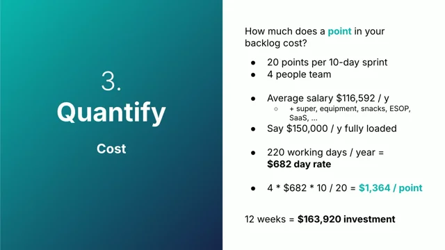
The session begins with an introduction to popovers, including their prevalence since the web’s inception and recent native support that covers 88% of browsers. A quick demonstration of a simple popover implementation reveals how to make one appear using attributes in HTML.
Customizing Popover Behavior
This section delves into customizing popover actions beyond the default toggle, introducing functionalities like separate show and hide buttons. Additionally, it explains the concept of the "top layer" where popovers are placed, avoiding the need for additional libraries. The presentation touches on the visual tools in DevTools for popover management and emphasizes the benefits of automatic dismissal and nested popovers.
Manual Popovers and JavaScript Control
The distinction between auto and manual popovers is clarified with examples, illustrating how manual popovers do not include light dismiss functionality by default. Manual popovers allow for more than one open popover and can be managed using JavaScript. Sample code is provided to show how JavaScript can be used to control popover visibility in the DOM API, offering extensive customization.
Styling Popovers
Focus shifts to styling popovers, explaining the default styles and how to override them for custom appearances. The use of pseudo elements like 'backdrop' in the top layer is introduced, along with techniques for customizing popover positioning using CSS.
Dialogs vs Popovers
The comparison between the dialog element and the popover API is explored, highlighting key differences such as the inert behavior of the dialog's background and its interaction limitations. Tab navigation within nested dialogs is demonstrated, and a comparison chart summarizes the characteristics of auto, manual popovers, and dialogs to assist in choosing the right implementation for different use cases.
Advanced Popover Implementations
The talk concludes with advanced applications of the popover API for features like toast notifications, emphasizing manual popover usage for greater control. Complex popover behaviors, such as stacking and styling, are briefly discussed alongside anchor positioning techniques that enable powerful combinations with nested menus.
Has anyone ever seen a popover or popup on the web?
Some people paying attention.
They're absolutely everywhere.
And they've been around since the beginning of the web.
And we've only finally got a native way to do them.
With pretty good browser support, around 88 percent at the moment.
To create a popover, you add the popover attribute to your, popover that you want to appear on the page.
And that does instantly something where it puts display none on it.
As soon as you put the popover attribute, it'll disappear from the page.
And then if you want to open it, you need to give it an ID.
We'll give an ID of Gandalf to this.
And then we use the popover target attribute on a button and that will toggle our popover.
So we've linked our Gandalf popover with our button and that will show our popover.
So you can see here I've got the button and my popover and that's it, we're done.
Alright, thanks for coming to my talk.
So that's it, that's how easy it is.
But what if we want more custom functionality?
So what if we want a separate show and hide button?
We could do that with popover target action.
By default it's toggle.
But you can customize it to be show or hide.
So here we've got a different buttons.
So we've got our toggle, just the same as what we had, and then we've got show.
And if I click that multiple times, won't do anything, hide will hide.
So you've got this additional functionality.
And also I had here, so pop over target Gandalf.
There's no action on this button.
But the next button, there is the action.
So they're basically the same thing.
You don't have to specify toggle.
So when we show a popover, display none is removed obviously because we can now see it.
But it's also placed into something called the top layer.
What's the top layer?
Essentially, it's the browser's way of doing all of this tricky business for us.
It'll put your popover above everything else on the page and you don't need to load in a library.
It's built into the browser.
It will be above your other content.
It's a really good, abstraction where the browser does all the work for you.
Puts it in the top layer and, you don't have to program in all these edge cases yourself.
And the DevTools has a really good, visualization.
It'll come up with a top layer, badge, just like Flexbox or Grid.
And then you can click that and it takes you to this separate, they present it like a document fragment.
Or a shadow DOM, and it's here at the bottom, separate from the document, it's like completely separate.
At the moment we've been using auto popovers.
Just putting popover on your element will make it auto.
And there's a lot of bonus functionality with an auto popover.
So with auto popovers, clicking outside the popover gets rid of it.
Same as hitting escape or any browser specific mechanism.
We don't know what that could be in the future.
Neuralink, maybe you think it goes away and it goes away.
And non nested popovers dismiss, the first one, if you open up a second one, but if the nested that can be within each other, we'll get into that.
Safari, we are waiting on Safari to allow you to tap outside a popover to close it.
So make sure you add in a close button within it so that people can actually close it.
So you can see here I can toggle gandalf and then if I toggle Gollum, we'll get Gollum But then if I hide Gollum gandalf won't be there.
So, when we open the first popover, when we open the second popover, the first one will close automatically.
So this is that auto behavior.
You can't have two popovers open at the same time if they're auto.
So if I show gandalf and then Show Gollum, hide Gollum, Gandalf's not there.
We've also got popover manual.
This lets us take full control.
So what's the difference between auto and manual?
So they're both creating this top layer for us.
Where we're above all the other content on the page.
The difference is light dismiss.
So with auto, we can click outside, we can escape, and it gets rid of it.
Whereas with, manual, we don't have this functionality.
So we'd have to use a, custom close button, or maybe if it's a toast notification, it goes away after a set amount of time.
And you can also have more, more than one popover open if it's manual.
So here with manual popovers, we can toggle Gandalf.
And then toggle Gollum.
And if I go and hide Gollum, we've still got Gandalf.
So we can have two open at the same time.
But if I go back to Demo 3, and you'll have to trust me on this, I'm hitting escape, it goes away.
Or if I click outside, it goes away.
Whereas in Demo 4, if I click outside, nothing's happening.
Trust me, I am clicking.
Or if I hit escape, nothing happens.
So that's the main difference between auto and manual.
And we also have a JavaScript way of doing this.
So if you want to programmatically control your popovers, there's a DOM API.
So, we've got our ID on our popover and our ID on our toggle, but we haven't specified the popover attribute or the popover target.
So what we'll do here, we'll pull these into JavaScript and if we support popover, so this is a nice easy way of checking if we have support within JavaScript.
Then we will continue creating our popover.
This is the same as just putting our attribute on the element, and then we'll set our popover target element, on the button, and the action, which is toggle.
And you don't need this.
And, otherwise, we'll just hide our popover, because if the browser doesn't support popover, it's one of those 12 percent currently, then we don't want the popover just displaying by default, because that might look ugly on the page.
And here it just works the same as using it in HTML.
We've also got functions to show or hide the popover.
So we can call showPopover, hidePopover, toggle, demo6.
It's good to number your demos.
Okay, so I've got a keymap here where S will show, T for toggle, and H to hide.
And I've got some JavaScript here where we're pulling the elements in again, checking if we have support, and we'll map a key to all these actions.
So if I press S, I'll show the popover.
Press it again, it won't do anything.
Hide, H, and then T for toggle.
You can do all sorts of fancy stuff.
Show, hide popovers through JavaScript, and that'll be useful later for Toast notifications.
But what if we want to style things?
There's a lot of HTML elements that we probably don't use because we can't style them, and it's really annoying.
But with Popover, even though it's beautiful default styles, look at this wonderful border.
These are the default styles, so we can override these and style it however we want.
So by default, you have all these, properties which sort of center it on the page and, make sure it's, in the top layer and, the only thing you really have to worry about here is the inset zero, which if you want to put your popover somewhere else on the screen rather than just right in the center, you have to override your inset.
So you do inset, unset usually.
That's the only sort of gotcha there.
For styling our popover, we've got pretty much the same thing.
I think I've still got Gandalf there.
There we go.
We've got a coloured background there.
So we're styling just the popover attribute, putting some padding, background image, and we're using the nice new, colour mix functions.
And, backdrop.
So we've got a slight grey backdrop you can probably see there.
We've got this new pseudo element backdrop.
That's to do with the new top layer that we've got.
Backdrop will appear behind that.
And it will actually nest as well, so if you have nested popovers, it will stack the backdrop as well.
So you've got these new methods of styling.
But what about dialogue?
We already have the dialogue element for creating modals.
What's the difference between Dialog and this new Popover API?
Lots of demos.
So we've got Dialog here, and Dialog is a bit different, because you can't use just HTML with Dialog.
You need a bit of JavaScript.
So here I've got this button, and on click, we will take our Dialog, and we will call the showModal method, which is different from showPopover.
And we've got our Dialog here, and it's actually its own HTML element.
And we've got a button inside of there to close it.
Because there's no light dismiss functionality with dialogues.
So if I click this button, we'll get our dialogue.
It's very similar basic styling.
And then our close button will close it.
So we've got these JavaScript methods.
But there's no way to do it through HTML.
And I didn't add this into the demo.
I don't think.
But if you can't, cause I can't do it in CodePen.
But you'll have to trust my word on this.
If I tab while inside the modal, I can't actually tab to the button because the rest of the page outside of the dialogue becomes inert.
What is inert?
Inert blocks focus, so I can't click, and in a screen reader, I can't navigate through anything that's inert.
When you call showModal, The only thing you can interact with is that modal and you have to finish whatever job you've got there before you can go and access the rest of the page.
Sometimes you might want that, sometimes you might not want that.
Browsers, might not allow you to search text that's inert.
And they disable clicking and dragging, highlighting.
Inert basically means you can still see it, but you can't interact with it at all.
So if I have a nested dialogue as well, So I've got Dialog1 here, and I can open Dialog2 within Dialog1.
And yeah, I can't show this in CodePen, but if I tabbed within this Dialog2, I can't actually tab to Dialog1.
But this is to show as well that you can have nested dialogs as well.
So if you have really complex logic, you can do some cursed things.
So this is a wonderful graph of, already Christmas themed, of the pros and cons between auto popovers.
Manual popovers, and dialogues.
So they're all in the top layer.
They all create this separate top layer that you don't have to worry about all the implementations.
The browser does it for you.
Semantically, the dialogue is semantically a modal.
It'll convey to screen readers, without needing to add a role.
So if you want to use the popover API, you'll need to add an ARIA role if you want to convey semantics.
The background is inert.
In dialogues, but not in auto or manual popovers.
Light Dismiss only works on the auto popovers.
So for manual or dialogue, you have to implement that yourself.
Make sure you don't forget to put a close button.
Otherwise you use this stuck and you can have more than two, manual popovers or dialogues open at the same time.
So you you've got to think, what am I creating?
What features do I need?
And, they're all useful, you just have to know the differences, and these are the differences between each, on what to choose for your popover.
If we wanted to create a toast, this is a fun little toast notification that I whipped up.
It's using the popover API, and we're using a manual popover.
Because we don't want the light to dismiss, we want to control when the popover goes away.
We don't want a user clicking on the page anywhere.
And having it just disappear, or hitting escape and having it disappear.
And we might want more than one open at the same time.
Maybe we have a stack of them in some complex logic.
And here I'm essentially pulling the HTML elements again.
I'm setting my message in a variable.
You have way more complex logic here.
And I'm changing the text content of our output element pretty much.
What we've got here and I'm showing popover.
So we're using that show popover functionality.
And then we set a timeout for simply hiding it.
So you could have a much more complex logic here.
If you have multiple toasts in a stack, you can add animations.
There's new CSS coming out for that.
And you can do all sorts of fun stuff.
So it's really extensible.
It's not just like old form controls where you have to use what the browser's chosen for you.
You can style it and make it work exactly how you want.
And popovers are really fun when you combine them with anchor positioning.
Now, I'm not at this level yet, so I've stolen a pen from Una Kravets.
Let's say you want a nested submenu.
This is a popover right here.
This is native in the browser.
So we've got a popover here and it's anchored to this, button.
And then if we click storefront, we get another popover nested within that.
So popovers plus anchor positioning.
You can do all of this natively with basically some, just some HTML and there's no JavaScript here at all.
So essentially, we name our anchors.
I don't know much about anchor positioning.
But we have our popover.
Where is it?
Popover target right here.
Menu.
And we're essentially just two nested popovers here.
So we've got another popover within our popover.
So anchor positioning plus popovers.
Great fun.
Any questions?
No, I've been Zach.
I work at Prezzee and that link should take you to my LinkedIn.
- display
- ID attribute
- top layer
- popovers DOM API
- showPopover
- hidePopover
- toggle
- color mix function
- backdrop
- Dialog element
- showModal method
- inert attribute
- manual popover
- textContent property
- setTimeout function
- anchor positioning
Elements that ‘popover’ the contents of a page–dialog boxes, tooltips, modals, menus, and notifications have always been a lot of work to get right. But with the new HTML popover element it’s got a whole lot easier.
Learn all about what they offer and how to use them in this session.

