Beyond CSS Media Queries — Smashing Magazine
May 17, 2024
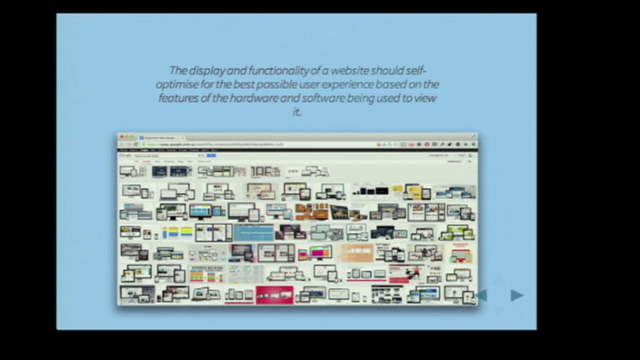
Today, there are more options and tools in CSS for establishing layouts that allow page elements to adapt to many different conditions besides the size of the viewport. Some are more widely used — Flexbox and Grid for certain — but also things like responsive length units and, most notably, container queries, a concept we will come back to in a bit.
But media queries are still often the de facto tool that developers reach for. Maybe it’s muscle memory, inconsistent browser support, or that we’re stuck in our ways, but adoption of the modern approaches we have for responsive interfaces seems slow to take off.
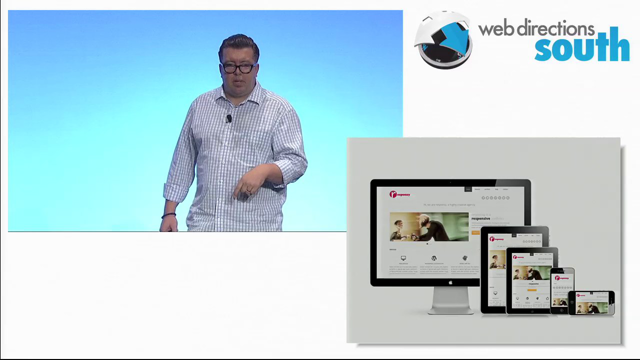
Ethan Marcotte’s Responsive Web Design, which placed media queries at the centre of developing and designing for a range of screen sizes. But 14 years later while its an approach still widely used, it might be time to move past media queries in many instances.


